The Project Gutenberg EBook of The Art of the Book, by
Bernard H. Newdigate and Douglas Cockerell and L. Deubner and E. A. Taylor

This eBook is for the use of anyone anywhere at no cost and with
almost no restrictions whatsoever.  You may copy it, give it away or
re-use it under the terms of the Project Gutenberg License included
with this eBook or online at www.gutenberg.org


Title: The Art of the Book
       A Review of Some Recent European and American Work in
              Typography, Page Decoration & Binding

Author: Bernard H. Newdigate
        Douglas Cockerell
        L. Deubner
        E. A. Taylor

Editor: Charles Holme

Release Date: June 14, 2014 [EBook #45968]

Language: English

Character set encoding: UTF-8

*** START OF THIS PROJECT GUTENBERG EBOOK THE ART OF THE BOOK ***


Produced by Chris Curnow, Turgut Dincer and the Online
Distributed Proofreading Team at http://www.pgdp.net (This
file was produced from images generously made available
by The Internet Archive)
THE ART OF THE BOOK
AXiREVIEWXiOFXiSOME
RECENTXXeeEUROPEAN
ANDeAMERICANeWORK
INeTYPOGRAPHY,ePAGE
DECORATION & BINDING
........................................
CHARLES HOLME, EDITOR
MCMXIV
“THE STUDIO” LTD.
LONDON, PARIS, NEW YORK
THE Editor desires to express his thanks to the following who have kindly assisted in the preparation of this volume:—to the Trustees of the Kelmscott Press for permission to reproduce the pages printed in the three types designed by William Morris, and to Mr. Emery Walker for the valuable assistance he has rendered in the reproductions of these particular pages, and also the page of Proctor's Greek type; to Mr. Lucien Pissarro for allowing the three pages by the Eragny Press to appear; to Mr. C. H. St. John Hornby, whose page by the Ashendene Press has been especially set up for this volume; to Mr. Philip Lee Warner for permission to show two pages by the Riccardi Press; to Messrs. Chatto & Windus for the page by the Florence Press; to Messrs. Methuen & Co. for the page printed in the “Ewell” type; to Messrs. H. W. Caslon & Co. for the page of their new “Kennerley” type; to Messrs. P. M. Shanks & Sons for the page of “Dolphin Old Style” type; to Mr. F. V. Burridge for the two pages especially set up at the London County Council Central School of Arts and Crafts; to Messrs. George Allen & Co. for permission to reproduce the two pages designed by Mr. Walter Crane; to Mr. Percy J. Smith for the book-opening designed by him; to the Cuala Press, the Vincent Press, the Reigate Press, Messrs. B. T. Batsford, Messrs. J. M. Dent & Sons, Messrs. George Routledge & Sons, Messrs. Siegle, Hill & Co., for permission to show various pages from their publications; and to Mr. J. Walter West, R. W. S., for the pages designed by him.
The Editor's thanks are due to the various bookbinders whose work has been lent for illustration, and to Monsieur Emile Lévy for the loan of the photographs of Mr. Douglas Cokerell's bindings; to Mr. John Lane for permission to illustrate the cover designs by Aubrey Beardsley; and to Messrs. George Newnes for the end-paper design by Mr. Granville Fell.
The Editor is also indebted to the various Continental and American publishers, printers, type-founders, bookbinders and book-decorators who have kindly placed at his disposal the examples of their work shown in the foreign sections; particularly to Herren Gebrüder Klingspor, the Bauersche Giesserei, Herr Emil Gursch, Herr D. Stempel, Herren Genzsch and Heyse, MM. G. Peignot et fils, Monsieur L. Pichon, and Monsieur Jules Meynial for the pages of type especially set up for this volume.
| PAGE | ||
| British Types for Printing Books. | By Bernard H. Newdigate | 3 |
| Fine Bookbinding in England. | By Douglas Cockerell | 69 |
| The Art of the Book in Germany. | By L. Deubner | 127 |
| The Art of the Book in France. | By E. A. Taylor | 179 |
| The Art of the Book in Austria. | By A. S. Levetus | 203 |
| The Art of the Book in Hungary. | —— | 231 |
| The Art of the Book in Sweden. | By August Brunius | 243 |
| The Art of the Book in America. | By William Dana Orcutt | 259 |
TO judge rightly of the good or bad features of types used for printing books, we should have some acquaintance at least with the earlier forms from which our modern types have come. Let us therefore glance at the history of the letter from which English books are printed to-day.
The earliest printed books, such as the Mainz Bible and Psalters, were printed in Gothic letter, which in its general character copied the book-hands used by the scribes in Germany, where these books were printed. In Italy, on the other hand, the Gothic hand did not satisfy the fastidious taste of the scholars of the Renaissance, who had adopted for their own a handwriting of which the majuscule letters were inspired, or at least influenced, by the letter used in classical Rome, of which so many admirable examples had survived in the old monumental inscriptions. For the small letters they went back to the fine hand which by the eleventh and twelfth centuries had gradually been formed out of the Caroline minuscules of the ninth and had become the standard book-hand of the greater part of Latin Europe. When the Germans Sweynheim and Pannartz brought printing into Italy, they first printed books in a very beautiful but somewhat heavy Roman letter of strong Gothic tendency. It seems, indeed, to have been somewhat too Gothic for the refined humanistic taste of that day; and when they moved their press to Rome, it was discarded in favour of a letter more like the fashionable scrittura umanistica of the Renaissance. Other Italian printers had founts both of Gothic and of Roman types. The great Venetian printer Jenson, for instance, and many of his fellows printed books in both characters; but the Roman gradually prevailed, first in Italy, then in Spain and France, and later on in England. In Germany, on the other hand, the cradleland of the craft, Gothic letter of a sadly debased type has held its own down to this day. Even in Germany, however, the use of Roman type has gained ground of late years, nationalist feeling notwithstanding.
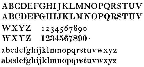
The Roman type used by the early Italian printers is, then, the prototype from which all other Roman founts are descended. Its development may be traced through such Roman type as was used by Aldus at Venice, by Froben at Basle, by the Estiennes in Paris, by Berthelet and Day in London, by Plantin at Antwerp, by the Elzevirs at Leyden and Amsterdam, and by printers generally right through the seventeenth century and the greater part of the eighteenth. Through all these years types still kept what modern printers call their “old-face” character, which they had acquired from the scrittura umanistica of the Italian Renaissance. In the seventeenth century the letters of the Roman[4] alphabet began to acquire certain new features at the hands of the copper-plate engravers, who supplied the book illustrations of the period. Working with the burin instead of the pen, they naturally used a sharper and finer line and also modified somewhat the curves of the letters, which tended to become more stilted and less open. The tail of the “R,” for instance, which in Jenson's type is thrust forward at an angle of about forty-five degrees, at the hands of some of the seventeenth-century engravers tends to drop more vertically, as in the “R” of “modern” type, the development of which we are seeking to trace. How far and how soon the lettering of the engravers of illustrations came to modify the letters cast by the type-founders is a question which invites further research. A material piece of evidence is supplied by the “Horace” printed by John Pine in 1733. Instead of being printed from type, the text of this book, together with the ornaments and illustrations, was printed from engraved copperplates. In date it was some sixty years prior to the earliest books printed in “modern-faced” type in this country; yet in the cut of the lines and the actual shape of the letters many distinguishing features of the “modern” face may already be traced. What these features became may be seen best by comparing an alphabet of the “old” with one of the “modern” face printed below it:
The “modern” tendency may be seen in certain features of the types designed by Baskerville, who printed his first book in 1757; but it is not nearly so pronounced as in Pine's “Horace,” engraved twenty-four years earlier. Baskerville's editions had an enormous vogue, not only in this country but on the Continent also, where they had considerable influence on the style of printing which then prevailed. Amongst those who felt this influence was Giambattista Bodoni, a scholar and printer of Parma, which city has lately kept the centenary of his death. To Bodoni more than anyone else the so-called “modern-face” is due. He cast a large number of founts, narrow in the “set” or width of the letters as com[5]pared with their height, and having the excessively fine lines and the close loops and curves which are characteristic of that face. Like Baskerville he printed his books with very great care on a spacious page in large and heavily-leaded type; and although an occasional protest was raised against the ugliness of his letter, his books caught the taste of his day, and his type was copied by all the English type-founders of the time. The new fashion completely drove out the older tradition, which dated from the very invention of printing; and from the closing years of the eighteenth to the middle of the nineteenth century books were printed almost exclusively in “modern-faced” type.
The older and more authentic letter had its revenge in 1843, when the publisher, William Pickering, arranged with his friend Charles Whittingham, the printer, to produce a handsome edition of Juvenal as a “leaving-present” for Eton; and the book was to be printed from the discarded type first cut by William Caslon about the year 1724. Prior to that time English printers had gone to Holland for most of their type; but Caslon's types surpassed in beauty any hitherto used in England, and the best English printing had been done from them till near the end of the century, when they were driven out by the “modern” face. Before the Juvenal was issued, a romance entitled “The Diary of Lady Willoughby,” dealing with the period of the Civil Wars, was also printed in old-faced type cast from William Caslon's matrices, so as to impart to the book a flavour of the period at which the diarist was supposed to be writing. It was the day of Pugin and of the Gothic revival; and the public taste was won by the appearance of this book, printed in old-fashioned guise in the selfsame type which had been cast aside half a century before. Type-founders are generally quick to follow one another's lead in new fashions; and before long every type-founder in England had cut punches and cast letter in that modified form of Caslon's old-faced type which printers call “old-style.” Mr. Adeney of the Reigate Press has used an “old-style” fount in the extract from Camden's “Britannia” reproduced on a very small scale on page 57. The “old-style” character and the points in which it is either like or unlike the more authentic old-faced letter may be seen by comparing the two. The lower of these founts is the “old-style” :


The favour which the revived “old-face” and the new “old-style” letter won for themselves in the middle of last century has suffered no diminution since. The ugly “modern-face,” which we owe to Bodoni, is still used almost exclusively for certain classes of work and alternatively for others; so that the printer is bound to be familiar with all three. For book-printing at the present day the “old style” and the “old-face” are used much more than the modern.
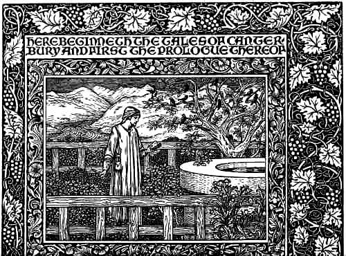
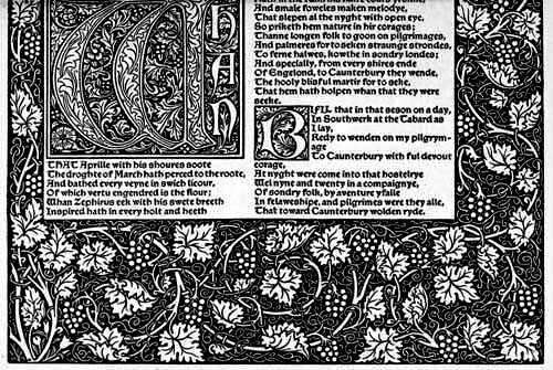
During the fifty years that followed the revived use of Caslon's types by the Whittinghams there is little else to record about the designs of the types used for printing books, until about the year 1890, when William Morris set himself to design type, fired thereto by a lecture, given by Mr. Emery Walker, on the work of the Early Printers, to which he had listened. In the “Note by William Morris on his aims in founding the Kelmscott Press,” printed after his death, he writes of the purpose which led him to print books, and of the character he sought to give his letter: “I began printing books with the hope of producing some which would have a definite claim to beauty, while at the same time they should be easy to read and should not dazzle the eye by eccentricity of form in the letters. I have always been a great admirer of the calligraphy of the Middle Ages and of the earlier printing which took its place. As to the fifteenth-century books, I had noticed that they were always beautiful by force of the mere typography, even without the added ornament with which many of them are so lavishly supplied. And it was the essence of my undertaking to produce books which it would be a pleasure to look upon as pieces of printing and arrangement of type.... Next as to type. By instinct rather than by conscious thinking it over, I began by getting myself a fount of Roman type. And here what I wanted was letter pure in form; severe without needless excrescences; solid without the thickening and thinning of the line, which is the essential fault of the ordinary modern type and which makes it difficult to read; and not compressed laterally, as all later type has grown to be owing to commercial exigencies. There was only one source from which to take examples of this perfected Roman type, to wit, the works of the great Venetian printers of the fifteenth century, of whom Nicholas Jenson produced the completest and most Roman characters from 1470 to 1476. This type I studied with much care, getting it photographed to a big scale, and drawing it over many times before I began designing my own letter; so that, though I think I mastered the[7] essence of it, I did not copy it servilely; in fact, my Roman type, especially in the lower case, tends rather more to the Gothic than does Jenson's. After a while I felt I must have a Gothic as well as a Roman fount; and herein the task I set myself was to redeem the Gothic character from the charge of unreadableness which is commonly brought against it. And I felt that this charge could not be reasonably brought against the types of the first two decades of printing: that Schoeffer at Mainz, Mentelin at Strassburg, and Günther Zainer at Augsburg, avoided the spiky ends and undue compression which lay some of the later types open to the above charge.... Keeping my end steadily in view, I designed a black-letter type which I think I may claim to be as readable as a Roman one, and to say the truth I prefer it to the Roman. This type is of the size called Great Primer (the Roman type is of 'English' size); but later on I was driven by the necessities of the Chaucer (a double-columned book) to get a similar Gothic fount of Pica size.”
Pages printed in each of Morris's three founts of type are reproduced here on pages 14, 15, 17 and 19. It is interesting to compare Morris's “Golden” type—so he called his Roman fount after the “Golden Legend,” which he printed from it—with the Roman letter of the Italian printers, which he studied with so much care before he began to design his type. The “Golden” type is much heavier in face than, say, that of Jenson; and it certainly lacks the suppleness and grace of the Italian types generally. As a point of detail we may notice especially the brick-bat serifs used on Morris's capital “M” and “N,” giving a certain clumsiness to these letters. The two Gothic letter founts which Morris designed, on the other hand, must be regarded as amongst the most beautiful ever cast. William Morris's types should be judged on the setting of richly decorated borders which he designed for his pages. Adding to these the designs of Sir Edward Burne-Jones, engraved on wood by W. H. Hooper, we have in the Kelmscott “Chaucer” the most splendid book which has ever been printed.
The “Golden” type of the Kelmscott Press was copied freely in America and sent back to the country of its birth under several different names. In somewhat debased forms it had a vogue for a time as a “jobbing” fount amongst printers who knew little or nothing of the Kelmscott Press; but the heaviness of its line and also its departure from accepted forms kept it from coming into general use for printing books. The interest awakened by the books printed by William Morris at Hammersmith tempted many more to set up private presses or to design private founts of type when the work of the Kelmscott Press came to an end after Morris's death, which took place in 1896. Most of such founts and the best of them followed more or less closely the letter of the early Italian printers, which, as we have seen, are the prototypes of our book letter of to-day. Even before the founding[8] of the Kelmscott Press Mr. Charles Ricketts had designed books, using some of the “old style” faces which were in general use. When the Kelmscott Press books appeared, he too was won over by what he called the “golden sunny pages” of the early Italian printers, and designed for himself the “Vale” type. In weight and general appearance it bears considerable likeness to Morris's “Golden” type, and in some ways is an improvement on it. Mr. Ricketts afterwards had the same letter cast in a smaller size for his edition of Shakespeare, whence its name of the “Avon” type. He also designed another letter, the interest of which lies in certain experiments towards the reform of the alphabet which it embodies. In the “King's” type, as Mr. Ricketts called it, many of the minuscule letters, such as e, g, t, are replaced by small majuscules. Such a departure from traditional use is too violent to give pleasure, and only two or three books were printed in this letter. The three Vale Press founts and also the punches and matrices were destroyed when the Press ceased publishing.
Mr. T. J. Cobden-Sanderson and Mr. Emery Walker set up the Doves Press at Hammersmith in 1900, and designed and got cast for themselves a fount of type which follows Jenson's Roman type very closely. It differs from it chiefly in the greater regularity of its lines, and also in the squareness and brick-bat shape of some of the serifs, which are, however, less conspicuous than in Morris's “Golden” type. The Doves Press books, unlike those of the Kelmscott Press, are entirely free from ornament or decoration, and owe their remarkable beauty to what Morris styled the architectural goodness of the pages and also to the fine versal and initial letters done by Mr. Edward Johnston and Mr. Graily Hewitt. Later on we shall have something more to say about the work of these men and their school.
The type of the Ashendene Press (p. 23) is modelled from that in which Sweynheim and Pannartz printed books at Subiaco, and which, as we have seen, they replaced by a purer Roman letter more in accord with the humanistic taste of their day. Morris himself designed, but never carried out, a fount of letter after the same fine model. It is a Roman type, with many Gothic features. The folio “Dante,” the “Morte Darthur,” the Virgil and the other books which Mr. St. John Hornby has printed from it in black and red, with occasional blue and gold, are superb examples of typography.
Mr. Lucien Pissarro's little octavos have a certain personal charm of their own distinct from anything that is found in the more weighty volumes which have issued from the other private presses. The first books which he produced at his Eragny Press were printed from the Vale type belonging to his friend Mr. Ricketts. In 1903 he began printing from the “Brook” type (pp. 25 to 29), which he had designed. Although in this article we are concerned chiefly with his types, it is impossible to withhold a tribute of praise for the graceful beauty of[9] these little books, which they owe even more to the admirable way in which their different elements have been combined—type, wood-engraving, colour, printing and binding, all of them the work of Mr. and Mrs. Pissarro themselves—than to the individual excellence of any one of them.
Mr. C. R. Ashbee's “Endeavour” type was designed by him for use at the Essex House Press, which he first established at Upton in the eastern suburbs of London and afterwards removed to Chipping Campden in Gloucestershire. It owes nothing to the types of the early printers, and taken by itself is not pleasing; but it makes a very handsome page when printed in red and black, as in the Campden Song Book. The type was also cut in large size for King Edward's Prayer Book, one of the most ambitious ventures of any private press.
Mr. Herbert P. Horne has designed three founts, all of them inspired by the Roman letter of the early Italian printers. The “Montallegro” type (p. 265), the first in order of date, was designed for Messrs. Updike and Co., of the Merrymount Press, Boston, and hardly falls within the scope of this article. In 1907 he designed for Messrs. Chatto and Windus a fount called the “Florence” type (p. 31), from which editions of “The Romaunt of the Rose,” “The Little Flowers of St. Francis,” A. C. Swinburne's “Songs before Sunrise,” R. L. Stevenson's “Virginibus Puerisque” and also his Poems have been printed at the Arden Press on behalf of the publishers. It is a letter of a clean, light face, and in many ways might serve as a model for a book type for general use. The capital letters used in continuous lines, as Aldus and other great Venetians delighted to use them, are especially charming. Mr. Horne's Riccardi Press type (pp. 33 and 35) was designed for the Medici Society, and many fine editions, amongst them a Horace, Malory's “Morte Darthur,” and “The Canterbury Tales,” have been printed from it. It is a little heavier in face than its predecessor, the “Florence,” and is a little further removed from the humanistic character. The type has also been cast successfully in a smaller size.
To the number of privately owned founts of type we must add the “Ewell” (p. 37), designed by Mr. Douglas Cockerell for Messrs. Methuen and Co., who will shortly publish the first book to be printed from it, an edition of the “Imitatio Christi.” It is a heavy but very graceful letter, based on one used by the Roman printer Da Lignamine.
One of the most interesting of the privately owned founts is the “Otter” Greek type designed by the late Mr. Robert Proctor, and shown in the page from the Odyssey printed on page 43. The Greek letter from which most of our school classics are printed is a descendant of the cursive type introduced by Aldus at the beginning of the sixteenth century, and has the merit neither of beauty nor of clearness. The majuscules are especially ugly, being nearly always of the “modern” type which we owe to Bodoni. Proctor took[10] as his model the finest of the old Greek founts, which was that used in the Complutensian Polyglot printed in 1514.
Amongst the types sold by the founders for general use none have enjoyed such successive favour as Caslon's “Old-Face” in its various sizes; and it is a splendid tribute to the excellence of this letter that at this day, nearly two centuries since it was first cut, it is being used more than any other face of type for printing fine books. This Special Number of The Studio is printed from Caslon's “Old-Face” type, as well as the pages, set up at the Central School of Arts and Crafts, which are shown on pages 45 and 47. The fame of Caslon's letter brought other rivals into the field besides Baskerville. One of these was Joseph Fry, a Bristol physician, who took to letter-founding in the year 1764, and cut a series of type somewhat like Baskerville's. A few years later, however, the Caslon character seems again to have recovered its old ascendancy, and Fry put on the market a new series in acknowledged imitation of Caslon's. Both these series of Fry's have been reissued within the last few years by Messrs. Stephenson and Blake, of Sheffield, who, in 1906, bought the type-founding business of Sir Charles Reed and Son, to whom Fry's business had eventually come. Like the revived Caslon “Old-Face” in 1843, these founts were cast from the old matrices, or from matrices struck from the old punches, so far as these had survived.
Since the “old-style” founts were designed about the middle of last century, what new book types have been cast by the founders for use by the printing trade generally have as a rule been mere variations of letter already in vogue. The founders have drawn but little on the wealth of beautiful book types which in the early printed books of Italy are offered to anyone who has the good taste and the skill to adapt them to modern needs. Messrs. Shanks and Sons, the type-founders of Red Lion Square, have, however, gone to this source for their “Dolphin” series (p. 41), which has many features of beauty to commend it. It is based on Jenson's Roman letter, somewhat thickened in the line. The punches were cut by Mr. E. P. Prince, who also cut the Kelmscott type and many others of the private founts.
Intelligent study of Italian models also gives us the “Kennerley” type (p. 39), designed by the American Mr. Goudy, which Messrs. Caslon will shortly put on the English market. This type is not in any sense a copy of early letter—it is original; but Mr. Goudy has studied type design to such good purpose that he has been able to restore to the Roman alphabet much of that lost humanistic character which the first Italian printers inherited from their predecessors, the scribes of the early Renaissance. Besides being beautiful in detail his type is beautiful in the mass; and the letters when set into words seem to lock into one another with a closeness which is common in the letter of early printers, but is rare in modern type. The[11] “Kennerley” type is quite clear to read and has few features which by their strangeness are likely to waken the prejudice of the modern reader. Since the first Caslon began casting type about the year 1724, no such excellent letter has been put within reach of English printers.
So large is the proportion of books which are now set in type by machinery that, however much our sympathies may make us prefer the hand-set book, we cannot but be concerned for the characters used in machine composition. Type set by machinery generally seems to be inferior in design to that set by hand; but the inferiority is in the main accidental, and is probably due to a lesser degree of technical skill shown either in the designing or in the process of punch-cutting, which is itself done by machinery. One or two admirable faces of type have, however, been produced by the Lanston Monotype Company for setting by the monotype machine. One of these is the “Imprint” type, adapted from one of the founts used by Christopher Plantin, the famous printer of Antwerp, in the late sixteenth century. The letters are bold and clear, and pages set in them are both pleasant to look at and easy to read. At the same time the type is sufficiently modern in character not to offend by any features unfamiliar to the ordinary reader.
No art can live by merely reviving and reproducing past forms, and in reviewing the share taken by the type-founders of the past and of the present in the art of the book one cannot help considering by what means and from what quarter good types are to be designed and cut in the future. We have seen that the early printers took their inspiration from the best of the contemporary book-hands. The invention of printing, however, killed the art of the scribe, and with it perished the source whence during the ages past life and beauty had been given to the letters of the alphabet and to the pages in which they were gathered. Henceforth the letters were cast in lead, and there was no influence save the force of tradition to make or keep them beautiful. Whatever change they underwent was for the worse, unless indeed it was a mere reversion to forms or features which for a while had been abandoned.
Conscious of this downward tendency, which he seems to look upon as inevitable and irresistible, Mr. Guthrie, of the Pear-tree Press at Bognor, has renounced type altogether, and now prints books, like William Blake, from etched plates inscribed with his own fine book-hand. Such a method is, of course, not practicable for the vast majority of books, even if we were willing to forgo the many fine qualities which are presented in a well-printed book. Neither is any such counsel of despair warranted, for of late years the art of the scribe itself has been renewed; and most readers of The Studio know something of the fine work done by the school of calligraphy established some ten years since by Mr. Edward Johnston, and still carried on by his pupil Mr. Graily Hewitt at the Central School[12] of Arts and Crafts in Southampton Row, London. May not the printer look to that school as the source whence the type-designer and type-founder shall learn to design and cut beautiful letter for his books? Not indeed that type-letter should be a mere reproduction of any written hand; rather must it bear nakedly and shamelessly all the qualities which the steel of the punch-cutter and the metal from which it is cast impose upon it. It must be easy to read as well as fair to look on, and besides carrying on the traditions of the past must respect the prejudices of the present. But only a calligrapher whose eye and hand have been trained to produce fine letter for the special needs of the printed book can have knowledge of the manifold subtleties of such letter and power to provide for them in the casting of types. If the writing schools can turn out such men, they will deserve well of all those who are interested in the art of the book. That our hope need not be vain is shown by the fact that calligraphers trained in the methods of the school have gone to Germany, and have there profoundly influenced the production of modern types; and the supreme irony of it all is that German type-founders are sending to England new types which draw their inspiration from a London school of which the English and Scottish type-founders seem never even to have heard.
Note—In the course of the preceding article the writer has had occasion to refer frequently to the type of Nicholas Jenson in its relation to the modern British founts. The Editor has therefore included amongst the examples shown a page from the “Pliny,” printed by Jenson in 1476, for purposes of comparison and reference. It will be found on page 21.
(Reproduced by permission of the Trustees of the
Kelmscott Press)
KELMSCOTT PRESS: PAGE FROM “THE WORKS OF GEOFFREY CHAUCER” PRINTED IN
THE “CHAUCER” TYPE DESIGNED BY WILLIAM MORRIS. ILLUSTRATION BY SIR
EDWARD BURNE-JONES, BART., BORDER AND INITIAL LETTER BY WILLIAM MORRIS
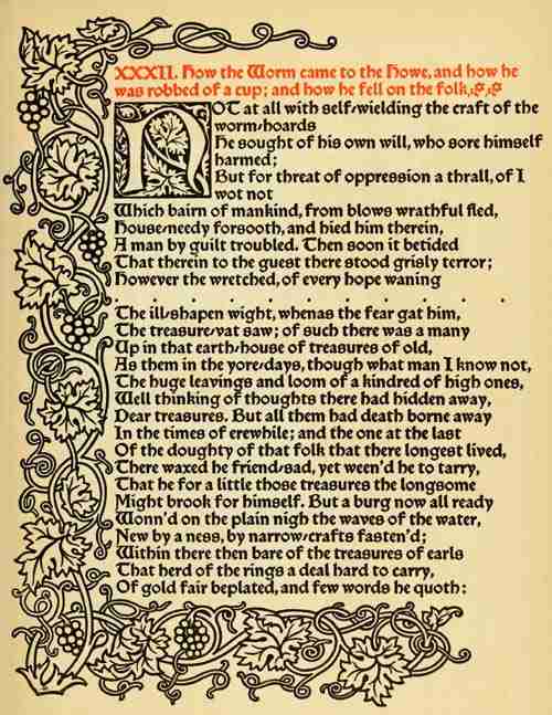
KELMSCOTT PRESS: PAGE FROM “THE TALE OF BEOWULF” PRINTED IN THE “TROY” TYPE DESIGNED BY WILLIAM MORRIS (REPRODUCED BY PERMISSION OF THE TRUSTEES OF THE KELMSCOTT PRESS)
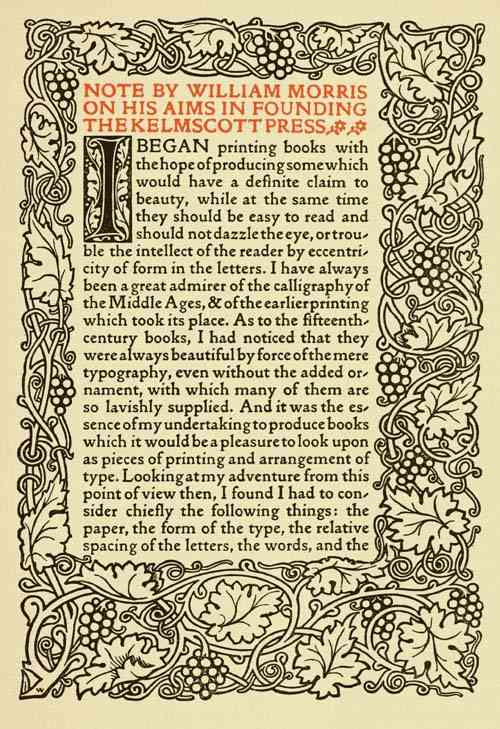
KELMSCOTT PRESS: PAGE PRINTED IN THE “GOLDEN” TYPE DESIGNED BY WILLIAM MORRIS (REPRODUCED BY PERMISSION OF THE TRUSTEES OF THE KELMSCOTT PRESS)
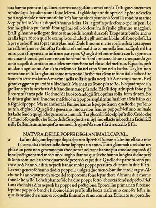
PAGE FROM THE “PLINY” PRINTED AT VENICE BY NICOLAS JENSON IN 1476
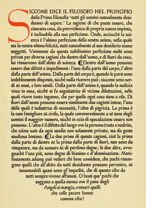
ASHENDENE PRESS: PAGE PRINTED IN GREAT PRIMER TYPE MODELLED UPON THE TYPE USED BY SWEYNHEIM AND PANNARTZ AT SUBIACO IN 1465
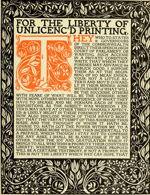
ERAGNY PRESS: OPENING PAGE OF THE “AREOPAGITICA” PRINTED IN THE “BROOK” TYPE, WITH BORDER AND INITIAL LETTER DESIGNED BY LUCIEN PISSARRO
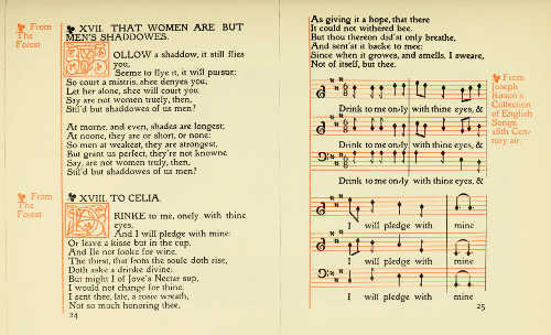
ERAGNY PRESS: PAGES FROM “SONGS BY BEN JONSON” PRINTED IN THE “BROOK” TYPE DESIGNED BY LUCIEN PISSARRO
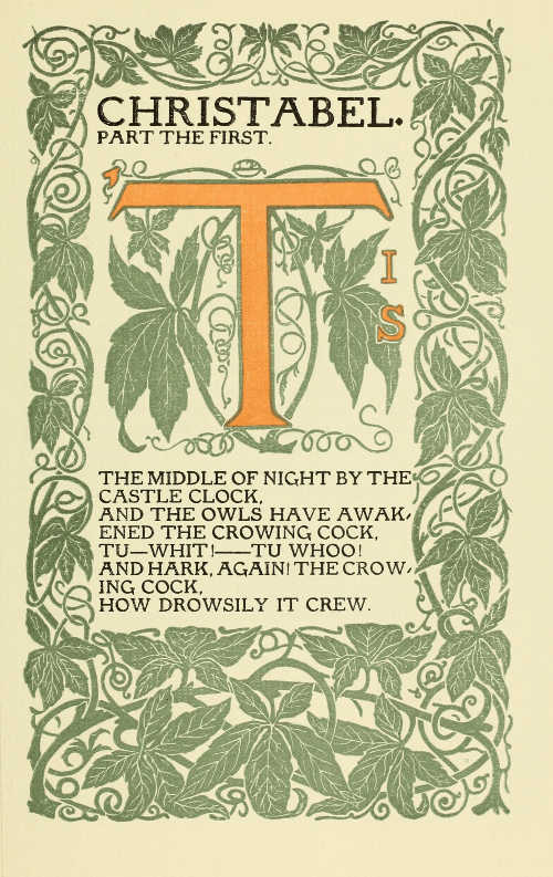
ERAGNY PRESS: OPENING PAGE OF COLERIDGE'S “CHRISTABEL” PRINTED IN THE “BROOK” TYPE, WITH BORDER AND INITIAL LETTER DESIGNED BY LUCIEN PISSARRO
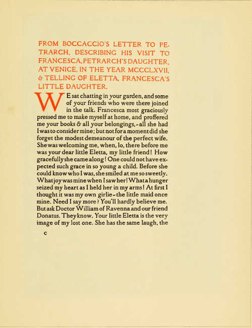
FLORENCE PRESS: PAGE FROM BOCCACCIO'S “OLYMPIA” SET IN ENGLISH TYPE DESIGNED BY HERBERT P. HORNE, AND PRINTED AT THE ARDEN PRESS, LETCHWORTH, FOR MESSRS. CHATTO AND WINDUS
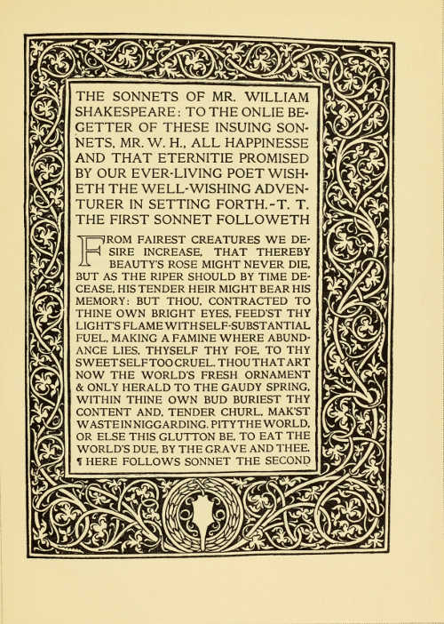
RICCARDI PRESS: PAGE FROM “SONNETS OF SHAKESPEARE” PRINTED IN 14 AND 11 POINT CAPITALS DESIGNED BY HERBERT P. HORNE. BORDER FROM BERNARD PICTOR AND ERHARDT RATDOLT'S “APPIANUS,” 1477
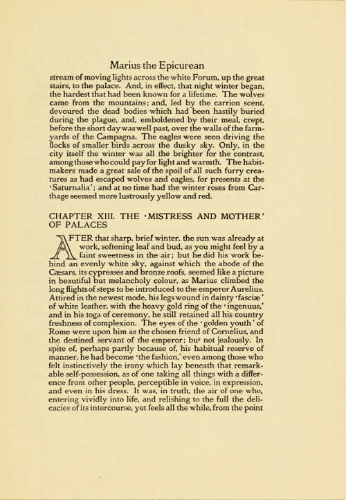
RICCARDI PRESS: PAGE FROM WALTER PATER'S “MARIUS THE EPICUREAN,” PRINTED IN 11 POINT FOUNT DESIGNED BY HERBERT P. HORNE
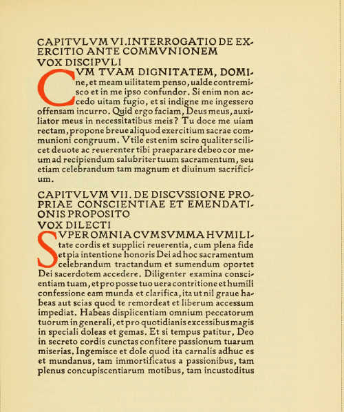
ABERDEEN UNIVERSITY PRESS: PAGE FROM THE “DE IMITATIONE CHRISTI” PRINTED IN THE “EWELL” TYPE DESIGNED BY DOUGLAS COCKERELL FOR MESSRS. METHUEN AND CO.
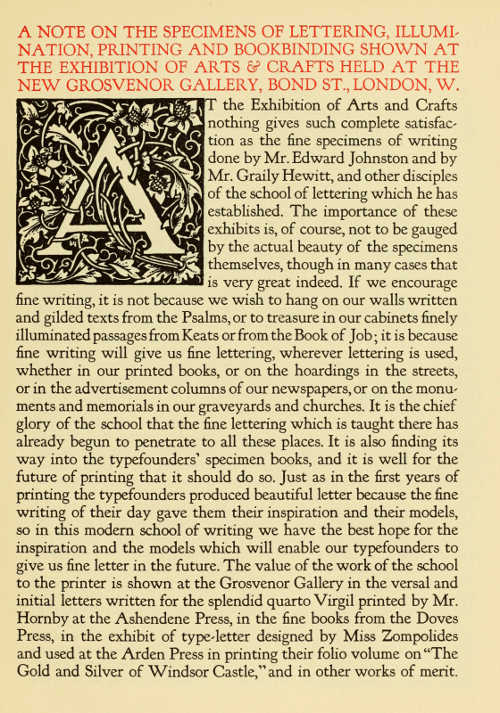
PAGE PRINTED IN THE “KENNERLEY” TYPE, 14 POINT, DESIGNED BY FREDERICK W. GOUDY AND CAST BY H. W. CASLON AND CO. LTD. INITIAL LETTER BY PAUL WOODROFFE, LENT BY THE ARDEN PRESS
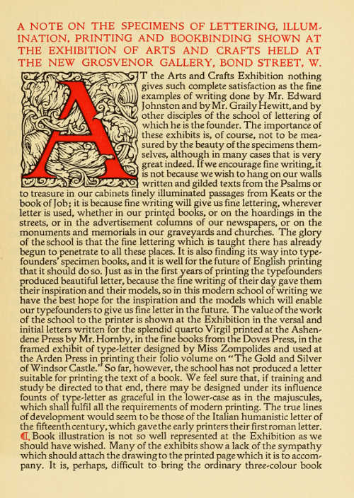
PAGE PRINTED IN THE “DOLPHIN OLD STYLE” TYPE, 12 POINT DESIGNED AND CAST BY P. M. SHANKS AND SONS
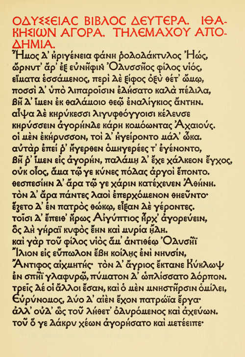
OXFORD UNIVERSITY PRESS: PAGE FROM THE “ODYSSEY,” PRINTED IN THE “OTTER” TYPE DESIGNED BY ROBERT W. PROCTOR
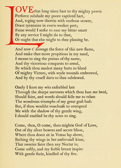
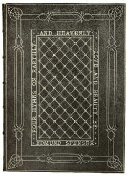
LONDON COUNTY COUNCIL CENTRAL SCHOOL OF ARTS AND CRAFTS: PAGE FROM EDMUND SPENSER'S “FOUR HYMNS ON EARTHLY AND HEAVENLY LOVE AND BEAUTY” PRINTED IN CASLON TYPE. WOODCUT INITIAL BY W. F. NORTHEND, STUDENT
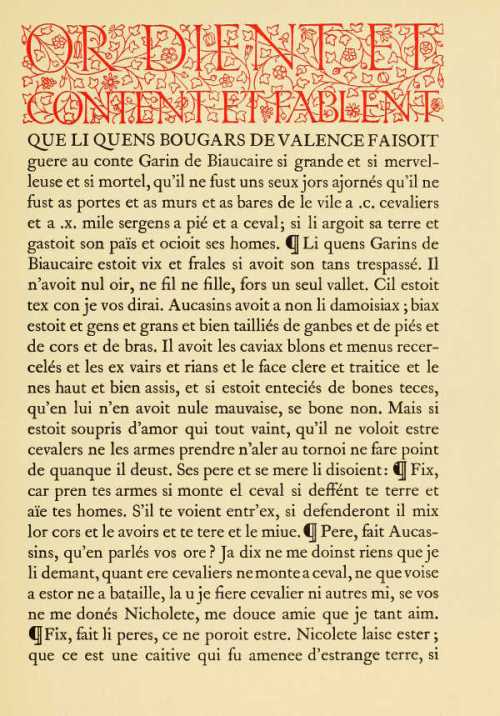
LONDON COUNTY COUNCIL CENTRAL SCHOOL OF ARTS AND CRAFTS: PAGE FROM “AUCASSIN AND NICOLETTE,” IN OLD FRENCH, PRINTED IN CASLON TYPE, WITH DECORATIVE HEADING
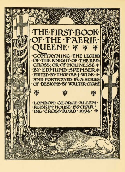
(Reproduced by permission of Messrs. George Allen and Co. Ltd.)
TITLE-PAGE BY WALTER CRANE FOR THE FIRST BOOK OF “THE
FAERIE QUEENE” (SIZE OF ORIGINAL WOOD-ENGRAVING 10 × 7-1/2 INCHES)
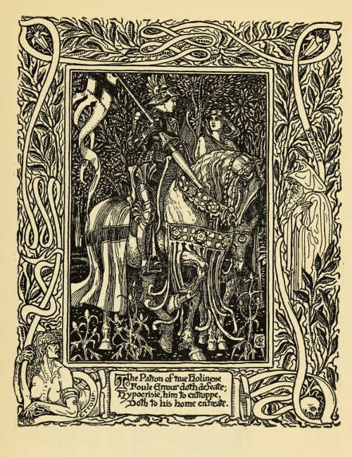
(Reproduced by permission of Messrs. George Allen and
Co. Ltd.)
FULL-PAGE ILLUSTRATION BY WALTER CRANE FOR THE FIRST BOOK OF “THE
FAERIE QUEENE.” (SIZE OF ORIGINAL WOOD-ENGRAVING 9½ × 7½ INCHES)
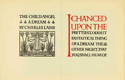
BOOK OPENING DESIGNED BY PERCY J. SMITH
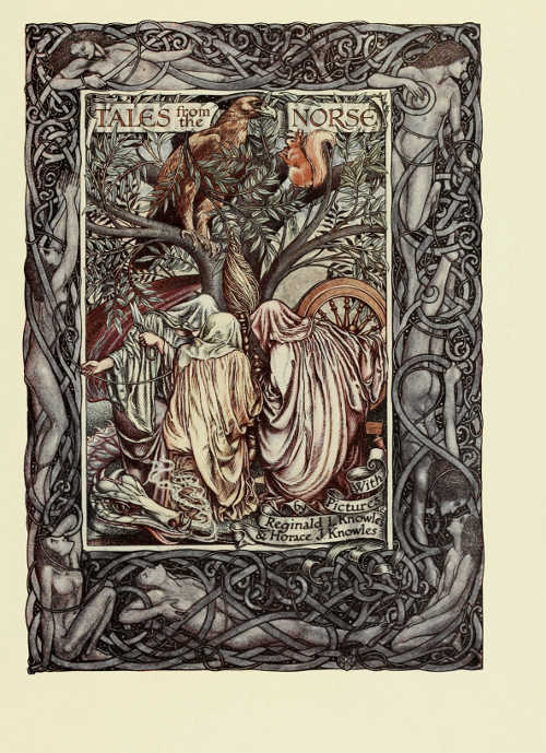
DESIGN FOR A TITLE-PAGE BY REGINALD L. KNOWLES. PUBLISHED BY MESSRS. GEORGE ROUTLEDGE AND SONS, LTD.
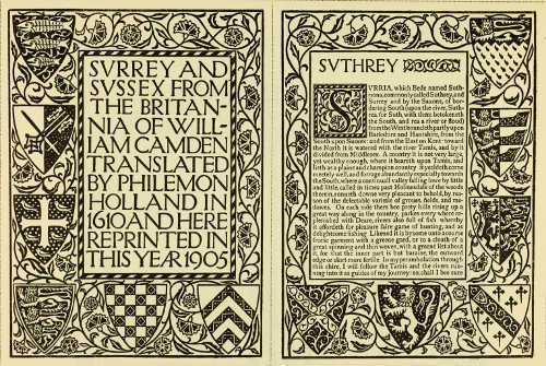
REIGATE PRESS: TITLE AND OPENING PAGES DESIGNED BY W. BERNARD ADENEY
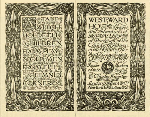
TITLE-PAGE OPENING OF THE FICTION SECTION OF “EVERYMAN'S LIBRARY” DESIGNED BY REGINALD L. KNOWLES FOR MESSRS. J. M. DENT AND SONS LTD.
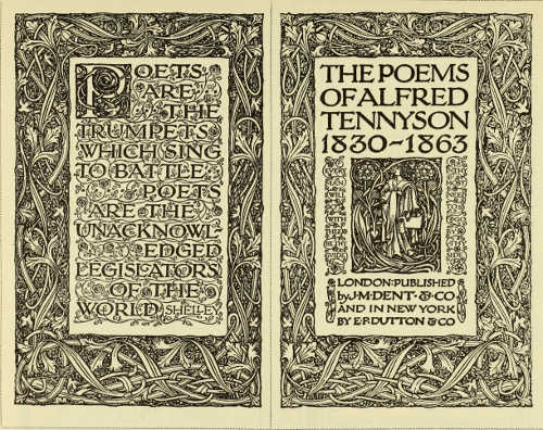
TITLE-PAGE OPENING OF THE POETRY SECTION OF “EVERYMAN'S LIBRARY” DESIGNED BY REGINALD L. KNOWLES FOR MESSRS. J. M. DENT AND SONS LTD.
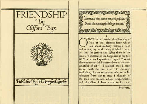
“FELLOWSHIP” BOOK. TITLE AND OPENING PAGES DESIGNED BY JAMES GUTHRIE LETTERING BY PERCY J. SMITH. PUBLISHED BY MESSRS. B. T. BATSFORD LTD.
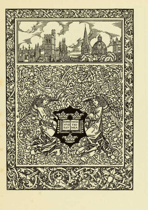
FRONTISPIECE TO AYMER VALLANCE'S “OLD COLLEGES OF OXFORD” DESIGNED BY HAROLD NELSON FROM SUGGESTIONS BY AYMER VALLANCE PUBLISHED BY MESSRS. B. T. BATSFORD LTD.
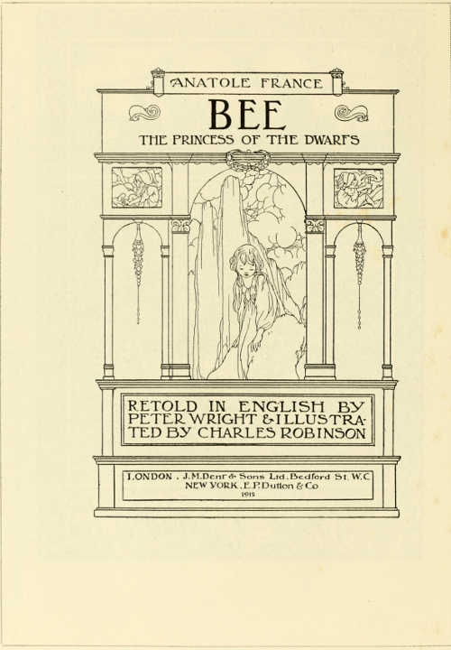
TITLE-PAGE DESIGNED BY CHARLES ROBINSON FOR MESSRS J. M. DENT AND SONS LTD.
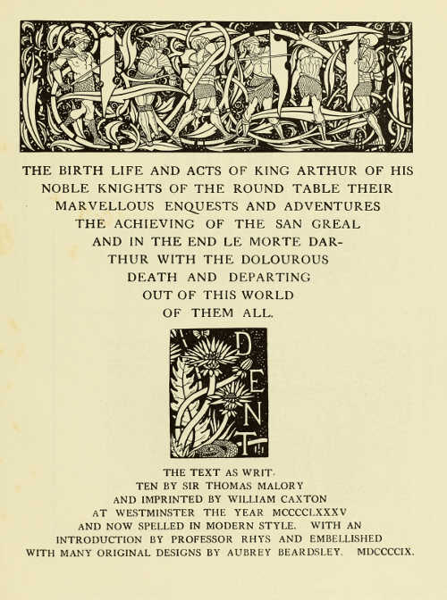
TITLE-PAGE DESIGNED BY AUBREY BEARDSLEY FOR MESSRS. J. M. DENT AND SONS LTD.
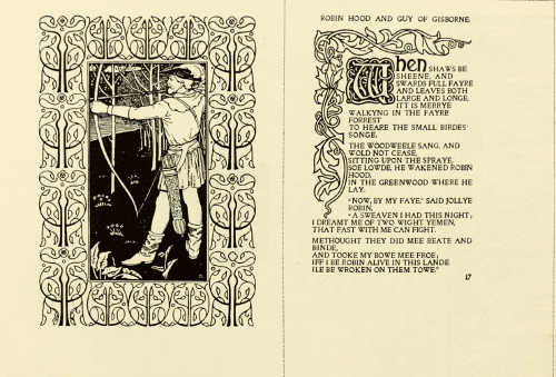
ILLUSTRATION AND PAGE OF TEXT FROM “ROBIN HOOD BALLADS.” DESIGNED BY R. JAMES WILLIAMS. PUBLISHED BY THE VINCENT PRESS
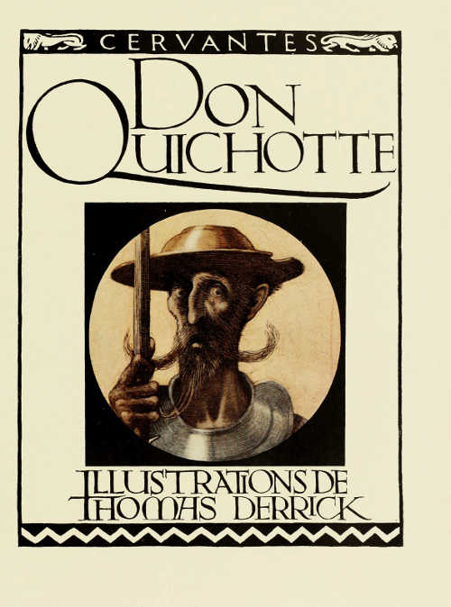
DESIGN FOR A TITLE-PAGE. BY THOMAS DERRICK. PUBLISHED BY MESSRS. SIEGLE, HILL AND CO.
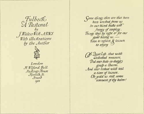
TITLE-PAGE AND PAGE OF TEXT DESIGNED BY J. WALTER WEST
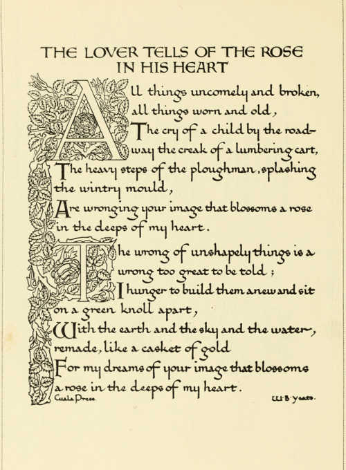
CUALA PRESS: PAGE DESIGNED BY CHARLES BRAITHWAITE
FINE or “extra” binding as it is called in the trade implies that the craftsman has done his best with the best materials. It may be plain or decorated, but whatever work there is should be the best of which the craftsman is capable. Printed books are largely machine-made productions, and it would seem reasonable that machine-made books should have machine-made covers, and it is in such covers or “cases” that most of our books are issued. There is a general feeling that the cost of the binding should bear some relation to the cost of the book; but since books are turned out by the thousand from the printing press, and fine bindings can only be made singly and laboriously by hand, it is inevitable that in most cases such a binding costs much more than the book it covers. This has probably been the case since the invention of printing cheapened books, and yet there have always been people who valued certain books highly enough to have them well bound and decorated. For a true book-lover does not value a book at the price it costs, and he may wish to have the words of a favourite author enshrined in a precious cover. Some books by their nature and use call for lavish treatment. Books used for important ceremonies, such as altar books or lectern Bibles, can quite well be covered with ornament, provided this ornament is good. They will be but a spot of gorgeousness in a great church or cathedral, and should be judged in relation to their surroundings and not as isolated articles.
There is a fashion now to value decoration in inverse ratio to its quantity, and demand that it should be concentrated on spots, leaving the greater part of the surface of articles bare. This is quite a reasonable way to treat a binding, but it is not the only way. A satisfactory binding can be made with little or no ornament, and there is then little fear of a disastrous failure. To cover a book all over with gold-tooled decoration is a more difficult thing to do satisfactorily, but it can be done, and, if well done, is well worth doing.
At the present time there are many binders working in England who are capable of turning out work of the highest class, and fortunately there are book-lovers here and in America with the taste and means to commission such work. Probably, if a man were bold enough to spend five or ten thousand pounds on binding the finest books that are being produced at the present time, he would find, if the money were wisely spent, that he had got a library that would be celebrated all over the world. There is an interesting revival in the use of arms-blocks on bindings, and when certain modern libraries come to be dispersed their owners will be remembered by their books in the same way as are the original owners of the many armorial bindings that have[70] come down to us from the past.
There are some qualities that are common to all well-bound books. Of course abnormal books have to be treated specially, but it may generally be said that every leaf of a book should open right to the back. This means that all single leaves and plates should be attached by guards, and that no overcasting or pasting-in should be allowed, and it also means that the back should be truly flexible. The sections should be sewn to flexible cords or tapes, the ends of these should be firmly attached to the boards, and the back should be covered with some flexible material, such as leather, which, while protecting the sewing-thread or cord, shall itself add to the strength of the binding. A fine binding will have many other features added by way of refinement or elaboration, but unless it has these qualities it is likely to be an unsatisfactory piece of work. A well-bound book should open well and stay open, and shut well and stay shut. The binder can bind any book so that it will not open, but there are some books that he cannot bind so that they will open and shut “sweetly.”
Bookbinding is only one part of the larger craft of book production, and to obtain a perfect book it is necessary that the workers in each branch of the craft should have a common ideal of what a book should be, and that each should do his part in such a way that this ideal may be attained. Unfortunately it too often happens that the printers are quite content if their printing looks perfect as it comes from the press, with the result—through errors in the choice of paper or the number of leaves to a section—that the bookbinder has unnecessary and sometimes unsurmountable obstacles put in his way. A book that will not open freely and that gapes like a dead oyster when it ought to be shut is not pleasant to use, and when these faults are noticed the binder generally gets the blame. Sometimes he deserves the blame, for the fault may be his, but more often than not the fault lies with the paper. To open a book a certain number of leaves of paper must be bent, and if the paper is so stiff that a single leaf will not fall over by its own weight, the book cannot be made to open quite satisfactorily if bound in the ordinary way. By swinging each leaf on a guard it is possible to bind a pack of playing-cards into something like a book which will open and shut freely, but that this can be done is no excuse for the production of books which necessitate this drastic treatment before they can be bound satisfactorily.
William Morris, when he founded the Kelmscott Press, did more than revive fine book-printing; he established a tradition for books that were eminently bindable, and the presses that followed his lead kept up the tradition; so that we have in England a large number of beautifully printed books that are worthy of the best binding, and that impose no unnecessary difficulties on the binder.
Mr. Cobden-Sanderson did much to revive the use of the tight or flexible back. In this style[71] the leather is attached directly to the back of the sections, and so helps to hold them firmly together. All leather-bound books had tight backs until about a hundred years ago, when the hollow back came into general use. A tight back should throw up when the book is opened; that is to say the back, convex when the book is shut, should become concave on the book being opened. This causes a certain amount of creasing in the leather, and this creasing is not good for gold tooling; but with a well-bound book the damage is not serious, and important constructional features must not be sacrificed for the sake of the decoration.
The hollow back does not crease the leather, and so is preferred by finishers, and besides it is easier to cover a hollow back neatly than a tight one; but the strain of opening and shutting, which should be distributed evenly across the back, is in the hollow back thrown on the joints, with the result that the leather is apt to break at these places unless specially strengthened, as is the case with well-bound account books.
While “flexible” backs that are truly flexible are undoubtedly the best, some binders line up their backs so stiffly under the leather as to allow little or no movement when the book is opened. This avoids the creasing of the leather and leaves the decoration uninjured, but the book will not open freely, and there is no virtue in such a tight back. Leather is chosen for binding because of its toughness and flexibility, yet binders deliberately sacrifice this last quality in order to obtain extreme neatness or to hide faults in the forwarding.
It is the fashion in some quarters to admire as the perfection of craftsmanship an exact and hard square edge to the boards of a book. This can only be got by paring the leather down till it is as thin as paper and has consequently very little strength. A softer, rounder edge is natural to a leather-covered article, and it is unreasonable to expect the qualities of a newly planed board in a material so wholly different in character. The edges of the leather-covered board should have a distinctly flat face, and clumsiness will be avoided by any good craftsman. It is only the extreme sharpness, so much admired by unknowing people, that is objectionable.
In the treatment of the edges of the leaves fashion has gone to two extremes: some book-lovers demand that the edges should be entirely uncut, while others require them to look like a solid piece of metal. The rough edges, or “deckle,” on hand-made paper is a necessary defect due to the way the paper is made. These rough edges were always trimmed off by the early binders because they were unsightly, difficult to turn over, and harboured dust. Some of the shorter leaves would usually be left untrimmed. Such short leaves are known in the trade as “proof,” i.e. proof that the book has not been unduly cut down. To gild a book-edge absolutely solid the binder must cut down to the shortest leaves and so often has to reduce the size of the book unreasonably; but an accept[72]able compromise between entirely uncut edges and solid gilding can be arrived at if the sections of a book to be finely bound are trimmed singly and gilt “in the rough” before sewing. This enriches the edges but does not disguise their nature nor necessitate their being unduly cropped.
In recent times there has been much good work done in England in the investigation of bookbinding materials. The Royal Society of Arts Committee on “Leather for Bookbinding” has established standards of leather that have made it possible for binders to procure skins that are uninjured in the process of manufacture, and bookbinding leather of the very highest class is now being produced in England. The leather manufacturers are able to dye leather any reasonable shade without the use of sulphuric acid, and it is only some of the lighter fancy colours that are unprocurable in “acid free” leather. That these “fancy” shades are unprocurable in uninjured leather is a distinct gain, as they mostly fade, and books bound in such leather seldom look as if they were intended to be used.
There are various ways by which leather-bound books may be decorated, but tooling, either in gold or blind, is by far the commonest, and it is tooled bindings that we are considering here. “Blind” tooling is the impression of hot tools on the leather. The most satisfactory tools for blind work are those cut die-sunk like a seal. These, by depressing the ground, leave the ornament in relief. Tools for gold work are cut so that the ornament with the gold is depressed below the surface of the leather. These tools may be used without gold, but blind tooling produced in this way has little of the character associated with this work when it was at its best, i.e. up to the end of the fifteenth century. Gold-tooling came to Europe from the East, and preserved a tradition of Eastern design for a very long period. The English gold-tooled bindings of the seventeenth and eighteenth centuries are often strangely Eastern in the style of the decoration.
The ornamentation of fine bindings reached almost its lowest ebb in England about the middle of last century. Of technical skill there was never any lack, but decoration had lost vitality, and the ornamental bindings of this time are for the most part copies or parodies of the work of earlier binders. William Morris designed a few very beautiful gold-tooled bindings which were covered all over with the impressions of tools, each one of which represented a complete plant. His friend, Mr. Cobden-Sanderson, who gave up the practice of the law to learn the binder's craft, produced books that are unsurpassed in the delicate beauty of their decoration. Before his time there had been few attempts to combine tools to form organic patterns. Mr. Cobden-Sanderson's tools were very elementary in character, each flower, leaf or bud being the impression of a separate tool. These impressions were combined in such a way as to give a sense of growth, and yet in no way overlapped the traditional limitations and conventions[73] of the craft. Mr. Cobden-Sanderson got his results by sheer genius in the right use of simple elements. He used inlays very sparingly, and his finest bindings depend entirely on the effect of gold on leather. The style of design which he founded has spread throughout the trade, mainly through the teaching at the various technical schools, and it is now comparatively rare to find an elaborate binding of recent date without some attempt having been made to connect the tools so that they together form an organic whole.
The use of composite tools (that is, tools which form a whole design in themselves and do not bear any definite relationship to one another) is now restricted to cheap bindings. The corners and centres on the backs of school prizes are familiar, if degraded, examples of the use of such tools. Together with the Cobden-Sanderson style of decoration there has been a marked revival of the use of interlacement in gold-tooled designs. Interlaced gold lines, if not so intricate as to be bewildering, may be very beautiful, but in this, as in most other crafts, the highly-skilled workman loves to attempt the almost impossible, and some of the recent interlaced patterns fail on account of their over-elaboration and consequent restlessness.
Mr. Charles Ricketts designed some very notable gold-tooled bindings for the Vale Press. These bindings have hardly received the attention they deserve, and the style has not spread to any extent, possibly because Mr. Ricketts' refinement and delicacy in the use of fine lines are not easy to acquire. These bindings have an architectural quality that places them in a class by themselves. Mr. Cobden-Sanderson and Mr. Ricketts, in their entirely different styles, have shown that gold-tooling may be extremely beautiful as decoration without overstepping the traditional limits of the craft, and in the case of the most successful bindings now being produced these traditional limits have been recognised. Gold-tooling is by its nature a limited means of expression, though exactly where the limits lie must be a matter of feeling and taste rather than of knowledge. Certainly in some of the elaborate bindings now being produced the limits of the craft have been passed, and while serving to show amazing dexterity on the part of the finisher, these bindings are less successful artistically than many that are less ambitious in technique.
There is no clearly marked school of blind-tooling at present, though here and there the method has been used with success. Mr. William Morris designed a notable binding in white pigskin for the Kelmscott “Chaucer.” Many copies were so bound at the Doves Bindery, but most of the attempts that have been made to carry out work in the same style have been comparatively unsuccessful.
There have been a good many efforts made to revive modelled leather-work as a means of decorating books, but although this method is capable of producing very fine results, most of the binding in modelled leather shown in recent[74] exhibitions cannot be said to be successful. Any work that has to be done on the leather before the book is bound is almost doomed to failure, because leather which is modelled before binding cannot be handled by the binder with the freedom that is necessary if he is to make a workmanlike job of the covering. It is, however, possible to put quite sufficient relief in modelled leather after a book is bound, if the leather be reasonably thick; indeed high relief for most books is objectionable.
Many of the old bindings had fine metal mounts and clasps. If clasps are used on modern books, as a rule they should be flush with the sides, so as not to scratch their neighbours when taken in and out of shelves. Raised clasps and bosses are only suitable for books that are expected to stand permanently on a lectern.
In criticising decorated bindings there is a danger of falling into the common error of generalising from isolated instances. You cannot put too much ornament on a thing as small as a bookcover if the ornament is good enough. A book well bound in beautiful leather may be perfectly satisfactory and beautiful by virtue of good workmanship, fine material and colour. A binding covered with fine gold-tooling may be just as restful and far more beautiful, but while there is comparatively little scope for failure in the plain binding, there are appalling pitfalls if the cover be lavishly decorated. There are, of course, all sorts of degrees of decoration between an absolutely plain binding and one covered entirely with gold, but there are some qualities common to most successful tooled ornament.
There are few bindings that are quite successful unless the ornament is arranged on a symmetrical plan. Any attempt to portray landscape, human figures or naturalistic flowers is almost doomed to failure. Gold-tooling is not a suitable medium for rendering such subjects.
Lettering should be well designed and free from eccentricities. The problem of lettering a long title across a narrow back may necessitate ungainly breaking of words, but where this is done it should only be done from obvious necessity, and the reasonable necessity for this fault should be apparent. To letter books in type so small as to be quite illegible, lettering that looks from a short distance like a gold line, is more unreasonable than almost any breaking of words that allows the use of letters of a larger size.
Fine binding is an expensive luxury but not an unreasonable one compared with many others. We have now in England a school of really fine binding, and the most reasonable and unobjectionable form that luxury can take is the use of beautiful things in everyday life. If a book is well bound and well decorated it is fit to use, and in choosing a book to be expensively bound it would be better to choose the book most often used than one which would be put away unopened. Most fine bindings would be greatly improved by use, and the reasonable using of them would give immense pleasure, a pleasure that would justify the binder's care and trouble and the purchaser's outlay. The use of a beautiful thing gives a far higher form of pleasure than does the mere sense of ownership.
 |
 |
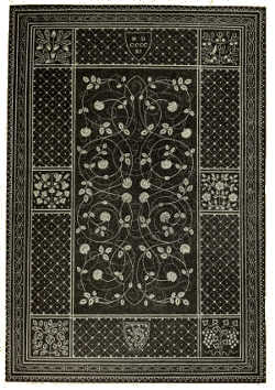
BOOKBINDING IN BLUE PIGSKIN, WITH HERALDIC BORDER ENCLOSING A PANEL OF FLORAL DESIGN AND BACKGROUND OF POINTILLÉ. BY KATHARINE ADAMS |
|
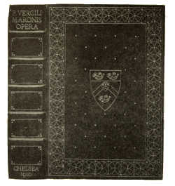
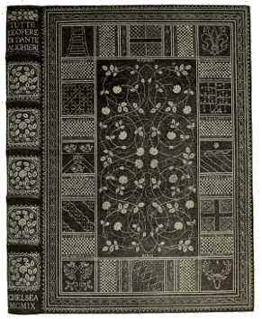
BOOKBINDING WITH GEOMETRICAL BORDER IN POINTILLÉ BY KATHARINE ADAMS
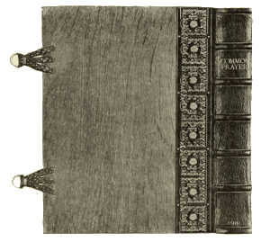
BOOKBINDING IN BROWN MOROCCO, WITH INLAY, GOLD TOOLING,
OAK SIDES AND LEATHER CLASPS. DESIGNED AND TOOLED BY L. HAY-COOPER
FORWARDED BY W. H. SMITH AND SON
(In the possession of the Grey Coat Hospital, Westminster)
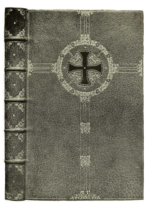
(In the possession of Lambeth Parish Church)
BOOKBINDING IN GREEN MOROCCO, WITH INLAY AND GOLD TOOLING DESIGNED AND
TOOLED BY L. HAY-COOPER, BOUND BY S. BARNARD
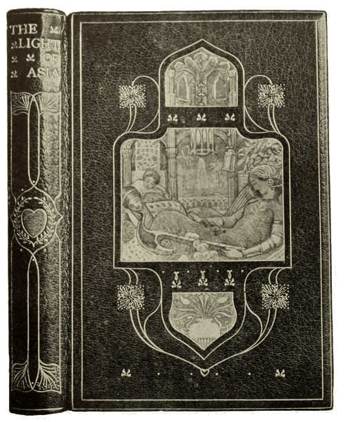
BOOKBINDING IN WHOLE CRUSHED CRIMSON LEVANT MOROCCO, WITH VELLUCENT PANELS AND GOLD TOOLING. DESIGNED BY H. GRANVILLE FELL, EXECUTED BY CEDRIC CHIVERS OF BATH
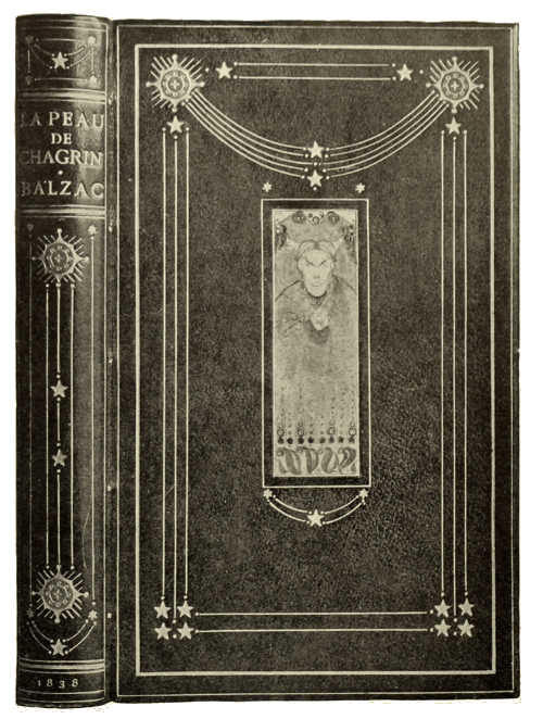
BOOKBINDING IN DONKEY HIDE, WITH VELLUCENT PANEL AND GOLD TOOLING DESIGNED BY O. CARLETON SMYTH, EXECUTED BY CEDRIC CHIVERS OF BATH
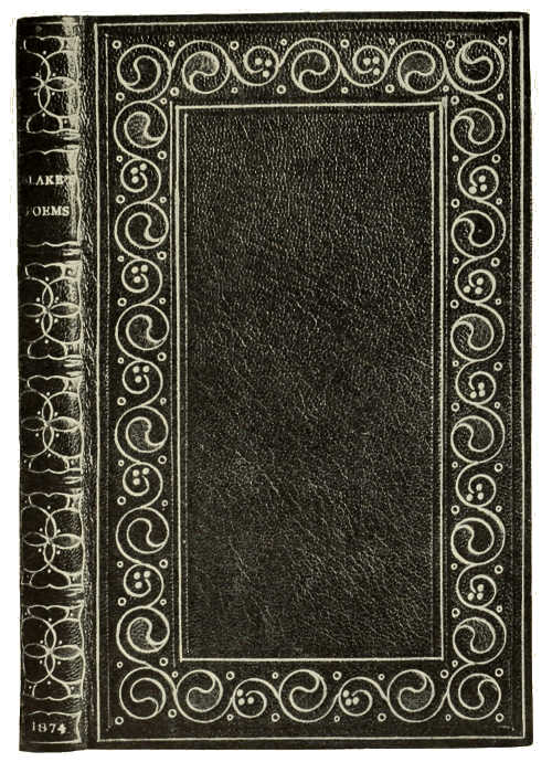
BOOKBINDING IN NIGER MOROCCO, WITH INLAY AND GOLD TOOLING BY R. DE COVERLY AND SONS
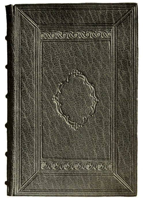
BOOKBINDING IN APPLE-GREEN LEVANT MOROCCO, WITH BLIND AND GOLD TOOLING. BY R. DE COVERLY AND SONS
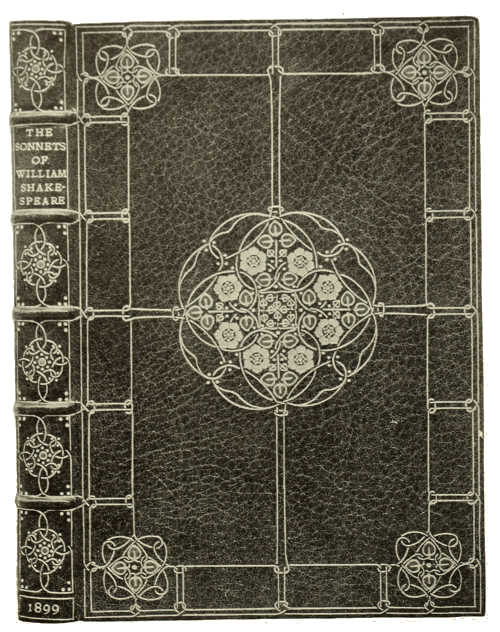
BOOKBINDING IN GREEN MOROCCO, WITH INLAY AND GOLD
TOOLING BY DOUGLAS COCKERELL
(Photo. lent by Mons. Emile Lévy)
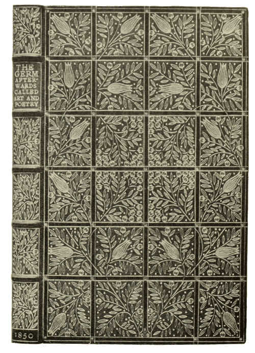
BOOKBINDING IN GREEN MOROCCO, WITH INLAY AND GOLD
TOOLING BY DOUGLAS COCKERELL
(Photo. lent by Mons. Emile Lévy)
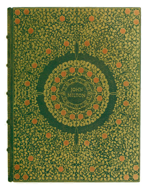
BOOKBINDING IN GREEN MOROCCO, WITH INLAY AND GOLD TOOLING. BY DOUGLAS COCKERELL
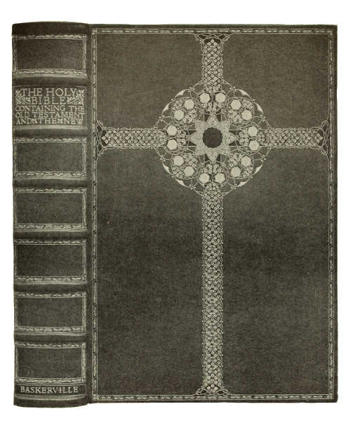
(Photo. lent by Mons. Emile Lévy)
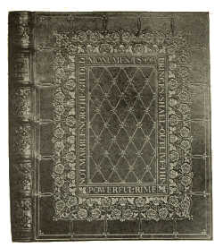
BOOKBINDING IN DARK RED MOROCCO, WITH INLAY AND GOLD TOOLING. BY
DOUGLAS COCKERELL
BOOKBINDING IN RED NIGER MOROCCO, WITH GOLD TOOLING BY FRANK G. GARRETT
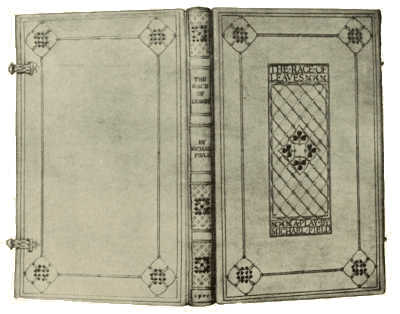
BOOKBINDING IN VELLUM, WITH GOLD AND GREEN TOOLING. BY FRANK G. GARRETT
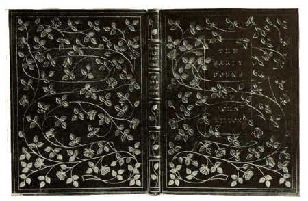
BOOKBINDING IN MAUVE MOROCCO, WITH INLAY AND GOLD TOOLING. BY HON. NORAH HEWITT
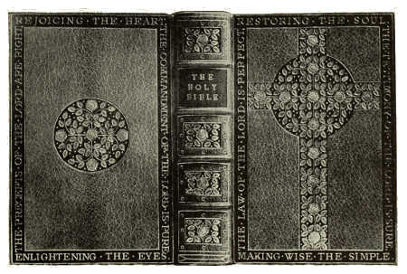
BOOKBINDING IN SAGE GREEN MOROCCO, WITH INLAY AND GOLD TOOLING. BY HON. NORAH HEWITT
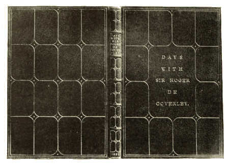
BOOKBINDING IN POWDER BLUE MOROCCO, WITH GOLD TOOLING. BY HON. NORAH HEWITT
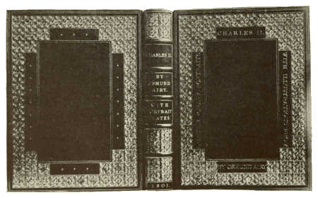
BOOKBINDING IN NIGER MOROCCO, WITH GOLD TOOLING. BY HON. NORAH HEWITT
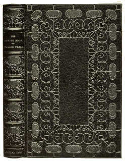 |
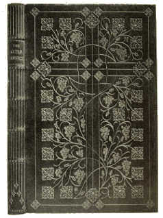 |
BOOKBINDING IN RED LEVANT MOROCCO, WITH INLAY AND GOLD TOOLING DESIGNED BY J. GREEN, EXECUTED BY S. TOUT (OXFORD UNIVERSITY PRESS) |
BOOKBINDING IN BLUE LEVANT MOROCCO, WITH INLAY AND GOLD TOOLING DESIGNED BY T. TURBAYNE, EXECUTED BY J. GREEN (OXFORD UNIVERSITY PRESS) |
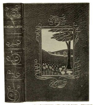
BOOKBINDING IN MAROON LEVANT MOROCCO, WITH INLAID PANEL. DESIGNED BY J. GREEN, EXECUTED BY P. WARD (OXFORD UNIVERSITY PRESS)
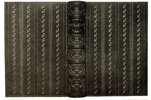
BOOKBINDING IN GREEN LEVANT MOROCCO, WITH GOLD TOOLING. DESIGNED BY T. TURBAYNE, EXECUTED BY P. WARD (OXFORD UNIVERSITY PRESS)
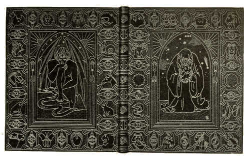
BOOKBINDING IN PURPLE LEVANT MOROCCO, WITH INLAY AND GOLD TOOLING. DESIGNED BY E. SPARKES EXECUTED BY J. GREEN (OXFORD UNIVERSITY PRESS)
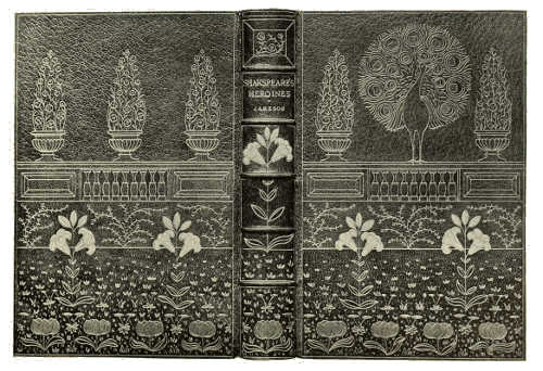
BOOKBINDING IN GREEN LEVANT MOROCCO, WITH INLAY AND GOLD TOOLING. DESIGNED BY J. GREEN EXECUTED BY P. WARD (OXFORD UNIVERSITY PRESS)
 |
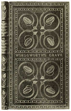 |
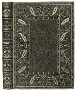
TOOLED LEATHER BOOKBINDING. BY S. T. PRIDEAUX |
TOOLED LEATHER BOOKBINDING. BY S. T. PRIDEAUX |
 |
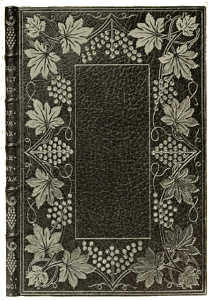 |
TOOLED LEATHER BOOKBINDING. BY S. T. PRIDEAUX |
TOOLED LEATHER BOOKBINDING. BY S. T. PRIDEAUX |
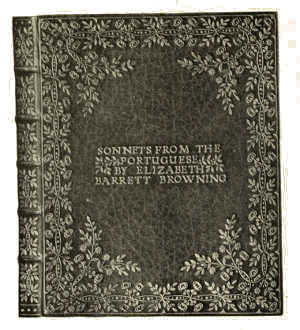
BOOKBINDING IN GREEN SEALSKIN, WITH INLAY AND GOLD TOOLING BY MARY E. ROBINSON
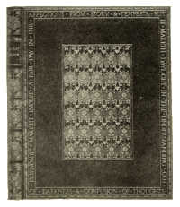 |
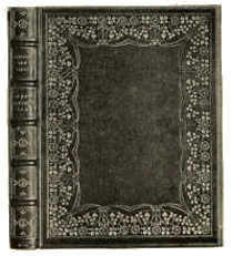 |
BOOKBINDING IN CRUSHED GREEN LEVANT MOROCCO WITH GOLD TOOLING. BY ALICE PATTINSON (MRS. RAYMUND ALLEN) |
BOOKBINDING IN CRUSHED DARK BLUE LEVANT MOROCCO WITH INLAY AND GOLD TOOLING. BY ALICE PATTINSON (MRS. RAYMUND ALLEN) |
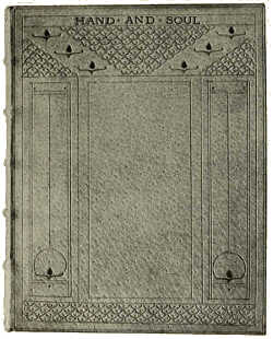 |
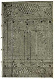 |
BOOKBINDING IN WHITE PIGSKIN, WITH BLIND AND GOLD TOOLING BY SYBIL PYE |
BOOKBINDING IN WHITE PIGSKIN, WITH BLIND AND GOLD TOOLING BY SYBIL PYE |
 |
 |
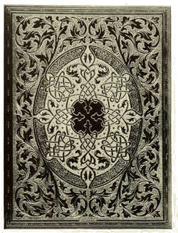
DOUBLURE IN LEVANT MOROCCO, WITH POINTILLÉ AND INLAY BY ROBERT RIVIERE AND SON |
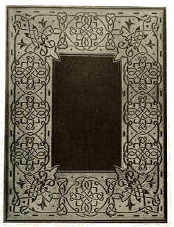
FLY-LEAF IN GREEN LEVANT MOROCCO, WITH POINTILLÉ AND INLAY BY ROBERT RIVIERE AND SON |
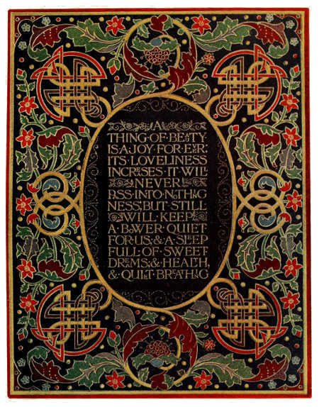
DOUBLURE IN LEVANT MOROCCO, WITH INLAY AND TOOLING. BY ROBERT RIVIERE AND SON
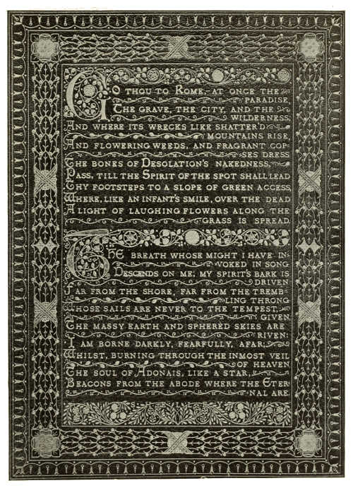
FLY-LEAF IN GREEN LEVANT MOROCCO, WITH INLAY AND GOLD TOOLING. BY F. SANGORSKI AND G. SUTCLIFFE
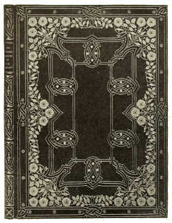 |
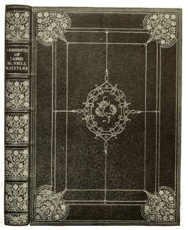 |
BOOKBINDING IN BLUE LEVANT MOROCCO, WITH GOLD TOOLING BY F. SANGORSKI AND G. SUTCLIFFE |
BOOKBINDING IN BLUE LEVANT MOROCCO, WITH GOLD TOOLING BY F. SANGORSKI AND G. SUTCLIFFE |
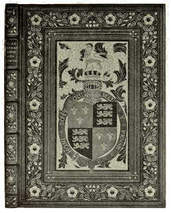 |
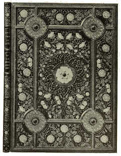 |
BOOKBINDING IN GREEN LEVANT MOROCCO, WITH INLAY AND GOLD TOOLING BY F. SANGORSKI AND G. SUTCLIFFE |
BOOKBINDING IN BROWN LEVANT MOROCCO, WITH INLAY AND GOLD TOOLING BY F. SANGORSKI AND G. SUTCLIFFE |
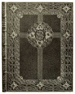 |
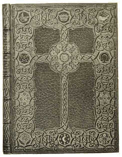 |
BOOKBINDING IN BLUE LEVANT MOROCCO, WITH INLAY AND GOLD TOOLING BY F. SANGORSKI AND G. SUTCLIFFE |
BOOKBINDING IN GREEN LEVANT MOROCCO, WITH GOLD TOOLING BY F. SANGORSKI AND G. SUTCLIFFE |
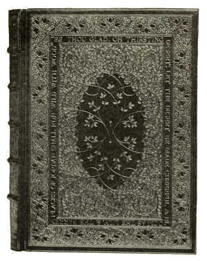
BOOKBINDING IN OLIVE MOROCCO, WITH GOLD TOOLING. CENTRE PANEL OF RED INLAY. BY A. DE SAUTY
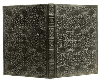
BOOKBINDING IN OLIVE MOROCCO, WITH GOLD TOOLING. BY A. DE SAUTY
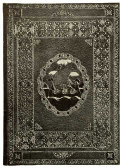 |
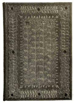 |
BOOKBINDING IN BLUE MOROCCO, WITH INLAY AND GOLD TOOLING BY SIR EDWARD SULLIVAN, BART. |
BOOKBINDING IN PINK MOROCCO, WITH INLAY AND GOLD TOOLING BY SIR EDWARD SULLIVAN, BART. |
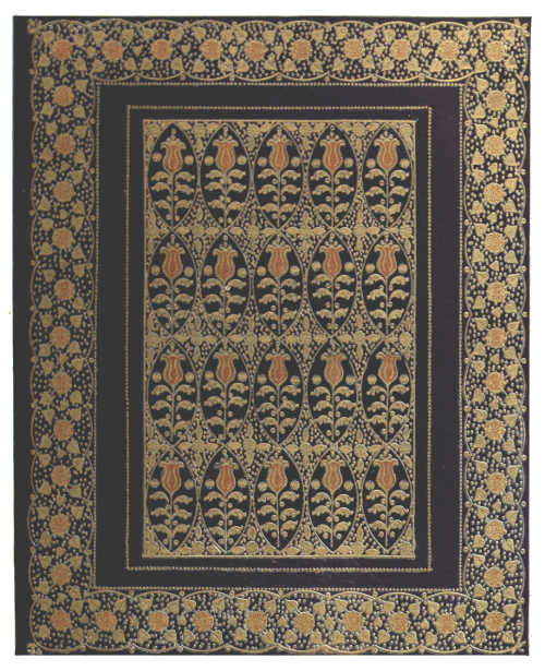
BOOKBINDING IN BLUE MOROCCO, WITH INLAY AND GOLD TOOLING. BY SIR EDWARD SULLIVAN, BART.
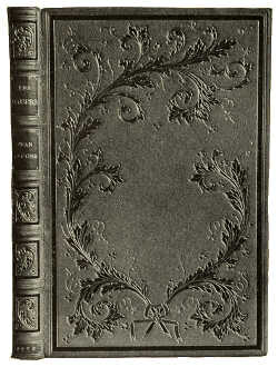 |
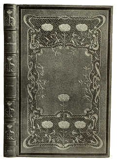 |
BOOKBINDING IN YELLOW LEVANT MOROCCO, WITH INLAY AND GOLD TOOLING. BY ZAEHNSDORF |
BOOKBINDING IN OLIVE GREEN LEVANT MOROCCO, WITH INLAY AND GOLD TOOLING. BY ZAEHNSDORF |
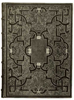 |
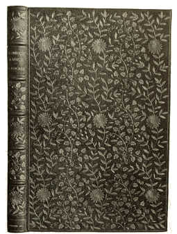 |
BOOKBINDING IN BLUE LEVANT MOROCCO, WITH INLAY AND GOLD TOOLING. BY ZAEHNSDORF |
BOOKBINDING IN GREEN LEVANT MOROCCO, WITH INLAY AND GOLD TOOLING. BY ZAEHNSDORF |
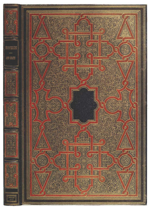
BOOKBINDING IN BLUE LEVANT MOROCCO, WITH INLAY AND GOLD TOOLING. BY ZAEHNSDORF
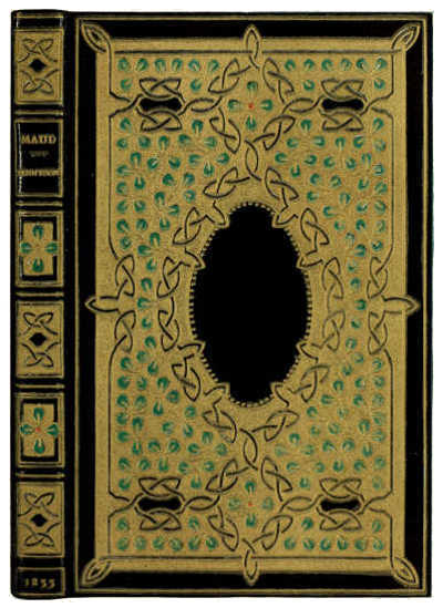
BOOKBINDING IN BLUE LEVANT MOROCCO, WITH INLAY AND GOLD TOOLING. BY ZAEHNSDORF
 |
 |
BOOKBINDING IN GREEN ENGLISH MOROCCO, WITH GOLD TOOLING BOUND BY B. BENKOSKI, DECORATED BY W. F. MATTHEWS (L.C.C. CENTRAL SCHOOL OF ARTS AND CRAFTS) |
BOOKBINDING IN GREEN LEVANT MOROCCO, WITH INLAY AND GOLD TOOLING BOUND BY S. H. COLE, DECORATED BY W. H. GIFFARD (L.C.C. CENTRAL SCHOOL OF ARTS AND CRAFTS) |
 |
 |
|
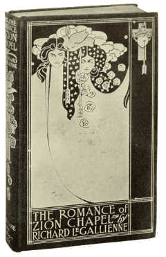
BINDING-CASE DESIGNED BY LAURENCE HOUSMAN FOR MR. JOHN LANE |
BINDING-CASE DESIGNED BY WILL BRADLEY FOR MR. JOHN LANE |
 |
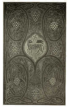 |
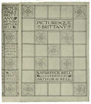
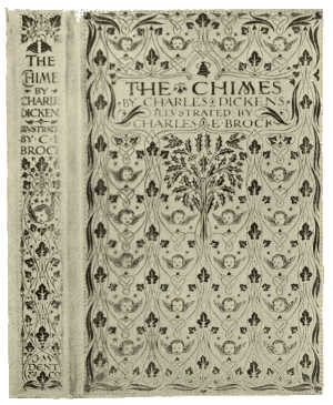
BINDING-CASE DESIGNED BY REGINALD L. KNOWLES FOR MESSRS. J. M. DENT AND SONS LTD. |
BINDING-CASE DESIGNED BY REGINALD L. KNOWLES FOR MESSRS. J. M. DENT AND SONS LTD. |
 |
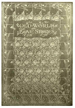 |
BINDING-CASE DESIGNED BY REGINALD L. KNOWLES FOR MESSRS. J. M. DENT AND SONS LTD. |
BINDING-CASE DESIGNED BY REGINALD L. KNOWLES FOR MESSRS. J. M. DENT AND SONS LTD. |
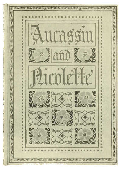
BINDING-CASE DESIGNED BY R. P. GOSSOP FOR MESSRS. J. M. DENT AND SONS LTD.
 |
 |
DESIGN FOR COVER OF “THE WOMAN WHO DID” BY AUBREY BEARDSLEY |
DESIGN FOR TITLE-PAGE OF “PAGAN PAPERS” BY AUBREY BEARDSLEY |
(By permission of Mr. John Lane) |
|
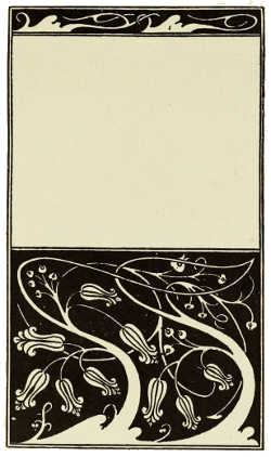 |
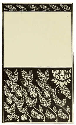 |
DESIGN FOR COVER OF “THE MOUNTAIN LOVERS” BY AUBREY BEARDSLEY |
DESIGN FOR COVER OF “NOBODY'S FAULT” BY AUBREY BEARDSLEY |
(By permission of Mr. John Lane) |
|
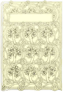 |
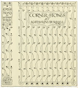 |
BINDING-CASE DESIGN BY REGINALD L. KNOWLES FOR MESSRS. J. M. DENT AND SONS LTD. |
BINDING-CASE DESIGN BY REGINALD L. KNOWLES FOR MESSRS. J. M. DENT AND SONS LTD. |
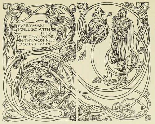
END-PAPER DESIGN BY REGINALD L. KNOWLES FOR “EVERYMAN'S LIBRARY.” FOR MESSRS. J. M. DENT AND SONS LTD.
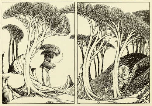
“THE HAUNT OF THE TROLL” —END-PAPER DESIGN BY REGINALD L. KNOWLES FOR “TALES FROM THE NORSE.” PUBLISHED BY MESSRS. GEORGE ROUTLEDGE AND SONS, LTD.
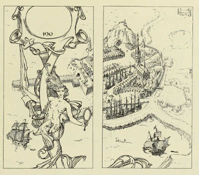
END-PAPER DESIGN BY H. GRANVILLE FELL FOR MESSRS. GEORGE NEWNES, LTD.
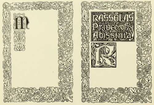
BORDER, INITIAL LETTERS, AND HEADPIECE DESIGNED BY R. JAMES WILLIAMS. FOR THE VINCENT PRESS
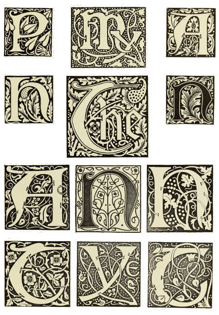
INITIAL LETTERS DESIGNED BY R. JAMES WILLIAMS. FOR THE VINCENT PRESS
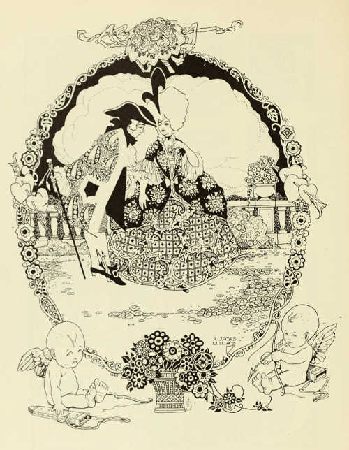
“COÛTE QUE COÛTE” —DECORATIVE DRAWING BY R. JAMES WILLIAMS
THE ART OF THE BOOK IN GERMANY. BY L. DEUBNER
“LETTERPRESS printing, even in the edition de luxe, is not an art, and neither the compositor nor the printer is an artist.” This is what was written in the year 1887 by Ludwig Nieper, at that time Director of what is now the Royal Academy of the Graphic Arts and Book Industry at Leipzig, a city which in the present year has in its International Exhibition, embracing every conceivable aspect of the industry as well as the arts most closely bound up with it, furnished such a convincing and impressive demonstration of the culture uniting the nations as perhaps has never been offered before. The conviction expressed in the passage just quoted, repudiating the existence of any influence of art on industrial labour, belongs to a period bereft of any real feeling for art and content with the imitation and repetition of historic styles while eschewing any contact with the practical requirements of the industry. Nowadays we know how beneficial and fruitful for both has been the reciprocal influence of art and industry in every sphere of activity, and that only by this means have we been able to proceed from mere external embellishment to artistic form, from book adornment to a true art of the book. Thus in the space of barely twenty-five years our views of what art really is and what are its functions have radically changed, and it must be left to those who come after us to estimate more correctly than we are able to at the present day, the immense labour which has been accomplished in the space of a generation. The incipient stages in the growth of the new movement in Germany date back some twenty years. At that time we looked with envy at the publications which issued from the private presses of England, and could boast of nothing that could compare with the far-famed “Faust” of the Doves Press; and if to-day we are at length able to stand on our own feet, it would yet be false to assert that the modern art of book production in Germany has developed from within, and to disavow the valuable stimulus and knowledge we owe especially to the English books of that period. And clearly as we perceived that the book in its entirety, with its harmonious co-ordination of type, decoration, composition, paper and binding, should form a work of art, yet only after many mistakes and deviations have we arrived at the goal. Thus nowadays no one would seriously seek to defend such a production as the official catalogue of the German section at the Paris Exhibition of 1900; and so, too, the so-called “Eckmann” type, which at one time was taken up with unexampled enthusiasm—a type in which the designer had contrived to adapt the ancient forms of the “Antiqua” type to the sinuous lines of modern[128] ornament—is now almost completely forgotten. These and many other things which at that time were acclaimed as creative achievements, belong to that class of errors which are really nothing but exaggerated truths. But in the absence of such excesses and that exuberance of feeling which was so violently manifested, it would have been quite impossible to accomplish in so short a time what as a matter of fact was accomplished, and in spite of shortcomings has even now lost none of its importance in the history of the development of a new art of the book.
The first event of significance which followed the renewed recognition of the decorative value of the printed letter was the issue of some new types designed by Otto Eckmann and Peter Behrens respectively, the former slender, delicate, and round, the latter bold, distinguished, and angular, but both alike quite free, natural, and easily legible. It was these founts that really inaugurated the new development; and the foundry of the Gebr. Klingspor which issued them, placed itself by so doing at the head of all those enterprising type-foundries which have since enriched our printing press with a wealth of new and valuable founts. It had come to be recognised that lettering and ornament were closely correlated; that the ornamentation of printed matter could not be regarded as an end in itself, but must be adapted to the character of the lettering in order that the rectangular space of a page should be so filled as to achieve a good general effect and satisfy the sensitive eye. Nothing remained, therefore, but to entrust the designing of new types to artists who had already accomplished good and original work as book decorators; and as none of the numerous German type-foundries desired or indeed could afford to be behindhand in a movement of this kind, it resulted that in the course of a few years the printing presses of the country were inundated with a flood of new “artist” types, of which, nevertheless, only relatively few have been able to survive till now. To design a new type or to re-mould the old forms of “Antiqua” (Roman) or “Fraktur” (German Gothic), so that the new forms should not only have a good black-and-white effect but that the eye should be able to grasp with ease the sequence of “word-pictures” as well as each individual letter and to read the lines quickly and comfortably, is a task of extraordinary difficulty which many who have attempted to grapple with have under-estimated. To obtain an idea of the multitude of difficulties that have to be overcome, one must bear in mind that the fundamental forms of the individual letters are fixed, and that only small changes are possible in the general shape, in the proportions of the component parts, in the alternation of the upright, horizontal, and oblique lines, in the curvature of the so-called “versal” or capital letters, in the serifs, and in the sweep of preliminary or terminal flourishes; that the printed letter, unlike manuscript, is bound up with fixed laws,[129] and that in order to justify its claim to consideration it should, while expressing the artistic individuality of its designer, not be too original and personal if it is to be employed for general use. Further, it should conform to the spirit and ideas of the age, and yet again it ought not to be wholly conditioned by contemporary considerations if it is to survive to a later age, as have many fine founts which the seventeenth and eighteenth centuries have bequeathed to us.
As already said, only a few among our modern German designers of printed types have mastered all these difficulties, and among these few the names of Behrens, Tiemann, Koch, Kleukens, Weiss, and Wieynk are pre-eminent. In the course of some thirteen years that born architect, Peter Behrens, who began as a painter of easel pictures and a decorator of books, and now builds palaces, factory buildings, and gigantic business-houses, has himself designed four founts in which the whole artistic evolution of this strong-willed nature is reflected, and which yet seem so entirely the product of a natural growth that one is quite unconscious of the years of labour spent on their improvement and perfection in the interval between the preparation of the designs and the actual casting of the founts. As compared with the architectonic character of the austere, angular forms of the first Behrens type, the italic or “Kursiv” fount (p. 141) which made its appearance six years later looks more decorative with the gentle sweep and uniform flow of its lines, and in the most successful of the Roman founts the full vigour and monumentality of his later period of activity is clearly expressed; while the most recent of all, the “Mediæval” (p. 140), which was only issued a few weeks ago, is again more ornamental with its uniformly fine lines, and admirably answers to its designation as a type embodying the characteristics of the Italian Renaissance script.
Another “Mediæval” type which even excels that just mentioned in clearness and beauty of form has been designed by Walter Tiemann (pp. 146 and 147), who holds the position of instructor at the Royal Academy of Graphic Arts at Leipzig, and devotes himself almost exclusively to the improvement of the art of lettering and book production. Like all the other types designed by this artist, it has less of a personal character about it, and reason more than sentiment has been the guiding motive in the design; but its cool, distinguished reticence gives it a quite exceptional merit. It is, moreover, completely independent of its classical prototypes and their Romanesque imitations; very effective in all its gradations, the use of it is not restricted to the limited editions of our private presses, and in fact it is now one of the most popular founts we have.
The fine Roman types by F. W. Kleukens (pp. 151, 153 and 156) rank among the most gratifying achievements of our new school. They are free from eccentricity of any kind, there is a seductive charm in their unassuming yet distinguished[130] forms, and even the ornamental slender kinds are agreeably clear. In spite of the thinness of their lines the letters belonging to this slender fount combine to make easily legible lines. The Kleukens types are practical as well as attractive, and in conjunction with specially designed borders, initials and decorative devices of all kinds, they are well adapted for the most diverse uses.
Of a far more personal character, but at the same time of a more restricted range of use, are the graceful types by Heinrich Wieynk (pp. 149 and 150). It is the spirit of the Rococo that dwells therein—that epoch to which, with its playful charm and light-hearted grace, we owe so many masterpieces of French typography. Even the superfluous loops and flourishes which were characteristic of that period are encountered again, with many bizarre peculiarities, in the “Kursiv” and “Trianon” of Wieynk, and yet there is a remarkable fluidity and vitality in each stroke; the general effect is highly artistic, and, as the examples now reproduced show, the founts are admirably adapted to numerous purposes.
Many attempts have been made to modernise the old “Schwabacher” type, which dates from the middle of the fifteenth century, and differs from German Gothic, or “Fraktur,” by being more compact. The most successful in this direction so far has been Rudolf Koch, whose “German Script,” in the three different forms here shown (pp. 142 to 145), has once more revealed the rich beauty and massive power inherent in the various kinds of German type. In these boldly designed letters is expressed a manly earnestness and also a simple grandeur which, in the sweeping, powerful forms of the initials, becomes truly monumental. They are, moreover, carefully thought out in all their details, and notwithstanding the strength of the lines, even in the smallest sizes, they are very expressive in their beauty.
Heinz König, too, has had good fortune with his “Schwabacher” type (p. 152). This is remarkably clear, and in its amalgamation of Roman forms with the characteristics of German founts it has proved both sound and serviceable, and it is one, moreover, which offers no difficulty whatever to the foreigner. The curls and loops which the champions of “Antiqua,” or Roman, find fault with in the German styles of type are absent; it is a Gothic purged of all unnecessary details and is at once dignified and decorative.
Among the new “Fraktur” or German Gothic types mention should first of all be made of that known as “Weiss-Fraktur,” which, designed by E. R. Weiss, has been perfected by him after many years of untiring collaboration with the Type Foundry of Bauer and Co. It has remained a purely German type, but is without the flourishes bequeathed by the old German Gothic. The light and open appearance of matter composed with it imparts to it a clarity which is distinctly agreeable, so that one can follow it with ease and comfort while deriving quiet pleasure from the simplicity and[131] definiteness of a type which satisfies in equal degree the requirements of use and æsthetic susceptibility. The Tempel Verlag, in common with a number of other important German publishing houses, has adopted the “Weiss-Fraktur” for its model editions of German classics.
When new desires call for satisfaction and new forms begin to develop, it is always those spheres of activity which offer easy and pleasant possibilities of accomplishment that are selected for experimenting. Thus some fifteen years ago the designing of book-bindings was a favourite occupation of the artists who interested themselves in the reform of industrial art, and many who have now attained to clear and definite ideas do not want to be reminded of the sort of work that was done in those days. Under the influence of Van de Velde's precept that every line is a force, the wrappers and bindings of books were among the things that were covered with a nervous labyrinth of lines which was expressive only of an attitude of mind radically at variance with all that had gone before. But many who at first occupied themselves with this kind of work in a more or less dilettante spirit, have by quiet, serious labour and steady development mastered its problems and have come to devote themselves almost exclusively to the graphic arts and the industry of book production, so that we now possess an important organisation of the workers in this field—the “Verein deutscher Buchgewerbekünstler” —whose collective exhibition at the International Exhibition now being held at Leipzig is one of the most interesting sections of this great display. Of the artists whose work is represented among the accompanying illustrations, Cissarz, Ehmcke, Kleukens, Köster, Koch, Renner, Steiner-Prag, Tiemann, Weiss and Wieynk belong to this group.
Johann Vincenz Cissarz had in 1900 already advanced to such prominence in this branch of work that the artistic arrangement of the German Typographical Section at the Paris Universal Exhibition was entrusted to him. A long way behind as this catalogue now is, it was nevertheless at that date an exemplary achievement as regards type, ornament, printing, and binding; and to the large number of commissions it brought the artist may be due the fact that thereafter his chief attention was bestowed on the art of the book, in spite of his penchant and decided genius for painting of a decorative and even monumental character and his particular partiality for the etching-needle. From Dresden Cissarz migrated, first to Darmstadt and then to Stuttgart, where as teacher at the Royal School of Applied Art he found a welcome opportunity of communicating to others his own sound principles in regard to the internal and external arrangement of books, and already he is able to look back upon a teaching career which has been very successful. And here, too, many grateful tasks have fallen to him, not only in connection with special events, such as jubilees, presentation addresses, and such things, but[132] more especially in the course of work undertaken for the publishing houses of Stuttgart. Though the luxurious binding executed by hand in costly materials may be superior in an artistic sense, yet from the economic and cultural point of view the tastefully designed bindings produced in large quantities by the publishing houses are of greater importance. A series of these publishers' cases of diverse design is illustrated on pages 168 and 172, and it shows how successfully the designer has utilised the space to display his boldly lettered title or to cover the whole field with becoming ornament.
Hugo Steiner-Prag, who first became known through his poetic drawings for children's fairy tales and books of verses, has also for some years past taught at the Royal Academy of Graphic Arts at Leipzig. His chief successes have been won as an illustrator, but from the bindings now reproduced (pp. 166 and 167) it will be seen that he has a marked talent for the embellishment of the book. By means of simple lines and decorative ornament, usually confined to a well-proportioned centre field, he achieves really charming effects.
Karl Köster was at one time a pupil of Peter Behrens, and in order to be able to take advantage of all the possibilities open to the bookbinder he has not shrunk from learning the craft in the regular way. Thus in the course of his work he has not been wholly concerned with the external embellishment of the book, which he always endeavours to harmonise with its contents, but has also kept in view the practical purpose of the binding as a protective covering for the book. His great skill in achieving delightful effects with the simplest means is amply demonstrated by the numerous bindings he has designed for publishers. Thus in the bindings here illustrated, “Heimkehr” and “Buch Joram” (p. 169), three lines of lettering suffice to animate and decorate the entire surface; but he is quite capable of employing much richer decorative devices with discretion and good taste. From the way in which he has placed a simple cross of violet leather in the richly ornamented middle field of his red missal binding (p. 163), to show to the greatest advantage the colour of the amethysts set in the silver mounts, it may be inferred that he is capable of producing new and peculiar arrangements of form and colour without breaking with the best traditions. In his second missal binding the form of the cross which dominates the entire space is distributed over twelve circular panels or fields, of which the middlemost is worked with a white leather inlay and gold-tooling. The other circles are lined with violet leather, and with the four amethysts of the corner rosettes, the sea-green morocco, and the rich gilding, produce a splendid effect of colour.
Among the professional craftsmen who yielded to the new ideas of book production Paul Kersten is perhaps the best known, as he is without doubt the most successful. With an extensive practical experience, which has mastered all the[133] technical possibilities, he combines artistic susceptibility and a literary aptitude which has enabled him to uphold the objects he has at heart in thoughtfully written essays and books. As head of the Technical School for Bookbinders in Berlin he is in a position to exercise an educative influence in the best sense. The bindings illustrated on pages 164 and 165 enable one to judge of his technical versatility and his methods of decoration, which are not restricted to a particular scheme. They are without exception leather bindings in which the title is placed independently on the back or within a panel left for it, the ornamentation of the cover being therefore uninfluenced by it. In bindings of a richer character he is very fond of utilising a diversity of colours for the sake of the animating effect. Thus in his dark-blue morocco binding, whose centre panel is occupied by five hexagons within circles, the flowers displayed therein are of red, green, and violet leather; while in the chamois binding of Baudelaire's “Fleurs du Mal,” for the ornamentation of which, in gold and blind stamping, no fewer than 18,000 impressions were required, leather overlays in seven different colours were used. But even with such an abundance of decoration one is not conscious of any excess, but only perhaps that agreeable sense of assurance which the practised hand communicates. Three colours, black, red and blue, are employed for ornamenting the calf-binding with a circular centre panel, the decoration of which is carried out by a special process of tooling and staining.
Of a much simpler character is the work of Franz Weisse, who likewise has come from the ranks of the handicraftsmen, and is now engaged as teacher at the School of Applied Art in Hamburg. The simple but bold stamping in which the decoration of his pigskin binding (p. 170) is executed comports well with the outspoken candour of Grimmelshausen's “Simplicissimus.” A feature of interest is the use of the “batik” process[A] for producing floral ornament spread over the sides and back of the parchment binding.
[A] Batik is a process of producing patterns by means of dyes and resists; it has long been in use in the Dutch East Indies, whence it was introduced into Holland, and now has a considerable vogue both there and in Germany, Austria and Hungary.
Again, in the richly decorated bindings of F. A. Demeter (pp. 161 and 162) one observes the sure hand of the experienced practitioner who knows how to take advantage of the beauties of material and technique in the fulfilment of his artistic aims. His ornamentation is certainly not quite original, but is distinguished by a clever decorative treatment of floral motives and a tasteful application of them; and even when he completely covers the back and sides with decoration of a uniform character, one does not feel that it is overdone. A beautiful example of his work is the binding with a design of leafage in gold on a reseda-green leather. Demeter also is a professional binder, and [134] at present is head of the applied art department of the Hübel and Denck wholesale bindery at Leipzig. Even these large industrial concerns, equipped for the wholesale production of cheap bindings, have been obliged to take account of the growing desire for books that have an artistic value, and to attach to their establishments special departments in which, under the supervision of artistically minded craftsmen, not only simple bindings in “boards,” but also the costly and elaborate kinds of binding requiring most careful hand-work, are prepared.
One of the most individual of the German artists who have devoted themselves to the modern art of the book is Emil Preetorius. He is a born illustrator, and has mastered all the various means of expression in equal degree; even in the very concise outline of the silhouette he achieves an abundance of characterisation and vitality. The silhouettes shown here (p. 160) are from a popular edition of Daudet's “Tartarin de Tarascon,” which he has embellished and illustrated with refined artistic feeling; they figure there merely as the decorative headpieces to certain of the chapters, and serve as a jocose premonition of what is to follow. They are not the actual illustrations of the book, but they certainly afford an excellent idea of the happy way in which with these queer little black figures he has caught the grotesque comicality of this strange adventure. He is also fond of giving the reader in his title-pages a foretaste of what awaits him, of expressing graphically, in drawings often containing a number of figures, the contents and spirit of the books in which they appear. His figures are mostly those of people who lived in the “Biedermeier” age; they have a distinctly old-fashioned look about them, but none of that sentimental “gush” which so often makes the so-called “Stimmung” pictures of that period unpalatable to us moderns. While having a decided partiality for the peculiarities and foibles of the “Biedermeier” folk, Preetorius is thoroughly modern in feeling; his drawings are austere rather than sweetly sentimental, and even their æsthetic defects are pertinent to his art.
The part played by various enterprising and ideally minded publishing
houses in fostering and stimulating that pleasure in beautiful books
and their acquisition which has increased to such an extraordinary
degree in Germany during the past decade must not go unrecorded
here. Among these the firm of Eugen Diederichs, of Jena, claims
primary consideration because of the ungrudging spirit in which it
has afforded to all who have made a name in the sphere of artistic
book-production an opportunity of displaying their ideas and skill.
This firm caters for all the manifold cultural tendencies of our age,
and its publications being of a serious character, the collaboration of
these artists has been in the main restricted to wrappers and bindings,
title-pages, initials, ornamental borders, and other decorative
details. On the[135]
other hand, there are houses, such as that of Georg Müller in Munich,
which besides good decoration go in largely for book illustration, in
which also numerous and interesting developments have taken place,
including a revival of various processes—such as wood-engraving,
lithography, and etching—that had fallen largely into disuse, but
now once more enjoy considerable favour for the purpose of book
illustration. The Insel-Verlag of Leipzig, S. Fischer of Berlin, Paul
and Bruno Cassirer of Berlin, Kurt Wolff of Leipzig, and many others,
have helped materially in this reflorescence of German illustrative
art. But at the same time, there are more than a few who hold that a
well-printed book with unimpeachable letterpress, paper and binding
requires neither decoration nor illustration, and that its intrinsic
merit depends on the perfect manner in which the technical work is
carried out. Thus the celebrated editions of the Hyperion Press and
the splendid issues of the Century Press of the Munich publishing firm
of Hans von Weber are brilliant examples of German typography; nor
need the publications of the Janus Press of Leipzig, produced with
consummate technical care under the supervision of Walter Tiemann and
Carl Ernst Poeschel, fear comparison with the books that issue from the
private presses of England. These volumes are only printed in small
 TITLE-PAGE DESIGNED BY PROF. PAUL LANG-KURZ
editions of one hundred and fifty to two hundred copies, and satisfy
the utmost demands of discriminating bibliophiles. Of distinction on
account of their typically German character are the “Rudolfinische
Drucke,” brought out by Rudolf Koch in association with Rudolf Gerstung
at Offenbach, and published by Wilhelm Gerstung. In these books, which
are also genuinely German in their contents, everything is expressly
avoided which in any way deviates from the considerations of chief
importance—proper spacing of the letters and the well-balanced
composition of the page of letterpress in Koch's essentially German
fount,[136] together with uniform excellence of workmanship throughout.
Thus only the title-pages are specially designed, and the body of
the letterpress is but sparingly relieved with the imposing initials
belonging to this fount; but the bindings, with their cover-papers cut
and printed by the artist himself, also bear witness to the virile
beauty of his art. Of a more arresting and luxurious character are the
productions of the Ernst Ludwig Press of the Grand Duke of Hesse, the
artistic supervision of which has been entrusted to F. W. Kleukens;
and the costly editions de luxe of the Pan-Press of Berlin, which are
embellished with lithographs by Slevogt, Corinth and
Pascin, or etchings by Geiger or Walser. Such productions, however, are
beyond the scope of this work.
What Germany is now able to offer in the art of book production is superabundantly shown in the International Exhibition which is being held this year at Leipzig. That after barely a score of years we should have seriously ventured to invite the civilised races to peaceful competition in this special domain is a proof that we are conscious of the value of our work, and do not fear the verdict of the world.
ORNAMENT DESIGNED BY PROF. F. W. KLEUKENS, FOR D. STEMPEL, FRANKFURT A.M.
THE “ANTIQUA” TYPE. DESIGNED BY PROF. PETER BEHRENS CAST BY GEBR. KLINGSPOR, OFFENBACH A.M.
THE “ANTIQUA” TYPE. DESIGNED BY PROF. PETER BEHRENS CAST BY GEBR. KLINGSPOR, OFFENBACH A.M.
THE “MEDIÆVAL” TYPE. DESIGNED BY PROF. PETER BEHRENS CAST BY GEBR. KLINGSPOR, OFFENBACH A.M.
THE “MEDIÆVAL” TYPE. DESIGNED BY PROF. PETER BEHRENS CAST BY GEBR. KLINGSPOR, OFFENBACH A.M.
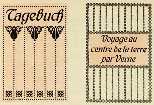
THE “KURSIV” TYPE. DESIGNED BY PROF. PETER BEHRENS CAST BY GEBR. KLINGSPOR, OFFENBACH A.M.
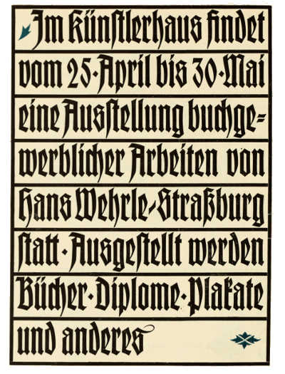
A GERMAN TYPE DESIGNED BY RUDOLF KOCH CAST BY GEBR. KLINGSPOR, OFFENBACH A.M.
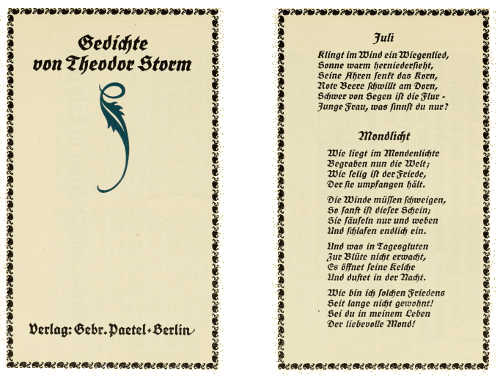
A GERMAN TYPE DESIGNED BY RUDOLF KOCH CAST BY GEBR. KLINGSPOR, OFFENBACH A.M.
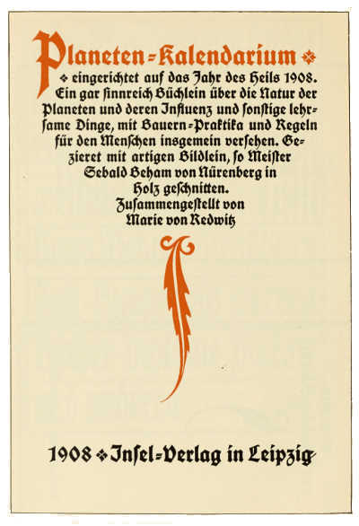
A GERMAN TYPE DESIGNED BY RUDOLF KOCH CAST BY GEBR. KLINGSPOR, OFFENBACH A.M.
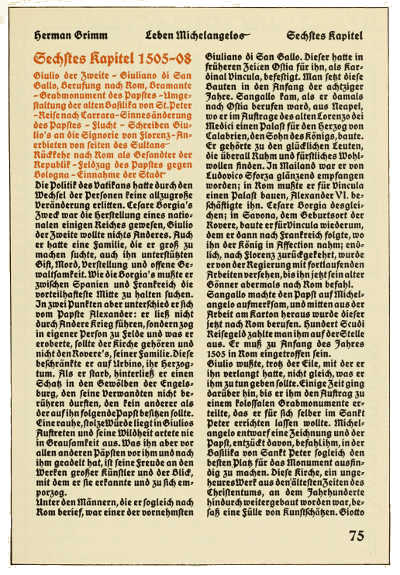
A GERMAN TYPE DESIGNED BY RUDOLF KOCH CAST BY GEBR. KLINGSPOR, OFFENBACH A.M.
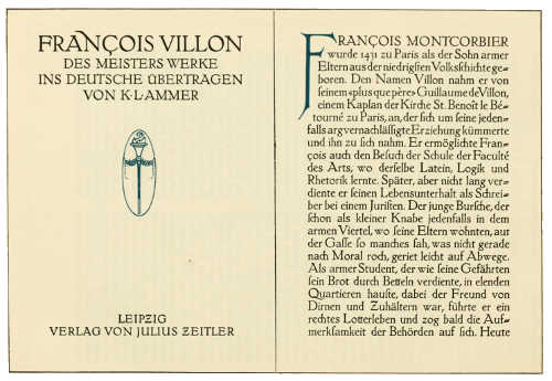
THE “MEDIÆVAL” TYPE. DESIGNED BY PROF. WALTER TIEMANN, CAST BY GEBR. KLINGSPOR, OFFENBACH A.M.
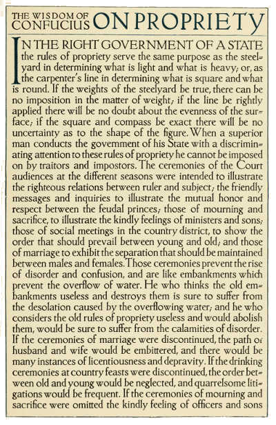
THE “MEDIÆVAL” TYPE. DESIGNED BY PROF. WALTER TIEMANN, CAST BY GEBR. KLINGSPOR, OFFENBACH A.M.
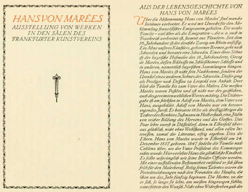
THE “MEDIÆVAL-KURSIV” TYPE. DESIGNED BY PROF. WALTER TIEMANN, CAST BY GEBR. KLINGSPOR, OFFENBACH A.M.
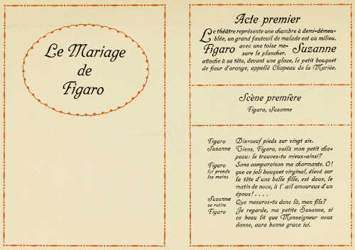
THE “TRIANON” TYPE. DESIGNED BY HEINRICH WIEYNK CAST BY THE BAUERSCHE GIESSEREI, FRANKFURT A.M.
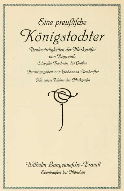
THE “WIEYNK-KURSIV” TYPE. DESIGNED BY HEINRICH WIEYNK CAST BY THE BAUERSCHE GIESSEREI, FRANKFURT A.M.
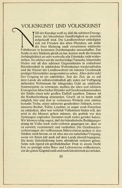
THE “SCHLANKE KLEUKENS-ANTIQUA” TYPE. DESIGNED BY PROF. F. W. KLEUKENS, CAST BY THE BAUERSCHE GIESSEREI, FRANKFURT A.M.
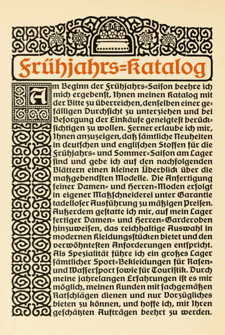
THE “SCHWABACHER” TYPE. DESIGNED BY HEINZ KÖNIG. CAST BY EMIL GURSCH, BERLIN
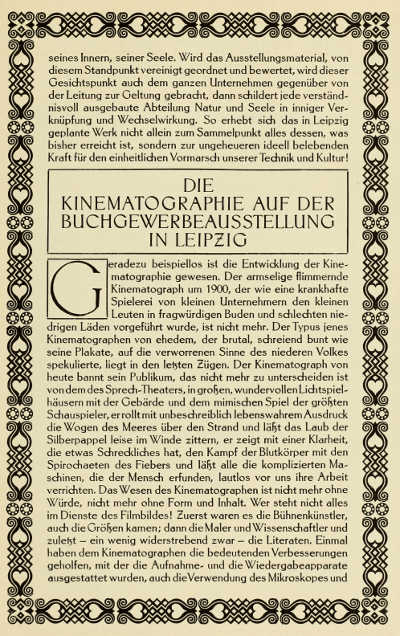
THE “HELGA-ANTIQUA” TYPE. DESIGNED BY PROFESSOR F. W. KLEUKENS, CAST BY D. STEMPEL, FRANKFURT A.M.
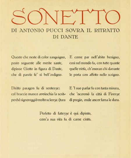
THE “HÖLZL-MEDIÆVAL” TYPE. DESIGNED BY EMIL HÖLZL, CAST BY D. STEMPEL, FRANKFURT A.M.
THE “HÖLZL-MEDIÆVAL” TYPE. DESIGNED BY EMIL HÖLZL, CAST BY D. STEMPEL, FRANKFURT A.M.
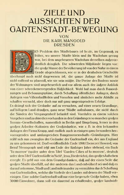
THE “INGEBORG-ANTIQUA” TYPE. DESIGNED BY PROFESSOR F. W. KLEUKENS, CAST BY D. STEMPEL, FRANKFURT A.M.
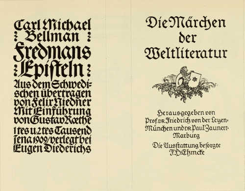
TITLE-PAGES DESIGNED BY PROF. F. H. EHMCKE PUBLISHED BY EUGEN DIEDERICHS
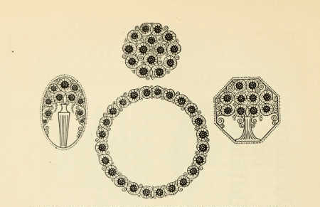
ORNAMENTS DESIGNED BY PROF. F. W. KLEUKENS, FOR THE BAUERSCHE GIESSEREI, FRANKFURT A.M.
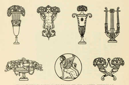
ORNAMENTS DESIGNED BY PROF. WALTER TIEMANN, FOR GEBR. KLINGSPOR, OFFENBACH A.M.
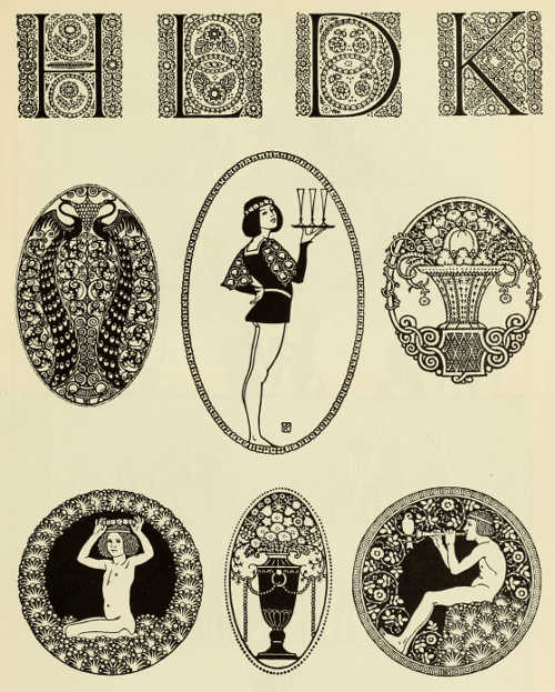
INITIAL LETTERS AND ORNAMENTS DESIGNED BY PROF. F. W. KLEUKENS, FOR D. STEMPEL, FRANKFURT A.M.
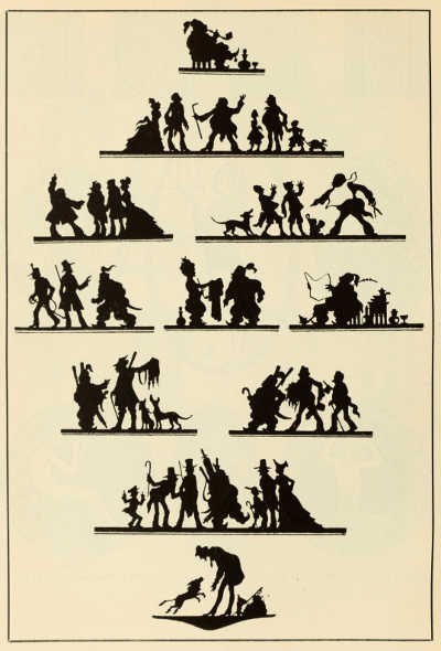
HEAD-PIECES BY EMIL PREETORIUS FOR DAUDET'S “TARTARIN DE TARASCON.” PUBLISHED BY DER GELBE VERLAG, MÜNCHEN-DACHAU
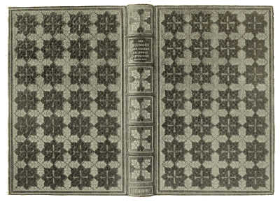
BOOKBINDING IN GREEN MOROCCO, WITH GOLD AND BLACK TOOLING DESIGNED BY P. A. DEMETER, EXECUTED BY HÜBEL AND DENCK
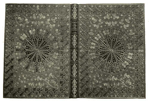
BOOKBINDING IN LEMON YELLOW MOROCCO, WITH GREEN INLAY AND GOLD TOOLING DESIGNED BY P. A. DEMETER, EXECUTED BY HÜBEL AND DENCK
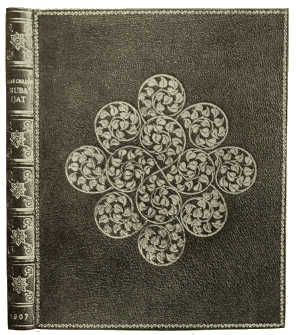 |
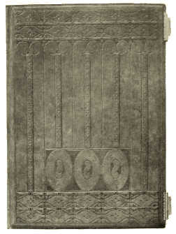 |
BOOKBINDING IN GREEN MOROCCO, WITH GOLD TOOLING. DESIGNED BY P. A. DEMETER EXECUTED BY HÜBEL AND DENCK |
BOOKBINDING IN BROWN LEATHER, WITH BLIND TOOLING. DESIGNED BY PROF. JOH. VINCENZ CISSARZ, EXECUTED BY AD. BÜHLER |
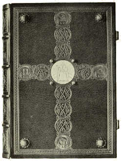 |
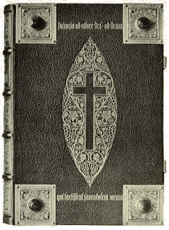 |
BOOKBINDING IN SEA-GREEN MOROCCO, WITH INLAY AND GOLD TOOLING DESIGNED BY KARL KÖSTER, EXECUTED BY HERDER'S BINDERY, FREIBURG |
BOOKBINDING IN DARK RED MOROCCO, WITH INLAY AND GOLD TOOLING DESIGNED BY KARL KÖSTER, EXECUTED BY HERDER'S BINDERY, FREIBURG |
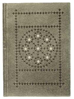 |
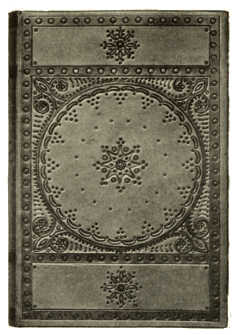 |
BOOK BINDING IN ORANGE YELLOW MOROCCO, WITH INLAY AND BLIND TOOLING. BY PAUL KERSTEN |
BOOKBINDING IN NEAT'S LEATHER, WITH PUNCHED AND TANNED ORNAMENTATION. BY PAUL KERSTEN |
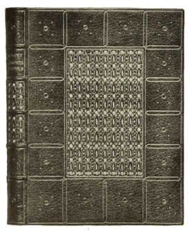 |
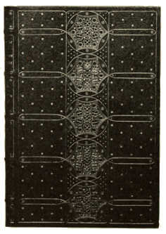 |
BOOKBINDING IN RED MOROCCO, WITH INLAY AND GOLD TOOLING. BY PAUL KERSTEN |
BOOKBINDING IN BLUE MOROCCO, WITH INLAY AND GOLD TOOLING. BY PAUL KERSTEN |
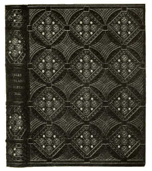 |
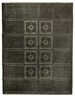 |
BOOKBINDING IN BUFF MOROCCO, WITH INLAY AND GOLD TOOLING. BY PAUL KERSTEN |
BOOKBINDING IN BLUE MOROCCO, WITH INLAY AND GOLD TOOLING. BY PAUL KERSTEN |
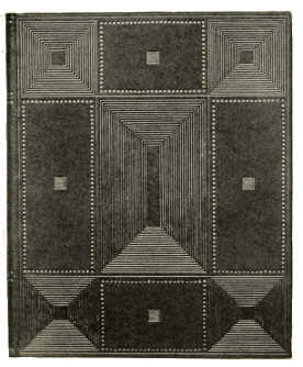 |
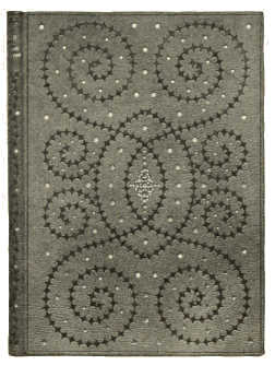 |
BOOKBINDING IN RED CALF, WITH INLAY AND GOLD TOOLING. BY PAUL KERSTEN |
BOOKBINDING IN PIGSKIN, WITH TOOLING BY PAUL KERSTEN |
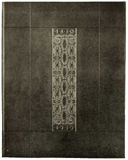 |
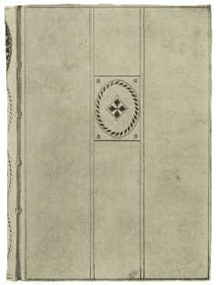 |
BOOKBINDING IN DARK BLUE CALF, WITH GOLD TOOLING. DESIGNED BY PROF. HUGO STEINER-PRAG, EXECUTED BY HÜBEL AND DENCK |
BOOKBINDING IN VELLUM, WITH GILT ORNAMENTATION. DESIGNED BY PROF. HUGO STEINER-PRAG, EXECUTED BY HÜBEL AND DENCK |
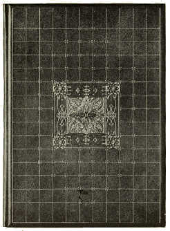 |
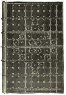 |
BOOKBINDING IN LEATHER, WITH GOLD TOOLING. DESIGNED BY PROF. HUGO STEINER-PRAG, EXECUTED BY HÜBEL AND DENCK |
BOOKBINDING IN LEATHER, WITH GOLD TOOLING. DESIGNED BY PROF. HUGO STEINER-PRAG, EXECUTED BY HÜBEL AND DENCK |
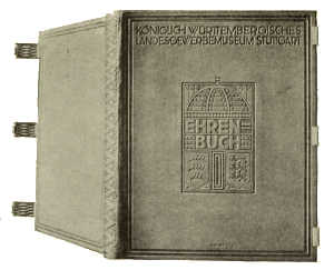
BOOKBINDING IN LEATHER, WITH SILVER CLASPS. DESIGNED BY PROF. JOH. VINCENZ CISSARZ, EXECUTED BY KARL STRENGER
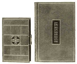 |
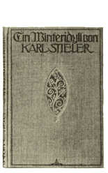 |
BOOKBINDINGS IN LEATHER, WITH GOLD TOOLING. DESIGNED BY PROF. JOH. VINCENZ CISSARZ, EXECUTED BY GUSTAV FRÖLICH |
BINDING CASE. DESIGNED BY PROF. JOH. VINCENZ CISSARZ |
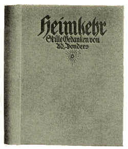 |
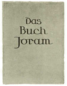 |
BINDING-CASE. DESIGNED BY KARL KÖSTER |
VELLUM BINDING. DESIGNED BY KARL KÖSTER |
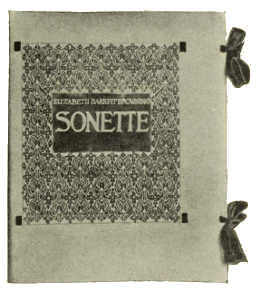 |
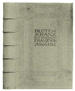 |
VELLUM BINDING, WITH BATIK ORNAMENTATION DESIGNED BY KARL KÖSTER |
BOOKBINDING IN LEATHER, WITH GOLD TOOLING DESIGNED BY KARL KÖSTER |
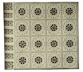
BOOKBINDING IN WHITE PIGSKIN, WITH INLAY AND GOLD TOOLING BY FRANZ WEISSE
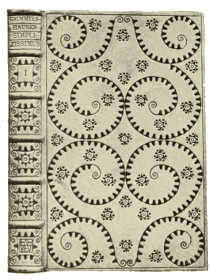 |
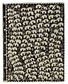 |
BOOKBINDING IN NATURAL COLOURED PIGSKIN, WITH BLIND TOOLING. BY FRANZ WEISSE |
PARCHMENT BINDING, WITH BATIK ORNAMENTATION BY FRANZ WEISSE |
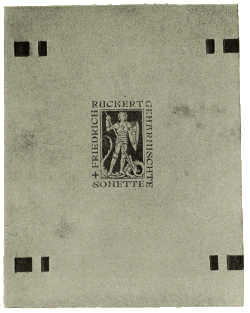 |
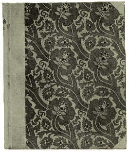 |
VELLUM BINDING. DESIGNED BY RUDOLF KOCH |
HALF-CALF AND PAPER BINDING. DESIGNED BY RUDOLF KOCH |
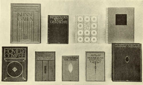
BINDING-CASES IN LEATHER AND CLOTH. DESIGNED BY PROF. JOH. VINCENZ CISSARZ
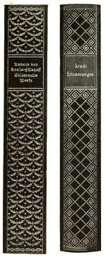 |
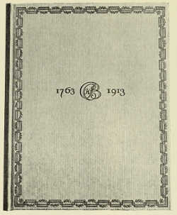 |
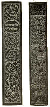 |
BACKS OF LEATHER BINDING-CASES DESIGNED BY PAUL RENNER |
BINDING-CASE. DESIGNED BY PAUL RENNER |
BACKS OF LEATHER BINDING-CASES DESIGNED BY PAUL RENNER |
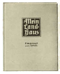 |
 |
DESIGNED BY PROF. EMANUEL VON SEIDL |
DESIGNED BY “L” |
 |
 |
DESIGNED BY FRITZ SCHOLL |
DESIGNED BY EMANUEL JOSEPH MARGOLD |
BINDING-CASES DESIGNED FOR ALEXANDER KOCH, DARMSTADT |
|
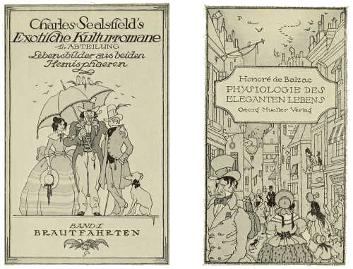
PAPER COVERS. DESIGNED BY EMIL PREETORIUS
 |
 |
END-PAPER DESIGNED BY PROF. PAUL LANG-KURZ |
END-PAPER DESIGNED BY PROF. PAUL LANG-KURZ |
[178]
[179]
THE ART OF THE BOOK IN FRANCE. BY E. A. TAYLOR
LINGERING in thought over the far-away days of the glorious bibliographic and typographical past that France has enjoyed, one finds little has happened, amidst all the changes which have swept over those arts in recent years, to disturb the employment of her bibliopegic artists. There are few of her remaining old streets through which one passes without being attracted in one way or another to the sign of the relieur-doreur. To give a remarkable instance of this unique position one has only to recall the sale of the collection of the Vicomte de la Croix-Laval in 1902, in which the books were not catalogued in the names of the author but in that of the bookbinder. But this is not surprising when we consider the excellent craftsmanship of such men as G. Canape, Chambolle-Duru, S. David, Charles Lanoë, Marius Michel, G. Mercier, René Kieffer, and the fascinating execution of the designs on vellum by André Mare. Yet it is not uncommon to hear the travellers' comment that books with an attractive outside appearance are non-existent in Paris. Unlike England, France expends little additional labour on the lasting, apart from the certain attractive qualities of cloth or paper-covered board casings, while modern end-papers, as known in other countries, have so far found little consideration. Much energy is focussed on the edition de luxe, embodying the work of popular artists, good paper and type, the result being a limited number of paper-covered volumes, all excellently produced, but very often disappointing in their page arrangement and design and the suitability of text to type and type to illustration.
But this leads me into an explanatory discussion on the old printer's independence of other craftsmen whose art is now divided into separate and recognised trades. And it is remarkable that it should be so to such a great extent, for fewer places other than Paris are so sympathetically enjoined to their artists. It may be the fault of the artist who is more enwrapped in his craft than the art evolved in its ultimate end.
Within the last few years, however, printing has vastly improved, and this has been due in no small measure to the efforts of MM. G. Peignot and Sons. As early as 1900 the Peignot type foundry introduced a new typography with frankly modern tendencies, the best testimony of their efforts at that time being the productions of “Grasset,” following with the “Auriol,” and later on the Bellery-Desfontaines types and ornaments. At the same time, not desiring to lose touch with that which in typography of the past is most intrinsically valuable for to-day, a little booklet issued lately, entitled “Les Cochins,” by the two brothers Peignot, clearly demonstrates the results of their attainment. This booklet, apart from being a catalogue of their research, has behind[180] it the primary desire that editors and printers should try to realise the significance of a typographical revival in France, and the influence it would have on all branches of the graphic arts.
Despite the remarkable progress that process work has made, apart from the most ingenious inventions and machinery being of French origin, wood-engravers and wood-engraving, as employed for illustrative purposes, maintain a prominent and more unique position in France than in any other European country. Amongst the most recent productions of note “Daphnis et Chloé” (p. 190), printed and published by M. L. Pichon, is uncommonly good, in fact all that issues from M. Pichon's little establishment is unusually refined. Then there are others, but space will not permit me to dwell on each one's excellent qualities. However, I must not neglect to mention the remarkable edition of “Le Grand Testament de François Villon,” which I have seen in preparation by M. A. M. Peignot, with illustrations and especially designed type by Bernard Naudin; also some thoughtful little volumes in the series “Les Maîtres du Livre,” published by MM. Georges Crès et Cie under the direction of M. Ad. van Bever; and if it were not for the thoughtful, untiring efforts of such editors as M. Lucien Vogel, of the “Gazette du Bon Ton,” and publishers of éditions d'art as MM. A. Blaizot, L. Carteret, H. Floury, F. Ferroud, Jules Meynial, R. Helleu, René Kieffer, E. Rey, Octave Charpentier, E. Lévy, and H. Piazza, the bibliophiles of Paris would have a poor output from which to select. From amongst others the notable and varied publications of the libraries Ollendorff, Larousse, Hachette et Cie, A. Fayard et Cie, Caiman Levy, Plon-Nourrit et Cie, Adrian Sporck, L. Michaud, E. Flammarion and A. Vaillant should be noted. Finally I must not forget to mention the powerful influence of the “Société des Amis des Livres,” “Les Cent Bibliophiles,” the “Société Normande du Livre illustré,” and the “Société du Livre d'Art Contemporain” ; and without a prolonged description of each Société it must suffice to mention the prosperity the “Société des Amis des Livres” enjoys under the presidency of M. Henri Beraldi, the originator of the “Société des Bibliophiles de Paris” and a publisher of note. Amongst his first efforts “Paysages Parisiens,” by Emile Goudeau, and G. Montorgueil's “Paris au Hasard,” both illustrated by Auguste Lepère, are the most distinguished, and to him my thanks are due for his kindly interest in my bibliographical quest, and to the President of “Les Cent Bibliophiles,” M. Eugène Rodrigues, for his generosity in placing at my disposal pages and illustrations from his admirable collection.
After all, it is to men like these, and to the organizations to which they belong, that France owes the prominent bibliographical position she holds, and the freedom her excellent artists and craftsmen enjoy in retaining for us in fitting garb the minds of the great, be they echoes of the past or turbulent cries in the dark, the songs of the open and sunlight, the sonnets of autumn and shade, or the love in the laughter of children.
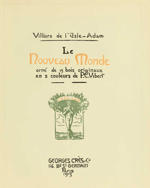
TITLE-PAGE DESIGNED BY P. E. VIBERT, FOR MM. GEORGES CRÈS ET CIE
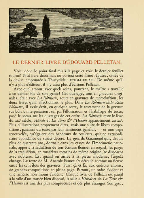
PAGE PRINTED IN “GARAMOND” TYPE (ENGRAVED FOR FRANÇOIS I), WITH WOODCUT BY PAUL EMILE COLIN, LENT BY MONS. R. HELLEU
PAGE PRINTED IN ROMAN FACE TYPE DESIGNED BY GEORGE AURIOL, CAST BY G. PEIGNOT ET FILS, PARIS
PAGE PRINTED IN ITALIC FACE TYPE. DESIGNED BY GEORGE AURIOL, CAST BY G. PEIGNOT ET FILS, PARIS
PAGE PRINTED IN “NICOLAS COCHIN” TYPE, ADAPTED AND CAST BY G. PEIGNOT ET FILS, PARIS
TYPE AND ORNAMENTS DESIGNED BY GRASSET CAST BY G. PEIGNOT ET FILS, PARIS
PAGE FROM A. DE MUSSET'S “LES NUITS” (JULES MEYNIAL, PARIS), PRINTED IN TYPE DESIGNED BY ADOLPHE GIRALDON CAST BY LA MAISON DEBERNY
PAGE FROM A. DE MUSSET'S “LES NUITS” (JULES MEYNIAL, PARIS). PRINTED IN TYPE DESIGNED BY ADOLPHE GIRALDON CAST BY LA MAISON DEBERNY
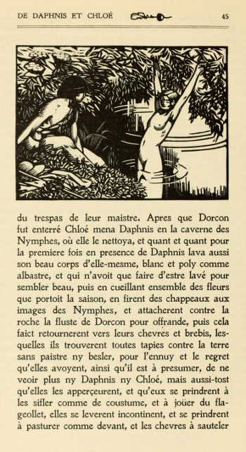
PAGE FROM “DAPHNIS ET CHLOÉ.” PRINTED IN “JENSON” TYPE BY L. PICHON, PARIS, WITH WOODCUT BY CARLÈGLE (weak in original)
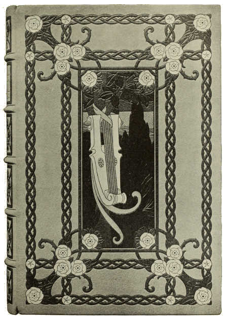
BOOKBINDING IN LEVANT MOROCCO, WITH INLAY AND TOOLING DESIGNED BY ADOLPHE GIRALDON, EXECUTED BY G. CANAPE
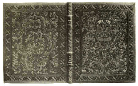
BOOKBINDING IN LEVANT MOROCCO, WITH INLAY AND TOOLING DESIGNED BY ADOLPHE GIRALDON, EXECUTED BY G. CANAPE
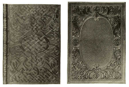
BOOKBINDINGS IN LEVANT MOROCCO, WITH INLAY AND TOOLING. BY CHAMBOLLE-DURU
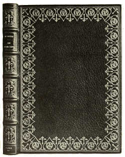 |
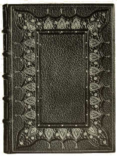 |
BOOKBINDING IN MOROCCO, WITH GOLD TOOLING. BY S. DAVID |
BOOKBINDING IN RED MOROCCO, WITH INLAY AND GOLD TOOLING. BY S. DAVID |
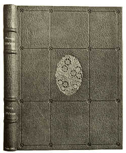 |
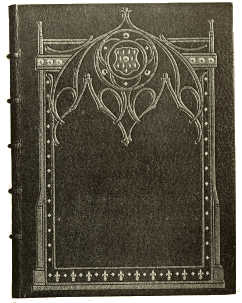 |
BOOKBINDING IN GREEN MOROCCO, WITH INLAY AND GOLD TOOLING BY RENÈ KIEFFER |
BOOKBINDING IN DARK BLUE FRENCH MOROCCO, WITH INLAY AND GOLD TOOLING BY S. DAVID |
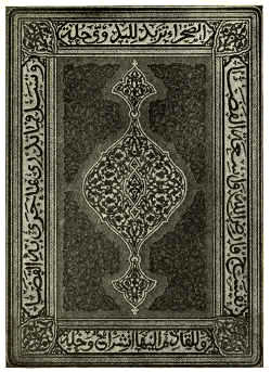 |
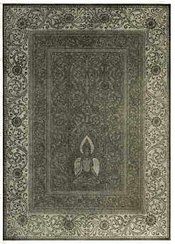 |
BOOKBINDING IN FRENCH MOROCCO, WITH INLAY AND GOLD TOOLING DESIGNED BY ETIENNE DINET, EXECUTED BY DURVAND |
BOOKBINDING IN FRENCH MOROCCO, WITH GOLD TOOLING DESIGNED BY J. DE LA NÉZIÈRE, EXECUTED BY DURVAND |
(In the possession of Mons. H. Piazza) |
(In the possession of Mons. H. Piazza) |
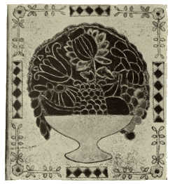
BOOKBINDING IN PARCHMENT, TOOLED AND COLOURED BY ANDRÉ
MARE
(In the possession of Mons. Paul Adam)
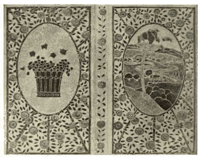
BOOKBINDING IN PARCHMENT, TOOLED AND COLOURED. BY ANDRÉ
MARE
(In the possession of Mons. L. Vauxcelles)
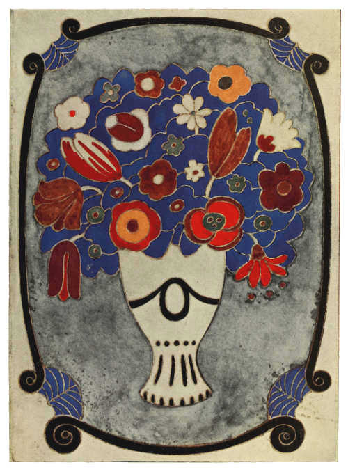
BOOKBINDING IN PARCHMENT, TOOLED AND COLOURED. BY ANDRÉ MARE
(In the possession of Madame d'Aleman.)
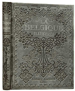 |
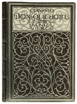 |
BINDING-CASE DESIGNED BY G. AURIOL. FOR MAISON LAROUSSE |
BOOKBINDING IN BLUE MOROCCO, WITH INLAY AND GOLD TOOLING
DESIGNED BY A. SEGAUD, EXECUTED BY P. SOUZE |
 |
 |
BINDING-CASE DESIGNED BY G. AURIOL FOR MAISON LAROUSSE |
BINDING-CASE DESIGNED BY LUCIEN LAFORGE FOR MAISON LAROUSSE |
[202]
[203]
THE ART OF THE BOOK IN AUSTRIA. BY A. S. LEVETUS
LIKE other countries Austria has, in all that relates to the book, gone
through periods of high developments, followed by a time of inactivity
which could but lead to eventual decay. That in the past many works
of a high artistic value as regards printing, illustrations, type,
and binding, in fact all the qualities which go to make an artistic
production, were issued by the various presses, many books still
existing go to prove. On the whole the printers of Austria were never
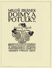 TITLE-PAGE DESIGNED BY R. RŮŽIČKA.
PUBLISHED BY THE MANES SOCIETY, PRAGUE
very numerous, and she has never been a book-producing centre, even in
the Capital itself, as have been many German cities, such as Nuremberg,
Augsburg and Leipzig. Under the Empress Maria Theresa the art of the
book flourished, for being possessed of a fine artistic nature, she
granted many privileges to the makers of books, and set great value
on such volumes as were real works of art. Her son, Joseph II, who
during his youth, following the custom of the time, adopted a trade,
chose printing, and mastered it thoroughly. He likewise granted certain
privileges to the printers and in every way encouraged the art.
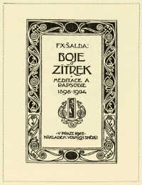 TITLE-PAGE DESIGNED BY VLADIMÍR ŽUPANSKÝ. PUBLISHED
BY THE MANES SOCIETY, PRAGUE
During the second half of the eighteenth century the Art of the Book developed
considerably. New types were invented, woodcut engravings gave way to
copper engravings, the paper was of the best quality, the bindings of
the finest leather and of beautiful design, everything, including the
end-papers, reached the highest standard. But reaction was inevitable
in Austria as it was in other countries, for the age of machinery had
come. Hand-made paper, which had furnished a staple trade in Moravia
since 1520, when the first paper-mill was founded in Gross-Ullersdorf,
deteriorated; the printing-machine took the
[204]
place of the hand-press; the fine hand-tooled leather bindings were
forced to yield to the more commercial article.
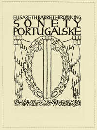 TITLE-PAGE DESIGNED BY J. BENDA. PUBLISHED BY THE
ŽENSKI KLUB, PRAGUEBut in Austria, as elsewhere, the Art of the Book was to be reborn,
and it was William Morris who was to give the impulse, for the fame
of the Kelmscott Press had reached Vienna. The men of the new school,
Alfred Roller, Josef Hoffmann, Koloman Moser, Baron Myrbach, Rudolf
von Larisch, and others have spread the new teaching. The moment was
the right one, the need of reform in all and everything concerning
book-production was recognised as part of the programme when the
general question of the teaching of art was raised in 1897; but the
regeneration of the Art of the Book really dated from the beginning
of the present century. It must not be thought that no efforts had
been made to rescue the art previous to the great reform. Far from it.
Twenty-five years ago the first steps were taken by the founding of the
Imperial “Lehr- und
Versuchsanstalt für graphische Kunst,” an institution for teaching
and experimenting in graphic art, where from the first excellent
work was done under Hofrat Eder. The “Hof- und
Staatsdruckerei” (Imperial and State Printing Office) had been called
into existence eighty years previously.
But the great impetus was given
some dozen years ago when men trained in the new school of thought
in decorative art were appointed teachers in the various schools and
institutions.
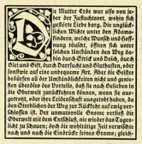 PAGE DESIGNED BY HEDWIG SCHMIEDL, FOR THE IMPERIAL
GRAPHISCHE LEHR-UND VERSUCHSANSTALT, VIENNA
The Art of the Book in Austria in its
modern aspect is but young, but its development is most interesting.
All that is best in graphic art of the past served as the ground-work
on which to build the art of our time; and this artistic basis being
of so fine a calibre, sound and sure, has led to very satisfactory
results. First, in the teaching of ornamental writing under Professor
Rudolf von Larisch. He has expounded his tenets in his “Unterricht in
ornamentaler Schrift,” a work of great
[205]
value to all interested in this subject. What he aims at is form,
configuration and spacing, to add rhythm to the letters themselves,
and to harmonise one with another in the building-up of the word; for
even the simplest of words rightly rendered should be decorative. He
does not consider the creating of new forms of paramount importance,
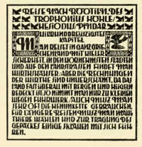 PAGE DESIGNED BY BERTA BINDTNER, FOR THE IMPERIAL
GRAPHISCHE LEHR-UND VERSUCHSANSTALT, VIENNA
but sets much store on the relation of the letter to the word, the word
to the sentence. These should fit into one another in the same manner
as the component parts of a perfect piece of architecture, for, as in
architecture we see the foundation of all art, so in lettering the
basis of all book decoration is to be sought. This theory is supported
by the study of early printed works and more particularly so in those
printed towards the end of the sixteenth century. Here we see the aim
was to achieve harmony in type, ornament and illustration. This, too,
is the aim of those who produce artistic books other than those issued
by the ordinary publisher. Unfortunately there are but few of the
former class in Austria. But many of the Austrian artists are engaged
in illustrating books for German and other publishers. In Vienna,
Artur Wolf has published some very fine works illustrated by Franz
von Bayros, Ferdinand Staeger, and other artists; Konegen's series of
children's books, illustrated by Marianne Hitschmann-Steinberger, are
full of charm and understanding of child life; Gerlach and Wiedling's
books for children have been illustrated by various artists: Professor
Czeschka, Karl Fahringer, F. Staeger, Franz Wacik, Fräulein Frimberger
among others. That excellent work is being done may be gathered from
our illustrations. Fräulein C. Hasselwander has done very good work
as an illustrator of children's stories; C. Köystrand has won renown
[207]
 COVER DESIGN BY F. KYSELA, FOR NOVA EDICE, PRAGUE
as an illustrator of refined humour; Ferdinand Staeger is one of the
best-known illustrators of the “Münchner Jugend,” and a draughtsman of
great[206]
variety and vitality; Wenzel Oswald and Gustav Kalhammer are past
students of the Imperial “Kunstgewerbeschule” in Vienna and are
essentially decorative in their art; while Dagobert Peche hails from
the Imperial Academy and his work is of a highly decorative character.
Alfred Keller is an architect by profession, as is Dagobert Peche, but
he is also an illustrator of books, his chief forte lying in line
drawing.
Some of the Austrian artists excel in the designing of book-bindings, and it is safe to say their work will achieve lasting fame. The mention of names such as Professors Josef Hoffmann, Koloman Moser and Czeschka, are sufficient to vouch for this assertion; Anton Hofer and Rudolf Geyer, both past students of the Imperial Arts and Crafts School, have also done some very beautiful work which will live. All these artists have produced bindings which in quality of design, material, and workmanship are all that could be desired.
 TAILPIECE DESIGNED BY HEDWIG SCHMIEDL, FOR THE IMPERIAL
GRAPHISCHE LEHR-UND VERSUCHSANSTALT, VIENNA
In the designing of new types excellent results have been achieved.
“Czeschka's Antiqua,” the invention of Professor Czeschka, is extremely
beautiful in its simplicity. I has been acquired by Messrs.
Genzsch and Heyse, of Hamburg, and is illustrated on page 211.
Dr. Rudolf Junk's new type is characterized by the same high qualities though it differs widely in form from that of Professor Czeschka; Herr Mader's type is less clear, though it is interesting. For this Professor Hoffmann has made the borders and ornament. Fräulein Schmidt may also be counted amongst those who have created new and interesting types. These have all been published by the “Hof-und Staatsdruckerei.”
In the provinces Bohemia holds the first place in the Art of the Book, which is but natural considering how high a prestige Prague, Pilsen, Kuttenberg, and other of her towns enjoyed in bygone ages. In modern graphic art and book-decoration many Czech artists have distinguished themselves. The various reproductions here show that their inspirations are those of the true artist. To these must be added Zdenka Braunerová, Adolf Kašpar, and Vojtěch Preissig. That the publishers are collaborating with the artists is a good sign, and the next few years will no doubt see further developments. The fact that the modern movement in Bohemia in the Art of the Book is still in its infancy, and that, in spite of this, so much that is good has already been done, speaks well for the future.
ORNAMENT BY WENZEL OSWALD
 |
 |
TITLE-PAGE DESIGNED BY F. KYSELA. PUBLISHED BY THE “NOVA EDICE,” PRAGUE |
DEDICATION PAGE DESIGNED BY V. H. BRUNNER, FOR PUSHKIN'S “HISTORY OF THE CZAR SALTAN.” PUBLISHED BY THE “SPOLEK ČESKÝCH BIBLIOFILŮ” |
 |
 |
TITLE-PAGE DESIGNED BY J. BENDA. PUBLISHED BY HEJDA A TUČEK, PRAGUE |
TITLE-PAGE DESIGNED BY VLADIMÍR ŽUPANSKÝ. PUBLISHED BY THE “SPOLEK MANES,” PRAGUE |
PAGES OF TYPE AND BORDER DESIGNED BY PROFESSOR C. O. CZESCHKA, CAST BY GENZSCH AND HEYSE, HAMBURG
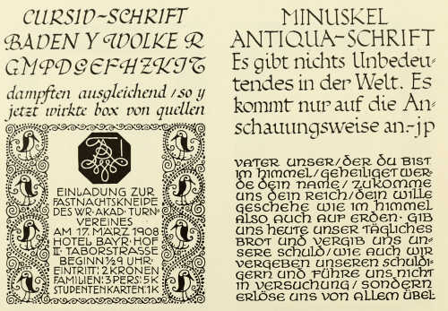
EXAMPLES OF ORNAMENTAL WRITING BY PROF. RUD. VON LARISCH FROM “UNTERRICHT IN ORNAMENTALER SCHRIFT”
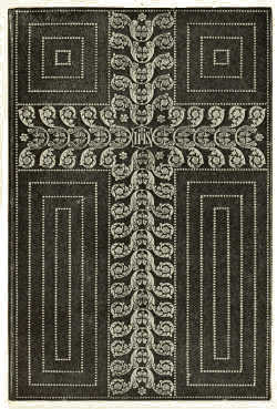 |
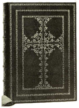 |
BOOKBINDING IN RED SHAGREEN, WITH EMBOSSED GOLD ORNAMENTATION DESIGNED BY RUDOLPH GEYER, EXECUTED BY ALBERT GÜNTHER |
BOOKBINDING IN BLACK SHAGREEN, WITH EMBOSSED GOLD ORNAMENTATION DESIGNED BY RUDOLPH GEYER, EXECUTED BY ALBERT GÜNTHER |
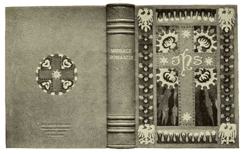
BOOKBINDING IN RUSSIAN LEATHER, WITH INLAY AND TOOLING. DESIGNED BY HENRYK UZIEMBLO, EXECUTED BY ROBERT JAHODA
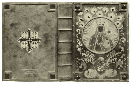
BOOKBINDING IN RUSSIAN LEATHER, WITH INLAY AND TOOLING. DESIGNED BY HENRYK UZIEMBLO, EXECUTED BY ROBERT JAHODA
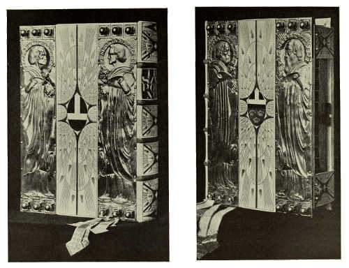
SILVER BOOKBINDING, WITH LEATHER INLAY AND GOLD TOOLING. BY ANTON
HOFER
(In the possession of H. E. Dr. Friedrich
Piffl, Prince-Bishop of Vienna)
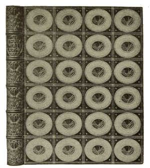
LEATHER BOOKBINDING, WITH INLAY AND GOLD TOOLING. DESIGNED BY PROF. JOSEF HOFFMANN EXECUTED BY THE WIENER WERKSTAETTE
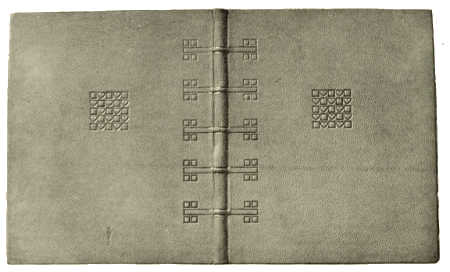
BOOKBINDING IN BUCKSKIN, WITH INLAY AND TOOLING. DESIGNED BY PROF. JOSEF HOFFMANN EXECUTED BY THE WIENER WERKSTAETTE
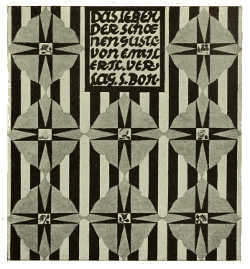
PAPER COVER DESIGNED BY DORA GROSS
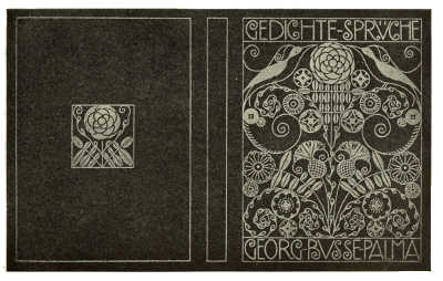
PAPER COVER DESIGNED BY HANSI BURGER-DIVECKY, PRINTED IN THE IMPERIAL GRAPHISCHE LEHR-UND-VERSUCHSANSTALT, VIENNA
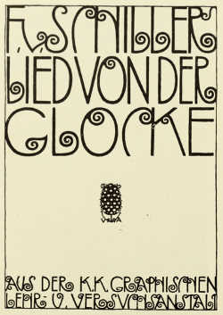 |
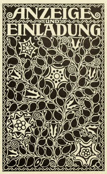 |
PAPER COVER DESIGNED BY ROBERT FUCHS, PRINTED IN THE IMPERIAL GRAPHISCHE LEHR-UND-VERSUCHSANSTALT, VIENNA |
PAPER COVER DESIGNED BY GUSTAV KALHAMMER |
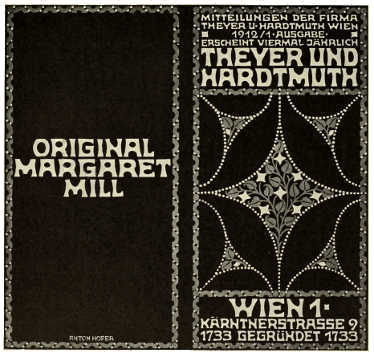 |
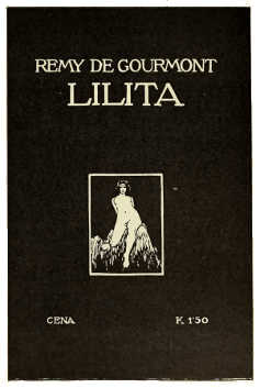 |
PAPER COVER DESIGNED BY ANTON HOFER. FOR THEYER UND HARDTMUTH |
PAPER COVER DESIGNED BY F. KOBLIHA |
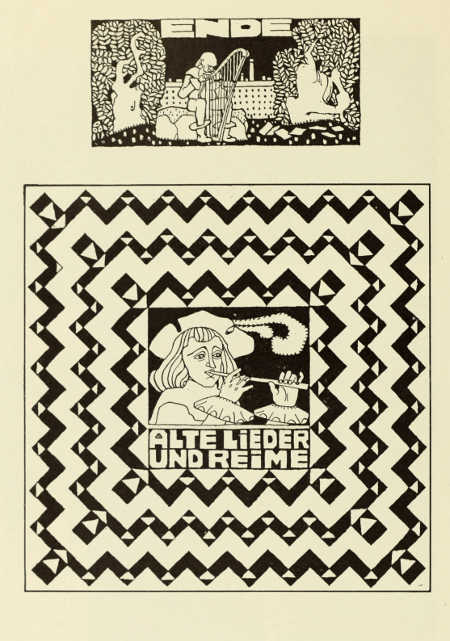
TAILPIECE AND COVER DESIGN BY HEDWIG SCHMIEDL
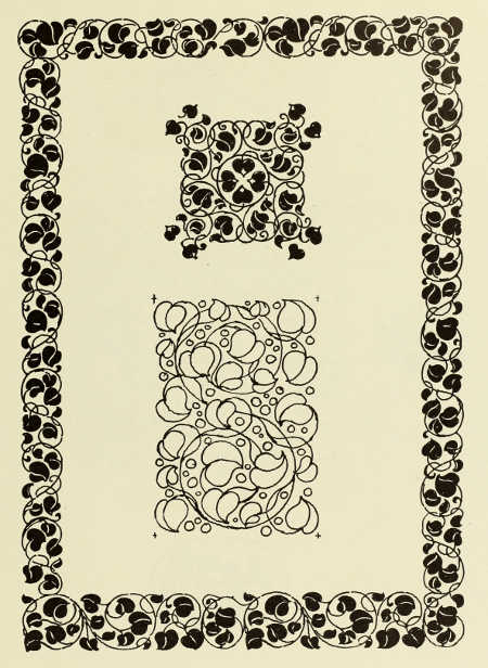
BORDER AND END-PAPER DESIGNS BY ALFRED KELLER. FOR L. STAAKMANN, LEIPZIG
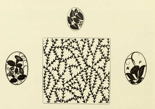
ORNAMENTS AND END-PAPER DESIGN BY DAGOBERT PECHE
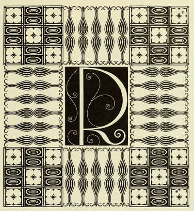
INITIAL LETTER AND BORDER DESIGNED BY PROF. C. O. CZESCHKA. FOR GENZSCH AND HEYSE, HAMBURG
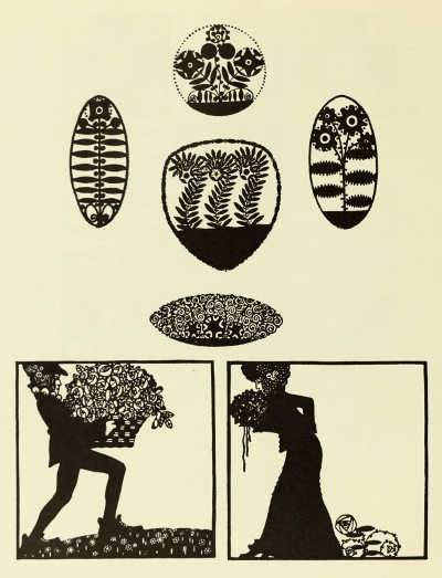
ORNAMENTS AND TAILPIECES BY WENZEL OSWALD
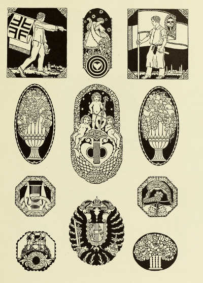
ORNAMENTS BY GUSTAV KALHAMMER
DECORATIVE ILLUSTRATIONS BY FERDINAND STAEGER
DECORATIVE ILLUSTRATIONS BY FERDINAND STAEGER
DECORATIVE ILLUSTRATIONS BY ALFRED KELLER, FOR R. H. BARTSCH'S “BITTERSÜSSE LIEBESGESCHICHTE” PUBLISHED BY L. STAAKMANN, LEIPZIG
DECORATIVE ILLUSTRATION BY ALFRED KELLER FOR “DAS BUCH DER KLEINEN KLEINEN” PUBLISHED BY L. STAAKMANN, LEIPZIG
 |
 |
DECORATIVE ILLUSTRATION BY C. HASSELWANDER |
DECORATIVE ILLUSTRATION BY C. KÖYSTRAND FOR “PIERROT ALS SCHILDWACHE.” PUBLISHED BY S. CZEIGER |
INITIAL LETTER BY GUSTAV MARISCH
DECORATIVE ILLUSTRATIONS BY MARIANNE HITSCHMANN-STEINBERGER FOR “KONEGEN'S KINDERBÜCHER.” PUBLISHED BY KONEGEN, VIENNA
THE development of art in Hungary reached its highest point in the fifteenth century. The influence of the Italian renaissance made itself felt in this country sooner than anywhere else, for Mathias Corvinus gathered round him at his Court a great many Italian artists and humanists, and acquired numerous finely painted books and manuscripts. The few remaining treasures of his library, called corvinas, are wonderful examples of renaissance book-illustrations, mostly the work of Italian miniaturists, for it would seem that Hungarian artists were not employed by the King. Political conflicts and wars put an end to the progress of art, and then came the domination of the Turks, who destroyed, or allowed to perish, the existing monuments of art.
There are many reasons to account for the long period of depression in book-production and illustrative art which followed. Up to as late as the middle of the nineteenth century the educated classes in Hungary adopted Latin for conversation, and it was also the official and legal language of the country. Students went to Italy and Germany to acquire culture. Consequently foreign influences were paramount, and only the cheapest books were produced at home. The native typography could not compete with that of other countries, the art of the book fell into decay, and Hungarian artists were only employed in work of lesser importance.
The books which have been published in Hungary during the last few
years show a distinct advance when compared with those previously
produced.
 TITLE-PAGE WRITTEN IN CORK. BY BLASIUS BUSAY (ARTS AND
CRAFTS SCHOOL, BUDAPEST)
This is in a large measure due to the training offered at
the National Arts and Crafts School at Budapest, where opportunity
is given for the study of typography, and characters based on the
national art have been introduced and popularized. There is a special
class for designing script based upon the best of the old national
manuscripts which combine the most desirable qualities—legibility and
artistic form. Three excellent examples of the work of the students are
reproduced on pages 237 to 239.
Hungary is happy in possessing a number of really clever book
decorators, though many of them have settled outside their native
country, and their work has in some respects little of the
[232]
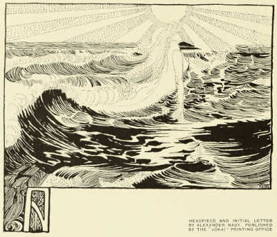 HEADPIECE AND INITIAL LETTER BY ALEXANDER NAGY.
PUBLISHED BY THE “JÓKAI” PRINTING OFFICE
purely national characteristics. A notable example of this is to be
found in the drawings of the Marquis Franz von Bayros, a Hungarian
by race, Croatia being his native province, whose work bears no
relation to his nationality. Delicate, refined, and eminently
decorative, it possesses a grace which recalls the poetic charm of
the fêtes galantes, and is yet, in its technical dexterity and
subtle comprehension of the requirements of black-and-white, modern in
feeling. We reproduce some charming examples of this artist's work.
Very different in conception and treatment, but more national in character, is the decorative illustration by Charles Kós (page 236) for his poem, “The Death of Attila” ; while other eminent book-decorators are Willy Pogány, many of whose drawings have been published in England, Alexander Nagy and Kriesch-Körösföi, both leaders of the famous Gödöllö group of artists. Nagy is a master of line, endowed with a poetic imagination, and he adopts with wonderful success those forms in which the Hungarian nation is so rich. Characteristic of his art is the headpiece shown on this page. A quaintly treated frontispiece by Blasius Busay is also reproduced. The original design was executed in burnt cork.
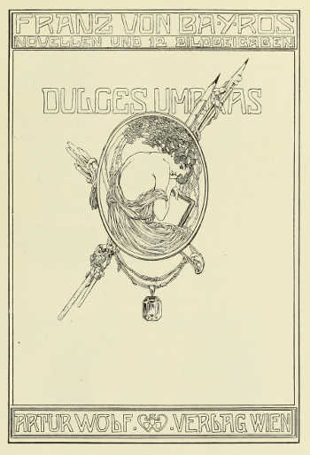
TITLE-PAGE DESIGNED BY FRANZ VON BAYROS PUBLISHED BY ARTUR WOLF, VIENNA
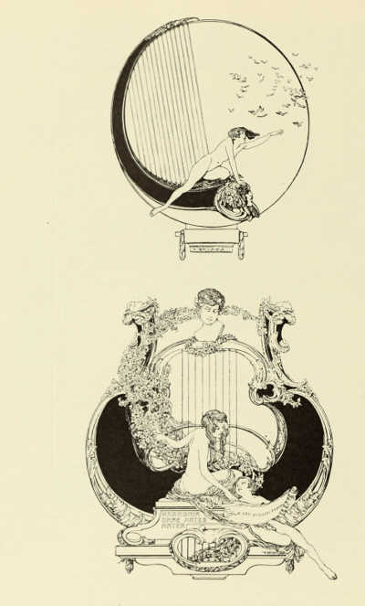
DECORATIVE ILLUSTRATIONS BY FRANZ VON BAYROS PUBLISHED BY ARTUR WOLF, VIENNA
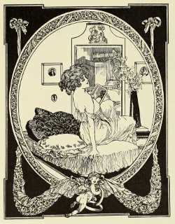 |
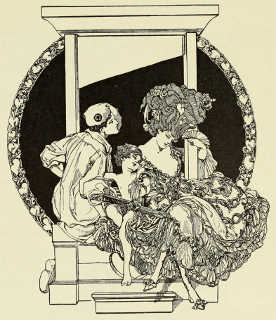 |
DECORATIVE ILLUSTRATION BY FRANZ VON BAYROS FOR VON SCHLOEMPS'S “DER PERVERSE MAIKÄFER” PUBLISHED BY GEORG MÜLLER, MUNICH |
BOOK-COVER DESIGN BY FRANZ VON BAYROS, FOR L. H. ROSEGGER'S “VON KÖNIGEN UND JAKOBINERN” PUBLISHED BY SEIFFERT, KOSTRITZ |
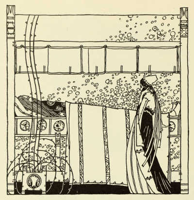
“DEATH OF ATTILA.” —DECORATIVE ILLUSTRATION BY CHARLES KOS
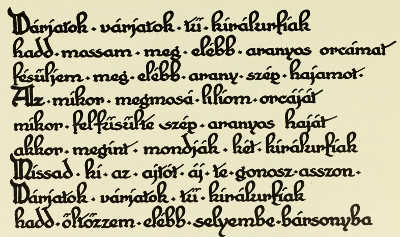
EXAMPLE OF WRITING WITH REED PEN. BY PAUL BENCSIK STUDENT OF THE ARTS AND CRAFTS SCHOOLS, BUDAPEST
EXAMPLE OF WRITING WITH REED PEN. BY IMRE KATONA STUDENT OF THE ARTS AND CRAFTS SCHOOL, BUDAPEST
EXAMPLE OF WRITING WITH REED PEN. BY IMRE KATONA STUDENT OF THE ARTS AND CRAFTS SCHOOL, BUDAPEST
ORNAMENT BY FRANZ VON BAYROS, FOR “DIE SECHZEHNTE EHEFREUDE.” PUBLISHED BY ARTUR WOLF, VIENNA
[242]
[243]
THE ART OF THE BOOK IN SWEDEN BY AUGUST BRUNIUS
IN Sweden, as elsewhere, the latter half of the nineteenth century brought about a brighter period for the Art of the Book as regards typography, quality of paper, and binding. Still the decay had hardly been as great as in other branches of decoration and handicraft. Two publishing firms, P. A. Norstedt, Stockholm, and Berling, Lund, have maintained a high standard of book-making. On the other hand, a more artistic character was adopted between 1870 and 1880 by using traditional means, by imitating Gothic manuscripts, or by a somewhat arbitrary use of Old Northern ornamental art. The renaissance, which in Sweden burst forth at the beginning of the nineties, originated in a revival of interest in the decorative arts, especially in the textiles of the Viking and Saga periods. The Old Northern spirit ran like an undercurrent through the life of the whole country, and culminated in Artur Hazelius's epoch-making museum work, Skansen and the Northern Museum. Just at the right moment there was added a practical study of modern book-making in England and on the Continent. A whole generation was seized by the new ideas which were proclaimed with such power by William Morris.
To initiate a movement, combining as it does artistic and practical
 PAGE FROM “A HISTORY OF SWEDISH WOODCUTS.” ORNAMENTS BY
ARTUR SAHLÉN. PRINTED BY NORSTEDT UND SÖNER
knowledge, a passionate idealist is required. Such an idealist is
Waldemar Zachrisson, a printer of Gothenburg (born 1861). He studied
in Sweden and at the best printing firms in Hamburg, Leipzig, Vienna,
Berlin, and St. Petersburg, and developed his taste by constant study
of the masterpieces of great times and the new English and American
fine printing practised by Morris and De Vinne. As soon as he had
secured his own great business he began to work for the raising of
the whole trade. He founded a union of experts, “Allmänna Svenska
Boktrycka-[244]reföreningen” (Swedish Printers' Society), which worked for the
establishment of the Museum of Industrial Art in Stockholm and the
Technical School for Industrial Art in Gothenburg. In a number of ways,
through artistic advertisements and articles in the trade papers, he
tried to prepare the ground for a higher standard in the printing-trade
generally, and his distinct practical outlook made his efforts
eminently successful.
Lately in Sweden the common feature in the aims for developing the art of the book has been the accentuation of the national character. The difficulties have here been considerable. As yet we do not possess a fount designed by a Swedish artist, but the types we have are founded on an old predilection for the Roman type. Already in 1550 the Roman type had been introduced into Sweden. During the seventeenth and eighteenth centuries Swedish taste was concentrated upon Dutch and French models. The Roman type which is now used in Sweden, and which is cut in Hamburg, suggests Caslon's somewhat modernized type. It is called “Mediæval-Roman,” and has many advantages, is easy to read, and has an unassuming simplicity. The light tone may perhaps sometimes seem monotonously grey. English readers will certainly find its resemblance to the English type, but will also easily discover the differences.
It is characteristic of Swedish printing that it appears to best advantage and is most personal in publications of an occasional character intended for a select public. The rest of the productions are on a considerably lower level. To English and French tastes our belles lettres show an astonishing lack of typographical unity. There is a great variety in the size and makeup, and also various many-coloured paper covers, both of good and bad style, are used. However, an improvement has occurred in the last few years, a quieter taste has manifested itself. A good step forward is the excellent publication of Swedish classics issued by the “Svenska Vitterhetssamfundet” (the Swedish Literature Society), and printed at Albert Bonnier's works. Here a severe and pure style is combined with exquisite material, and great care is bestowed upon the typography. An undertaking like this would be a credit to any country. In equally good style is the Swedish edition of Olaus Magnus's “Historia de Gentibus Septentrionalibus,” published by another society, the “Michaelisgillet” (the Michael Guild). It was written about 1550 by the last Catholic Archbishop of Sweden, who was one of the greatest travellers and most interesting writers of the Renaissance. The text is illustrated by old woodcuts, which had been carried out according to Olaus Magnus's own designs. Two volumes of this splendid work have been printed by Almqvist and Wiksell, Uppsala.
In a similar manner the great Handicraft Exhibition at Stockholm in 1909 produced four Swedish classics; they were given as prizes in a lottery. These four books were arranged and [245] printed by four different firms, an achievement which could not have been accomplished ten years earlier.
This general survey of the art of the book during the last decades would be incomplete if it did not mention a printing firm which, through its good typography, now occupies a prominent position. The two brothers Hugo and Carl Lagerström have bestowed a great deal of labour on trying to attain a higher level in printing. They learnt their trade in Germany, England, and France, and worked for some years—one in Stockholm, the other in Copenhagen—before they founded the Lagerström Brothers printing firm in 1903. They have also taken a prominent part in the arts and crafts movement generally. They started a paper called the Nordisk Boktryckarkonst (Northern Art of Printing), and founded two societies, one of which is the above-mentioned “Michaelisgillet.” Dr. Isak Collijn, a distinguished librarian, was the third founder.
The first book Lagerström Brothers printed was a kind of typographical
prospectus. Among the eight volumes by August Strindberg there is a
chemical work called “Antibarbarus.” This book was decorated by a
young artist, Artur Sjögren, who is a book-decorator with a profound
knowledge of old Swedish typography. The book was printed in a small
choice edition on hand-made paper, and four pages are shown here (pp.
249 to 252). Since then Lagerström Brothers have published numerous
 PAGE FROM “BONDE-PRACTICA.” INITIAL LETTER BY LEON
WELAMSON. PRINTED BY BRÖDERNA-LAGERSTRÖM
large and small books, always for a more limited public, but at a price
which only slightly exceeds the ordinary book-prices. Their productions
express the same ideas of compromise that the English Medici Society is
striving for.
The bibliophile public in Sweden leans towards the old books, and would not support a real aristocratic book-business on new lines and with modern aims. Lagerström Brothers, however, have printed some of the most beautiful Swedish books, with and without decoration: a couple of historical memoirs from the time of Charles XII; a series of small [246] books selected from old Swedish literature; and finally, a reprint of a book which certainly has no equivalent in English literature, but which all the same would probably have some interest for an English public. The title is “Bonde-practica,” and it is a kind of text-book for peasants in nature-study and hygiene, partly written in verse. The book was published for the first time in 1662. It is a collection of observations founded on the theories of astrology, and told with much humour. This book reveals the Swedish outlook on life and the education of the people in olden times. Leon Welamson, a young artist, has made for the new edition of this curious old book some simple and vigorous illustrations, which without being imitations are executed in the old style. It is a masterpiece of Swedish typography.
Book illustrations and decoration play an important part in the modern
art of the book. Illustrated books have always been popular, and many
of our best artists of to-day began their careers as illustrators.
Carl Larsson is a typical Swedish illustrator and a distinguished
painter. He illustrates, in colour or black-and-white, his own text.
But he belongs to an older school in so far as he does not pay so
much attention to the claims of decoration. Olle Hjortzberg is a
comparatively young artist. He is in part influenced by the modern
English school of book decorators, and has done work that would satisfy
even the most exacting critics. He has acquired an extraordinary
mastery over the early Christian language of symbols, and has in his
books used it in an ornamental manner with great success. At present
 PAPER COVER PRINTED BY NORSTEDT UND SÖNER
he is engaged on a richly decorated “State” Bible, (“Gustav
V's Bible,” ) a gigantic undertaking, in
which both artist and printer hope to surpass themselves (p. 248).
While Olle Hjortzberg and Artur Sjögren are more closely attached to the technique of the book, Einar Nerman, one of the youngest Swedish artists, is more independent. He has illustrated several children's books and has done some caricatures. There is a touch of the rococo in his drawing, and elegance combined with a bold wit which proves some French influence. His curving lines bring forth a “roguishness” that is unparalleled in Swedish art, and can compare with the best foreign[247] examples. The illustrations to the well-known tale by Hans Andersen, “Peter the Swineherd” (p. 256), are purely original.
Finally, a few words regarding modern Swedish bookbinding. Our productions have, from the sixteenth century up to the present time, followed sometimes German and sometimes French models; during certain periods, however, our craftsman have produced work important and original enough to be called “Swedish.” The middle of the eighteenth century especially was a flourishing age for the art of bookbinding. A hundred years later the art began to lose its value and importance, but before many decades had passed the first sign of an upward tendency was noticed. It was in 1886, when Gustaf Hedberg returned from Paris and London where he had been studying for a long time. He has designed and carried out numerous bindings, and has been especially successful in attaining a rich effect by small means. His ingenuity and ability in giving even to a simple binding an original character are qualities associated with the great craftsmen of all time.
The Countess Eva Sparre, née Mannerheim, is at present our leading artist in bookbinding, in the sense that the work is entirely her own, independent of traditional style and original in composition, in execution, and especially in colour-effects. She has not executed a great number of bindings, but they are all distinguished by individual character, very modest in their ornamentation, and exquisite in the use of the materials. Miss Greta Morssing, who has chiefly studied the modern English tooled work, is also an accomplished exponent of the art.
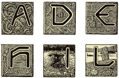
INITIAL LETTERS DESIGNED BY ARTUR SJÖGREN
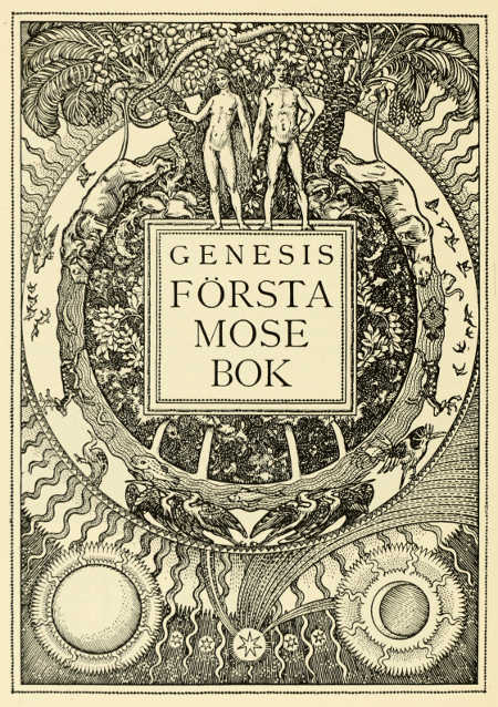
HALF-TITLE PAGE FROM GUSTAV V'S BIBLE. DESIGNED BY OLLE HJORTZBERG. PRINTED BY BRÖDERNA LAGERSTRÖM
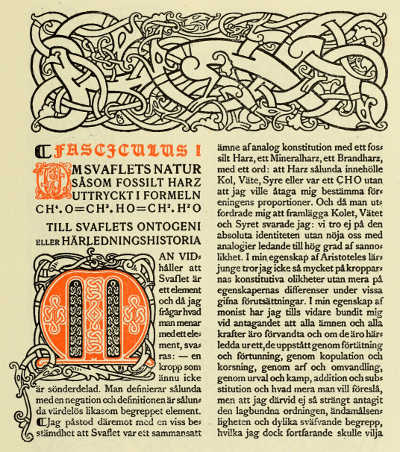
PAGE FROM AUGUST STRINDBERG'S “ANTIBARBARUS.” WITH DECORATIONS BY ARTUR SJÖGREN. PRINTED BY BRÖDERNA LAGERSTRÖM
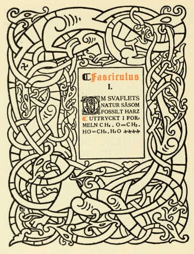
PAGE FROM AUGUST STRINDBERG'S “ANTIBARBARUS.” WITH DECORATIONS BY ARTUR SJÖGREN. PRINTED BY BRÖDERNA LAGERSTRÖM
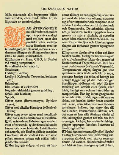
PAGE FROM AUGUST STRINDBERG'S “ANTIBARBARUS.” WITH INITIAL LETTER BY ARTUR SJÖGREN. PRINTED BY BRÖDERNA LAGERSTRÖM
![PAGE FROM AUGUST STRINDBERG'S “ANTIBARBARUS.”
(see previous pages)] PRINTED BY BRÖDERNA LAGERSTRÖM](images/i_260.jpg)
PAGE FROM AUGUST STRINDBERG'S “ANTIBARBARUS.” (see previous pages)] PRINTED BY BRÖDERNA LAGERSTRÖM
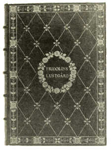 |
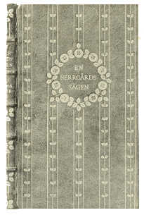 |
BOOKBINDING IN NIGER MOROCCO, WITH INLAY AND GOLD TOOLING. BY GRETA MORSSING |
BOOKBINDING IN NIGER MOROCCO, WITH INLAY AND GOLD TOOLING. BY GRETA MORSSING |
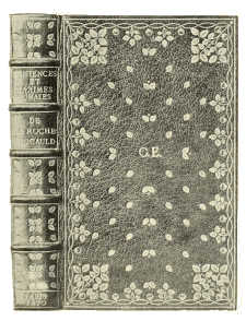 |
 |
BOOKBINDING IN RED MOROCCO, WITH INLAY AND GOLD TOOLING. BY GRETA MORSSING |
BOOKBINDING IN TOOLED LEATHER. BY COUNTESS EVA SPARRE |
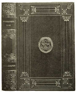 |
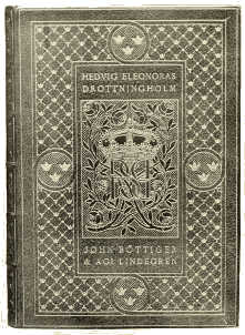 |
BOOKBINDING IN RED CALF, WITH GOLD TOOLING BY GUSTAF HEDBERG |
BOOKBINDING IN BLUE MOROCCO, WITH INLAY AND GOLD TOOLING BY GUSTAF HEDBERG |
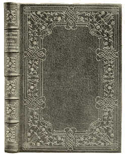 |
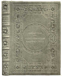 |
BOOKBINDING IN GREEN MOROCCO, WITH GOLD TOOLING BY GUSTAF HEDBERG |
BOOKBINDING IN BROWN MOROCCO, WITH INLAY AND GOLD TOOLING BY GUSTAF HEDBERG |
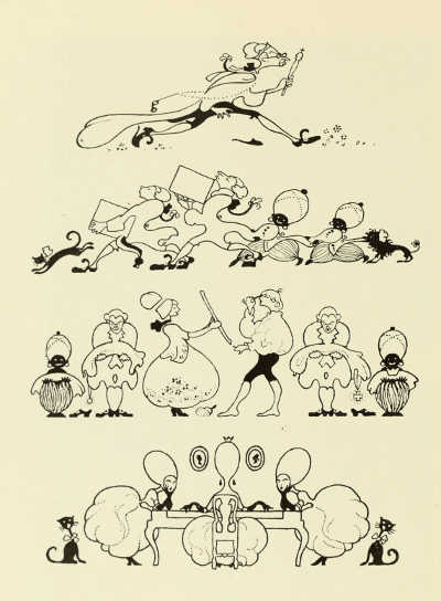
HEAD-PIECES BY EINAR NERMAN FOR HANS ANDERSEN'S “PER SVINAHERDE.” PUBLISHED BY P. A. NORSTEDT UND SÖNER
[258]
[259]
THE ART OF THE BOOK IN AMERICA BY WILLIAM DANA ORCUTT
THE Art of the Book in America received a tremendous impetus as a result of the work of William Morris in England. Previous to that time American printing showed no originality, the finest examples being based firmly upon the best English work of the period. The highest point of excellence was reached during the decade from 1860 to 1870, and no better example of orthodox printing could be cited than the “Life of Prescott,” produced by the University Press in 1864. After 1870, and down to the date of the Morris revival, well-made volumes were issued from the University, the Riverside and the De Vinne Presses, but the average quality deteriorated. The transition of book-making from a trade to an art dates from the appearance of the Kelmscott volumes.
Naturally enough, the early effect of the enthusiasm over Morris's work was the issuance of a series of monstrosities; but the very mistakes made by these zealous typographical disciples were educational, producing a momentum which finally brought excellent results. Those who copied Morris failed; those who were encouraged by his departure from the beaten track to think for themselves succeeded in retaining the basic principles upon which the work of the master printers has always firmly rested, applying them in the light of modern conditions, and giving them originality by their individual experiments. Morris's work made men think, broke down the smugness of precedent, and enabled printing to become an art.
Cobden-Sanderson's work accomplished much in helping American printing to assume a sane status after the hectic enthusiasm of the Morris period. Students of typography came to realize that William Morris belonged to the great decorators rather than to the master printers; that it was his superb presswork, and the general harmony of the factors which went into his books, rather than his typography overloaded with design, which represented his real contribution to the making of the Book Ideal. When the Doves Press, in continuing Morris's work, substituted a more classical fount of type, based upon an Italian model of the fifteenth century, there was a quick response in America in dropping the tendency towards the Gothic, engendered by the type faces cut by the Kelmscott Press. During the next ten years more original and better types were cut, and volumes were produced which carried printing as an art to a higher point than it had previously attained.
Of the types cut under the so-called Gothic influence, the “Renner” of the De Vinne Press is among the best. Theodore L. De Vinne, whose recent death removed the doyen of American master printers, was responsible for the well-sustained reputation of his Press during his active[260] association with it. As a technical master of typography, and in his magnificent presswork, he translated himself into his books, but the exactness of his training is reproduced in his translation of Renner's design into the rigidity of modern type. The page which is reproduced here (p. 264), taken from one of the many superb Grolier Club publications produced by the De Vinne Press, shows both the Renner model and the modern expression of it as interpreted by Mr. De Vinne. The oblique serif of the e,the fancy curve to the h, and the superfluous curl at the top of the g introduce features which are foreign to the model, and give to the modern type a “jobbiness” which unquestionably detracts from the otherwise dignified appearance of the face.
The Gilliss Press, whose work is now suspended, has contributed its share to the renaissance of printing in America. Its limited editions of the books of William Loring Andrews and other volumes issued for private distribution show excellence of workmanship and harmony in conception rather than originality in treatment. Instead of specially designed type, these volumes are rich in decoration, the artistic quality of which ranks with the best.
At the Merrymount Press, Mr. D. Berkeley Updike has produced a number of volumes which have made their impress upon American typography because of his sincerity in carrying out his announced purpose of “undertaking the work of to-day in the spirit of the best days of printing.” Two special faces of type have been designed for the Merrymount Press, both of which are among the successful faces cut in America. The “Montallegro” type, designed by Herbert P. Horne, of London, is used in the volumes of the “Humanistic Library,” issued by Mr. Updike, of which a page is here given (p. 265). Of the type the London Athenæum says: “We are inclined to say not only that it is better than any of the many attempts which have resulted from Morris's revival of the art of printing, but also that it is even more perfect than any of the fifteenth-century founts on the study of which that revival was based. It is ... absolutely without affectation ... and so perfectly are the proportions of the letters harmonized that every page is a thing of beauty. We regret that it was reserved for an American printer to bring out such an admirable fount.... It is the first time that a fount has been designed in modern times which satisfies at once practical and æsthetic demands. Mr. Horne has solved a problem which has exercised us ever since we began to think again that printing was an art.”
The “Merrymount” type, designed by Bertram Grosvenor Goodhue, is based upon fifteenth-century models, and has attracted much favourable comment. The “Holy Bible” and the “Life of Benvenuto Cellini,” from which pages are here reproduced (p. 269), are representative examples both of the type and of the typographical standards of the Press.
The writer of this present article[261] would hesitate to include his own design of “Humanistic” type except that it has come to be accepted by typographical students as representing an approach to the art from a standpoint entirely different from that of other designers. The first types were naturally based upon the best hand-lettering of their time, yet hand-lettering, as an art, reached its zenith after printing began, in the work of the Humanistic scribes. This type is based therefore not upon an early type, but upon hand-lettering at its highest point of perfection. The pages which are shown here (pp. 266 and 267) have been taken from “The Triumphs of Francesco Petrarch,” produced at the University Press under the writer's supervision. An examination of these pages will show that the principle upon which the fount is cut differs radically from that shown in regular modern types, namely, the ascending letters are short and the descending letters long. The designs of the letters closely follow those of the handwritten model, yet avoid the inevitable slight irregularity of such work, which would prove unpleasant in a printed page. Instead of a single character for each letter, a certain variety is introduced by having several characters, the compositor being trained to use the different forms exactly as the hand would automatically make a change in hand-lettering. Charles Eliot Norton says of this: “Most modern type lacks freshness and individuality, and the new fount to which the name 'Humanistic' has been given shows its contrast to the familiar dry, mechanical form. There is attractive freedom and unusual grace in its lines, derived immediately from the manuscript model, but adapted to the necessary rigid requirements of print.”
Among other important volumes produced at the University Press are those decorated by Bertram Grosvenor Goodhue and Will Bradley, two artists whose work in book-decoration stands in a class by itself. Much of Goodhue's work reflects the Morris influence, as will be seen in the page shown from “Esther” (p. 268); but his ability in original design is indicated by the border and initial of the “Songs of Heredia,” which is given on the same page.
Bradley's work evidences the greatest versatility of any decorative artist America has produced. Some of his work shows Beardsley's influence, but no single influence could control so original a genius as Bradley has proved himself to be. The two examples reproduced here (pp. 270 and 271) represent the extremes in his work—one drawn with a delicacy and accuracy of line which is marvellous in its execution; the other bold and heavy, giving a woodcut effect.
No one artist-printer has contributed so much to American typography as Bruce Rogers, whose “Montaigne” type is easily the best and most practical of any special face, and whose productions while associated with the Riverside Press are marked by an originality and a consistency of excellence beyond what has been attained by any other[262] American printer. He, better than anyone else, through his knowledge of types and his skill as a designer, has given expression to the basic principles of the old-time master printers awakened by modern conditions. His monumental folio edition of Montaigne—pages of which are reproduced here (pp. 272 and 273)—demonstrates a harmony of effect eminently appropriate to the style and period of its contents. The type itself is based upon an early French model, and the decorations and the initial letters (p. 274) are free renderings by Rogers of the original designs by Tory, in which the retention of the designer's spirit is admirably accomplished.
During the past five years the Plimpton Press has contributed much to elevate the standard of printing and binding by abolishing to a large extent the prevalent custom of publishers to produce their volumes by “piecemeal.” This has resulted in changing the making of books from a contracting to a manufacturing business, and has had its effect in raising the quality of the so-called “trade” volumes. When the composition, presswork, and binding of a book are divided up among as many firms, the result of the divided responsibility often means a general deterioration of quality; but by the “complete manufacture” method the volume is planned out in advance, even to the paper, cover design, and illustrations, by a single mind. This places the printer in the position of expert manufacturing man to a large number of his customers, and enables him to preserve standards and to introduce economies by purchasing supplies in larger quantities, and by combining forms of text and illustrations in the manufacture.
The influence which a publisher can exert upon the Art of the Book is shown by the series of classics issued in exquisite form by Mr. Thomas B. Mosher, at prices within the reach of all. These volumes are distinct evidences of his own taste and knowledge rather than triumphs of the printer, for Mr. Mosher has expressed himself in the type, margins, paper, and the general format of his admirable publications.
It would be difficult to estimate the far-reaching results in the general advance in typographical standards due to two magazines, The Printing Art and The Graphic Arts. The monthly issues of these publications have shown ordinary printers how to produce work above the average by placing before them actual examples of the best combinations of type, paper, and colour harmonies. They have been educational in the extreme, teaching buyers of printing as well as printers how to secure the effects desired.
In the matter of domestic production America shows little originality in book-papers, the “Old Stratford” being the only distinctive exception. No hand-made book-paper is now produced in America, owing principally to the high cost of labour. This makes it possible to import from England, France, and Italy cheaper than to manufacture at home. The “Old Stratford” paper,[263] however, is a unique product, and is used much in volumes of de luxe format, and in books where lasting qualities are demanded. In cover-papers, on the other hand, America produces a bewildering line, which quite excels those of other countries, offering a variety of selection which is a tremendous aid to the printer in securing artistic results.
Fine bookbinding in America is at present confined to a small number of individual workers, mostly pupils of the famous English and French binders, and their principal claim to originality of processes may be said to be an effort to combine the workmanship of the English with the artistic skill in decoration of the French. The Club Bindery, which flourished in New York during the lifetime of Mr. Robert Hoe, could scarcely be called an American institution, as its best workmen were brought to this country for this special purpose. Since his death this bindery has been broken up, and the finest work is to-day being done by women. Their skill and workmanship rank high, but they are handicapped by the excessive cost of labour and by the fact that all their leathers must be imported. The inevitable higher price makes it natural that American book-collectors should continue to send their volumes abroad for fine bindings. Amongst those whose work is most highly prized may be mentioned Miss Sears and Miss St. John of Boston, and Miss Lahey of New York.
In ordinary trade bindings the processes are more and more reduced to machine production, but in the best binderies this standardization has by no means proved a deterioration in quality. American trade books as a whole compare favourably with those of other countries, but it is quite true that the constantly increasing cost of every phase of book manufacture is in some instances causing American publishers to economize, and to accept a grade of work inferior to what they would have considered a few years ago. This, however, should not be regarded as a reflection upon American workmanship, but rather upon American conditions which force it. In cover design plain lettering still obtains for books of fiction and for serious works, but considerable elaboration is used upon smaller volumes issued as seasonable publications, or with a specific appeal. A few characteristic examples are reproduced on pp. 275 and 276.
It is impossible, within the scope of this article, to do more than chronicle some of the results of the remarkable advance made in the standards of book-manufacturing in America during the past ten years. The knowledge of what constitutes a well-made volume is much greater than ever before, and the ability of the buying public to discriminate is the most hopeful promise for the future. In the omission of other examples of printing and binding, and of mention of other artists entitled to credit for the part they have played in advancing the Art of the Book in America, the writer pleads the limitations imposed by space.
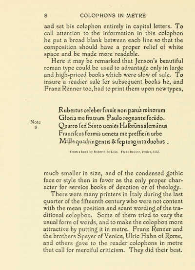
PAGE FROM “TITLE-PAGES” (THE GROLIER CLUB) PRINTED IN THE “RENNER” TYPE DESIGNED BY THEODORE LOW DE VINNE
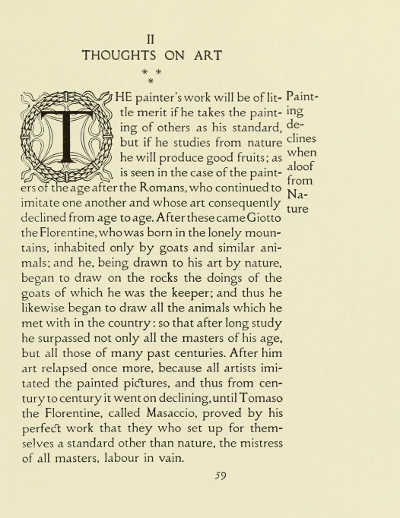
MERRYMOUNT PRESS: PAGE FROM “THE HUMANISTIC LIBRARY” PRINTED IN THE “MONTALLEGRO” TYPE DESIGNED BY HERBERT P. HORNE
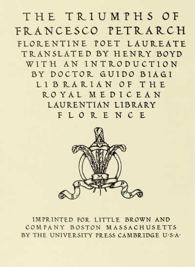
TITLE-PAGE FROM “THE TRIUMPHS OF FRANCESCO PETRARCH” (LITTLE, BROWN AND CO. AND JOHN MURRAY) PRINTED IN THE “HUMANISTIC” TYPE DESIGNED BY WILLIAM DANA ORCUTT
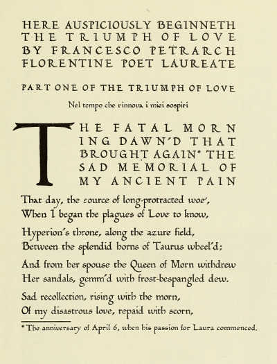
PAGE FROM “THE TRIUMPHS OF FRANCESCO PETRARCH” (LITTLE, BROWN AND CO. AND JOHN MURRAY) PRINTED IN THE “HUMANISTIC” TYPE DESIGNED BY WILLIAM DANA ORCUTT
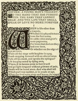 |
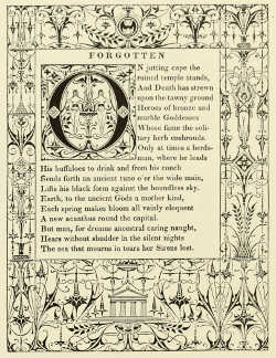 |
BORDER AND INITIAL LETTERS DESIGNED BY BERTRAM GROSVENOR GOODHUE FOR “ESTHER” (COPELAND AND DAY) |
BORDER AND INITIAL LETTER DESIGNED BY BERTRAM GROSVENOR GOODHUE FOR “SONGS OF HEREDIA” (SMALL, MAYNARD AND CO.) |
MERRYMOUNT PRESS: TITLE AND OPENING PAGES PRINTED IN THE “MERRYMOUNT” TYPE DESIGNED BY BERTRAM GROSVENOR GOODHUE
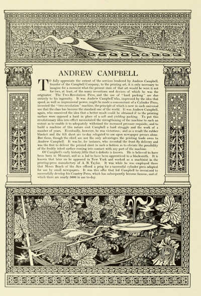
PAGE DESIGNED BY WILL BRADLEY FROM “THE CAMPBELL BOOK”
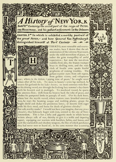
BORDER AND INITIAL LETTER DESIGNED BY WILL BRADLEY. FROM “THE CAMPBELL BOOK”
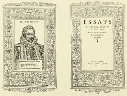
FRONTISPIECE AND TITLE-PAGE DESIGNED BY BRUCE ROGERS FROM “ESSAYS OF MONTAIGNE” (HOUGHTON, MIFFLIN AND CO.)
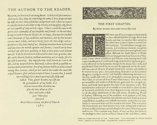
OPENING PAGES PRINTED IN THE “MONTAIGNE” TYPE DESIGNED BY BRUCE ROGERS FROM “ESSAYS OF MONTAIGNE” (HOUGHTON, MIFFLIN AND CO.)
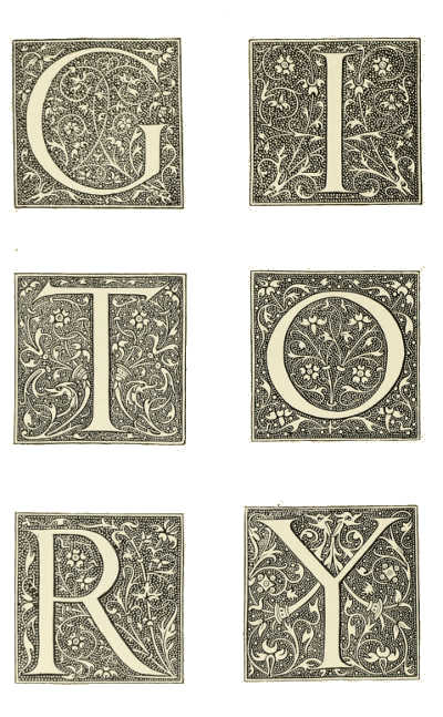
INITIAL LETTERS DESIGNED BY BRUCE ROGERS. FROM “ESSAYS OF MONTAIGNE” (HOUGHTON, MIFFLIN AND CO.)
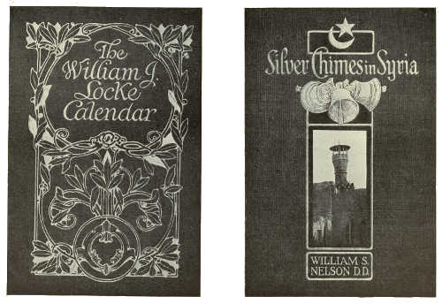
BINDING-CASES BY THE PLIMPTON PRESS STUDIO
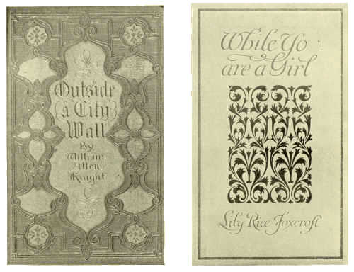
BINDING-CASES BY THE PLIMPTON PRESS STUDIO
End of the Project Gutenberg EBook of The Art of the Book, by
Bernard H. Newdigate and Douglas Cockerell and L. Deubner and E. A. Taylor

*** END OF THIS PROJECT GUTENBERG EBOOK THE ART OF THE BOOK ***

***** This file should be named 45968-h.htm or 45968-h.zip *****
This and all associated files of various formats will be found in:
        http://www.gutenberg.org/4/5/9/6/45968/

Produced by Chris Curnow, Turgut Dincer and the Online
Distributed Proofreading Team at http://www.pgdp.net (This
file was produced from images generously made available
by The Internet Archive)


Updated editions will replace the previous one--the old editions
will be renamed.

Creating the works from public domain print editions means that no
one owns a United States copyright in these works, so the Foundation
(and you!) can copy and distribute it in the United States without
permission and without paying copyright royalties.  Special rules,
set forth in the General Terms of Use part of this license, apply to
copying and distributing Project Gutenberg-tm electronic works to
protect the PROJECT GUTENBERG-tm concept and trademark.  Project
Gutenberg is a registered trademark, and may not be used if you
charge for the eBooks, unless you receive specific permission.  If you
do not charge anything for copies of this eBook, complying with the
rules is very easy.  You may use this eBook for nearly any purpose
such as creation of derivative works, reports, performances and
research.  They may be modified and printed and given away--you may do
practically ANYTHING with public domain eBooks.  Redistribution is
subject to the trademark license, especially commercial
redistribution.


*** START: FULL LICENSE ***

THE FULL PROJECT GUTENBERG LICENSE
PLEASE READ THIS BEFORE YOU DISTRIBUTE OR USE THIS WORK

To protect the Project Gutenberg-tm mission of promoting the free
distribution of electronic works, by using or distributing this work
(or any other work associated in any way with the phrase "Project
Gutenberg"), you agree to comply with all the terms of the Full Project
Gutenberg-tm License available with this file or online at
  www.gutenberg.org/license.


Section 1.  General Terms of Use and Redistributing Project Gutenberg-tm
electronic works

1.A.  By reading or using any part of this Project Gutenberg-tm
electronic work, you indicate that you have read, understand, agree to
and accept all the terms of this license and intellectual property
(trademark/copyright) agreement.  If you do not agree to abide by all
the terms of this agreement, you must cease using and return or destroy
all copies of Project Gutenberg-tm electronic works in your possession.
If you paid a fee for obtaining a copy of or access to a Project
Gutenberg-tm electronic work and you do not agree to be bound by the
terms of this agreement, you may obtain a refund from the person or
entity to whom you paid the fee as set forth in paragraph 1.E.8.

1.B.  "Project Gutenberg" is a registered trademark.  It may only be
used on or associated in any way with an electronic work by people who
agree to be bound by the terms of this agreement.  There are a few
things that you can do with most Project Gutenberg-tm electronic works
even without complying with the full terms of this agreement.  See
paragraph 1.C below.  There are a lot of things you can do with Project
Gutenberg-tm electronic works if you follow the terms of this agreement
and help preserve free future access to Project Gutenberg-tm electronic
works.  See paragraph 1.E below.

1.C.  The Project Gutenberg Literary Archive Foundation ("the Foundation"
or PGLAF), owns a compilation copyright in the collection of Project
Gutenberg-tm electronic works.  Nearly all the individual works in the
collection are in the public domain in the United States.  If an
individual work is in the public domain in the United States and you are
located in the United States, we do not claim a right to prevent you from
copying, distributing, performing, displaying or creating derivative
works based on the work as long as all references to Project Gutenberg
are removed.  Of course, we hope that you will support the Project
Gutenberg-tm mission of promoting free access to electronic works by
freely sharing Project Gutenberg-tm works in compliance with the terms of
this agreement for keeping the Project Gutenberg-tm name associated with
the work.  You can easily comply with the terms of this agreement by
keeping this work in the same format with its attached full Project
Gutenberg-tm License when you share it without charge with others.

1.D.  The copyright laws of the place where you are located also govern
what you can do with this work.  Copyright laws in most countries are in
a constant state of change.  If you are outside the United States, check
the laws of your country in addition to the terms of this agreement
before downloading, copying, displaying, performing, distributing or
creating derivative works based on this work or any other Project
Gutenberg-tm work.  The Foundation makes no representations concerning
the copyright status of any work in any country outside the United
States.

1.E.  Unless you have removed all references to Project Gutenberg:

1.E.1.  The following sentence, with active links to, or other immediate
access to, the full Project Gutenberg-tm License must appear prominently
whenever any copy of a Project Gutenberg-tm work (any work on which the
phrase "Project Gutenberg" appears, or with which the phrase "Project
Gutenberg" is associated) is accessed, displayed, performed, viewed,
copied or distributed:

This eBook is for the use of anyone anywhere at no cost and with
almost no restrictions whatsoever.  You may copy it, give it away or
re-use it under the terms of the Project Gutenberg License included
with this eBook or online at www.gutenberg.org

1.E.2.  If an individual Project Gutenberg-tm electronic work is derived
from the public domain (does not contain a notice indicating that it is
posted with permission of the copyright holder), the work can be copied
and distributed to anyone in the United States without paying any fees
or charges.  If you are redistributing or providing access to a work
with the phrase "Project Gutenberg" associated with or appearing on the
work, you must comply either with the requirements of paragraphs 1.E.1
through 1.E.7 or obtain permission for the use of the work and the
Project Gutenberg-tm trademark as set forth in paragraphs 1.E.8 or
1.E.9.

1.E.3.  If an individual Project Gutenberg-tm electronic work is posted
with the permission of the copyright holder, your use and distribution
must comply with both paragraphs 1.E.1 through 1.E.7 and any additional
terms imposed by the copyright holder.  Additional terms will be linked
to the Project Gutenberg-tm License for all works posted with the
permission of the copyright holder found at the beginning of this work.

1.E.4.  Do not unlink or detach or remove the full Project Gutenberg-tm
License terms from this work, or any files containing a part of this
work or any other work associated with Project Gutenberg-tm.

1.E.5.  Do not copy, display, perform, distribute or redistribute this
electronic work, or any part of this electronic work, without
prominently displaying the sentence set forth in paragraph 1.E.1 with
active links or immediate access to the full terms of the Project
Gutenberg-tm License.

1.E.6.  You may convert to and distribute this work in any binary,
compressed, marked up, nonproprietary or proprietary form, including any
word processing or hypertext form.  However, if you provide access to or
distribute copies of a Project Gutenberg-tm work in a format other than
"Plain Vanilla ASCII" or other format used in the official version
posted on the official Project Gutenberg-tm web site (www.gutenberg.org),
you must, at no additional cost, fee or expense to the user, provide a
copy, a means of exporting a copy, or a means of obtaining a copy upon
request, of the work in its original "Plain Vanilla ASCII" or other
form.  Any alternate format must include the full Project Gutenberg-tm
License as specified in paragraph 1.E.1.

1.E.7.  Do not charge a fee for access to, viewing, displaying,
performing, copying or distributing any Project Gutenberg-tm works
unless you comply with paragraph 1.E.8 or 1.E.9.

1.E.8.  You may charge a reasonable fee for copies of or providing
access to or distributing Project Gutenberg-tm electronic works provided
that

- You pay a royalty fee of 20% of the gross profits you derive from
     the use of Project Gutenberg-tm works calculated using the method
     you already use to calculate your applicable taxes.  The fee is
     owed to the owner of the Project Gutenberg-tm trademark, but he
     has agreed to donate royalties under this paragraph to the
     Project Gutenberg Literary Archive Foundation.  Royalty payments
     must be paid within 60 days following each date on which you
     prepare (or are legally required to prepare) your periodic tax
     returns.  Royalty payments should be clearly marked as such and
     sent to the Project Gutenberg Literary Archive Foundation at the
     address specified in Section 4, "Information about donations to
     the Project Gutenberg Literary Archive Foundation."

- You provide a full refund of any money paid by a user who notifies
     you in writing (or by e-mail) within 30 days of receipt that s/he
     does not agree to the terms of the full Project Gutenberg-tm
     License.  You must require such a user to return or
     destroy all copies of the works possessed in a physical medium
     and discontinue all use of and all access to other copies of
     Project Gutenberg-tm works.

- You provide, in accordance with paragraph 1.F.3, a full refund of any
     money paid for a work or a replacement copy, if a defect in the
     electronic work is discovered and reported to you within 90 days
     of receipt of the work.

- You comply with all other terms of this agreement for free
     distribution of Project Gutenberg-tm works.

1.E.9.  If you wish to charge a fee or distribute a Project Gutenberg-tm
electronic work or group of works on different terms than are set
forth in this agreement, you must obtain permission in writing from
both the Project Gutenberg Literary Archive Foundation and Michael
Hart, the owner of the Project Gutenberg-tm trademark.  Contact the
Foundation as set forth in Section 3 below.

1.F.

1.F.1.  Project Gutenberg volunteers and employees expend considerable
effort to identify, do copyright research on, transcribe and proofread
public domain works in creating the Project Gutenberg-tm
collection.  Despite these efforts, Project Gutenberg-tm electronic
works, and the medium on which they may be stored, may contain
"Defects," such as, but not limited to, incomplete, inaccurate or
corrupt data, transcription errors, a copyright or other intellectual
property infringement, a defective or damaged disk or other medium, a
computer virus, or computer codes that damage or cannot be read by
your equipment.

1.F.2.  LIMITED WARRANTY, DISCLAIMER OF DAMAGES - Except for the "Right
of Replacement or Refund" described in paragraph 1.F.3, the Project
Gutenberg Literary Archive Foundation, the owner of the Project
Gutenberg-tm trademark, and any other party distributing a Project
Gutenberg-tm electronic work under this agreement, disclaim all
liability to you for damages, costs and expenses, including legal
fees.  YOU AGREE THAT YOU HAVE NO REMEDIES FOR NEGLIGENCE, STRICT
LIABILITY, BREACH OF WARRANTY OR BREACH OF CONTRACT EXCEPT THOSE
PROVIDED IN PARAGRAPH 1.F.3.  YOU AGREE THAT THE FOUNDATION, THE
TRADEMARK OWNER, AND ANY DISTRIBUTOR UNDER THIS AGREEMENT WILL NOT BE
LIABLE TO YOU FOR ACTUAL, DIRECT, INDIRECT, CONSEQUENTIAL, PUNITIVE OR
INCIDENTAL DAMAGES EVEN IF YOU GIVE NOTICE OF THE POSSIBILITY OF SUCH
DAMAGE.

1.F.3.  LIMITED RIGHT OF REPLACEMENT OR REFUND - If you discover a
defect in this electronic work within 90 days of receiving it, you can
receive a refund of the money (if any) you paid for it by sending a
written explanation to the person you received the work from.  If you
received the work on a physical medium, you must return the medium with
your written explanation.  The person or entity that provided you with
the defective work may elect to provide a replacement copy in lieu of a
refund.  If you received the work electronically, the person or entity
providing it to you may choose to give you a second opportunity to
receive the work electronically in lieu of a refund.  If the second copy
is also defective, you may demand a refund in writing without further
opportunities to fix the problem.

1.F.4.  Except for the limited right of replacement or refund set forth
in paragraph 1.F.3, this work is provided to you 'AS-IS', WITH NO OTHER
WARRANTIES OF ANY KIND, EXPRESS OR IMPLIED, INCLUDING BUT NOT LIMITED TO
WARRANTIES OF MERCHANTABILITY OR FITNESS FOR ANY PURPOSE.

1.F.5.  Some states do not allow disclaimers of certain implied
warranties or the exclusion or limitation of certain types of damages.
If any disclaimer or limitation set forth in this agreement violates the
law of the state applicable to this agreement, the agreement shall be
interpreted to make the maximum disclaimer or limitation permitted by
the applicable state law.  The invalidity or unenforceability of any
provision of this agreement shall not void the remaining provisions.

1.F.6.  INDEMNITY - You agree to indemnify and hold the Foundation, the
trademark owner, any agent or employee of the Foundation, anyone
providing copies of Project Gutenberg-tm electronic works in accordance
with this agreement, and any volunteers associated with the production,
promotion and distribution of Project Gutenberg-tm electronic works,
harmless from all liability, costs and expenses, including legal fees,
that arise directly or indirectly from any of the following which you do
or cause to occur: (a) distribution of this or any Project Gutenberg-tm
work, (b) alteration, modification, or additions or deletions to any
Project Gutenberg-tm work, and (c) any Defect you cause.


Section  2.  Information about the Mission of Project Gutenberg-tm

Project Gutenberg-tm is synonymous with the free distribution of
electronic works in formats readable by the widest variety of computers
including obsolete, old, middle-aged and new computers.  It exists
because of the efforts of hundreds of volunteers and donations from
people in all walks of life.

Volunteers and financial support to provide volunteers with the
assistance they need are critical to reaching Project Gutenberg-tm's
goals and ensuring that the Project Gutenberg-tm collection will
remain freely available for generations to come.  In 2001, the Project
Gutenberg Literary Archive Foundation was created to provide a secure
and permanent future for Project Gutenberg-tm and future generations.
To learn more about the Project Gutenberg Literary Archive Foundation
and how your efforts and donations can help, see Sections 3 and 4
and the Foundation information page at www.gutenberg.org


Section 3.  Information about the Project Gutenberg Literary Archive
Foundation

The Project Gutenberg Literary Archive Foundation is a non profit
501(c)(3) educational corporation organized under the laws of the
state of Mississippi and granted tax exempt status by the Internal
Revenue Service.  The Foundation's EIN or federal tax identification
number is 64-6221541.  Contributions to the Project Gutenberg
Literary Archive Foundation are tax deductible to the full extent
permitted by U.S. federal laws and your state's laws.

The Foundation's principal office is located at 4557 Melan Dr. S.
Fairbanks, AK, 99712., but its volunteers and employees are scattered
throughout numerous locations.  Its business office is located at 809
North 1500 West, Salt Lake City, UT 84116, (801) 596-1887.  Email
contact links and up to date contact information can be found at the
Foundation's web site and official page at www.gutenberg.org/contact

For additional contact information:
     Dr. Gregory B. Newby
     Chief Executive and Director
     [email protected]

Section 4.  Information about Donations to the Project Gutenberg
Literary Archive Foundation

Project Gutenberg-tm depends upon and cannot survive without wide
spread public support and donations to carry out its mission of
increasing the number of public domain and licensed works that can be
freely distributed in machine readable form accessible by the widest
array of equipment including outdated equipment.  Many small donations
($1 to $5,000) are particularly important to maintaining tax exempt
status with the IRS.

The Foundation is committed to complying with the laws regulating
charities and charitable donations in all 50 states of the United
States.  Compliance requirements are not uniform and it takes a
considerable effort, much paperwork and many fees to meet and keep up
with these requirements.  We do not solicit donations in locations
where we have not received written confirmation of compliance.  To
SEND DONATIONS or determine the status of compliance for any
particular state visit www.gutenberg.org/donate

While we cannot and do not solicit contributions from states where we
have not met the solicitation requirements, we know of no prohibition
against accepting unsolicited donations from donors in such states who
approach us with offers to donate.

International donations are gratefully accepted, but we cannot make
any statements concerning tax treatment of donations received from
outside the United States.  U.S. laws alone swamp our small staff.

Please check the Project Gutenberg Web pages for current donation
methods and addresses.  Donations are accepted in a number of other
ways including checks, online payments and credit card donations.
To donate, please visit:  www.gutenberg.org/donate


Section 5.  General Information About Project Gutenberg-tm electronic
works.

Professor Michael S. Hart was the originator of the Project Gutenberg-tm
concept of a library of electronic works that could be freely shared
with anyone.  For forty years, he produced and distributed Project
Gutenberg-tm eBooks with only a loose network of volunteer support.

Project Gutenberg-tm eBooks are often created from several printed
editions, all of which are confirmed as Public Domain in the U.S.
unless a copyright notice is included.  Thus, we do not necessarily
keep eBooks in compliance with any particular paper edition.

Most people start at our Web site which has the main PG search facility:

     www.gutenberg.org

This Web site includes information about Project Gutenberg-tm,
including how to make donations to the Project Gutenberg Literary
Archive Foundation, how to help produce our new eBooks, and how to
subscribe to our email newsletter to hear about new eBooks.