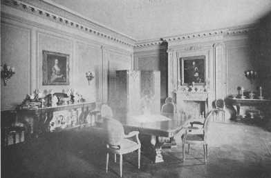

Trowbridge & Livingston, architects. A principle which can be applied to both large and small houses is shown in the beauty of the panel spacing and the adequate support of the cornice by the pilasters
| A modern dining-room | Frontispiece |
| FACING PAGE | |
| Italian Renaissance fireplace and overmantel, modern | 8 |
| Doorways and pilaster details, Italian Renaissance | 9 |
| Two Louis XIII chairs | 22 |
| A Gothic chair of the fifteenth century | 23 |
| A Louis XIV chair | 32 |
| Louis XIV inlaid desk-table | 33 |
| Louis XIV chair with underbracing | 33 |
| A modern French drawing-room | 40 |
| A drawing-room, old French furniture and tapestry | 41 |
| Early Louis XIV chair | 44 |
| Louis XV bergère | 44 |
| Louis XVI bench | 45 |
| Louis XVI from Fontainebleau | 50 |
| American Empire bed | 51 |
| An Apostles bed of the Tudor period | 60 |
| Adaptation of the style of William and Mary to dressing table | 61 |
| Reproduction of Charles II chair | 61 |
| Living-room with reproductions of different periods | 64 |
| Original Jacobean sofa | 65 |
| Reproductions of Charles II chairs | 65 |
| Reproductions of Queen Anne period | 72 |
| Reproduction of James II chair | 73 |
| Reproduction of William and Mary chair | 73 |
| Gothic and Ribbonback types of Chippendale chairs | 78 |
| Chippendale mantel mirror showing French influence | 79 |
| Chippendale fretwork tea-table | 79 |
| Chippendale china cupboard | 82 |
| Typical chairs of the eighteenth century | 83 |
| Chippendale and Hepplewhite sofas | 86 |
| Adam mirror, block-front chest of drawers, and Hepplewhite chair | 87 |
| Two Adam mantels | 92 |
| A group of old mirrors | 93 |
| Dining-room furnished with Hepplewhite furniture | 96 |
| Old Hepplewhite sideboard | 97 |
| Reproduction of Hepplewhite settee | 97 |
| Sheraton chest of drawers | 104 |
| Sheraton desk and sewing-table | 105 |
| Dining-room in simple country house | 112 |
| Dining-room furnished with fine old furniture | 113 |
| Dorothy Quincy's bed-room | 124 |
| Two valuable old desks | 125 |
| Pembroke inlaid table | 144 |
| Sheraton sideboard | 144 |
| Four post bed | 145 |
| Doorway detail, Compiègne | 152 |
| Reproduction of a bed owned by Marie Antoinette | 153 |
| Reproduction of Louis XVI bed | 153 |
| A Georgian hallway | 162 |
| Rare block-front chest of drawers | 163 |
| A modern living-room | 178 |
| Curtain treatment for a summer home | 179 |
| Hallway showing rugs | 188 |
| Hallway showing rugs | 189 |
| Colonial bed-room | 189 |
| Dining-room with paneled walls | 196 |
| Four post bed owned by Lafayette | 197 |
| Modern dining-room | 204 |
| Four post bed | 205 |
| Reproductions of Adam painted furniture | 222 |
| Three-chair Sheraton settee | 223 |
| Reproduction of a Sheraton wing-chair | 223 |
| Slat-backed chair | 223 |
| Group of chairs and pie-crust table | 232 |
| Groups of chairs | 233 |
| Reproduction of Jacobean buffet | 236 |
| Group of mirrors | 237 |
| Reproduction of William and Mary settee | 240 |
| Adaptation of Georgian ideas to William and Mary dressing table | 240 |
| Two Adam chairs | 241 |
| Jacobean day-bed | 241 |
| Reproductions of Chippendale table and Hepplewhite desk | 244 |
| Reproduction of Sheraton chest of drawers | 245 |
| Reproduction of William and Mary chest of drawers | 245 |
| A modern sun-room | 246 |
| Sheraton sofa | 247 |
| Hepplewhite chair and nest of tables | 247 |
| Chippendale wing-chair | 247 |
| Modern paneled living-room | 248 |
| Empire bed | 248 |
| Hancock desk, and fine old highboy | 249 |
To try to write a history of furniture in a fairly short space is almost as hard as the square peg and round hole problem. No matter how one tries, it will not fit. One has to leave out so much of importance, so much of historic and artistic interest, so much of the life of the people that helps to make the subject vivid, and has to take so much for granted, that the task seems almost impossible. In spite of this I shall try to give in the following pages a general but necessarily short review of the field, hoping that it may help those wishing to furnish their homes in some special period style. The average person cannot study all the subject thoroughly, but it certainly adds interest to the problems of one's own home to know something of how the great periods of decoration grew one from another, how the influence of art in one country made itself felt in the next, molding and changing taste and educating the people to a higher sense of beauty.
It is the lack of general knowledge which makes it possible for furniture built on amazingly bad lines to be sold masquerading under the name of some great period. The customer soon becomes bewildered, and, unless he has a decided taste of his own, is apt to get something which will prove a white elephant on his hands. One must have some standard of comparison, and the best and simplest way is to study the great work of the past. To study its rise and climax rather than the decline; to know the laws of its perfection so that one can recognize the exaggeration which leads to degeneracy. This ebb and flow is most interesting: the feeling the way at the beginning, ever growing surer and surer until the high level of perfection is reached; and then the desire to "gild the lily" leading to over-ornamentation, and so to decline. However, the germ of good taste and the sense of truth and beauty is never dead, and asserts itself slowly in a transition period, and then once more one of the great periods of decoration is born.
There are several ways to study the subject, one of the pleasantest naturally being travel, as the great museums, palaces, and private collections of Europe offer the widest field. In this country, also, the museums and many private collections are rich in treasures, and there are many proud possessors of beautiful isolated pieces of furniture. If one cannot see originals the libraries will come to the rescue with many books showing research and a thorough knowledge and appreciation of the beauty and importance of the subject in all its branches.
I have tried to give an outline, (which I hope the reader will care to enlarge for himself), not from a collector's standpoint, but from the standpoint of the modern home-maker, to help him furnish his house consistently,—to try to spread the good word that period furnishing does not necessitate great wealth, and that it is as easy and far more interesting to furnish a house after good models, as to have it banal and commonplace.
The first part of this little book is devoted to a short review of the great periods, and the second part is an effort to help adapt them to modern needs, with a few chapters added of general interest to the home-maker.
A short bibliography is also added, both to express my thanks and indebtedness to many learned and delightful writers on this subject of house furnishing in all its branches, and also as a help to others who may wish to go more deeply into its different divisions than is possible within the covers of a book.
I wish to thank the Editors of House and Garden and The Woman's Home Companion for kindly allowing me to reprint articles and portions of articles which have appeared in their magazines.
I wish also to thank the owners of the different houses illustrated, and Messrs. Trowbridge and Livingston, architects, for their kindness in allowing me to use photographs.
Thanks are also due Messrs. Bergen & Orsenigo, Nahon & Company, Tiffany Studios, Joseph Wild & Co. and the John Somma Co. for the use of photographs to illustrate the reproduction of period furniture and rugs of different types.
The early history of art in all countries is naturally connected more closely with architecture than with decoration, for architecture had to be developed before the demand for decoration could come. But the two have much in common. Noble architecture calls for noble decoration. Decoration is one of the natural instincts of man, and from the earliest records of his existence we find him striving to give expression to it, we see it in the scratched pieces of bone and stone of the cave dwellers, in the designs of savage tribes, and in Druidical and Celtic remains, and in the great ruins of Yucatan. The meaning of these monuments may be lost to us, but we understand the spirit of trying to express the sense of beauty in the highest way possible, for it is the spirit which is still moving the world, and is the foundation of all worthy achievement.
Egypt and Assyria stand out against the almost impenetrable curtain of pre-historic days in all the majesty of their so-called civilization. Huge, massive, aloof from the world, their temples and tombs and ruins remain. Research has given us the key to their religion, so we understand much of the meaning of their wall-paintings and the buildings themselves. The belief of the Egyptian that life was a short passage and his house a mere stopping-place on the way to the tomb, which was to be his permanent dwelling-place, explains the great care and labor spent on the pyramids, chapels, and rock sepulchers. They embalmed the dead for all eternity and put statues and images in the tombs to keep the mummy company. Colossal figures of their gods and goddesses guarded the tombs and temples, and still remain looking out over the desert with their strange, inscrutable Egyptian eyes. The people had technical skill which has never been surpassed, but the great size of the pyramids and temples and sphinxes gives one the feeling of despotism rather than civilization; of mass and permanency and the wonder of man's achievement rather than beauty, but they personify the mystery and power of ancient Egypt.
The columns of the temples were massive, those of Karnak being seventy feet high, with capitals of lotus flowers and buds strictly conventionalized. The walls were covered with hieroglyphics and paintings. Perspective was never used, and figures were painted side view except for the eye and shoulder. In the tombs have been found many household belongings, beautiful gold and silver work, beside the offerings put there to appease the gods. Chairs have been found, which, humorous as it may sound, are certainly the ancestors of Empire chairs made thousands of years later. This is explained by the influence of Napoleon's Egyptian campaign, but there is something in common between the two times so far apart, of ambition and pride, of grandeur and colossal enterprise.
Greece may well be called the Mother of Beauty, for with the Greeks came the dawn of a higher civilization, a striving for harmony of line and proportion, an ideal clear, high and persistent. When the Dorians from the northern part of Greece built their simple, beautiful temples to their gods and goddesses they gave the impetus to the movement which brought forth the highest art the world has known. Traces of Egyptian influence are to be found in the earliest temples, but the Greeks soon rose to their own great heights. The Doric column was thick, about six diameters in height, fluted, growing smaller toward the top, with a simple capital, and supported the entablature. The horizontal lines of the architrave and cornice were more marked than the vertical lines of the columns. The portico with its row of columns supported the pediment. The Parthenon is the most perfect example of the Doric order, and shattered as it is by time and man it is still one of the most beautiful buildings in the world. It was built in the time of Pericles, from about 460 to 435 B.C., and the work was superintended by Phidias, who did much of the work himself and left the mark of his genius on the whole.
The Ionic order of architecture was a development of the Doric, but was lighter and more graceful. The columns were more slender and had a greater number of flutes and the capitals formed of scrolls or volutes were more ornamental.
The Corinthian order was more elaborate than the Ionic as the capitals were foliated (the acanthus being used), the columns higher, and the entablature more richly decorated. This order was copied by the Romans more than the other two as it suited their more florid taste. All the orders have the horizontal feeling in common (as Gothic architecture has the vertical), and the simple plan with its perfect harmony of proportion leaves no sense of lack of variety.
The perfection attained in architecture was also attained in sculpture, and we see the same aspiration toward the ideal, the same wonderful achievement. This purity of taste of the Greeks has formed a standard to which the world has returned again and again and whose influence will continue to be felt as long as the world lasts.
The minor arts were carried to the same state of perfection as their greater sisters, for the artists and artisans had the same noble ideal of beauty and the same unerring taste. We have carved gems and coins, and wonderful gold ornaments, painted and silver vases, and terra-cotta figurines, to show what a high point the household arts reached. No work of the great Grecian painters remains; Apelles, Zeuxis, are only names to us, but from the wall paintings at Pompeii where late Greek influence was strongly felt we can imagine how charming the decorations must have been. Egypt and Greece were the torch bearers of civilization.
The Gothic period has been treated in later chapters on France and England, as it is its development in these countries which most affects us, but the Renaissance in Italy stands alone. So great was its strength that it could supply both inspiration and leaders to other countries, and still remain preëminent.
It was in the fifteenth and sixteenth centuries that this great classical revival in Italy came, this re-birth of a true sense of beauty which is called the Renaissance. It was an age of wonders, of great artistic creations, and was one of the great epochs of the world, one of the turning points of human existence. It covered so large a field and was so many-sided that only careful study can give a full realization of the giants of intellect and power who made its greatness, and who left behind them work that shows the very quintessence of genius.
Italy, stirring slightly in the fourteenth century, woke and rose to her greatest heights in the fifteenth and sixteenth. The whole people responded to the new joy of life, the love of learning, the expression of beauty in all its forms. All notes were struck,—gay, graceful, beautiful, grave, cruel, dignified, reverential, magnificent, but all with an exuberance of life and power that gave to Italian art its great place in human culture. The great names of the period speak for themselves,—Michelangelo, Raphael, Botticelli, Titian, Leonardo da Vinci, Andrea del Sarto, Machiavelli, Benvenuto Cellini, and a host of others.
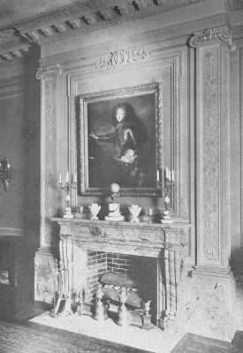
An exquisite and true Renaissance feeling is shown in the pilasters.
The inspiration of the Renaissance came largely from the later Greek schools of art and literature, Alexandria and Rhodes and the colonies in Sicily and Italy, rather than ancient Greece. It was also the influence which came to ancient Rome at its most luxurious period. The importance of the taking of Alexandria and Constantinople in 1453 must not be underestimated, as it drove scholars from the great libraries of the East carrying their manuscripts to the nobles and priests and merchant princes of Italy who thus became enthusiastic patrons of learning and art. This later type of Greek art lacked the austerity of the ancient type, and to the models full of joy and beauty and suffering, the Italians of the Renaissance added the touch of their own temperament and made them theirs in the glowing, rich and astounding way which has never been equaled and probably never will be. Perfection of line and beauty was not sufficient, the soul with its capacity for joy and suffering, "the soul with all its maladies" as Pater says, had become a factor. The impression made upon Michelangelo by seeing the Laocoön disinterred is vividly described by Longfellow—
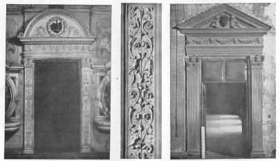
The Italian Renaissance is still inspiring the world. In the two doorways the use of pilasters and frieze, and the pedimented and round over-door motifs are typical of the period.
"It was an age productive in personalities, many-sided, centralized, complete. Artists and philosophers and those whom the action of the world had elevated and made keen, breathed a common air and caught light and heat from each other's thoughts. It is this unity of spirit which gives unity to all the various products of the Renaissance, and it is to this intimate alliance with mind, this participation in the best thoughts which that age produced, that the art of Italy in the fifteenth century owes much of its grave dignity and influence."[A]
[A]Walter Pater: "Studies in the Renaissance."
It is to this unity of the arts we owe the fact that the art of beautifying the home took its proper place. During the Middle Ages the Church had absorbed the greater part of the best man had to give, and home life was rather a hit or miss affair, the house was a fortress, the family possessions so few that they could be packed into chests and easily moved. During the Renaissance the home ideal grew, and, although the Church still claimed the best, home life began to have comforts and beauties never dreamed of before. The walls glowed with color, tapestries and velvets added their beauties, and the noble proportions of the marble halls made a rich background for the elaborately carved furniture.
The doors of Italian palaces were usually inlaid with woods of light shade, and the soft, golden tone given by the process was in beautiful, but not too strong, contrast with the marble architrave of the doorway, which in the fifteenth century was carved in low relief combined with disks of colored marble, sliced, by the way, from Roman temple pillars. Later as the classic taste became stronger the carving gave place to a plain architrave and the over-door took the form of a pediment.
Mantels were of marble, large, beautifully carved, with the fireplace sunk into the thickness of the wall. The overmantel usually had a carved panel, but later, during the sixteenth century, this was sometimes replaced by a picture. The windows of the Renaissance were a part of the decoration of the room, and curtains were not used in our modern manner, but served only to keep out the draughts. In those days the better the house the simpler the curtains. There were many kinds of ceilings used, marble, carved wood, stucco, and painting. They were elaborate and beautiful, and always gave the impression of being perfectly supported on the well-proportioned cornice and walls. The floors were usually of marble. Many of the houses kept to the plan of mediæval exteriors, great expanses of plain walls with few openings on the outsides, but as they were built around open courts, the interiors with their colonnades and open spaces showed the change the Renaissance had brought. The Riccardi Palace in Florence and the Palazzo della Cancelleria in Rome, are examples of this early type. The second phase was represented by the great Bramante, whose theory of restraining decoration and emphasizing the structure of the building has had such important influence. One of his successors was Andrea Palladio, whose work made such a deep impression on Inigo Jones. The Library of St. Mark's at Venice is a beautiful example of this part. The third phase was entirely dominated by Michelangelo.
The furniture, to be in keeping with buildings of this kind, was large and richly carved. Chairs, seats, chests, cabinets, tables, and beds, were the chief pieces used, but they were not plentiful at all in our sense of the word. The chairs and benches had cushions to soften the hard wooden seats. The stuffs of the time were most beautiful Genoese velvet, cloth of gold, tapestries, and wonderful embroideries, all lending their color to the gorgeous picture. The carved marriage chest, or cassone, is one of the pieces of Renaissance furniture which has most often descended to our own day, for such chests formed a very important part of the furnishing in every household, and being large and heavy, were not so easily broken as chairs and tables. Beds were huge, and were architectural in form, a base and roof supported on four columns. The classical orders were used, touched with the spirit of the time, and the fluted columns rose from acanthus leaves set in an urn supported on lion's feet. The tester and cornice gave scope for carving and the panels of the tester usually had the lovely scrolls so characteristic of the period. The headboard was often carved with a coat-of-arms and the curtains hung from inside the cornice.
Grotesques were largely used in ornament. The name is derived from grottoes, as the Roman tombs being excavated at the time were called, and were in imitation of the paintings found on their walls, and while they were fantastic, the word then had no unkindly humorous meaning as now. Scrolls, dolphins, birds, beasts, the human figure, flowers, everything was called into use for carving and painting by genius of the artisans of the Renaissance. They loved their work and felt the beauty and meaning of every line they made, and so it came about that when, in the course of years, they traveled to neighboring countries, they spread the influence of this great period, and it is most interesting to see how on the Italian foundation each country built her own distinctive style.
Like all great movements the Renaissance had its beginning, its splendid climax, and its decline.
When Caesar came to Gaul he did more than see and conquer; he absorbed so thoroughly that we have almost no knowledge of how the Gauls lived, so far as household effects were concerned. The character which descended from this Gallo-Roman race to the later French nation was optimistic and beauty-loving, with a strength which has carried it through many dark days. It might be said to be responsible for the French sense of proportion and their freedom of judgment which has enabled them to hold their important place in the history of art and decoration. They have always assimilated ideas freely but have worked them over until they bore the stamp of their own individuality, often gaining greatly in the process.
One of the first authentic pieces of furniture is a bahut or chest dating from sometime in the twelfth century and belonging to the Church of Obazine. It shows how furniture followed the lines of architecture, and also shows that there was no carving used on it. Large spaces were probably covered with painted canvas, glued on. Later, when panels became smaller and the furniture designs were modified, moldings, etc., began to be used. These bahuts or huches, from which the term huchiers came (meaning the Corporation of Carpenters), were nothing more than chests standing on four feet. From all sources of information on the subject it has been decided that they were probably the chief pieces of furniture the people had. They served as a seat by day and, with cushions spread upon them, as a bed by night. They were also used as tables with large pieces of silver dressé or arranged upon them in the daytime. From this comes our word "dresser" for the kitchen shelves. In those days of brigands and wars and sudden death, the household belongings were as few as possible so that the trouble of speedy transportation would be small, and everything was packed into the chests. As the idea of comfort grew a little stronger, the number of chests grew, and when a traveling party arrived at a stopping-place, out came the tapestries and hangings and cushions and silver dishes, which were arranged to make the rooms seem as cheerful as possible. The germ of the home ideal was there, at least, but it was hard work for the arras and the "ciel" to keep out the cold and cover the bare walls. When life became a little more secure and people learned something of the beauty of proportion, the rooms showed more harmony in regard to the relation of open spaces and walls, and became a decoration in themselves, with the tapestries and hangings enhancing their beauty of line. It was not until some time in the fifteenth century that the habit of traveling with all one's belongings ceased.
The year 1000 was looked forward to with abject terror, for it was firmly believed by all that the world was then coming to an end. It cast a gloom over all the people and paralyzed all ambition. When, however, the fatal year was safely passed, there was a great religious thanksgiving and everyone joined in the praise of a merciful God. The semi-circular arch of the Romanesque style gave way to the pointed arch of the Gothic, and wonderful cathedrals slowly lifted their beautiful spires to the sky. The ideal was to build for the glory of God and not only for the eyes of man, so that exquisite carving was lavished upon all parts of the work. This deeply reverent feeling lasted through the best period of Gothic architecture, and while household furniture was at a standstill church furniture became more and more beautiful, for in the midst of the religious fervor nothing seemed too much to do for the Church. Slowly it died out, and a secular attitude crept into decoration. One finds grotesque carvings appearing on the choir stalls and other parts of churches and cathedrals and the standard of excellence was lowered.
The chest, table, wooden arm-chair, bed, and bench, were as far as the imagination had gone in domestic furniture, and although we read of wonderful tapestries and leather hangings and clothes embroidered in gold and jewels, there was no comfort in our sense of the word, and those brave knights and fair ladies had need to be strong to stand the hardships of life. Glitter and show was the ideal and it was many more years before the standard of comfort and refinement gained a firm foothold.
Gothic architecture and decoration declined from the perfection of the thirteenth and fourteenth centuries to the over-decorated, flamboyant Gothic of the fifteenth century, and it was in the latter period that the transition began between the Gothic and the Renaissance epochs.
The Renaissance was at its height in Italy in the fifteenth century, and its influence began to make itself felt a little in France at that time.
When the French under Louis XII seized Milan, the magnificence of the court of Ludovico Sforza, the great duke of Milan, made such an impression on them that they could not rest content with the old order, and took home many beautiful things. Italian artisans were also imported, and as France was ready for the change, their lessons were learned and the French Renaissance came slowly into existence. This transition is well shown by the Chateau de Gaillon, built by Cardinal d'Amboise. Gothic and Renaissance decoration were placed side by side in panels and furniture, and we also find some pure Gothic decoration as late as the early part of the sixteenth century, but they were in parts of France where tradition changed slowly. Styles overlap in every transition period, so it is often difficult to place the exact date on a piece of furniture; but the old dies out at last and gives way to the new.
With the accession of Frances I in 1515 the Renaissance came into its own in France. He was a great patron of art and letters, and under his fostering care the people knew new luxuries, new beauties, and new comforts. He invited Andrea del Sarto and Leonardo da Vinci to come to France. The word Renaissance means simply revival and it is not correctly used when we mean a distinct style led or inspired by one person. It was a great epoch, with individuality as its leading spirit, led by the inspiration of the Italian artists brought from Italy and molded by the genius of France. This renewal of classic feeling came at the psychological moment, for the true spirit of the great Gothic period had died. The Renaissance movements in Italy, France, England and Germany all drew their inspiration from the same source, but in each case the national characteristics entered into the treatment. The Italians and Germans both used the grotesque a great deal, but the Germans used it in a coarser and heavier way than the Italians, who used it esthetically. The French used more especially conventional and beautiful floral forms, and the inborn French sense of the fitness of things gave the treatment a wonderful charm and beauty. If one studies the French chateaux one will feel the true beauty and spirit of the times—Blois with its history of many centuries, and then some of the purely Renaissance chateaux, like Chambord. Although great numbers of Italian artists came to France, one must not think they did all the beautiful work of the time. The French learned quickly and adapted what they learned to their own needs, so that the delicate and graceful decorations brought from Italy became more and more individualized until in the reign of Henry II the Renaissance reached its high-water mark.
The furniture of the time did not show much change or become more varied or comfortable. It was large and solid and the chairs had the satisfactory effect of good proportion, while the general squareness of outline added to the feeling of solidity. Oak was used, and later walnut. The chair legs were straight, and often elaborately turned, and usually had strainers or under framing. Cushions were simply tied on at first, but the knowledge of upholstering was gaining ground, and by the time of Louis XIII was well understood. Cabinets had an architectural effect in their design. The style of the decorative motive changed, but it is chiefly in architecture and the decorative treatment of it that one sees the true spirit of the Renaissance. Two men who had great influence on the style of furniture of the time were Androuet du Cerceau and Hugues Sambin. They published books of plates that were eagerly copied in all parts of France. Sambin's influence can be traced in the later style of Louis XIV.
 |
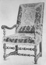 |
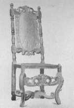
| Louis XIII chair now in the Cluny Museum showing the Flemish influence. | A typical Louis XIII chair, many of which were covered with velvet or tapestry. |
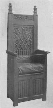
By courtesy of the Metropolitan Museum of Art.
This Gothic chair of the 16th century shows the beautiful linen-fold design in the carving on the lower panels, and also the keyhole which made the chest safe when traveling.
The marriage of Henry II and Catherine de Medici naturally continued the strong Italian influence. The portion of the Renaissance called after Henry II lasted about seventy-five years, and corresponds with the Elizabethan period in England.
During the regency of Marie de Medici, Flemish influence became very strong, as she invited Rubens to Paris to decorate the Luxembourg. There were also many Italians called to do the work, and as Rubens had studied in Italy, Italian influence was not lacking.
Degeneracy began during the reign of Henry IV, as ornament became meaningless and consistency of decoration was lost in a maze of superfluous design.
It was in the reign of Louis XIII that furniture for the first time became really comfortable, and if one examines the engravings of Abraham Bosse one will see that the rooms have an air of homelikeness as well as richness. The characteristic chair of the period was short in the back and square in shape—it was usually covered with leather or tapestry, fastened to the chair with large brass nails, and the back and seat often had a fringe. A set of chairs usually consisted of arm-chairs, plain chairs, folding stools and a lit-de-repos. Many of the arm-chairs were entirely covered with velvet or tapestry, or, if the woodwork showed, it was stained to harmonize with the covering on the seat and back.
The twisted columns used in chairs, bedposts, etc., were borrowed from Italy and were very popular. Another shape often used for chair legs was the X that shows Flemish influence. The lit-de-repos, or chaise-longue, was a seat about six feet long, sometimes with arms and sometimes not, and with a mattress and bolster. The beds were very elaborate and very important in the scheme of decoration, as the ladies of the time held receptions in their bedrooms and the king and nobles gave audiences to their subjects while in bed. These latter were therefore necessarily furnished with splendor. The woodwork was usually covered with the same material as the curtains, or stained to harmonize. The canopy never reached to the ceiling but was, from floor to top, about 7 ft. 3 in. high, and the bed was 6-1/2 ft. square. The curtains were arranged on rods and pulleys, and when closed this "lit en housse" looked like a huge square box. The counterpane, or "coverture de parade," was of the curtain material. The four corners of the canopy were decorated with bunches of plumes or panache, or with a carved wooden ornament called pomme, or with a "bouquet" of silk. The beds were covered with rich stuffs, like tapestry, silk, satin, velvet, cloth-of-gold and silver, etc., all of which were embroidered or trimmed with gold or silver lace. One of the features of a Louis XIII room was the tapestry and hangings. A certain look of dignity was given to the rooms by the general square and heavy outlines of the furniture and the huge chimney-pieces.
The taste for cabinets kept up and the cabinets and presses were large, sometimes divided into two parts, sometimes with doors, sometimes with open frame underneath. The tables were richly carved and gilded, often ornamented with bronze and copper. The cartouche was used a great deal in decoration, with a curved surface. This rounded form appears in the posts used in various kinds of furniture. When rectangles were used they were always broader than high. The garlands of fruit were heavy, the cornucopias were slender, with an astonishing amount of fruit pouring from them, and the work was done in rather low relief. Carved and gilded mirrors were introduced by the Italians as were also sconces and glass chandeliers. It was a time of great magnificence, and shadowed forth the coming glory of Louis XIV. It seems a style well suited to large dining-rooms and libraries in modern houses of importance.
It is often a really difficult matter to decide the exact boundary lines between one period and another, for the new style shows its beginnings before the old one is passed, and the old style still appears during the early years of the new one. It is an overlapping process and the years of transition are ones of great interest. As one period follows another it usually shows a reaction from the previous one; a somber period is followed by a gay one; the excess of ornament in one is followed by restraint in the next. It is the same law that makes us want cake when we have had too much bread and butter.
The world has changed so much since the seventeenth and eighteenth centuries that it seems almost impossible that we should ever again have great periods of decoration like those of Louis XIV, Louis XV and Louis XVI. Then the monarch was supreme. "L'état c'est moi," said Louis XIV, and it was true. He established the great Gobelin works on a basis that made France the authority of the world and firmly imposed his taste and his will on the country. Now that this absolute power of one man is a thing of the past, we have the influence of many men forming and molding something that may turn into a beautiful epoch of decoration, one that will have in it some of the feeling that brought the French Renaissance to its height, though not like it, for we have the same respect for individuality working within the laws of beauty that they had.
The style that takes its name from Louis XIV was one of great magnificence and beauty with dignity and a certain solidity in its splendor. It was really the foundation of the styles that followed, and a great many people look upon the periods of Louis XIV, the Regency, Louis XV and Louis XVI as one great period with variations, or ups and downs—the complete swing and return of the pendulum.
Louis XIV was a man with a will of iron and made it absolute law during his long reign of seventy-two years. His ideal was splendor, and he encouraged great men in the intellectual and artistic world to do their work, and shed their glory on the time. Condé, Turenne, Colbert, Molière, Corneille, La Fontaine, Racine, Fénélon, Boulle, Le Brun, are a few among the long and wonderful list. He was indeed Louis the Magnificent, the Sun King.
One of the great elements toward achieving the stupendous results of this reign was the establishment of the "Manufacture des Meubles de la Couronne," or, as it is usually called, "Manufacture des Gobelins." Artists of all kinds were gathered together and given apartments in the Louvre and the wonderfully gifted and versatile Le Brun was put at the head. Tapestry, goldsmiths' work, furniture, jewelry, etc., were made, and with the royal protection and interest France rose to the position of world-wide supremacy in the arts. Le Brun had the same taste and love of magnificence as Louis, and had also extraordinary executive ability and an almost unlimited capacity for work, combined with the power of gathering about him the most eminent artists of the time. André Charles Boulle was one, and his beautiful cabinets, commodes, tables, clocks, etc., are now almost priceless. He carried the inlay of metals, tortoise-shell, ivory and beautiful woods to its highest expression, and the mingling of colors with the exquisite workmanship gave most wonderful effects. Sheets of white metal or brass were glued together and the pattern was then cut out. When taken apart the brass scrolls could be fitted exactly into the shell background, and the shell scrolls into the brass background, thus making two decorations. The shell background was the more highly prized. The designs usually had a Renaissance feeling. The metal was softened in outline by engraving, and then ormolu mounts were added. Ormolu or gilt bronze mounts, formed one of the great decorations of furniture. The most exquisite workmanship was lavished on them, and after they had been cast they were cut and carved and polished until they became worthy ornaments for beautiful inlaid tables and cabinets. The taste for elaborately carved and gilded frames to chairs, tables, mirrors, etc., developed rapidly. Mirrors were made by the Gobelins works and were much less expensive than the Venetian ones of the previous reign. Walls were painted and covered with gold with a lavish hand. Tapestries were truly magnificent with gold and silver threads adding richness to their beauty of color, and were used purely as a decoration as well as in the old utilitarian way of keeping out the cold. The Gobelins works made at this time some of the most beautiful tapestries the world has known. The massive chimney-pieces were superseded by the "petite-cheminée" and had great mirrors over them or elaborate over-mantels. The whole air of furnishing and decoration changed to one of greater lightness and brilliancy. The ideal was that everything, no matter how small, must be beautiful, and we find the most exquisite workmanship lavished on window-locks and door-knobs.
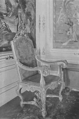
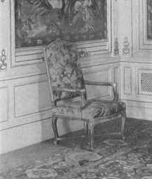
One of a set of three rare Louis XIV chairs, beautifully carved and gilded, and said to have belonged to the great Louis himself.
In the early style of Louis XIV, we find many trophies of war and mythological subjects used in the decorative schemes. The second style of this period was a softening and refining of the earlier one, becoming more and more delicate until it merged into the time of the Regency. It was during the reign of Louis XIV that the craze for Chinese decoration first appeared. La Chinoiserie it was called, and it has daintiness and a curious fascination about it, but many inappropriate things were done in its name. The furniture of the time was firmly placed upon the ground, the arm-chairs had strong straining-rails, square or curved backs, scroll arms carved and partly upholstered and stuffed seats and backs. The legs of chairs were usually tapering in form and ornamented with gilding, or marquetry, or richly carved, and later the feet ended in a carved leaf design. Some of the straining-rails were in the shape of the letter X, with an ornament at the intersection, and often there was a wooden molding below the seat in place of fringe. Many carved and gilded chairs had gold fringe and braid and were covered with velvet, tapestry or damask.
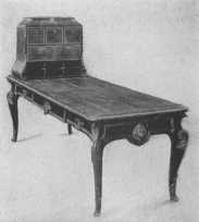 |
 |
| By courtesy of the Metropolitan Museum of Art Inlaid desk with beautifully chiselled ormolu mounts. |
Rare Louis XIV chair, showing the characteristic underbracing. |
There were many new and elaborate styles of beds that came into fashion at this time. There was the lit d'ange, which had a canopy that did not extend over the entire bed, and had no pillars at the foot, the curtains were drawn back at the head and the counterpane went over the foot of the bed. There was the lit d'alcove, the lit de bout, lit clos, lit de glace, with a mirror framed in the ceiling, and many others. A lit de parade was like the great bed of Louis XIV at Versailles.
Both the tall and bracket clocks showed this same love of ornament and they were carved and gilded and enriched with chased brass and wonderful inlay by Boulle. The dials also were beautifully designed. Consoles, tables, cabinets, etc., were all treated in this elaborate way. Many of the ceilings were painted by great artists, and those at Versailles, painted by Le Brun and others, are good examples. There was always a combination of the straight line and the curve, a strong feeling of balance, and a profusion of ornament in the way of scrolls, garlands, shells, the acanthus, anthemion, etc. The moldings were wide and sometimes a torus of laurel leaves was used, but in spite of the great amount of ornament lavished on everything, there is the feeling of balance and symmetry and strength that gives dignity and beauty.
Louis was indeed fortunate in having the great Colbert for one of his ministers. He was a man of gigantic intellect, capable of originating and executing vast schemes. It was to his policy of state patronage, wisely directed, and energetically and lavishly carried out, that we owe the magnificent achievements of this period.
Everywhere the impression is given of brilliancy and splendor—gold on the walls, gold on the furniture, rich velvets and damasks and tapestries, marbles and marquetry and painting, furniture worth a king's ransom. It all formed a beautiful and fitting background for the proud king, who could do no wrong, and the dazzling, care-free people who played their brilliant, selfish parts in the midst of its splendor. They never gave a thought to the great mass of the common people who were over-burdened with taxation; they never heard the first faint mutterings of discontent which were to grow, ever louder and louder, until the blood and horror of the Revolution paid the debt.
When Louis XIV died in 1715, his great-grandson, Louis XV, was but five years old, so Philippe, Duc d'Orleans, became Regent. During the last years of Louis XIV's life the court had resented more or less the gloom cast over it by the influence of Madame de Maintenon, and turned with avidity to the new ruler. He was a vain and selfish man, feeling none of the responsibilities of his position, and living chiefly for pleasure. The change in decoration had been foreshadowed in the closing years of the previous reign, and it is often hard to say whether a piece of furniture is late Louis XIV or Regency.
The new gained rapidly over the old, and the magnificent and stately extravagance of Louis XIV turned into the daintier but no less extravagant and rich decoration of the Regency and Louis XV. One of the noticeable changes was that rooms were smaller, and the reign of the boudoir began. It has been truly said that after the death of Louis XIV "came the substitution of the finery of coquetry for the worship of the great in style." There was greater variety in the designs of furniture and a greater use of carved metal ornament and gilt bronze, beautifully chased. The ornaments took many shapes, such as shells, shaped foliage, roses, seaweed, strings of pearls, etc., and at its best there was great beauty in the treatment.
It was during the Regency that the great artist and sculptor in metal, Charles Cressant, flourished. He was made ébeniste of the Regent, and his influence was always to keep up the traditions when the reaction against the severe might easily have led to degeneration. There are beautiful examples of his work in many of the great collections of furniture, notably the wonderful commode in the Wallace collection. The dragon mounts of ormolu on it show the strong influence the Orient had at the time. He often used the figures of women with great delicacy on the corners of his furniture, and he also used tortoise-shell and many colored woods in marquetry, but his most wonderful work was done in brass and gilded bronze.
In 1723, when Louis was thirteen years old, he was declared of age and became king. The influence of the Regent was, naturally, still strong, and unfortunately did much to form the character of the young king. Selfishness, pleasure, and low ideals, were the order of court life, and paved the way for the debased taste for rococo ornament which was one marked phase of the style of Louis XV.
The great influence of the Orient at this time is very noticeable. There had been a beginning of it in the previous reign, but during the Regency and the reign of Louis XV it became very marked. "Singerie" and "Chinoiserie" were the rage, and gay little monkeys clambered and climbed over walls and furniture with a careless abandon that had a certain fascination and charm in spite of their being monkeys. The "Salon des Singes" in the Chateau de Chantilly gives one a good idea of this. The style was easily overdone and did not last a great while.
During this time of Oriental influence lacquer was much used and beautiful lacquer panels became one of the great features of French furniture. Pieces of furniture were sent to China and Japan to be lacquered and this, combined with the expense of importing it, led many men in France to try to find out the Oriental secret. Le Sieur Dagly was supposed to have imported the secret and was established at the Gobelins works where he made what was called "vernis de Gobelins."
The Martin family evolved a most characteristically French style of decoration from the Chinese and Japanese lacquers. The varnish they made, called "vernis Martin," gave its name to the furniture decorated by them, which was well suited to the dainty boudoirs of the day. All kinds of furniture were decorated in this way—sedan chairs and even snuff-boxes, until at last the supply became so great that the fashion died. There are many charming examples of it to be seen in museums and private collections, but the modern garish copies of it in many shops give no idea of the charm of the original. Watteau's delightful decorations also give the true spirit of the time, with their gayety and frivolity showing the Arcadian affectations—the fad of the moment.
As the time passed decoration grew more and more ornate, and the followers of Cressant exaggerated his traits. One of these was Jules Aurèle Meissonier, an Italian by birth, who brought with him to France the decadent Italian taste. He had a most marvelous power of invention and lavished ornament on everything, carrying the rocaille style to its utmost limit. He broke up all straight lines, put curves and convolutions everywhere, and rarely had two sides alike, for symmetry had no charms for him. The curved endive decoration was used in architraves, in the panels of overdoors and panel moldings, everywhere it possibly could be used, in fact. His work was in great demand by the king and nobility. He designed furniture of all kinds, altars, sledges, candelabra and a great amount of silversmith's work, and also published a book of designs. Unfortunately it is this rococo style which is meant by many people when they speak of the style of Louis XV.
Louis XV furniture and decoration at its best period is extremely beautiful, and the foremost architects of the day were undisturbed by the demand for rococo, knowing it was a vulgarism of taste which would pass. In France, bad as it was, it never went to such lengths as it did in Italy and Spain.
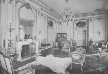
The mantel with its great glass reaching to the cornice, the wall panels, paintings over the doors, and beautiful furniture, all show the spirit of the best Louis XV period. The fur rug is an anachronism and detracts from the effect of the room.
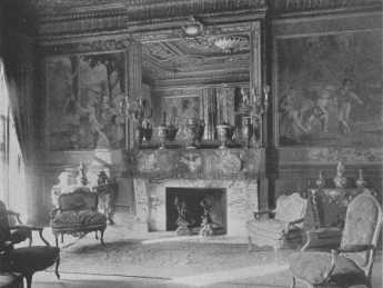
The rare console tables and chairs and the Gobelin tapestry, "Games of Children," show to great advantage in this beautifully proportioned room of soft dull gold. The side-and centre-lights, reflected in the mirror, light the room correctly.
The easy generalization of the girl who said the difference between the styles of Louis XV and Louis XVI was like the difference in hair, one was curly and one was straight, has more than a grain of truth in it. The curved line was used persistently until the last years of Louis XV's time, but it was a beautiful, gracious curve, elaborate, and in furniture, richly carved, which was used during the best period. The decline came when good taste was lost in the craze for rococo.
Chairs were carved and gilded, or painted, or lacquered, and also beautiful natural woods were used. The sofas and chairs had a general square appearance, but the framework was much curved and carved and gilded. They were upholstered in silks, brocades, velvets, damasks in flowered designs, edged with braid. Gobelin, Aubusson and Beauvais tapestry, with Watteau designs, were also used. Nothing more dainty or charming could be found than the tapestry seats and chair backs and screens which were woven especially to fit certain pieces of furniture. The tapestry weavers now used thousands of colors in place of the nineteen used in the early days, and this enabled them to copy with great exactness the charming pictures of Watteau and Boucher. The idea of sitting on beautiful ladies and gentlemen airily playing at country life, does not appeal to our modern taste, but it seems to be in accord with those days.
Desks were much used and were conveniently arranged with drawers, pigeon-holes and shelves, and roll-top desks were made at this time. Commodes were painted, or richly ornamented with lacquer panels, or panels of rosewood or violet wood, and all were embellished with wonderful bronze or ormolu. Many pieces of furniture were inlaid with lovely Sèvres plaques, a manner which is not always pleasing in effect. There were many different and elaborate kinds of beds, taking their names from their form and draping. "Lit d'anglaise" had a back, head-board and foot-board, and could be used as a sofa. "Lit a Romaine" had a canopy and four festooned curtains, and so on.
The most common form of salon was rectangular, with proportions of 4 to 3, or 2 to 1. There were also many square, round, octagonal and oval salons, these last being among the most beautiful. They all were decorated with great richness, the walls being paneled with carved and gilded—or partially gilded—wood. Tapestry and brocade and painted panels were used. Large mirrors with elaborate frames were placed over the mantels, with panels above reaching to the cornice or cove of the ceiling, and large mirrors were also used over console tables and as panels. The paneled overdoors reached to the cornice, and windows were also treated in this way. Windows and doors were not looked upon merely as openings to admit air and light and human beings, but formed a part of the scheme of decoration of the room. There were beautiful brackets and candelabra of ormolu to light the rooms, and the boudoirs and salons, with their white and gold and beautifully decorated walls and gilded furniture, gave an air of gayety and richness, extravagance and beauty.
An apartment in the time of Louis XV usually had a vestibule, rather severely decorated with columns or pilasters and often statues in niches. The first ante-room was a waiting-room for servants and was plainly treated, the woodwork being the chief decoration. The second ante-room had mirrors, console tables, carved and gilded woodwork, and sometimes tapestry was used above a wainscot. Dining-rooms were elaborate, often having fountains and plants in the niches near the buffet. Bedrooms usually had an alcove, and the room, not counting the alcove, was an exact square. The bed faced the windows and a large mirror over a console table was just opposite it. The chimney faced the principal entrance.
A "chambre en niche" was a room where the bed space was not so large as an alcove. The designs for sides of rooms by Meissonier, Blondel, Briseux Cuilles and others give a good idea of the arrangement and proportions of the different rooms. The cabinets or studies, and the garde robes, were entered usually from doors near the alcove. The ceilings were painted by Boucher and others in soft and charming colors, with cupids playing in the clouds, and other subjects of the kind. Great attention was given to clocks and they formed an important and beautiful part of the decoration.
The natural consequence of the period of excessive rococo with its superabundance of curves and ornament, was that, during the last years of Louis's reign, the reaction slowly began to make itself felt. There was no sudden change to the use of the straight line, but people were tired of so much lavishness and motion in their decoration. There were other influences also at work, for Robert Adam had, in England, established the classic taste, and the excavations at Pompeii were causing widespread interest and admiration. The fact is proved that what we call Louis XVI decoration was well known before the death of Louis XV, by his furnishing Luciennes for Madam Du Barri in almost pure Louis XVI style.
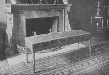
There is a special charm about this old Louis XVI bench with its Gobelin tapestry cover
Louis XVI came to the throne in 1774, and reigned for nineteen years, until that fatal year of '93. He was kind, benign, and simple, and had no sympathy with the life of the court during the preceding reign. Marie Antoinette disliked the great pomp of court functions and liked to play at the simple life, so shepherdesses, shepherd's crooks, hats, wreaths of roses, watering-pots and many other rustic symbols became the fashion.
Marie Antoinette was but fifteen years old when in 1770 she came to France as a bride, and it is hardly reasonable to think that the taste of a young girl would have originated a great period of decoration, although the idea is firmly fixed in many minds. It is known that the transition period was well advanced before she became queen, but there is no doubt that her simpler taste and that of Louis led them to accept with joy the classical ideas of beauty which were slowly gaining ground. As dauphin and dauphiness they naturally had a great following, and as king and queen their taste was paramount, and the style became established.
Architecture became more simple and interior decoration followed suit. The restfulness and beauty of the straight line appeared again, and ornament took its proper place as a decoration of the construction, and was subordinate to its design. During the period of Louis XVI the rooms had rectangular panels formed by simpler moldings than in the previous reign, with pilasters of delicate design between the panels. The overdoors and mantels were carried to the cornice and the paneling was usually of oak, painted in soft colors or white and gilded. Walls were also covered with tapestry and brocade. Some of the most characteristic marks of the style are the straight tapering legs of the furniture, usually fluted, with some carving. Fluted columns and pilasters often had metal quills filling them for a part of the distance at top and bottom, leaving a plain channel between. The laurel leaf was used in wreath form, and bell flowers were used on the legs of furniture. Oval medallions, surmounted by a wreath of flowers and a bow-knot, appear very often, and in about 1780 round medallions were used. Furniture was covered with brocade or tapestry, with shepherds and shepherdesses or pastoral scenes for the design. The gayest kinds of designs were used in the silks and brocades; ribbons and bow-knots and interlacing stripes with flowers and rustic symbols scattered over them. Curtains were less festooned and cut with great exactness. The canopies of beds became smaller, until often only a ring or crown held the draperies, and it became the fashion to place the bed sideways, "vu de face."
There was a great deal of beautiful ornament in gilded bronze and ormolu on the furniture, and many colored woods were used in marquetry. The fashion of using Sèvres plaques in inlay was continued. There was a great deal of white and colored marble used and very fine ironwork was made. Riesener, Roentgen, Gouthiére, Fragonard and Boucher are some of the names that stand out most distinctly as authors of the beautiful decorations of the time. Marie Antoinette's boudoir at Fontainebleau is a perfect example of the style and many of the other rooms both there and at the Petit Trianon show its great beauty, gayety and dignity combined with its richness and magnificence.
The influence of Pompeii must not be overlooked in studying the style of Louis XVI, for it appeared in much of the decoration of the time. The beautiful little boudoir of the Marquise de Sérilly is a charming example of its adaptation. The problem of bad proportion is also most interestingly overcome. The room was too high for its size, so it was divided into four arched openings separated by carved pilasters, and the walls covered with paintings. The ceiling was darker than the walls, which made it seem lower, and the whole color scheme was so arranged that the feeling of extreme height was lessened. The mantel is a beautiful example of the period. This room was furnished about 1780-82.
Compared to the lavish curves of the style of Louis XV, the fine outlines and the beautiful ornament of Louis XVI appear to some people cold, but if they look carefully at the matter, they will find them not really so. The warmth of the Gallic temperament still shows through the new garb, giving life and beauty to the dainty but strong furniture.
If one studies the examples of the styles of Louis XIV, Louis XV and Louis XVI that one finds in the great palaces, collections, museums and books of prints and photographs, one will see that the wonderful foundation laid by Louis XIV was still there in the other two reigns. During the time of Louis XVI the pose of rustic simplicity was a very sophisticated pose indeed, but the reaction from the rocaille style of Louis XV led to one of the most beautiful styles of decoration that the world has seen. It had dignity, true beauty and the joy of life expressed in it.
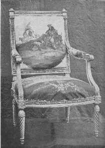
Rare Louis XVI chair—an original from Fontainebleau.
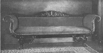
The American Empire sofa, when not too elaborate, is a very beautiful article of furniture.
The French Revolution made a tremendous change in the production of beautiful furniture, as royalty and the nobility could no longer encourage it. Many of the great artists died in poverty and many of them went to other countries where life was more secure.
After the Revolution there was wholesale destruction of the wonderful works of art which had cost such vast sums to collect. Nothing was to remain that would remind the people of departed kings and queens, and a committee on art was appointed to make selections of what was to be saved and what was to be destroyed. That committee of "tragic comedians" set up a new standard of art criticism; it was not the artistic merits of a piece of tapestry, for instance, that interested them, but whether a king or queen dared show their heads upon it. If so, into the flames it went. Thousands of priceless things were destroyed before they finished their dreadful work.
When Napoleon came into power he turned to ancient Rome for inspiration. The Imperial Cæsars became his ideal and gave him a wide field in which to display his love for splendor, uncontrolled by any true artistic sense. It gave decoration a blow from which it was hard to recover. Massive furniture without real beauty of line, loaded with ormolu, took the place of the old. The furniture was simple in construction with little carving, until later when all kinds of animal heads and claws, and animals never seen by man, and horns of plenty, were used to support tables and chairs and sofas. Everywhere one turned the feeling of martial grandeur was in the air. Ormolu mounts of bay wreaths, torches, eagles, military emblems and trophies, winged figures, the sphinx, the bee, and the initial N, were used on furniture; and these same motives were used in wall decoration. The furniture was left the natural color of the wood, and mahogany, rosewood, and ebony, were used. Veneer was also extensively used. The front legs of chairs were usually straight, and the back legs slightly curved. Beds were massive, with head and foot-board of even height, and the tops rolled over into a scroll. Swans were used on the arms of chairs and sofas and the sides of beds. Tables were often round, with tripod legs; in fact, the tripod was a great favorite. There was a great deal of inlay of the favorite emblems but little carving. Plain columns with Doric caps and metal ornaments were used. The change in the use of color was very marked, for deep brown, blue and other dark colors were used instead of the light and gay ones of the previous period. The materials used were usually of solid colors with a design in golden yellow, a wreath, or a torch, or the bee, or one of the other favorite emblems being used in a spot design, or powdered on. Some of the color combinations in the rooms we read of sound quite alarming.
Since the time of the Empire, France has done as the rest of the world has, gone without any special style.
The early history of furniture in all countries is very much the same—there is not any. We know about kings and queens, and war and sudden death, and fortresses and pyramids, but of that which the people used for furniture we know very little. Research has revealed the mention in old manuscripts once in a while of benches and chests, and the Bayeux tapestry and old seals show us that William the Conquerer and Richard Coeur de Lion sat on chairs, even if they were not very promising ones, but at best it is all very vague. It is natural to suppose that the early Saxons had furniture of some kind, for, as the remains of Saxon metalwork show great skill, it is probable they had skill also in woodworking.
In England, as in France, the first pieces of furniture that we can be sure of are chests and benches. They served all purposes apparently, for the family slept on them by night and used them for seats and tables by day. The bedding was kept in the chests, and when traveling had to be done all the family possessions were packed in them. There is an old chest at Stoke d'Abernon church, dating from the thirteenth century, that has a little carving on it, and another at Brampton church of the twelfth or thirteenth century that has iron decorations. Some chests show great freedom in the carving, St. George and the Dragon and other stories being carved in high relief.
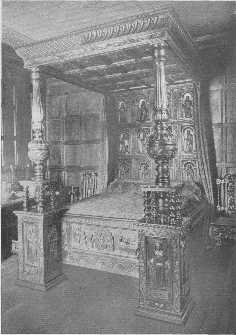
An Apostles bed of the Tudor period, so-called from the carved panels of the back. The over elaboration of the late Tudor work corresponded in time with France's deterioration in the reign of Henry IV.
Nearly all the existing specimens of Gothic furniture are ecclesiastical, but there are a few that were evidently for household use. These show distinctly the architectural treatment of design in the furniture. Chairs were not commonly used until the sixteenth century. Our distinguished ancestors decided that one chair in a house was enough, and that was for the master, while his family and friends sat on benches and chests. It is a long step in comfort and manners from the fifteenth to the twentieth century. Later the guest of honor was given the chair, and from that may come the saying that a speaker "takes the chair." Gothic tables were probably supported by trestles, and beds were probably very much like the early sixteenth century beds in general shape. There were cupboards and armoires also, but examples are very rare. From an old historical document we learn that Henry III, in 1233, ordered the sheriff to attend to the painting of the wainscoted chamber in Winchester Castle and to see that "the pictures and histories were the same as before." Another order is for having the wall of the king's chamber at Westminster "painted a good green color in imitation of a curtain." These painted walls and stained glass that we know they had, and the tapestry, must have given a cheerful color scheme to the houses of the wealthy class even if there was not much comfort.
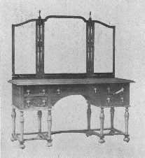 |
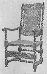 |
| In this walnut dressing-table the period of William and Mary has been adapted to modern needs. | This reproduction of a Charles II chair shows cherubs supporting crowns. |
The history of the great houses of England, and also the smaller manor-houses, is full of interest in connection with the study of furniture. There are many manor-houses that show all the characteristics of the Gothic, Renaissance, Tudor and Jacobean periods, and from them we can learn much of the life of the times. The early ones show absolute simplicity in the arrangement, one large hall for everything, and later a small room or two added. The fire was on the floor and the smoke wandered around until it found its way out at the opening, or louvre, in the roof. Then a chimney was built at the dais end of the hall, and the mantelpiece became an important part of the decoration. The hall was divided by "screens" into smaller rooms, leaving the remainder for retainers, and causing the clergy to inveigh against the new custom of the lord of the manor "eating in secret places." The staircase developed from the early winding stair about a newel or post to the beautiful broad stairs of the Tudor period. These were usually six or seven feet broad, with about six wide easy steps and then a landing, and the carving on the balusters was often very elaborate and sometimes very beautiful—a ladder raised to the nth power.
Slowly the Gothic period died in England and slowly the Renaissance took its place. There was never the gayety of decorative treatment that we find in France, but the English workmen, while keeping their own individuality, learned a tremendous amount from the Italians who came to the country. Their influence is shown in the Henry VIIth Chapel in Westminster Abbey, and in the old part of Hampton Court Palace, built by Cardinal Wolsey.
The religious troubles between Henry VIII and the Pope and the change of religion helped to drive the Italians from the country, so the Renaissance did not get such a firm foothold in England as it did in France. The mingling of Gothic and Renaissance forms what we call the Tudor period. During the time of Elizabeth all trace of Gothic disappeared, and the influence of the Germans and Flemings who came to the country in great numbers, helped to shorten the influence of the Renaissance. The over-elaboration of the late Tudor time corresponded with the deterioration shown in France in the time of Henry IV. The Hall of Gray's Inn, the Halls of Oxford, the Charterhouse and the Hall of the Middle Temple are all fine examples of the Tudor period.
We find very few names of furniture makers of those days; in fact, there are very few names known in connection with the buildings themselves. The word architect was little used until after the Renaissance. The owner and the "surveyor" were the people responsible, and the plans, directions and details given to the workmen were astonishingly meager.
The great charm that we all feel in the Tudor and Jacobean periods is largely due to the beautiful paneled walls. Their woodwork has a color that only age can give and that no stain can copy. The first panels were longer than the later ones. Wide use was made of the beautiful "linen-fold" design in the wainscoting, and there was also much elaborate carving and strapwork. Scenes like the temptation of Adam and Eve were represented, heads in circular medallions, and simply decorative designs were used. In the days of Elizabeth it became the fashion to have the carving at the top of the paneling with plain panels below. Tudor and Jacobean mantelpieces were most elaborate and were of wood, stone, or marble richly carved, to say nothing of the beautiful plaster ones, and there are many fine examples in existence. They were fond of figure decoration, and many subjects were taken from the Bible. The overmantels were decorated with coats-of-arms and other carving, and the entablature over the fireplace often had Latin mottoes. The earliest firebacks date from the fifteenth century. Coats-of-arms and many curious designs were used upon them.
The furniture of the Tudor period was much carved, and was made chiefly of oak. Cornices of beds and cabinets often had the egg-and-dart molding used on them, and the S-curve is often seen opposed on the backs of settees and chairs. It has a suggestion of a dolphin and is reminiscent of the dolphins of the Renaissance. The beds were very large, the "great bed of Ware" being twelve feet square. The cornice, the bed-head, the pedestals and pillars supporting the cornice were all richly carved. Frequently the pillars at the foot of the bed were not connected with it, but supported the cornice which was longer than the bed. The "Courtney bedstead," dated 1593, showing many of the characteristics of the ornament of the time, is 103-1/2 inches high, 94 inches long, 68 inches wide. The majority of the beds were smaller and lower, however, and the pillars usually rose out of drum-like members, huge acorn-like bulbs that were often so large as to be ugly. They appeared also on other articles of furniture. When in good proportion, with pillars tapering from them, they were very effective, and gradually they grew smaller. Some of the beds had the four apostles, Matthew, Mark, Luke and John, carved on the posts. They were probably the origin of the nursery rhyme:
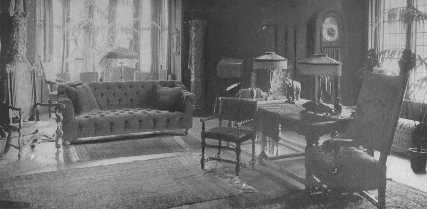
In this living-room, Italian, Jacobean, and modern stuffed furniture, give a satisfactory effect because each piece is good of its kind and is in a certain relationship to each other. The huge clock with chimes and the animal casts are out of keeping.
Bed hanging were of silk, velvet, damask, wool damask, tapestry, etc., and there were fine linen sheets and blankets and counterpanes of wool work. The chairs were high-backed of solid oak with cushions. There were also jointed stools, folding screens, chests, cabinets, tables with carpets (table covers) tapestry hangings, curtains, cushions, silver sconces, etc.
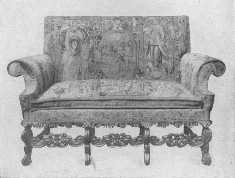
Original Jacobean settle with tapestry covering. These pieces of furniture range in price between $900 and $1,400.
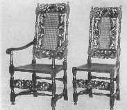
Fine reproductions of Jacobean chairs of the time of Charles II. The carved front rail balances the carving on the back perfectly.
The Jacobean period began with James I, and lasted until the time of William and Mary, or from 1603 to about 1689. In the early part there was still a strong Tudor feeling, and toward the end foreign influence made itself felt until the Dutch under William became paramount. Inigo Jones did his great work at this time in the Palladian style of architecture. His simpler taste did much to reduce the exaggeration of the late Tudor days.
Chests of various kinds still remained of importance. Their growth is interesting: first the plain ones of very early days, then panels appeared, then the pointed arch with its architectural effect, then the low-pointed arch of Tudor and early Jacobian times, and the geometrical ornament. Then came a change in the general shape, a drawer being added at the bottom, and at last it turned into a complete chest of drawers.
Cabinets or cupboards were also used a great deal, and the most interesting are the court-and livery-cupboards. The derivation of the names is a bit obscure, but the court cupboard probably comes from the French court, short. The first ones were high and unwieldy and the later ones were lower with some enclosed shelves. They were used for a display of plate, much as the modern sideboard is used. The number of shelves was limited by rank; the wife of a baronet could have two, a countess three, a princess four, a queen five. They were beautifully carved, very often, the doors to the enclosed portions having heads, Tudor roses, arches, spindle ornaments and many other designs common to the Tudor and Jacobean periods. They had a silk "carpet" put on the shelves with the fringe hanging over the ends, but not the front, and on this was placed the silver.
The livery-cupboard was used for food, and the word probably comes from the French livrer, to deliver. It had several shelves enclosed by rails, not panels, so the air could circulate, and some of them had open shelves and a drawer for linen. They were used much as we use a serving-table, or as the kitchen dresser was used in old New England days. In them were kept food and drink for people to take to their bedrooms to keep starvation at bay until breakfast.
Drawing-tables were very popular during Jacobean times. They were described as having two ends that were drawn out and supported by sliders, while the center, previously held by them, fell into place by its own weight. Another characteristic table was the gate-legged or thousand-legged table, that was used so much in our own Colonial times. There were also round, oval and square tables which had flaps supported by legs that were drawn out. Tables were almost invariably covered with a table cloth.
Some of the chairs of the time of James I were much like those of Louis XIII, having the short back covered with leather, damask, or tapestry, put on with brass or silver nails and fringe around the edge of the seat. The chief characteristic of the chairs of this time was solidity, with the ornament chiefly on the upper parts, which were molded oftener than carved, with the backs usually high. A plain leather chair called the "Cromwell chair," was imported from Holland. The solid oak back gave way at last to the half solid back, then came the open back with rails, and then the Charles II chair, with its carved or turned uprights, its high back of cane, and an ornamental stretcher like the top of the chair back, between the front legs. This is a very attractive feature, as it serves to give balance of decoration and also partly hides the plain stretcher from sight. A typical detail of Charles II furniture is the crown supported by cherubs or opposed S-curves. James II used a crown and palm leaves.
Grinling Gibbons did his wonderful work in carving at this time, using chiefly pear and lime wood. The greater part of his work was wall decoration, but he made tables, mirrors and other furniture as well. The carving was often in lighter wood than the background, and was in such high relief that portions of it had often to be "pinned" together, for it seemed almost in the round. Evelyn discovered Gibbons in a little shop working away at such a wonderful piece of carving that he could not rest until he had taken him to Sir Christopher Wrenn. From this introduction came the great amount of work they did together. The influence of his work was still seen in the early eighteenth century.
The room at Knole House that was furnished for James I is of great interest, as it is the same to-day as when first furnished. The bed is said to have cost £8,000. As it is one of the show places of England one should not miss a chance of seeing it.
Until the time of the Restoration the furniture of England could not compare in sumptuousness with that of the Continental countries. England, besides having a simpler point of view, was in a perpetual state of unrest. The honest and hard-working English joiners and carpenters adapted in a plain and often clumsy way the styles of the different foreigners who came to the country. Through it all, however, they kept the touch of national character that makes the furniture so interesting, and they often did work of great beauty and worth. When Charles II came to the throne he brought with him the ideas of France, where he had spent so many years, and the change became very marked. The natural Stuart extravagance also helped to form his taste, and soon we hear of much more elaborate decoration throughout the land.
Many of the country towns were far behind London in the style of furniture, and this explains why some furniture that is dated 1670, for instance, seems to belong to an earlier time. The famous silver furniture of Knole House, Seven-oaks, belongs to this time. Evelyn mentions in his diary that the rooms of the Duchess of Portsmouth were full of "Japan cabinets and screens, pendule clocks, greate vases of wrought plate, tables, stands, chimney furniture, sconces, branches, baseras, etc., all of massive silver," and later he mentions again her "massy pieces of plate, whole tables and stands of incredible value."
In the reign of William and Mary, Dutch influence was naturally very pronounced, as William disliked everything English. The English, being now well grounded in the knowledge of construction, took the Dutch ideas as a foundation and developed them along their own lines, until we have the late Queen Anne type made by Chippendale.
The change in the style of chairs was most marked and noticeable. They were more open backed than in Charles's time and had two uprights and a spoon-or fiddle-shaped splat to support the sitter's back. The chair backs took more the curve of the human figure, and the seats were broader in front than in the back; the cabriole legs were broad at the top and ended in claw or pad feet, and there were no straining-rails. The shell was a common form of ornament, and all crowns and cherubs had disappeared. Inlay and marquetry came to be generously used, but there had been many cabinets of Dutch marquetry brought to England even before the time of William and Mary. Flower designs in dyed woods, shell, mother-of-pearl, and ivory were used.
The marquetry clocks made at this time are wonderful and characteristic examples of the work, and are among the finest clocks ever made for beauty of line and finish, and proportion.
Although marquetry and inlay have much in common there is one great difference between them, and they should not be used as synonymous terms. In marquetry the entire surface of the article is covered with pieces of different colored woods cut very thin and glued on. It is like a modern picture puzzle done with regard to the design. In inlay, the design only is inlaid in the wood, leaving a much larger plain background. Veneering is a thin layer of beautiful and often rare wood glued to a foundation of some cheaper kind. The tall clocks and cabinets of William and Mary's time and the wonderful work of Boulle in France are examples of marquetry, the fine furniture of Hepplewhite and Sheraton are masterly examples of inlay.
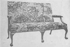
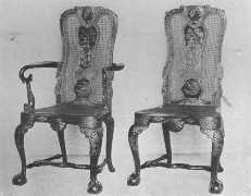
Examples of line reproductions. The lacquer chairs carry out the true feeling of the old with great skill.
"Queen Anne" furniture is a very elastic term, for it is often used to cover the reigns of William and Mary, Queen Anne, George I, and a part of the reign of George II, or, in other words, all the time of Dutch influence. The more usual method is to leave out William and Mary, but at best the classification of furniture is more or less arbitrary, for in England, as well as other countries, the different styles overlap each other. Chippendale's early work was distinctly influenced by the Dutch.
Walnut superseded oak in popularity, and after 1720 mahogany gradually became the favorite. There was a good deal of walnut veneering done, and the best logs were saved for the purpose. Marquetry died out and gave place to carving, and the cabriole leg, one of the chief marks of Dutch influence, became a firmly fixed style. The carving was put on the knees and the legs ended in claw and ball and pad feet. Some chairs were simply carved with a shell or leaf or scroll on top rail and knees of the legs. In the more elaborately carved chairs the arms, legs, splat, and top rail were all carved with acanthus leaves, or designs from Gibbons's decoration. Chairs were broad in the seat and high of back with wide splats, often decorated with inlay, in the early part of the period. The top rail curved into the side uprights, and the seat was set into a rebate or box-seat. The chair backs slowly changed in shape, becoming broader and lower, the splat ceased to be inlaid and was pierced and carved, and the whole chair assumed the shape made so familiar to us by Chippendale.
Tables usually had cabriole legs, although there were some gate-or thousand-legged, tables, and card tables, writing-tables, and flap-tables, were all used. It was in the Queen Anne period that highboys and lowboys made their first appearance.
In the short reign of Anne it also became the fashion to have great displays of Chinese porcelain, and over-mantels, cupboards, shelves and tables were covered with wonderful pieces of it. Addison, in Sir Roger de Coverley, humorously describes a lady's library of the time.
"... And as it was some time before the lady came to me I had an opportunity of turning over a great many of her books, which were ranged in a very beautiful order. At the end of the folios (which were finely bound and gilt) were great jars of china placed one above another in a very noble piece of architecture. The quartos were separated from the octavos by a pile of smaller vessels, which rose in a delightful pyramid. The octavos were bounded by tea-dishes of all shapes, colors, and sizes, which were so disposed on a wooden frame that they looked like one continued pillar indented with the finest strokes of sculpture and stained with the greatest variety of dyes. Part of the library was enclosed in a kind of square, consisting of one of the prettiest grotesque works that ever I saw, and made up of scaramouches, lions, monkeys, mandarins, trees, shells, and a thousand other odd figures in china ware. In the midst of the room was a little Japan table."
Between 1710 and 1730 lacquer ware became very fashionable, and many experiments were made to imitate the beautiful Oriental articles brought home by Dutch traders. In Holland a fair amount of success was attained and a good deal of lacquered furniture was sent from there to England where the brass and silver mounts were added. English and French were experimenting, the French with the greatest success in their Vernis Martin, mentioned elsewhere, which really stood quite in a class by itself, but the imitations of Chinese and Japanese lacquer were inferior to the originals. Pine, oak, lime, and many other woods, were used as a base, and the fashion was so decided that nearly all kinds of furniture were covered with it. This lacquer ware of William and Mary's and Queen Anne's time must not be confounded with the Japanned furniture of Hepplewhite's and Sheraton's time, which was quite different and of much lower grade.
It was in the reign of Queen Anne that the sun began to rise on English cabinet work; it shone gloriously through the eighteenth century, and sank in early Victorian clouds.
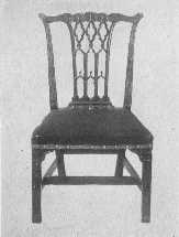 |
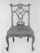 |
| Two important phases of Chippendale's work—an elaborate ribbon-back chair, and one of the more staid Gothic type. | |
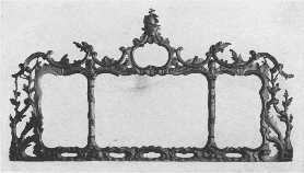
An elaborately carved and gilded Chippendale mantel mirror, showing French influence.
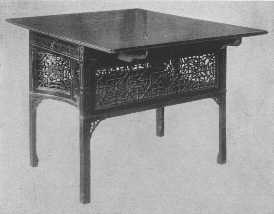
One of the most beautiful examples of Chippendale's fretwork tea-tables in existence.
The classification of furniture in England is on a different basis from that of France, as the rulers of England were not such patrons of art as were the French kings. Flemish, Dutch and French influences all helped to form the taste of the people. The Jacobean period lasted from the time of James I to the time of William and Mary. William brought with him from Holland the strong Dutch feeling that had a tremendous influence on the history of English furniture, and during Anne's short reign the Dutch feeling still lasted.
It was not until the early years of the reign of George II that the Georgian period came into its own with Chippendale at its head. Some authorities include William and Mary and Queen Anne in the Georgian period, but the more usual idea is to divide it into several parts, better known as the times of Chippendale, Adam, Hepplewhite and Sheraton. French influence is marked throughout and is divided into parts. The period of Chippendale was contemporaneous with that of Louis XV, and the second part included the other three men and corresponded with the last years of Louis XV, when the transition to Louis XVI was beginning, and the time of Louis XVI.
It was not until the latter part of Chippendale's life that he gave up his love of rococo curves and scrolls, dripping water effects, and his Chinese and Gothic styles. His early chairs had a Dutch feeling, and it is often only by ornamentation that one can date them.
The top of the Dutch chair had a flowing curve, the splat was first solid and plain, then carved, and later pierced in geometrical designs; then came the curves that were used so much by Chippendale. The carving consisted of swags and pendants of fruit and flowers, shells, acanthus leaves, scrolls, eagle's heads, carved in relief on the surface.
Dutch chairs were usually of walnut and some of the late ones were of mahogany. Mahogany was not used to any extent before 1720, but at that time it began to be imported in large quantities, and its lightness and the ease with which it could be worked made it appropriate for the lighter style of furniture then coming into vogue.
Chippendale began to make chairs with the curved top that is so characteristic of his work. The splat back was always used, in spite of the French, and its treatment is one of the most interesting things in the history of English furniture. It gave scope for great originality. Although, as I have said before, foreign influence was strong, the ideas were adapted and worked out by the great cabinet-makers of the Georgian period with a vigor and beauty that made a distinct English style, and often went far, far ahead of the originals.
There were, so far as we know, three Thomas Chippendales: the second was the great one. He was born in Worcester, England, about 1710, and died in 1779. He and his father, who was also a carver, came to London before 1727. Very little is known about his life, but we may feel sure he was that rare combination: a man of genius with decided business ability. He not only designed the furniture which was made in his shop, but executed a large part of it also, and superintended all the work done there by others. That he was a man of originality shows distinctly through his work, for although he adapted and copied freely and was strongly influenced by the Dutch, French, and "Chinese taste," there is always his own distinctive touch. The furniture of his best period, and those belonging to his school, has great beauty of line and proportion, and the exquisite carving shows a true feeling for ornament in relation to plain surfaces. There are a few examples in existence of carving in almost as high relief as that of Grinling Gibbons, swags, etc., and in his most rococo period his carving was very elaborate. It always had great clearness of edge and cut, and a wonderful feeling for light and shade. In what is called "Irish Chippendale," which was furniture made in Ireland after the style of Chippendale, the carving was in low relief and the edges fairly smoothed off, which made it much less interesting.
Chippendale looked upon his work as one of the arts and placed his ideal of achievement very high, and that he received the recognition of the best people of the time as an artist of merit is proved by his election to the Society of Arts with such men as Sir Joshua Reynolds, Horace Walpole, Samuel Johnson, David Garrick, and others.
The genius of Chippendale justly puts him in the front rank of cabinet-makers and his influence was the foundation of much of the fine work done by many others during the eighteenth century. He is often criticized for his excessive rococo taste as displayed in the plates of the "Gentleman's and Cabinet-maker's Director," and in some of his finished work. Many of the designs in the "Director" were probably never carried out, and some of them were probably added to by the soaring imaginations of the engraver. This is true of all the books published by the great cabinet-makers, and it always seems more fair to have their reputations rest on their finished work which has come down to us.
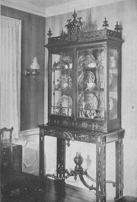
The dripping-water effect, of which Chippendale was so fond at one time, is plainly shown on the doors of this particularly fine example of his work.
Chippendale, of course, must bear the chief part of the charge of over-elaboration, and he frankly says that he thinks "much enrichment is necessary." He copied Meissonier's designs and had a great love for gilding, but the display of rococo taste is not in all his work by any means, nor was it so excessive as that of the French. The more self-restrained temperament of the Anglo-Saxon race makes a deal of difference. He early used the ogee curve and cabriole leg, the knees of which he carved with cartouches and leaves or other designs. The front rail of the chair also was often carved. There were several styles of curved leg, the cabriole leg of Dutch influence, and the curved style of Louis XV. There were also several variations on the claw and ball foot. Many Chippendale chairs were without stretchers, but the straight legged style usually had four. The seats were sometimes in a box frame or rebate, and sometimes the covering was drawn over the frame and fastened with brass headed nails. Chippendale in the "Director" speaks of red morocco, Spanish leather, damask, tapestry and other needlework as being appropriate for the covering of his chairs.
In about 1760 or 1765 he began to use the straight leg for his chairs. The different shapes of splats will often help in deciding the dates of their making, and its development is of great interest. The curves shown in the diagram on page 84 are the merest suggestions of the outline of the splat, and they were carved most beautifully in many different designs. Ribbon-back chairs are dated about 1755 and show the adapted French influence. His Gothic and Chinese designs were made about 1760-1770. Ladder-back chairs nearly always had straight legs, either plain or with double ogee curve and bead moldings, but there are a few examples of ladder-back and cabriole legs combined, although these are very rare. The chair settees of the Dutch time, with backs having the appearance of chairs side by side, were also made by Chippendale. "Love seats" were small settees. It was naïvely said that "they were too large for one and too small for two." A large armchair that shows a decided difference in the manners of the early eighteenth century and the present day was called the "drunkard's chair."
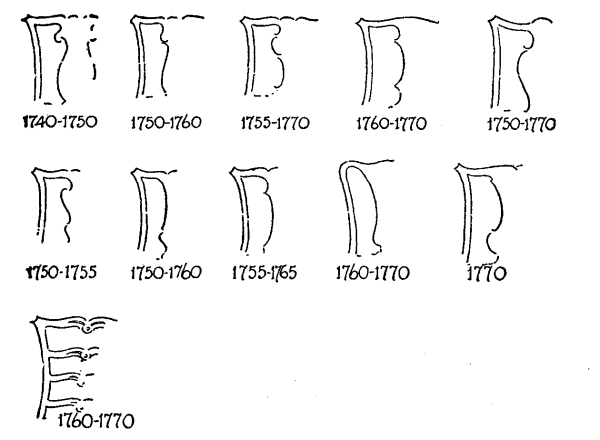
DIFFERENT TYPES OF CHAIR SPLATS USED BY CHIPPENDALE.
When the craze for "Indian work" was at its height, there were many pieces of old oak and walnut furniture covered with lacquer to bring it up to the fashionable standard, but their forms were not suitable, and oak especially, with its coarse grain did not lend itself to the process. The stands for lacquer cabinets vary in style, but were often gilded in late Louis XIV and Louis XV style. The difference between true lacquer and its imitations is hard to explain. The true was made by repeated coats of a special varnish, each rubbed down and allowed to become hard before the next was put on. This gave a hard, cool, smooth surface with no stickiness. Modern work, done with paint and French varnish, has not this delightful feeling, but is nearly always clammy to the touch, and the colors are hurt by the process of polishing. Chippendale did not use much lacquer, but in the "Director" he often says such and such designs would be suitable for it.
Much of the furniture that Chippendale made was heavy, but the best of it had much beauty. His delicate fretwork tea-tables are a delight, with their fretwork cupboards and carving. He seemed to combine many sides in his artistic temperament, a fact that many people lay to his power of assimilating the work of others. He did not make sideboards in our sense of the word. His were large side-tables, sometimes with a drawer for silver and sometimes not. Pier-tables were very much like them in shape, but smaller, and were often gilded to match the mirrors which were placed above them.
The larger pieces of Chippendale furniture have the same characteristic of perfect workmanship and detail which the chairs possess. Dining-tables were made in sections consisting of two semi-circular ends and two center pieces with flaps which could all be joined together and make a very large table. The beds he made had four posts and cornice tops elaborately carved and often gilded, with a strong Louis XV feeling. The curtains hung from the inside of the cornice. He also made many other styles of beds, such as canopy beds, tent beds, flat tester beds, Chinese beds, Gothic beds: there was almost nothing he did not make for the house from wall brackets to the largest wardrobes.
To many people used to the simple Chippendale furniture which is commonly seen, the idea of rich and beautiful carving and gilding comes as a surprise, and even in the "Director" there are no plates which show his most beautiful work. His elaborate furniture was naturally chiefly order work, and so was not pictured, and much of it that is left is still in the possession of the descendants of the original owners. The small number of authentic pieces which have reached public sales have been eagerly snapped up by private collectors and museums at large prices.
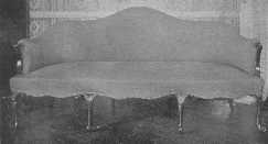
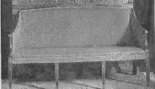
It is interesting to compare the generous curves of the Chippendale sofa with the greater severity of Hepplewhite's taste.
In America much of the furniture called Chippendale was not made by Chippendale himself, but was made after his designs and copied from imported pieces by clever cabinet-makers here in the, then, colonies. The average American of the eighteenth century was a simple and not over rich person of good breeding and refined taste who appreciated the fact that the elaborate furniture of England and France would not be in keeping with life in America, and so either imported the simpler kinds, or demanded that the home cabinet-maker choose good models for his work. This partly explains why we have so much really good Colonial furniture, and not so much of the elaborately carved and gilded variety.
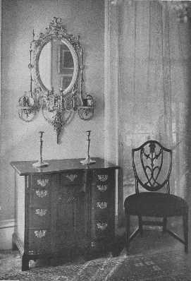
A valuable collection of an Adam mirror, a block-front, knee-hole chest of drawers, and a Hepplewhite chair.
Robert Adam was the second of the four sons of William Adam, and was born in 1728. The Adam family was Scotch of good social position. Robert early showed a talent for drawing. He was ambitious, and, as old Roman architecture interested him above all other subjects, he decided that he could attain his ideals only by study and travel in Italy. He returned to England in 1758 after four years of hard work with the results of his labors, the chief treasure being his careful drawings of Diocletian's villa. His classical taste was firmly established, and was to be one of the important influences of the eighteenth century.
Robert and James Adam went into partnership and became the most noted architects of their day in England. The list of their buildings is long and interesting, and much of their architectural and decorative work is still in existence.
To many people it will seem like putting the cart before the horse to say that Robert Adam had in any way influenced the style we call Louis XVI, but it is a plausible theory and certainly an interesting one. Mr. G. Owen Wheeler in his interesting book on "Old English Furniture" makes a strong case in favor of the Adam Brothers. Classical taste was well established in England by 1765, before the transition from Louis XV to Louis XVI began, and Robert Adam published his book in parallel columns of French and English, which shows it must have been in some demand in France. The great influence of the excavations at Pompeii must naturally not be underestimated, as it was far reaching, but with the beautiful Adam style well developed, just across the Channel, it seems probable that it may have had its share in forming French taste. The foundation being there, the French put their characteristic touch to it and developed a much richer style than that of the Adam Brothers, but the two have so much in common that Louis XVI furniture may be put into an Adam room with perfect fitness, and vice versa. As the Adams cared only to design furniture some one else had to carry out the designs, and Chippendale was master carver and cabinet-maker under them at Harewood House, Yorkshire, and probably was also in many other instances.
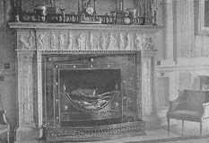
A mantel of marble and steel in the drawing-room, Rushton Hall, Northamptonshire—the work of the brothers Adam.
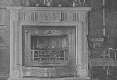
Another Adam mantel. It is interesting to note how clearly these mantels are the inspiration of our own Colonial work.
The early furniture of Adam was plain, and the walls were treated with much decoration that was classic in feeling. He possessed the secret of a composition of which his exquisite decorations on walls and ceilings were made. After 1770 he simplified his walls and elaborated his furniture designs until they met in a beautiful and graceful harmony. He designed furniture to suit the room it was in, and with the dainty and charming coloring, the beauty of proportion and the charm of the wall decoration, the scheme had great beauty.
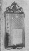 |
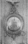 |
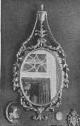 |
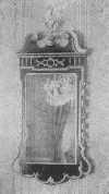 |
| This group of old mirrors indicates the extent to which refinement of design was carried during the Georgian period in England—the time of the great cabinet-makers. | |
He used the ram's head, wreaths, honeysuckle, mythological subjects, lozenge-shaped, oval and octagonal panels, and many other designs. He was one of the first to use the French idea of decorating furniture with painting and porcelain plaques, and the furniture itself was simple and beautiful in line. The stucco ceilings designed by the brothers were picked out with delicate colors and have much beauty of line.
A great deal of the most beautiful Adam decoration was the painting on walls and ceilings and furniture by Angelica Kaufmann, Zucchi, Pergolesi, Cipriani, and Columbani. The standard of work was so high that only the best was satisfactory.
Adam usually designed his furniture for the room in which it was to stand, and he often planned the house and all its contents, even to the table silver, to say nothing of the door-locks. The chairs were of mahogany, or painted, or gilded, wood. Some had oval upholstered backs, with the covering specially designed for the room, and some had lyre backs, later used so much by Sheraton, and others had small painted panels placed in the top rail, with beautiful carving. Mirrors were among the most charming articles designed by Adam, and had composition wreaths and cupids and medallions for ornament. They were usually made in pairs in both large and small sizes. A pair of antique mirrors should be kept together, as they are very much more valuable than when separated.
Adam was one of the first to assemble the pieces that later grew into the sideboard—a table, two pedestals, and a cellaret. There is a sideboard designed by him for Gillows, in which the parts are connected, and it is at least one of the ancestors of the beautiful Shearer and Hepplewhite ones and our modern useful, though not always beautiful, article. When, late in his career, Adam attempted to copy the French, he was not so successful, as he did not have their flexibility of temperament, and was unable to give the warmer touch to the classic, which they did so well. His paneled walls, however, have great dignity and purity of line and feeling, and the applied ornament was really an ornament, and not a disfigurement as too often happens in our day. With Adam one feels the surety of knowledge and the refinement of good taste led by a high ideal.
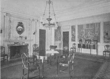
There are many details worthy of notice in this room, the mahogany doors, the paneled walls with the old picture paper, the over-mantel, the knife boxes on the sideboard, the Hepplewhite furniture, and the side-lights. The chandelier is badly chosen.
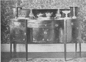
A fine old Hepplewhite sideboard, with old glass and silver, but the modern wallpaper is not in harmony.
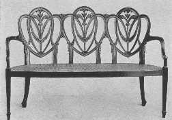
A modern Hepplewhite settee, showing the draped scarf carving he used so much.
The work of Hepplewhite and his school lasted from about 1760 to 1795; the last nine years of the time the business was carried on by his widow, Alice, under the name of A. Hepplewhite & Co. For five years after that some work was done after his manner, but it was distinctly inferior. In the early seventies Hepplewhite's work was so well known and so much admired that its influence was shown in the work of his contemporaries. There was a great difference between his style and that of Chippendale, his being much lighter in construction and effect, besides the many differences of design. Hepplewhite was strongly influenced by the French style of Louis XVI, and also the pure taste of Robert Adam at its height. Hepplewhite, however, like all the great cabinet-makers, both French and English, was a great genius himself and stamped the impress of his own personality upon his work.
Many people date Hepplewhite's fame from the time of the publication of his book, "The Cabinet Maker and Upholsterer's Guide," in 1788, not realizing that he had been dead for two years when it appeared. Its publication was justified by the well established popularity of his furniture and the success with which his designs were carried out by A. Hepplewhite & Co.
It is interesting to notice the difference in the size of chairs which became apparent during Hepplewhite's time. Hoop-skirts and stiffened coats went out of fashion, and with them went the need of large chair seats. The transition chairs made by Hepplewhite were not very attractive in proportion, as the backs were too low for the width. The transition from Chippendale to Hepplewhite was not sudden, as the last style of Chippendale was simpler and had more of the classic feeling in it. Hepplewhite says, in the preface to his book: "To unite elegance and utility, and blend the useful with the agreeable, has ever been considered a difficult, but an honorable task." He sometimes failed and sometimes succeeded. His knowledge of construction enabled him to make his chairs with shield, oval, and heart-shaped backs. The tops were slightly curved, also the tops of the splats, and at the lower edge where the back and the splat join, a half rosette was carved. He often used the three feathers of the Prince of Wales, sheaves of wheat, anthemion, urns, and festoons of drapery, all beautifully carved, and forming the splat. The backs of his chairs were supported at the sides by uprights running into the shield-shaped back and did not touch the seat frame in any other way. With this apparent weakness of construction it is wonderful how many of his chairs have come down to us in perfect condition, but it was his knowledge of combining lightness with strength which made it possible.
Hepplewhite used straight or tapering legs with spade feet for his furniture, often inlaid with bellflowers in satinwood. The legs were sometimes carved with a double ogee curve and bead molding. He did not use carving in the lavish manner of Chippendale, but it was always beautifully done, and he used a great deal of inlay of satinwood, etc., oval panels, lines, urns, and many other motives common to the other cabinet-makers of the day, and also painted some of his furniture. His Japan work was inferior in every way to that of the early part of the eighteenth century. The upholstery was fastened to the chairs with brass-headed tacks, often in a festoon pattern. Oval-shaped brass handles were used on his bureaus, desks, and other furniture. He made many sideboards, some, in fact, going back to the side table and pedestal idea, and bottle-cases and knife-boxes were put on the ends of the sideboards. His regular sideboards were founded on Shearer's design.
Shearer's furniture was simple and dainty in design, and he has the honor of making the first real serpentine sideboard, about 1780, which was not a more or less disconnected collection of tables and pedestals. It was the forerunner of the Hepplewhite and Sheraton sideboards that we know so well. Shearer is now hardly known even by name to the general world, but without doubt his ideal of lightness and strength in construction had a good deal of influence on his contemporaries and followers.
Hepplewhite was very fond of oval and semi-circular shapes, and many of his tables are made in either one way or the other. His sideboards, founded on Shearer's designs, are very elegant, as he liked to say, in their simplicity of line, their inlay, and their general beauty of wood. He was most successful in his chairs, sideboards, tables, and small household articles, for his larger pieces of furniture were often too heavy. Some of the worst, however, were made by other cabinet-makers after his designs, and not by Hepplewhite himself.
Thomas Sheraton was born in 1750, and was a journeyman cabinet-maker when he went to London. His great genius for furniture design was combined with a love of writing tracts and sermons. Unfortunately for his success in life, he had a most disagreeable personality, being conceited, jealous, and perfectly willing to pour scorn on his brother cabinet-makers. This impression he quite frankly gives about himself in his books. The name of Robert Adam is not mentioned, and this seems particularly unpleasant when one thinks of the latter's undoubted influence on Sheraton's work. Sheraton's unfortunate disposition probably helped to make his life a failure.
It is very sad to see such possibilities as his not reaping their true reward, for poverty dogged his steps all through life, and he was always struggling for a bare livelihood. His books were not financially successful, and at last he gave up his workshop and ceased to make the furniture he designed. He was an expert draughtsman and his designs were carried out by the skillful cabinet-makers of the day. Adam Black gives a very pitiful account of the poverty in which Sheraton lived, and says: "That by attempting to do everything he does nothing." His "nothing," however, has proved a very big something in the years which have followed, for Sheraton is responsible for one of the most beautiful types of furniture the world has known, and although his life was hard and bitter, his fame is great.
Sheraton took the style of Louis XVI as his standard, and some of his best work is quite equal to that of the French workmen. He felt the lack of the exquisite brass and ormolu work done in France, and said if it were only possible to get as fine in England, the superior cabinet-making of the English would put them far ahead in the ranks. To many of us this loss is not so great, for the beauty of the wood counts for more, and is not detracted from by an oversupply of metal ornament, as sometimes happened in France. "Enough is as good as a feast." Sheraton, at his best, had beauty, grace, and refinement of line without weakness, lightness and yet perfect construction, combined with balance, and the ornament just sufficient to enhance the beauty of the article without overpowering it. It is this fine work which the world remembers and which gave him his fame, and so it is far better to forget his later period when nearly all trace of his former greatness was lost.
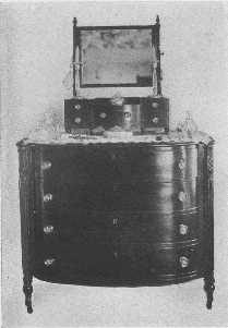
A Sheraton bureau with a delightful little dressing-glass.
Sheraton profited by the work of Chippendale, Adam, and Hepplewhite, for these great men blazed the trail for him, so to speak, in raising the art of cabinet-making to so high a plane that England was full of skilled workmen. The influence of Adam, Shearer, and Hepplewhite, was very great on his work, and it is often difficult to tell whether he or Hepplewhite or Shearer made some pieces. He evidently did not have business ability and his bitter nature hampered him at every turn. The Sheraton school lasted from about 1790 to 1806. He died in 1806, fairly worn out with his struggle for existence. Poor Sheraton, it certainly is a pitiful story.
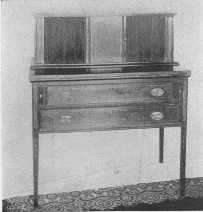 |
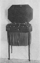 |
| One of Sheraton's charming desks, with sliding doors made of thin strips of wood glued on cloth. | A sewing-table having the spirit of both Hepplewhite and Sheraton. |
Sheraton's chair backs are rectangular in type, with urn splats, and splats divided into seven radiates, and also many other designs. The chairs were made of mahogany and satinwood, some carved, some inlaid, and some painted. The splat never ran into the seat, but was supported on a cross rail running from side to side a few inches above the seat. The material used for upholstery was nailed over the frame with brass-headed tacks.
Bookcases were of mahogany and satinwood veneer, and the large ones were often in three sections, the center section standing farther out than the two sides. The glass was covered with a graceful design in moldings, and the pediments were of various shapes, the swan-neck being a favorite.
Sideboards were built on very much the lines of those made by Shearer and Hepplewhite. There were drawers and cupboards for various uses. The knife-boxes to put on the top came in sets of two, and sometimes there was a third box. The legs were light and tapering with inlay of satinwood, and sometimes they were reeded. There was inlay also on the doors and drawers. There were also sideboards without inlay. The legs for his furniture were at first plain, and then tapering and reeded. He used some carving, and a great deal of satinwood and tulip-wood were inlaid in the mahogany; he also used rosewood. The bellflower, urn, festoons, and acanthus were all favorites of his for decoration.
He made some elaborate and startling designs for beds, but the best known ones are charming with slender turned posts or reeded posts, and often the plain ones were made of painted satinwood.
The satinwood from the East Indies was fine and of a beautiful yellow color, while that from the West Indies was coarser in grain and darker in color. It is a slow growing tree, and that used nowadays cannot compare with the old, in spite of the gallant efforts of the hard working fakirs to copy its beautiful golden tone.
All the cabinet-makers of the eighteenth century made ingenious contrivances in the way of furniture, washstands concealed in what appear to be corner cupboards, a table that looks as simple as a table possibly can, but has a small step-ladder and book rest hidden away in its useful inside, and many others. Sheraton was especially clever in making these conveniences, as these two examples show, and his books have many others pictured in them. Sheraton's list of articles of furniture is long, for he made almost everything from knife-boxes to "chamber-horses," which were contrivances of a saddle and springs for people to take exercise upon at home.
Sheraton's "Drawing Book" was the best of those he published. It was sold chiefly to other cabinet-makers and did not bring in many orders, as Chippendale's and Hepplewhite's did. His other books showed his decline, and his "Encyclopedia," on which he was working at the time of his death, had many subjects in it beside furniture and cabinet-making. His sideboards, card-tables, sewing-tables, tables of every kind, chairs—in fact, everything he made during his best period—have a sureness and beauty of line that makes it doubly sad that through the stress of circumstances he should have deserted it for the style of the Empire that was then the fashion in France. One or two of his Empire designs have beauty, but most of them are too dreadful, but it was the beginning of the end, and the eighteenth century saw the beautiful principles of the eighteenth century lost in a bog of ugliness.
There were many other cabinet-makers of merit that space does not allow me to mention, but the great four who stood head and shoulders above them all were Chippendale, Adam, Hepplewhite and Sheraton. They, being human, did much work that is best forgotten, but the heights to which they all rose have set a standard for English furniture in beauty and construction that it would be well to keep in mind.
The nineteenth century passed away without any especial genius, and in fact, with a very black mark against its name in the hideous early Victorian era. The twentieth century is moving along without anything we can really call a beautiful and worthy style being born. There are many working their way towards it, but there is apt to be too much of the bizarre in the attempts to make them satisfactory, and so we turn to the past for our models and are thankful for the legacy of beauty it has left to the world.
When one faces the momentous question of furnishing a house, there are numerous things which must be looked into and thoroughly understood if success is to be assured. If one is building in the country the first question is the placing of the house in regard to the view, but in town there is not much choice. The architect being chosen with due regard to the style of house one wishes, the planning can go merrily on. The architect should be told if there are any especially large and beautiful pieces of furniture or tapestry to be planned for, so they shall receive their rightful setting. After all, architects are but human, and cannot tell by intuition what furniture is in storage.
It is sad to see how often architecture and decoration are looked upon as two entirely disconnected subjects, instead of being closely allied, playing into each other's hands, as it were, to make a perfect whole. To many people, a room is simply a room to be treated as they wish; whereas many rooms are absolute laws unto themselves, and demand a certain kind of treatment, or disaster follows. In America this kind of house is not found so often as in Europe, but the number is growing rapidly as architects and their clients realize more and more the beauties and possibilities of the great periods as applied to the modern house. It is only to the well-trained architect and decorator with correct taste that one may safely turn, for the ill-trained and commonplace still continue to make their astounding errors, and so to have the decoration of a room truly successful one must begin with the architect, for he knows the correct proportions of the different styles and appreciates their importance. He will plan the rooms so that they, when decorated, may complete his work and form a beautiful and convincing whole. This will give the restfulness and beauty that absolute appropriateness always lends.
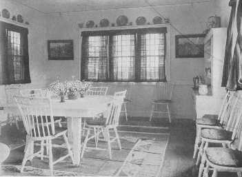
This room shows how fresh and charming white paint and simplicity can be.
This matter of appropriateness must not be overlooked, and the whole house should express the spirit of the owner; it should be in absolute keeping with his circumstances. There are few houses which naturally demand the treatment of palaces, but there are many which correspond with the smaller chateaux of France and the manor-houses of England. It is to these we must turn for our inspiration, for they have the beauty of good taste and high standards without the lavishness of royalty; but even royalty did not always live in rooms of state, for at Versailles, and Petit Trianon, there is much simple exquisite furniture. The wonderful and elaborate furniture of the past must be studied of course, but to the majority of people, then as now, the simpler expression of its fundamental lines of beauty are more satisfactory. The trouble with many houses is that their furnishings are copied from too grand models, and the effect in an average modern house is unsuitable in every way. They cannot give the large vistas and appropriate background in color and proportion which are necessary. Beauty does not depend upon magnificence.
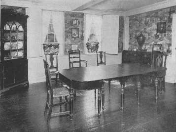
The warm tones of a brown Chinese wallpaper are attractive with the mahogany furniture, and the pattern is prevented from becoming monotonous by the strong rectangular lines of the ivory woodwork which frames it. The corner cupboard and the exceptionally fine dining-table and the variety of chairs are interesting.
If one has to live in a house planned and built by others one often has to give up some long cherished scheme and adopt something else more suited to the surroundings. For instance, the rooms of the great French periods were high, and often the modern house has very low ceilings, that would not allow space for the cornice, over-doors and correctly proportioned paneling, that are marked features of those times. Mrs. Wharton has aptly said: "Proportion is the good breeding of architecture," and one might add that proportion is good breeding itself. One little slip from the narrow path into false proportion in line or color or mass and the perfection of effect is gone.
Proportion is another word for the fitness of things, and that little phrase, "the fitness of things," is what Alice in Wonderland calls a "portmanteau" phrase, for it holds so much, and one must feel it strongly to escape the pitfalls of period furnishing. Most amazing things are done with perfect complacency, but although the French and English kings who gave their names to the various periods were far from models of virtue, they certainly deserved no such cruel punishment as to have some of the modern rooms, such as we have all seen, called after them.
The best decorators refuse to mix styles in one room and they thus save people from many mistakes, but a decorator without a thorough understanding of the subject, often leads one to disaster. A case in point is an apartment where a small Louis XV room opens on a narrow hall of nondescript modern style, with a wide archway opening into a Mission dining-room. As one sits in the midst of pink brocade and gilding and looks across to the dining-room, fitted out in all the heavy paraphernalia of Mission furniture, one's head fairly reels. No contrast could be more marked or more unsuitable, and yet this is by no means an uncommon case.
If one intends to adopt a style in decorating one's house, there should be a uniformity of treatment in all connecting rooms, and there must be harmony in the furniture and architecture and ornament, as well as harmony in the color scheme. The foundation must be right before the decoration is added. The proportion of doors and windows, for instance, is very important, with the decorated over-door reaching to the ceiling. The over-doors and mantels were architectural features of the rooms, and it was not until wallpapers came into common use, in the early part of the nineteenth century, that these decorative features slowly died out.
The mantel and fireplace should be a center of interest and should be balanced with something of importance on the other side of the room, either architectural or decorative. It was this regard for symmetry, balance, proportion, and harmony, which made the old rooms so satisfying; there was no magic about it, it was artistic common sense.
The use for which a room is intended must be kept in view and carried out with real understanding of its needs. The individuality of the owner is of course a factor. Unfortunately the word individuality is often confounded with eccentricity and to many people it means putting perfectly worthy and unassuming articles to startling uses. By individuality one should really mean the best expression of one's sense of beauty and the fitness of things, and when it is guided by the laws of harmony and proportion the result is usually one of great charm, convenience, and comfort. These qualities must be in every successful house.
In furnishing any house, whether in some special period or not, there are certain things which must be taken into account. One of these is the general color scheme. Arranging a color scheme for a house is not such a difficult matter as many people suppose, nor is it the simple thing that many others seem to think. There is a happy land between the two extremes, and the guide posts pointing to it are a good color sense, a true feeling for the proportion and harmony of color, and an understanding of the laws of light. The trouble is that people often do not use their eyes; red is red to them, blue is blue, and green is green. They have never appeared to notice that there are dozens of tones in these colors. Nature is one of the greatest teachers of color harmony if we would but learn from her. Look at a salt marsh on an autumn day and notice the wonderful browns and yellows and golds in it, the reds and russets and touches of green in the woods on its edge, and the clear blue sky over all with the reflections in the little pools. It is a picture of such splendor of color that one fairly gasps. Then look at the same marsh under gray skies and see the change; there is just as much beauty as before, the same russets and golds and reds, but exquisitely softened. One is sparkling, gay, a harmony of brilliancy; the other is more gentle, sweet and appealing, a harmony of softened glory.
Again, Nature makes a thousand and one shades of green leaves to harmonize with her flowers; the yellow green of the golden rod, the silver green of the milkweed, the bright green of the nasturtium. Notice the woods in wintertime with the wonderful purple browns and grays of the tree trunks and branches, the bronze and russet of the dead leaves, and the deep shadows in the snow. Everywhere one turns there are lessons to learn if one will only use seeing eyes and a thinking mind.
A house should be looked at as a whole, not as so many units to be treated in a care-free manner. A room is affected by all the rooms opening from it, as they, in turn, are affected by it. There can be variety of color with harmony of contrast, or there can be the same color used throughout, with the variety gained by the use of its different tones. The plan of each floor should be carefully studied to get the vistas in all directions so that harmony may reign and there will be no danger of a clashing color discord when a door is opened. The connecting rooms need not be all in one color, of course, but they should form a perfect color harmony one with another, with deft touches of contrast to accent and bring out the beauty of the whole scheme: This matter of harmony in contrast is an important one. The idea of using a predominant color is a restful one, and adds dignity and apparent size to a house. The walls, for instance, could be paneled in white enameled wood, or plaster, and the necessary color and variety could be supplied by the rugs, hangings, furniture, and pictures.
Another charming plan is to have different tones of one color used—a scheme running from cream or old ivory through soft yellow and tan to a russet brown would be lovely, especially if the house did not have an over supply of light. Greens may be used with discretion, and a cool and attractive scheme is from white to soft blue through gray. If different colors are to be used in the different rooms the number of combinations is almost unlimited, but there must always be the restraining influence of a good color sense in forming the scheme or the result will be disappointing, to say the least.
A very important matter in the use of color is in its relation to the amount and quality of the light. Dreary rooms can be made cheerful, and too bright and dazzling rooms can be softened in effect, by the skillful use of color. The warm colors,—cream white, yellows—but not lemon yellow—orange, warm tans, russet, pinks, yellow greens, yellowish reds are to be used on the north or shady side of the house. The cool colors,—white, cream white, blues, grays, greens, and violet, are for the sunny side. Endless combinations may be made of these colors, and if a gray room, for example, is wished on the north side of the house, it can be used by first choosing a warm tone of gray and combining with it one of the warm colors, such as certain shades of soft pink or yellow. We can stand more brilliancy of color out-of-doors than we can in the house, where it is shut in with us. It is too exciting and we become restless and nervous. No matter on what scale a house is furnished one of its aims should be to be restful.
There is one great mistake which many people make of thinking of red as a cheerful color, and one which is good to use in a dark room. The average red used in large quantities absorbs the light in a most disheartening manner, making a room seem smaller than it really is; it makes ugly gloomy shadows in the corners, for at night it seems to turn to a dingy black, and increases the electric light bill. Red is also a severe strain on the eyes, and many a red living-room is the cause of seemingly unaccountable headaches. I do not mean to say that red should never be used, for it is often a very necessary color, but it must be used with the greatest discretion, and one must remember that a little of it goes a long way. A room, for instance, paneled with oak, with an oriental rug with soft red in it, red hangings, and a touch of red in an old stained glass panel in the window, and red velvet cushions on the window seat, would have much more warmth and charm than if the walls were covered entirely with red. One red cushion is often enough to give the required note. The effect of color is very strong upon people, although a great many do not realize it, but nearly everyone will remember a sudden and apparently unexplained change of mood in going into some room. One can learn a deal by analyzing one's own sensations. Figured wall-papers should also be chosen with the greatest care for this same reason. Papers which have perpetual motion in their design, or eyes which seem to peer, or an unstable pattern of gold running over it, must all be ignored. People who choose this kind of paper are blest, or cursed, whichever way one looks at it, by an utter lack of imagination.
A room is divided into three parts, the floor, the walls, and the ceiling, and the color of the room naturally follows the law of nature; the heaviest or darkest at the bottom, or floor; the medium tone in the center, or walls; and the lightest at the top, or ceiling. It is only when one has to artificially correct the architectural proportions of a room that the ceiling should be as dark, or darker, than the walls. A ceiling can also be seemingly lowered by bringing the ceiling color down on the side walls. A low room should never have a dark ceiling, as it makes the room seem lower.
Walls should be treated as a background or as a decoration in themselves. In the latter case any pictures should be set in specially arranged panels and should be pictures of importance, or fresco painting. The walls of the great periods were of this decorative order. They were treated architecturally and the feeling of absolute support which they gave was most satisfactory. The pilasters ran from base or dado to the cornice and the over-doors made the doors a dignified part of the scheme, rather than mere useful holes in the wall as they too often are nowadays.
Paneling is one of the most beautiful methods of wall decoration. There are many styles of paneling, stone, marble, stucco, plaster, and wood, and each period has its own distinctive way of using them, and should be the correct type for the style chosen. The paneling of a Tudor room is quite different from a Louis XVI room. In the course of a long period like that of Louis XV the paneling slowly changed its character and the rococo style was followed by the more dignified one that later became the style of Louis XVI.
Tapestry and paintings of importance should have panels especially planned for them. If one does not wish to have the paneling cover the entire wall, a wainscot or dado with the wall above it covered with tapestry, silk, painting, or paper, will make a beautiful and appropriate room for many of the different styles of furniture. A wainscot should not be too high; about thirty-six inches is a good height, but should form a background for the chairs, sofas, and tables, placed around the room.
A wainscot six or more feet high is not as architecturally correct as a lower one, because a wall is, in a way, like an order in its divisions, and if the base, or wainscot, is too high it does not allow the wall, which corresponds to the column, to have its fair proportion. This feeling is very strong in many apartment houses where small rooms are overburdened by this kind of wainscot, and to make matters worse, the top is used as a plate-rail. A high wainscot should be used only in a large room, and if there are pilasters arranged to connect it with the cornice, and the wall covering is put on in panel effect between, the result is much better than if the wall were left plain, as it seems to give more of a raison d'être.
Tapestry is another of the beautiful and important wall coverings, and the happy possessor of Flemish or Gobelin, or Beauvais, tapestries, is indeed to be envied. A rare old tapestry should be paneled or hung so it will serve as a background. Used as portières, tapestry does not show the full beauty of its wonderful time-worn colors and its fascination of texture. It is not everyone, however, who is able to own these almost priceless treasures of the past, and so modern machinery has been called to the aid of those who wish to cover their walls and furniture with tapestry. Many of these modern manufactures are really beautiful, thick in texture, soft in color, and often have the little imperfections and unevennesses of hand weaving reproduced, so that we feel the charm of the old in the new. Many do not realize that in New York there are looms making wonderful hand-woven tapestries with the true decorative feeling of the best days of the past. On the top floor of a large modern building stand the looms of various sizes, the dyeing tubs, the dripping skeins of wool and silk, the spindles and bobbins, and the weavers hard at work carrying out the beautiful designs of the artist owner. There are few colors used, as in mediæval days, but wonderful effects are produced by a method of winding the threads together which gives a vibrating quality to the color. When the warp in some of the coarser fabrics is not entirely covered it is sometimes dyed, which gives an indescribable charm. Tapestries of all sizes have been made on these looms, from the important decoration of a great hall, to sofa and chair coverings. Special rugs are also made. It is a pleasure to think that an art which many considered dead is being practiced with the highest artistic aim and knowledge and skill in the midst of our modern rush. This hand-woven tapestry is made to fit special spaces and rooms, and there is nothing more beautiful and suitable for rooms of importance to be found in all the long list of possibilities.
The effect of modern tapestry, like the old, is enhanced if the walls are planned to receive it, for it was never intended to be used as wall-paper. It is sometimes used as a free hanging frieze, so to speak, and sometimes a great piece of it is hung flat against the wall, but as a general thing to panel it is the better way.
Another beautiful wall covering is leather. It should be used much more than it is, and is especially well adapted for halls, libraries, dining-rooms, smoking-and billiard-rooms, and dens. Its wonderful possibilities for rooms which are to be furnished in a dignified and beautiful manner are unsurpassed. It may be used in connection with paneling or cover the wall above a wainscot.
Fresco painting is another of the noble army of wall treatments which lends itself beautifully to all kinds and styles of rooms.
Amidst all the grandeur of tapestry and painting one must not lose sight of the simpler methods, for they are not to be distained. Wall-papers are growing more and more beautiful in color, design, and texture, and one can find among them papers suited to all needs. Fabrics of all kinds have become possibilities since their dust-collecting capacity is now no longer a source of terror, as vacuum cleaners are one of the commonplaces of existence. Painting or tinting the walls, when done correctly, is very satisfactory in many rooms.
There is no doubt that in many houses are wonderful collections of furniture, tapestries and treasures of many kinds, that are placed without regard to the absolute harmony of period, although the general feeling of French or Italian or English is kept. They are usually great houses where the sense of space keeps one from feeling discrepancies that would be too marked in a smaller one, and the interest and beauty of the rare originals against the old tapestries have an atmosphere all their own that no modern reproduction can have. There are few of us, however, who can live in this semi-museum kind of house, and so one would better stick to the highway of good usage, or there is danger of making the house look like an antique shop.
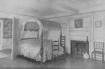
Dorothy Quincy's bedroom contains a fine old mahogany field bed, which is appropriately covered with the flowered chintz popular at the end of the Eighteenth Century. The chairs are fitting for all bedrooms decorated in Colonial style. Notice the woodwork in the room and hall.
To carry out a style perfectly, all the small details should be attended to—the door-locks, the framework of the doors and windows, the carving. All these must be taken into account if one wishes success. It is better not to attempt a style throughout if it is to be a makeshift affair and show the effects of inadequate knowledge. The elaborate side of any style carried out to the last detail is really only possible and also only appropriate for those who have houses to correspond, but one can choose the simpler side and have beautiful and charming rooms that are perfectly suited to the average home. For instance, if one does not wish elaborate gilded Louis XVI furniture, upholstered in brocade, one can choose beautiful cane furniture of the time and have it either in the natural French walnut or enameled a soft gray or white to match the woodwork, with cushion of cretonne or silk in an appropriate design. Period furnishing does not necessarily mean a greater outlay than the nondescript and miscellaneous method so often seen.
Whatever the plan for furnishing a house may be, the balance of decoration must be kept; the same general feeling throughout all connecting parts. If a drawing-room is too fine for the hall through which one has to pass to reach it, the balance is upset. If too simple chairs are used in a grand dining-room the balance is upset, the fitness of things is not observed. When the happy medium is struck throughout the house one feels the delightful well-bred charm which a regard for the unities always gives. It is not only in the quality of the decorations that this feeling of balance must be kept, but in the style also. If one chooses a period style for the drawing-room it is better to keep to it through the house, using it in its different expressions according to the needs of the different rooms. If one style throughout should seem a bit monotonous at least one nationality should be kept, such as French, or English. If several styles of French furniture are used do not have them in the same room; for instance, Louis XV and Empire have absolutely nothing in common, but very late Louis XVI and early Empire have to a certain extent. It does not give the average person a severe shock to walk from a Louis XVI hall into a Louis XV drawing-room, but the two mixed in one room do not give a pleasing effect. The oak furniture of Jacobean days does not harmonize with the delicate mahogany furniture of the eighteenth century in England. The delicate beauty of Adam furniture would be lost in the greatness of a Renaissance salon. A lady whose dining-room was furnished in Sheraton furniture one day saw two elaborate rococo Louis XV console tables which she instantly bought to add to it. The shopman luckily had more sense of the fitness of things than a mere desire to sell his wares, and was so appalled when he saw the room that he absolutely refused to have them placed in it. She saw the point, and learned a valuable lesson. One could go on indefinitely, giving examples to warn people against startling and inappropriate mixtures which put the whole scheme out of key.
I am taking it for granted that reproductions are to be chosen, as originals are not only very rare, but also almost prohibitive in price. Good reproductions are carefully made and finished to harmonize with the color scheme. The styles most used at present are, Louis XIV, XV, XVI, Jacobean, William and Mary, and Georgian. Gothic, Italian and French Renaissance, Louis XIII, and Tudor styles are not so commonly used. We naturally associate dignity and grandeur with the Renaissance, and it is rather difficult to make it seem appropriate for the average American house, so it is usually used only for important houses and buildings. Some of the Tudor manor houses can be copied with delightful effect. The styles of Henri II and Louis XIII can both be used in libraries and dining-rooms with most effective and dignified results.
The best period of the style of Louis XV is very beautiful and is delightfully suited to ball-rooms, small reception-rooms, boudoirs, and some bedrooms. In regard to these last, one must use discretion, for one would not expect one's aged grandmother to take real comfort in one. Nor does this style appeal to one for use in a library, as its gayety and curves would not harmonize with the necessarily straight lines of the bookcases and rows of books. Any one of the other styles may be chosen for a library.
The English developed the dining-room in our modern sense of the word, while the French used small ante-chambers, or rooms that were used for other purposes between meals, and I suppose this is partly the reason we so often turn to an English ideal for one. There are many beautiful dining-rooms done in the styles of Louis XV and XVI, but they seem more like gala rooms and are usually distinctly formal in treatment. Georgian furniture, or as we so often say, Colonial, is especially well suited to our American life, as one can have a very simple room, or one carried out in the most delightful detail. In either case the true feeling must be kept and no startling anachronisms should be allowed; radiators, for instance, should be hidden in window-seats. This same style may be used for any room in the house, and there are beautiful reproductions of Chippendale, Adam, Hepplewhite, and Sheraton furniture that are appropriate for any need.
In choosing new "old" furniture, do not buy any that has a bright and hideous finish. The great cabinet-makers and their followers used wax, or oil, and rubbed, rubbed, rubbed. This dull finish is imitated, but not equaled, by all good furniture makers, and the bright finish simply proclaims the cheap department store.
In parts of the country Georgian furniture has been used and served as a standard from the first, and it is a happy thing for the beauty of our homes that once more it has come into its own. It is the high grade of reproduction which has made it possible.
The mahogany used by Chippendale, and in fact by all the eighteenth century cabinet-makers, was much more beautiful than is possible to get to-day, for the logs were old and well seasoned wood, allowed to dry by the true process of time, which leaves a wonderful depth of color quite impossible to find in young kiln-dried wood. The best furniture makers nowadays, those who have a high standard and pride in their work, have by careful and artistic staining and beautiful finish, achieved very fine results, but the factory article with its dreadful "mahogany" stain, its coarse carving, and its brilliant finish, shows a sad difference in ideal. The best reproductions are well worth buying, and, as they are made with regard to the laws of construction, they stand a very good chance of becoming valued heirlooms. There are certain characteristics of all the eighteenth century cabinet-makers, both English and French, which are picked out and overdone by ill-informed manufacturers. The rococo of Chippendale is coarsened, his Chinese style loses its fine, if eccentric, distinction, and the inlay of Hepplewhite and Sheraton is another example of spoiling a beautiful thing. Thickening a line here and there, or curving a curve a bit more or less, or enlarging the amount of inlay, achieves a vulgarity of appearance quite different from the beautiful proportions of the originals, and it is this which one must guard against in buying reproductions. The lack of knowledge of correct proportion is not confined to the cheaper grades, where necessary simplicity is often a protection, but is apt to be found in all. The best makers, as I have said, take a pride in their work and one can rely on them for fine workmanship and being true to the spirit of the originals.
There is one matter of great importance to be kept in mind and practiced with the sternest self-control, and that is, to eliminate, eliminate, eliminate. Walk into the center of a room and look about with seeing, but impersonal eyes, and you will be astonished to find how many things there are which are unnecessary, in fact, how much the room would be improved without them. In every house the useless things which go under the generic name of "trash" accumulate with alarming swiftness, and one must be up with the lark to keep ahead of the supply. If something is ugly and spoils a room, and there is no hope of bringing it into harmony, discard it; turn your eyes aside if you must while the deed is being done, but screw your courage to the sticking point, and do it. She is, indeed, a lucky woman who can start from the beginning or has only beautiful heritages from the past, for the majority of people have some distressingly strong pieces of ugly furniture which, for one reason or another, must be kept. One sensible woman furnished a room with all her pieces of this kind, called it the Chamber of Horrors, and used it only under great stress and strain, which was much better than letting her house be spoiled.
A home should not be a museum, where one grows exhausted going from one room to another looking at wonderful things. Rather should it have as many beautiful things in it as can be done full justice to, where the feeling of simplicity and restfulness and charm adds to their beauty, and the whole is convincingly right. The fussy house is, luckily, a thing of the past, or fast getting to be so, but we should all help the good cause of true simplicity. It does not debar one from the most beautiful things in the world, but adds dignity and worth to them. It does not make rooms stiff and solemn, but makes it possible to have the true gayety and joy of life expressed in the best periods.
A delightful renaissance of the Georgian period in house decoration is being felt more and more, and every day we see new evidence that people are turning with thanksgiving to the light and graceful designs of the eighteenth century English cabinet-makers. There is a charm and distinction about their work which appeals very strongly to us, and its beauty and simplicity of line makes delightful schemes possible.
The Georgian period seems especially fitted for use in our homes, for it was the inspiration of our Colonial houses and furniture, which we adapted and made our own in many ways. The best examples of Colonial architecture are found in the thirteen original states. In many of these houses we find an almost perfect sense of proportion, of harmony and balance, of dignity, and a spaciousness and sense of hospitality, which few of our modern houses achieve. The halls were broad and often went directly through the house, giving a glimpse of the garden beyond; the stairs with their carefully thought-out curve and sweep and well placed landings, gave at once an air of importance to the house, while the large rooms opening from the hall, with their white woodwork, their large fireplaces, and comfortable window-seats, confirmed the impression.
It is to this ideal of simple and beautiful elegance that many people are turning. By simplicity I do not mean poverty of line and decoration, but the simplicity given by the fundamental lines being simple and beautiful with decoration which enhances their charms, but does not overload them. Even the most elaborate Adam room with its exquisite painted furniture, its beautifully designed mantel and ceiling and paneled walls, gave the feeling of delightful and beautiful simplicity. This same feeling is expressed in the furniture of Louis XVI, for no matter how elaborate it may be, it is fundamentally simple, but with a warmer touch than is found in the English furniture of the same time.
The question of period furnishing has two sides, and by far the more delightful side is the one of having originals. There is a glamor about old furniture, a certain air of fragility, although in reality it is usually much stronger than most of our modern factory output, which adds to the charm. With furniture, as with people, breeding will out. When one has inherited the furniture, the charm is still greater, for it is pleasant to think of one's own ancestors as having used the chairs and tables, and danced the stately minuet, with soft candle-light falling from the candelabra, and the great logs burning on the old brass andirons. But if one cannot have one's own family traditions, the next best thing is to have furniture with some other family's traditions, and the third choice is to have the best modern reproductions, and build up one's own traditions oneself.
The feeling which many people have that Georgian furniture was stiff and uncomfortable is not borne out by the facts. The sofas were large and roomy, the settees delightful, the arm-chairs and wing chairs regular havens of rest, and when one adds the comfort which modern upholstery gives, there is little left to desire. Even the regulation side-chair of the period, which some think was the only chair in very common use, is absolutely comfortable for its purpose. Lounging was much less in vogue then than nowadays and the old cabinet-makers realized that one must be comfortable when sitting up as well as when taking one's ease. One must not be deterred by this unfounded bugaboo of discomfort if one wishes a room or house done after the great period styles of the eighteenth century. With care and knowledge, the result is sure to be delightful and beautiful.
This little book, as I have said before, is not intended to be a guide for collectors, for that is a very big subject in itself, but is meant to try to help a little about the modern side of the question. There are many grades of furniture made, and one should buy with circumspection, and the best grade which is possible for one to afford. The very best reproductions are made with as much care and knowledge and skill as the originals, and will last as long, and become treasured heirlooms like those handed down to us. They are works of art like their eighteenth century models. The wood is chosen with regard to its beauty of grain, and is treated and finished so the beauty and depth of color is brought out, and the surface is rubbed until there is a soft glow to it. If one could have the ages-old mahogany which Chippendale and his contemporaries used, there would be little to choose between the originals and our best reproductions, so far as soundness of construction and beauty of detail go. But the fact that they were the originals of a great style, that no one since then has been able to design any furniture of greater beauty than that of England and France in the eighteenth century, and that we are still copying it, gives an added charm to a rare old chair or sideboard or mirror. The modern workman in the best workshops is obliged to know the different styles so well that he cannot make mistakes, and if he ventures to take a little flight of fancy on his own account, it will be done with such correctness of feeling that one is glad he flew; but few attempt it. In the lower grade of reproductions one must have an eagle eye when buying. I saw a rather astounding looking Chippendale chair in a shop one day, with a touch of Gothic—a suspicion of his early Dutch manner—and, to give a final touch, tapering legs with carved bellflowers! "What authority have you for that chair?" I asked, for I really wanted to know what they would call the wonder.
"That," the shopman answered, the pride of knowledge shining in his eyes, "is Chinese Chippendale."
Another anachronism which has appeared lately, and sad to say in some of the shops that should know better, is painted Adam furniture with pictures on it of the famous actresses of the eighteenth century. The painting of Angelica Kauffman, Cipriani, Pergolesi and the others, was charming and delightful. Nymphs and cupids, flowers, wreaths, musical instruments, and poetical little scenes, but never the head of a living woman! The bad taste of it would have been as apparent to them as putting the picture of Miss Marlowe, or Lillian Russell on a chair back would be to us.
The finish is another matter to bear in mind. There is a thick red stain, which for some mysterious reason is called mahogany, which is put on cheaper grades of furniture and finished with a high polish. Fortunately, it is chiefly used on furniture of vulgar design, but it sometimes creeps in on better models. Shun it whenever seen. The handles must be correct also, and a glance at the different illustrations will be of help in this matter.
The pieces of furniture used throughout a house, no matter what the period may be, are more or less the same, so many chairs, tables, beds, mirrors, etc., and when one has decided what one's needs are, the matter of selection is much simplified. Of course one's needs are influenced by the size of the house, one's circumstances, and one's manner of life. To be successful, a house must be furnished in absolute harmony with the life within its walls. A small house does not need an elaborate drawing-room, which could only be had at the expense of family comfort; a simple drawing-room would be far better, really more of a living-room. In a large house one may have as many as one wishes.
A house could be furnished throughout with Chippendale furniture and show no sign of monotony of treatment. The walls could be paneled in some rooms, wainscoted in others, and papered in others. This question of paper is one we have taken in our own hands nowadays, and although it was not used much before the late eighteenth and early nineteenth centuries, there are so many lovely designs copied from old-time stuffs and landscape papers, which are in harmony with the furniture, that they are used with perfect propriety. One must be careful not to choose anything with a too modern air, and a plain wall is always safe.
The average hall will probably need a pair of console tables and mirrors, some chairs, Oriental rugs, a tall clock if one wishes, and, if the hall is very large and calls for more furniture, there are many other interesting pieces to choose from. A hall should be treated with a certain amount of formality, and the greater the house, the greater the amount; but it also should have an air of hospitality, of impersonal welcome, which makes one wish to enter the rooms beyond where the real welcome waits.
The window frames of Colonial and Georgian houses were often of such good design that no curtains were used, and the wooden inside shutters were shut at night. Nowadays the average house has what might be called utility woodwork at its windows and so we cover them with curtains. These curtains may be of linen, cretonne, damask, or brocade, according to the house, and may either fall straight at the side with a slight drapery or shaped or plain valance at the top, or be drawn back from the center. A carved cornice or the regular box frame may be used.
The stairs were often of beautifully polished hardwood, and they were sometimes covered with rugs. Large Chinese porcelain jars on the console tables are suitable, and other beautiful ornaments.
As the drawing-room usually opens from the hall, it is better to keep both rooms in the same general scale of furnishing. The average sized drawing-room will need sofas, a small settee, two or three tables, one of them a gallery table if desired, chairs of different shapes and size, mirrors, a cabinet if one has rare pieces of old porcelain, and candelabra. Oriental rugs, a fire screen, ornaments, and pictures, but these last should not be of the modern impressionistic school. The woodwork should be white, or light, and the furniture covered with damask, needlework, brocade or tapestry.
The dining-room can be made most charming with corner cupboards and cabinet, a large mahogany table and side table and beautiful morocco covered chairs. Chippendale did not make sideboards in our sense of the word, but used large side tables. One of the modern designs which many like to use, for to them it seems a necessity, is a sideboard made in the style of Chippendale. The screen may be leather painted after "the Chinese taste," or it may be damask. The chairs may be covered with tapestry or damask if one does not care for morocco. Portraits are interesting in a dining-room, or old prints, or paintings, and if you can get the old dull gold carved frames, so much the better. They may also be set in panels.
The bedrooms may have either four-post canopy beds or low-posts beds. Chippendale's canopy beds had usually a carved cornice with the curtains hung from the inside. The other furniture should consist of a dressing-table, a chest of drawers to correspond with a chiffonier, a highboy, a sewing table, a bedside table, a comfortable sofa, a fireside or wing chair and other chairs according to one's need. The walls may be covered with either an old-fashioned or plain paper,—or paneled, with hangings and chair coverings of chintz or cretonne. The bed hangings may be of cretonne also, for it makes a very charming room, but if one objects to colored bed hangings, white dimity, or muslin or linen may be used.
It is the art of keeping the correct feeling which makes or mars a room of this kind, and no pieces of markedly modern and inharmonious furniture should be used. In furnishing a house in Georgian or Colonial manner one need not keep all the rooms in the same division of the period, for there is a certain general air of harmony and relationship about them all, and the common bond of mahogany makes it possible to have a Chippendale library, an Adam drawing-room, a Hepplewhite dining-room and a Sheraton hall, or any other combination desired. The spirit of all the eighteenth century cabinet-makers was one of honest construction and beauty of line and workmanship. When they took ideas from other sources they made them so distinctly their own, so essentially English that there is a family resemblance through all their work.
Adam decoration and furniture makes most delightful rooms. The painted satinwood furniture for dining-room, drawing-room and bedrooms, lends itself to lovely schemes with its soft golden tones, its delightfully woven cane chair backs and panels. A room on the sunny side of the house, with a soft old ivory colored wall, dull blue silk curtains, and a yellow and blue Chinese rug, would be most charming with this satinwood furniture.
Then, as I have said before, there are the many different shades of enameled and carved furniture and also beautiful natural wood. One can have more of a sideboard in an Adam than in a Chippendale room, as he used two pedestals, one at each end of a large serving-table. He often made tables to fit in niches, which is a charming idea.
An Adam mantel is very distinctive and one should be careful in having it correct. There are beautiful reproductions made. The lamp and candle shades should also be designed in the spirit of the time. There are lovely Adam designs in nearly all materials suitable for hangings and chair coverings. Oriental rugs or plain colored carpets appeal to us more than large-figured rugs. Adam sometimes had special rugs made exactly reproducing the design of the ceiling, but it is an idea that is better forgotten.
With Hepplewhite and Sheraton the same general ideas hold; keep to the spirit of the furniture, try to have a central idea in the house furnishing, so that the restful effect of harmony may be given.
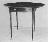
Pembroke tables were made by Hepplewhite. This is a fine example and shows characteristic inlay and the legs sloping on the inside edge only. The flaps fold down and make a small oblong table.
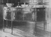
This fine Sheraton sideboard shows curved doors, and knife boxes with oval inlay of satinwood. The center cupboard is straight. The legs are reeded.
The rugs which harmonize best with Georgian furniture are Orientals of different weaves and colors, or plain domestic carpet rugs. The floor should be the darkest of the three divisions of a room—the floor, the walls, the ceiling, but it should be an even gradation of color value, the walls half-way in tone between the other two. This is a safe general plan, to be varied when necessity demands. In drawing-rooms light and soft colors are usually in better harmony than dark ones, and a wide and beautiful choice can be made among Kermanshah, Kirman, Khorasan, Tabriz, Chinese, Oman rugs, and many others. It is more restful in effect if the greater part of the floor is covered with a large rug, but if one has beautiful small rugs they may be used if they are enough alike in general tone to escape the appearance of being spotty. One should try them in different positions until the best arrangement is found.
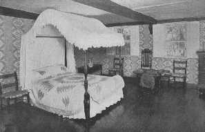
A pleasing design of the old field bed. The chairs here are samples of some eighteenth century manufacture that are to-day reproduced in admirable consistency. The patch work quilt is interesting and the bed hanging are exceptionally good.
Living-rooms and libraries are usually more solid in color than drawing-rooms and so need deeper tones in the rugs. The choice is wide, and the color scheme can be the deciding note if one is buying new rugs. If one already has rugs they must be the foundation for the color scheme of the room.
"This is my Louis XVI drawing-room," said a lady, proudly displaying her house.
"What makes you think so?" asked her well informed friend.
To guard against the possibility of such biting humor one must be ever on the alert in furnishing a period room. It is not a bow-knot and a rococo curve or two that will turn a modern room, fresh from the builder's hands, into a Louis XV drawing-room.
French furniture is not appropriate to all kinds of houses, and it is often difficult to adapt it to circumstances over which one has no control. The leisurely and pleasant custom of our ancestors of building a house as they wished it, and what is more, living in it for generations, is more or less a thing of the past. Nowadays a house is built, and is complete and beautiful in every way, but almost before the house-warming is over, business is sitting on the doorstep, and so the family moves on. We, as a nation, have not the comfortable point of view of the English who consider their home, their home, no matter how the outside world may be behaving. Their front doors are the protection which insures their cherished privacy, and the feeling that they are as settled as the everlasting hills gives a calmness to their attitude toward life which is often missing from ours. How many times have we heard people say when talking over plans—"Have it thus and so, for it would be much better in case we ever care to sell." This attitude, to which of course there are hundreds of exceptions, is an outgrowth of our busy life and our tremendous country. The larger part of the home ideal is the one which Americans so firmly believe in and act upon—that it is the spirit and atmosphere which makes a home, and not only the bricks and mortar.
It is this point of view which makes it possible for many of us to live happily in rented houses whose architecture and arrangement often give us cold shivers. We are not to blame if all the proportions are wrong; and there is a certain pleasure in getting the better of difficulties.
If one is building a house, or is living in one planned with a due regard to some special period, and has a well thought out scheme of decoration, the work is much simplified; but if one has to live in the average nondescript house and wishes to use French furniture, the problem will take time and thought to solve. In this kind of house, if one cannot change it at all, it is better to keep as simple and unobtrusive a background as possible, to have the color scheme and hangings and furniture so beautiful that they are a convincing reason themselves of the need of their being there, but one should not try to turn the room itself into a period room, for it would mean failure. The walls may be covered with a light plain paper, or silk, the woodwork enameled white or cream or ivory, and then with one's mirrors and furnishings, the best thing possible has been done, and it ought to be a charming room, if not a perfect one. If one can make a few changes I advise new lighting fixtures and a new mantel, for these two important objects in the room are conspicuous and nearly always wrong.
It is almost impossible to give a list of furniture for each room in a house, as each house is a law unto itself, but the fundamental principles of beauty and utility and appropriateness apply to all.
The furniture of the time of Louis XIV, having so much that is magnificent about it, is especially well suited to large rooms for state occasions, great ballrooms and state drawing-rooms. These rooms not being destined for everyday use should be treated as a brilliant background; paneling, painting, tapestry, and gilding should decorate the walls, and beautiful lights and mirrors should aid in the effect of brilliancy. It must be done with such knowledge that there is no suggestion of an hotel about it. Console tables, and large and dignified chairs should be used for furniture. Nothing small and fussy in the way of ornaments should be put in the rooms, for they would be completely out of scale and ruin the effect.
Every house does not need these rooms for the elaborate side of life, and the average drawing-room is a much simpler affair. If both kinds are required the simpler one should be in the same general style as the great rooms, but not on so grand a scale. If the style of Louis XV is chosen for all, in the family drawing-and living-rooms the paneling, or dado, and furniture should be of the simpler kind, and beautiful, gay, and home-like rooms, evolved with soft colored brocades, Beauvais or Gobelin tapestry, and either gilded or enameled or natural walnut furniture. The arm-chairs or bergères of both Louis XV and Louis XVI are very comfortable, the chaise-longue cannot be surpassed, and the settees of different shapes and sizes are delightful. There need be no lack of comfort in any period room, whether French or English.
A music room, to be perfect, should not have heavy draperies to deaden the sound, and the window and door openings should be treated architecturally to make this possible. In a French music room the walls may be either paneled, or have a dado with a soft tint above it. This space may be treated in several ways: it may have silk panels outlined with moldings, or dainty pastoral scenes painted and framed with wreaths and garlands of composition. The style of the Regency with its use of musical instruments for decorative motifs is also attractive. The chairs should be comfortable, the lights soft and well shaded side-lights, with a plentiful supply near the piano.
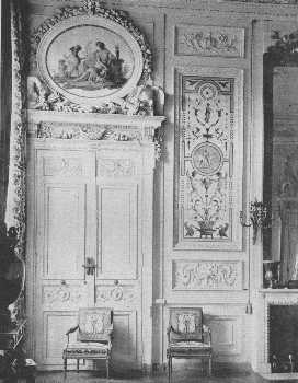
A beautiful doorway in the bedroom of the Empress, Compiègne. The fastening shows how much thought was expended on small matters, so the balance of decoration would be kept. The chairs are Louis XVI.
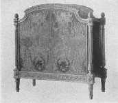
An exquisite reproduction of the bed of Marie Antoinette.
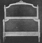
A simple but charming Louis XVI bed in enamel and cane.
A piano is usually a difficulty, for they are so unwieldy and dark that they are quite out of key with the rest of the room. We have become so used to its ugliness, however, that, sad to say, we are not so much shocked by it as we should be, thinking it a necessary evil. If we walk through the show rooms of one of the great piano companies we shall see that this is a mistake, for there are many cases made of light colored woods, and some have a much more graceful outline than the regulation piano. Cases can be made to order to suit any scheme, if one has a competent designer. A music room should not have small and meaningless ornaments in it; the ideal is a restful and charming room where one may listen with an undistracted mind.
The modern dining-room with all its comforts is really of English descent. In France, even in the eighteenth century, only the palaces and great houses had rooms especially set apart for dining-rooms. Usually a small ante-chamber was used, which served as a boudoir or reception room between meals. To our more established point of view it seems a very casual method. At last, late in the century, the real ideal of a dining-room began to gain ground, and although they were very different from ours, we find really charming ones described and pictured. The walls were usually light in tone, paneled, with graceful ornamentation, and often there were niches containing wall-fountains of delightful design. The sideboards were either large side-tables, or a species of side-table built in niches, with a fountain between them which was used as a wine cooler. These fountains where cupids and dolphins disported themselves would be a most attractive feature to copy in some of our rooms, in country houses especially. The tables were round or square, but not the extension type which came later from England, and the chairs were comfortable, with broad upholstered or cane seats, and rather low backs. There should be a screen to harmonize with the room in front of the pantry door. We also add hangings, for, as I have said many times, our window-frames are not a decoration in themselves. Old prints show most delightfully the manner in which curtains were hung when they were used; the very elaborate methods, however, were not used by the better class.
A morning-room should be furnished as a small informal living-room, and the simpler style of the chosen period used.
The style of Louis XVI is beautifully adapted to libraries, for they do not have to be dark and solid in style, as many seem to think. In fact a library may be in any style if carried out with the true feeling and love of books, but of course some styles are more appropriate than others. In a Louis XVI library the paneling gives way to the built-in bookcases which are spaced with due regard to keeping the correct proportions. There is usually a cupboard space running round the room about the height of a dado and projecting a little beyond the bookcases above. The colors of the rugs and hangings may be warm and rich as the books give the walls a certain strength.
There are also beautiful reproductions of bedroom furniture, chairs and dressing-tables, desks, chiffoniers and Chaises-longues, and beds.
Andirons, side-lights for the walls and dressing-table, doorknobs and locks, can all be carried out perfectly. Lamp and candle shades and sofa cushions should all be in keeping. The walls may be paneled in wood enameled with white or some light color, or they may be covered with silk or paper, in a panel design, with curtains to match. There are lovely designs in French period stuffs.
The rugs most appropriate for French period rooms are light or medium in tone, and of Persian design. The floral patterns of the Persians seem to harmonize better with the curves and style of furniture than do the geometrical designs of the Caucasian rugs. Savonnerie and Aubusson rugs may also be used, if chosen with care, and the plain carpets and rugs mentioned later are a far better choice than gaudy Orientals of modern make, or bad imitations.
The Country House is a comparatively modern idea, and one which has added much to the joy of life. There are all kinds and conditions of them, great and small, grand and simple, and each is a joy to the proud possessor.
Life was such a turbulent affair in the Middle Ages that country life in the modern sense was an impossibility. The chateaux and castles and large manor-houses were strongly fortified, and there were inner courts for exercise. When war became the exception and not the rule, the inherent love in all human beings for the open began to assert itself, and the country house idea began to grow.
Italy was the first country where we find this freedom of attitude exemplified in the beautiful Renaissance villas near Rome and Florence. The best were built during the sixteenth century, and were owned by the great Italian families, like the de Medici and d'Este. They seem more like places built for the parade and show of life than homes, but the home ideal with all its conveniences was another outgrowth of peace.
The plan of an Italian villa is very interesting to study, to see how every advantage was taken of the land, how the residence, or casino, was placed in regard to the formal garden and the view over the valley, for they were usually on a hillside and the slope was terraced, how the statues and fountains, the beautiful ilex and cypress and orange trees, the box-edged flower-beds and gravel paths, all formed a wonderful setting for the house, and together made a perfect whole. The Italian villa was not necessarily large, in fact the Villa Lante contains only six acres, which are divided into four terraces, the house being on the second and built in two parts, one on each side. Each terrace has a beautiful fountain, with a cascade connecting those on the fourth and third. This villa is indeed, an example of taking advantage of a fairly small space. It was built by the great Vignola in 1547, and although slightly showing the wear of time, has all the beauty and charm and romance which only centuries can give.
The Italian villa can be adapted to the American climate and scenery and point of view, but it must be done by one of the architects who have made a deep study of the Italian Renaissance so the true feeling will be kept. There are some beautiful examples already in the country.
In France, the chateaux which have most influenced country house building are those which were built during the sixteenth century, many of them during the reign of Francis 1st. Among the number are Azay le Rideau, Chenonceaux, and Chaumont. Blois and Amboise are also absorbingly interesting, but belong partly to an earlier time. The chateau region in Touraine is a treasure land of architectural beauty. In the time of Louis XIV Le Nôtre changed many of these old chateaux from their fortified state to the more open form made possible by a peaceful life.
We turn to England for the most perfect examples of country houses, for the theory of country living is so thoroughly understood there, one might really say it is a national institution. Many of the manor-houses, both great and small, are beautiful examples of Tudor architecture, which seems especially suited to their setting of lovely green parks. The smaller country house, which has no pretention to being a show place, is as perfect in its way. The English love for out-of-doors makes them achieve wonders with even small gardens, and the climate, being gentle, helps matters immensely.
In America we are taking up the English country house ideal more and more and adapting it to our own needs. The question of architecture is a question of personal choice influenced by climate, and there are now numberless charming houses scattered over the length and breadth of the land which have been built with the purpose of being country homes. They are not for summer use only, but all the year round keep their hospitable doors open, or else the season begins so early and ends so late, that, with the holiday time between, the house hardly seems closed at all. It is this attitude which is changing country house architecture to a great extent. The terraces and porches and gardens and glasshouses are all there, but the house itself is more solidly built and is prepared to stand cold weather.
For the average American the best types of country house to choose from are the smaller Tudor manor-houses, Italian villas, Georgian architecture in England, and our own Colonial style which of course was founded on the Georgian. In the south and southwestern parts of this country a modified Spanish type may be used in place of Tudor, which does not give the feeling of cool spaces so necessary in hot climates. The bungalow type is also popular in the South.
There are many architects in this country who understand thoroughly the plan and spirit of Colonial times, and who succeed in giving to the comforts of modern days the true stamp of the eighteenth century. The style makes most delightful houses, and with the great supply of appropriate furniture from which to choose, it would be hard to fail in having a charming whole.
The house and garden should be planned together to have the best effect. Each can be added to as time goes on, but when a plan is followed there is a look of belonging together which adds greatly to the charm.
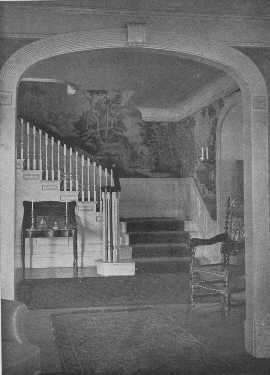
A hall to conjure with—although a Hepplewhite or Sheraton chair would be more in keeping.
In an all-the-year country house a vestibule is a necessity as much as in a town house, and the hall should be treated with the dignity a hall deserves, and not as a second living-room. In many English houses of Tudor days the stairs were behind a carved screen, or concealed in some manner, which made it possible to use the hall as a gathering place. Our modern hall is not a descendant of this old hall of a past day (the living-room is much more so), but is really only a passage, often raised to the nth power, connecting the different rooms of the house, and should be treated as such. The stairs and landing and vista should be beautiful, and the furnishing should be dignified and in perfect scale with the rest of the house. Marble stairs and tapestry and old carved furniture and beautiful rugs, or the simplest possible furniture, may be used, but the hall should have an impersonally hospitable air, one which gives the keynote of the house, but reserves its full expression until the privacy of the living-rooms is reached.
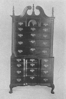
A very rare block-front chest of drawers with the original brasses.
The average country house is neither very magnificent nor very simple, but strikes the happy medium and achieves a most delightful home-like charm, which at the very outset makes life seem well worth living. It is rarely furnished in a period style throughout, but has the modern air of comfort which good taste and correct feeling give. For instance, the hall may have paneling and Chippendale mirror, a table, and chairs; the living-room furnished in a general Colonial manner mixed with some comfortable stuffed furniture, but not over-stuffed, lovely chintz or silk hangings, and a wide fireplace; the morning-room on something the same plan, but a little less formal; and the drawing-room a little more so, say in Adam or simple Louis XVI furniture. The library should have plenty of comfortable sofas and chairs, and a large table (it is hard to get one too large), some of the bookcases should be built in to form part of the architectural plan of the room, and personally I think it is a better idea to have all the space intended for bookcases built in in the first place, as this insures harmony of plan. Another important thing in a library is to have the lights precisely right, and the window-seats and the fireplace should be all that their names imply in the way of added charm and comfort to the room. The dining-room should be bright and cheerful and in harmony with the near-by rooms. A breakfast-room done in lacquer is very charming.
The bedrooms should be light and airy, and so planned that the beds can be properly placed. They may be furnished in old mahogany, French walnut in either Louis XV or XVI style, or in carefully chosen Empire; painted Adam furniture is also lovely, and willow furniture makes a fresh and attractive room. The curtains should be hung so they can be drawn at night if desired, and the material should be chosen to harmonize in design with the room.
The children's rooms should be sunny and bright and furnished according to their special tastes, which if too astounding, as sometimes happens, can be tactfully guided into safe channels.
The servants should be given separate bedrooms, a bathroom, and a comfortable sitting-room beside their dining-room. Making them comfortable seems a simple way of solving the servant question.
The bungalow type of small country house is usually very simply furnished, and the best type of Mission furniture or willow is especially well suited to it. Bungalows are growing more and more in favor, and, although they originated in America in the West, we find delightful ones everywhere, on the Maine coast and in the woods and mountains. They are a tremendous advance over the small and elaborate house of a few years ago.
Cretonne and chintz can be used in all the rooms of a country house with perfect propriety, and is a really lovely method of furnishing, as it is fresh and washable, and comes in all gradations of price. Willow furniture with cretonne cushions makes a pleasant variety with mahogany in simple rooms.
Fresh air and sunlight, lovely vistas through doors and windows of the garden beyond, cool and comfortable rooms furnished appropriately, and with an atmosphere about them which expresses a hospitable and charming home spirit, is the ideal standard for a country house.
We should be thankful that the old idea of a nursery has passed away and instead of the dreary and rather shabby room has come the charming modern nursery with its special furniture and papers, its common sense and sanitary wisdom and its regard for the childish point of view. The influence of surroundings during the formative years of childhood has a deal to do with the child's future attitude toward life, and now that parents realize this more, the ideal nursery has simplicity, charm and artistic merit, all suited to the needs of its romping inhabitants.
The wall-papers for nurseries are especially attractive with their gay friezes of wonderful fairy-tale people, Mother Goose, Noah's Ark and happy little children playing among the flowers. Some of the designs come in sets of four panels that can be framed if desired. A Noah's Ark frieze with the animals marching two by two under the watchful eyes of the Noah family, with an ark and stiff little Noah's Ark trees, will give endless pleasure if placed about three feet from the floor where small tots can take in its charm. If placed too high, it is very often not noticed at all. Some of the most attractive nurseries have painted walls with special designs stenciled on them.
If any one of these friezes is placed above a simple wainscot, the effect is charming. The paper for nurseries is usually waterproof, for a nursery must be absolutely spick and span. Another thing that gives much pleasure in a nursery is to build on one side of the room a platform about a yard wide and six inches high, and cover it with cushions.
The furniture in a day nursery should consist of a toy cupboard stained to match the color scheme of the room and large enough for each child to have his own special compartment in it. If the children's initials are painted or burned on the doors, it gives an added feeling of pride in keeping the toys in order. There are many designs of small tables and chairs made with good lines, and the wicker ones with gay cretonne cushions are very attractive. The tables and chairs should not have sharp corners and should be heavy enough not to tip over easily. There should be a bookcase for favorite picture-books. Besides the special china for the children's own meals there should be a set of play china for doll's parties. A sand table, with a lump of clay for modeling, a blackboard and, in the spring, window-boxes where the children can plant seeds, will all add vastly to the joy of life.
And do not forget a comfortable chair for the nurse-maid. White muslin curtains with side hangings of washable chintz or linen or some special nursery design in cretonne should hang to the sill.
The colors in both day and night nurseries should be soft and cheerful, and the color scheme as carefully thought out as for the rest of the house. Both rooms should be on the sunny side of the house, and far enough away from the family living-room to avoid any one's being disturbed when armies charge up and down the play-room battle-ground or Indians start out on the warpath.
The best floor covering for a day nursery is plain linoleum, as it is not dangerously slippery and is easily kept clean. If the floor is hard wood, it must not have a slippery wax finish. It will also save tumbles if the day nursery has no rugs, but the night nursery ought to have one large one or several small ones by the beds and in front of the open fire. Washable cotton rugs are best to use for this purpose.
When children are very small, it is necessary to have sides to the beds to keep them from falling out. The beds should be placed so that the light does not shine directly in the children's eyes in the morning, and there should be plenty of fresh air. The rest of the night nursery furniture should consist of a dressing-table, a chest of drawers, a night table and some chairs. There should be a few pictures on the walls hung low, and beautiful and interesting in subjects and treatment. The fire should be well screened.
Pictures like the "Songs of Childhood," for instance, would be charming simply framed. If there is only one nursery for both day and night use, the room should be decorated as a day nursery and the bed-cover made of white dimity with a border of the curtain stuff or made entirely of it.
The modern window, with its huge panes of glass and simple framework, makes an insistent demand for curtains. Without curtains windows of this kind give a blank, staring appearance to the room and also a sense of insecurity in having so many holes in the walls. The beautiful windows of the seventeenth and eighteenth centuries in Italy, England and France, give no such feeling of incompleteness, for their well-carved frames, and over-windows, and their small panes of glass, were important parts of the decorative scheme. Windows and doors were more than mere openings in those days, but things have changed, and the hard lines of our perfectly useful windows get on our nerves if we do not soften them with drapery. In that hopeless time in the last century called "Early Victorian," when black walnut reigned supreme, the curtains were as terrifying as the curves of the furniture and the colors of the carpets. Luckily most of us know only from pictures what that time was, but we all have seen enough remnants of its past glories to be thankful for modern ways and days. The over-draped, stuffy, upholstered nightmares have entirely disappeared, and in their place have come curtains of a high standard of beauty and practicality—simple, appropriate, and serving the ends they were intended for.
The effect of curtains must be taken into account from both the outside and the inside of the house. The outside view should show a general similarity of appearance in the windows of each story, in the manner of hanging the curtains and also of material. The shades throughout the house should be of the same color, and if a different color is needed inside for the sake of the color scheme, either two shades should be used or they should be the double-faced kind. Shades should also be kept drawn down to the same line, or else be rolled up out of sight, for there is nothing that gives a more ill-kept look to a house than having the shades and curtains at any haphazard height or angle.
And now to "return to our muttons." The average window needs two sets of curtains and a shade. Sometimes a thin net or lace curtain, a "bonne femme" is hung close to the glass, but this is usual only in cities where privacy has to be maintained by main force, or where the curtains of a floor differ greatly. Thin curtains in combination with side curtains of some thicker material are most often used.
Curtains either make or mar a room, and they should be carefully planned to make it a perfect whole. They must be so convincingly right that one only thinks at first how restful and pleasant and charming the whole room is; the details come later. When curtains stand out and astound one, they are wrong. It is not upholstery one is trying to display, but to make a perfect background for one's furniture, one's pictures and one's friends.
There are so many materials to choose from that all tastes and purses can be suited; nets, thin silk and gauzes; scrims and batistes; cotton and silk crepes, muslin or dotted Swiss, cheesecloth, soleil cloth, madras, and a host of other fascinating fabrics which may be used in any room of the house. The ready-made curtains are also charming. There are muslin curtains with appliqué borders cut from flowered cretonne; sometimes the cretonne is appliqué on net which is let into the curtain with a four-inch hem at the bottom and sides. A simpler style has a band of flowered muslin sewed on the white muslin, or used as a ruffle. It is also added to the valance. There are many kinds of net and lace curtains ready for use that will harmonize with any kind of room. Some of the expensive ones are really beautiful examples of needlecraft, with lace medallions and insertions and embroidery stitches.
When it comes to the question of side curtains the supply to choose from is almost unlimited, and this great supply forms the bog in which so many are lost. A thing may be beautiful in itself and yet cause woe and havoc in an otherwise charming room. There are linens of all prices, and cretonnes, both the inexpensive kind and the wonderful shadow ones; there are silks and velvets and velours, aurora cloth, cotton crêpe and arras cloth, and a thousand other beautiful stuffs that are cheap or medium-priced or expensive, whose names only the shopman knows, but which win our admiration from afar. The curtains for a country house are usually of less valuable materials than those for a town house, and this is as it should be, for winter life is usually more formal than summer life. Nothing can be prettier, however, for a country house than cretonne. It is fresh and dainty and gives a cool and delightful appearance to a room. Among the many designs there are some for every style of decoration.
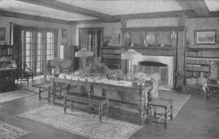
The arrangement of sofa and table are excellent, but there should be other centers of interest in the room. As it is, this room just misses its aim, and is neither a strict period room nor a really comfortable modern one.
The height and size of a room must be taken into account in hanging curtains, for with their aid, and also that of wallpaper, we can often change a room of bad proportions to one of seemingly good ones. If a room is very low, a stripe more or less marked in the design, and the curtains straight to the floor, will make it seem higher. A high room may have the curtains reach only to the sills with a valance across the top. This style may be used in a fairly low room if the curtain material is chosen with discretion and is not of a marked design. If the windows are narrow they can be made to seem wider by having the rod for the side curtains extend about eight inches on each side of the window, and the curtain cover the frame and a part of the wall. This leaves all the window for light and air. A valance connecting the side curtains and covering the top of the net curtains will also make the window seem broader. A group of three windows can be treated as one by using only one pair of side curtains with a connecting ruffle, and a pair of net curtains at each window. Curtains may hang in straight lines or be simply looped back, but fancy festooning is not permissible. There is another attractive method of dividing the curtains in halves, the upper sections to hang so they just cover the brass rod for the lower sections, which are pushed back at the sides. These lower sections may have the rod on which they are run fastened to the window-sash if one wishes. They will then go up with the window and of course keep clean much longer, but to my mind it is not so alluring as a gently blowing curtain on a hot day. I have seen a whole house curtained most charmingly in this manner, with curtains of unbleached muslin edged with a narrow little ruffle. They hung close to the glass and reached just to the sill with the lower part pushed back at the sides. The outside view was most attractive, and the inside curtains varied according to the needs of each room.
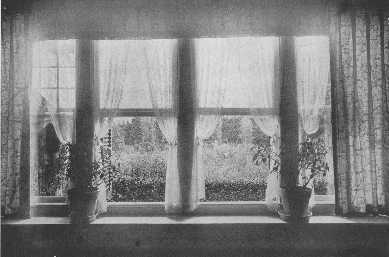
A charming window treatment, in a room whose color scheme is carried out in the garden, giving a unique and delightful touch.
Casement windows should have the muslin curtains drawn back with a cord or a muslin band, and the side curtains should hang straight, with a little top ruffle; if the windows open into the room the curtains may be hung on the frames. The muslin curtains may be left out entirely if one wishes. Net curtains on French doors should be run on small brass rods at top and bottom, and the heavy curtains that are drawn together at night for privacy's sake should be so hung that they will not interfere with the opening of the door. There should be plenty of room under all ruffles or shaped valances where the curtains are to be drawn to allow for easy working of the cords, otherwise tempers are liable to be suddenly lost.
All windows over eighteen inches wide need two curtains, and the average allowance of fullness is at least twice the width of the window for net and any very soft material, while once and a half is usually enough for material with more body. Great care must be taken to measure curtains correctly and have them cut evenly. It is also a good plan to allow for extra length, which can be folded into the top hem and will not show, but will allow for shrinking.
Stenciling can be very attractively used for curtains and portières for country houses. Cheesecloth, scrim, aurora cloth, pongee, linen, and velours, are a few of the materials that can be used. The design and kind used in a room should be chosen with due regard to its suitability. A Louis XVI room could not possibly have arras cloth used in it, while it would be charming and appropriate in a modern bungalow. Arras cloth with an appliqué design of linen couched on it makes beautiful curtains and portières to go with the Mission or Craftsman furniture.
There is an old farmhouse on Long Island that has been made over into a most delightful country house, and the furnishing throughout is consistent and charming. The curtains are reproductions of old designs in chintz and cretonne. The living-room, with its white paneling to the ceiling, its wide fireplace, old mahogany furniture, and curtains gay with parrots and flowers, hanging over cool white muslin, is a room to conjure with.
In town houses the curtains and hangings must also harmonize with the style of furnishing. When the windows are hung with soft colored brocade, the portières are usually beautiful tapestry or rich toned velvets, and care is always taken to have the balance of color kept and the color values correct. There are silks and damasks and velvets, and many lesser stuffs, made for all the period styles, whether carried out simply or elaborately, and it is the art of getting the suitable ones for the different rooms which gives the air of harmony, beauty, and restfulness, for which the word home stands.
In hanging these more formal curtains the shaped valance is usually used with the curtains hanging straight at the sides of the window, so they can be drawn together at night. The cords and pulleys should always be in perfect working order. Another method is to have the curtains simply parted in the center, either with a valance or without, and drawn back at the sides with heavy cords and tassels, or bands of the stuff. If a draped effect is desired great care must be taken not to have it too elaborate.
If the walls of a room are plain in color one may have either plain or figured hangings, but if the wall covering is figured it gives a feeling of unrest if the curtains are also figured. Sometimes one sees bedrooms and small boudoirs where the walls and curtains show the same design, but it must be done with skill, or disaster is sure to follow.
Plain casement cloth or the different "Sunfast" fabrics are attractive with plain or figured papers, especially in bedrooms of country houses.
If one has to live in the town house through the summer do not make the fatal mistake of taking down the curtains and living in bare discomfort during the hot season. If the curtains are too handsome to be kept up, buy a second set of inexpensive ones that can be washed without injury. It is better that they should stop the dust, and then go into the tub, than that one's lungs should collect it all. Curtains are useful as well as ornamental, and a house without them is as dreary as breakfast without coffee.
In planning a room the color values should be divided into the natural divisions of the heaviest, or darkest, part at the bottom, which is the floor; the medium color tone in the middle, which is the wall; and the lightest at the top, which is the ceiling. This keeps the room from seeming top-heavy and gives the necessary feeling of support for the wall and ceiling. The walls and floor serve as a background and should not be insistant or startling in color; and the size and height of the room, the amount of wall space, the position of doors, windows and fireplace, the quantity and quality of the light, and the connecting rooms will all be factors in the color scheme and materials chosen.
The floor of a room must be right or all the character of the furnishings will be lost. One should first see that it is in perfect condition. If it is a hardwood or parquetry floor it should not be finished the bright and glaring yellow which is sometimes seen, but should be slightly toned down before the finish is put on. Samples of different tones should be submitted to be tried with samples of the rug and stuffs to be used before the decision is made. A wax finish is better than the usual coats of shellac, for the wax has a soft and beautiful glow, while shellac has a hard commercial glare. A waxed floor, if properly taken care of, which is not difficult, wears extremely well and does not have the distressingly shabby appearance of a partly worn shellaced floor. If the floor is old and worn and is to be painted or stained all cracks should be filled, and the color chosen should be a neutral color-in harmony with the rest of the room, the wood shades usually being the best, with the exception of cherry and the red tones of mahogany. Teak is a good tone for hard wood. Soft wood floors of such woods as pine, fir, and cypress can be made to have the appearance of hardwood if first scraped or sandpapered and then stained with an oil stain and finished with a thin coat of shellac and two coats of prepared floor wax.
The usual ways of using floor covering are: one large rug which leaves a border of hard wood floor of about a foot all around it; several small rugs placed with a well balanced plan upon the floor; and carpet, either seamless or of strips sewed together, made into one rug or entirely covering the floor.
In the majority of cases the use of a single large plain rug is by far the best plan, for it gives the feeling of an unobtrusive background whose beauty of color serves to bind the room in the unity of a well planned scheme; and this sense of dignity and solidity goes a long way on the road to success. It is one of the most satisfactory methods of covering a floor imaginable. These plain carpets come in several grades and many colors and are woven in widths from nine to thirty feet which can be cut in any desired length. This makes it possible to have a rug which will be a suitable size for a room. The colors are very good, especially the soft grays, tans, putty color, and taupe. There are also some good blues and greens, a very beautiful dark blue having great possibilities. There are also, besides these wide carpets, narrow carpets from twenty-seven inches to four feet wide which can be sewed together and made into rugs, or the carpet can cover the entire floor. In some cases this is the most attractive thing to do, for it will make a room seem larger by carrying the vision all the way to the wall without the break of a border; and it also covers a multitude of sins in the way of a rough floor. In these days of vacuum cleaners the old terrors of dust have lost their sting.
A plain carpet or rug may be used with propriety in any room in the house, provided the right color is chosen for the surroundings. Some people, however, prefer a figured carpet in the dining-room on account of the wear and tear around the table. This risk is not very great if the rug is of good quality in the first place. A two-toned all-over design is often chosen for halls and stairs because of the special wear which they receive, and a Chinese rug is a good selection to make with a stair carpet of soft blue and yellow Chinese design to match. A small, figured, all-over design is a good choice for a nursery.
Bedrooms may have either one large rug or be covered entirely with carpet, or have several rugs so placed that the floor is practically covered but is easily kept clean. Plain rugs are more restful in effect in bedrooms than figured rugs, and with plain walls and chintz are fresh and charming. These carpet rugs should be made with a flat binding which turns under and is sewed down, as this looks far better and lies flatter on the floor than the usual over-and-over finish, which is apt to stretch. All rugs should be thoroughly stretched before they are delivered as otherwise they will not lie flat.
There is a kind of plain woven linen rug, with a different colored border if desired, which is very good to use in many country houses. These rugs come in a large assortment of colors and sizes, and, when sufficient time is allowed, they can be made in special sizes. Old-fashioned woven and hooked rag rugs are not appropriate in all kinds of rooms, even in the country. They should only be used in the simple farm house type and in some bungalows, and should be used with the simple styles of old furniture and never with fine examples, whether copies or originals.
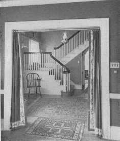
This attractive Colonial hallway shows a good arrangement of rugs. The border on the portières spoils the effect, but the lamp is well chosen.
The light in a room must be taken into account in choosing a rug, and cold colors should not be used in north or cheerless rooms. The theory of color in regard to light has been explained in other chapters, very fully in the chapter on wallpapers, and its principles should be applied to all questions of furnishing, or disappointment will be the result.
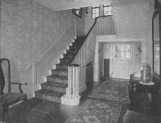
The Oriental rug used on the stairs harmonizes with those used on the floor.
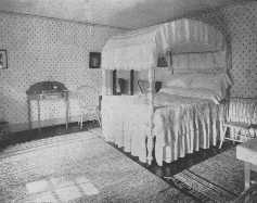
This bed-room is a good example of a simple Colonial bed-room, and the rag rugs are in keeping with it. The repeat design of the wallpaper ties the room into a unified whole.
The question of whether to use Oriental rugs or plain rugs is one which many people find hard to solve. One of the deciding factors is often finding just what is right for the room, for really beautiful Oriental rugs in large or carpet size are rare and also expensive, but soft-toned Persian rugs with their interesting floral designs, and Chinese rugs with their wonderful tones of blue and yellow are works of art and well worth the trouble necessary to discover them and the price asked. They are best adapted to some libraries and halls and some dining-rooms, but they should not be startling in either design or color. To my mind Oriental rugs are not well suited to the majority of living-rooms and bedrooms because of the constant and varied use of these rooms. When Oriental rugs are used there should be plenty of plain effect in the room; the walls, for instance, should be plain. I have never seen a room which was successful if both walls and rug were figured. A fine tapestry may be used with Oriental rugs, but that is quite different from a figured wall. If several rugs are to be used in one room they must be of the same color value and the same general color tone or the floor will appear uneven. One does not wish to have a room give the uncomfortable effect of "the rocky road to Dublin." A rug with a general blue tone must not be put with other rugs of many colors or an overpowering amount of red, but should be matched in color by having blue the chief color of the other rugs also. The color value, too, must be even, for a light rug next to a dark has the same disagreeable effect. It is impossible to have a beautiful room if the rug seems to rise up and smite you as you enter. Persian rugs with their conventional floral designs should not be used with the marked color and geometrical designs of Caucasian rugs. These points are important to remember and follow, for otherwise unity of scheme for the room will be impossible.
If one has several fine rugs well matched in color value and design they should be placed with a due regard to the shape of the room and the position of the furniture. A rug placed cat-a-cornered breaks up the structural plan of the room and makes it appear smaller than it really is. The new lines formed are at odds with the lines of the walls and interfere with the sense of space by stopping the eye in its instinctive journey to the boundary of things. Oriental rugs should be tried if possible in the rooms in which they are to be used before the final choice is made, and one must always try the rug with the light falling across the nap and also with the nap, for one way makes the rug lighter and the other darker, and one of the two may be just what is wanted.
If one owns a rug which seems far too bright to use it can be toned down, but the owner must take the risk of its being spoiled in the process. To me it does not seem a great risk, because if the rug is so bright that it is absolutely nerve-destroying and useless, and there is a chance that for a small sum it can be made charming, why not take it? I have never heard of one failing, but I suppose some of them must or the stipulation would not be made.
If an Oriental rug is used it should give the keynote for the color scheme, and the design of the rug will decide whether there can be any figured material used in the room. It is far easier to build up a scheme from a satisfactory rug than it is to try to fit one into a room which is otherwise finished. One's field of choice is much wider. Samples of wallpaper, curtain material and furniture coverings should always be tried with the rugs, whether Oriental or plain in color, for the scheme of a room must be worked out as a whole, not piece-meal. Each room must be considered in relation to the other rooms near it, because, although it may be beautiful in itself, if it does not harmonize with the connecting rooms the whole effect will be a failure. Vistas from one room to another should be alluring and charming; there should be no violent and clashing contrasts of color or styles of furniture or sudden change in the scale of furnishings. One room cannot shake off its relationship to the rest of the house and be a success, and floor coverings must bear their full share of responsibility in making the whole house beautiful.
The walls of a house hold a most important place in the order of things and their treatment requires much thought. The floor is the darkest color value in a room, as it is the foundation, and the walls come next in color value and consideration. What I have said in other chapters about the necessity of connecting rooms being harmonious applies of course to the selection of wall coverings.
The first question to be settled is: shall paint or paper be used?
If a house is new the walls are apt to settle a little making the plaster crack, and it is far better in such a case to allow the walls to remain white for a year. If the effect of plain white plaster strikes one as too cold one of the many water tints may be used as this will not interfere with any later scheme. In houses that have been built for a number of years the walls are often so badly cracked and marred that to put them into condition for painting would be more expensive than preparing them for paper. Estimates should be given for both paint and paper.
When the plaster has done its worst and settled down to a quiet life the work of covering the walls appropriately begun.
Plain walls, whether painted, tinted, or papered, are more restful in effect and form better backgrounds than figured walls. This is not a question of the beauty of the design or the expense of the material, but simply the fact that a plain surface is quiet, while a figured wall, even if only two-toned, will at once assert itself more, and so be less of a background. If many pictures and mirrors are to be used, or a figured rug and much furniture, by all means have plain walls. If one has some special object of great beauty and interest, it should be treated with the dignity and honor it deserves and given a plain background. A miscellaneous collection of lares and penates can be made to hold together better by having a plain wall of some soft neutral color rather than a figured paper, which would only make the confusion more pronounced. Small rooms should have plain and light colored walls, as they then appear larger. Plain walls give a wider scope in the matter of decoration, for, beside the possibilities of plain stuffs, chintz and various striped silks and linen may be used which would be quite out of the question with figured walls, more flowers may be used, and lampshades, always a bit assertive, take their proper place in the scheme, instead of making another distracting note.
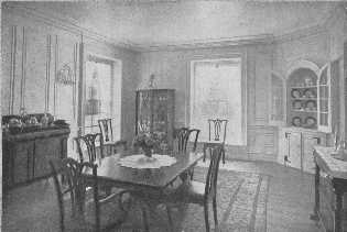
A built-in corner cupboard has an architecturally decorative value for it supplies a spot of color in the paneled walls. The modern china closet is bad, and the chairs have the failing of many reproductions, the backs are a little too high for the width.
The question of paint or paper has often to be decided by circumstances, such as the condition of the walls or the climate. With paint one can have the exact shade desired and either a "glossy" or eggshell finish. With paper it is often a matter of taking the nearest thing to the color wanted and changing the other colors to harmonize. Paint is better to use in a damp or foggy climate, as paper may peel from the walls in the course of time.
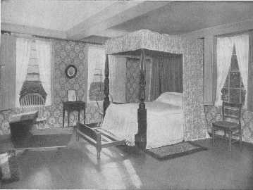
This fine well-curtained four poster, once the property of Lafayette, the trundle-bed, cradle, chairs and table, are all interesting, but the wallpaper appears to be of the ugly time of about 1880. Something more appropriate should be chosen.
Walls may be tinted or painted, and paneled with strips of molding which are painted the wall color or a tone lighter or darker as the scheme requires. Also, the wall inside the moulding may be a tone lighter than the wall outside, or vice versa, but the contrast must not be strong or the wall at once becomes uneven in effect and ceases to be a good background. Paintings may be paneled on the walls. If one has only one suitable picture for the room it should be placed over the mantel, or in some other position of importance, making a centre of interest in the room. Using pictures and pieces of tapestry in this way is quite different from having the walls painted in two sharply contrasting colors, because the paint gives the feeling of permanence while the picture is obviously an added decoration requiring a correct background. I am speaking of the average house, not of houses and palaces where the walls have been painted by great artists.
Painted walls are appropriate for all manner of homes, from the elaborate country or city house all through the list to the farm house or small bungalow, but if, for any reason, one cannot have painted walls, or prefers paper, one need not forego the restful pleasure of plain backgrounds, for there are many beautiful plain papers to be had.
Personal taste usually decides whether paint or paper is to be used. Paint is thought by some to be too cold or hard in appearance (it is only so when badly done or when disagreeable colors are chosen,) or it is considered too formal, or, with the memory of New England farm houses in mind, too informal. For those who wish paper, the possibilities are very great if the paper is properly chosen. The reason why so many people are disappointed with the effect of their newly papered rooms is that they judged the paper at the shop from one piece, and did not realize that a design which appealed to them there might be overpowering when repeated again and again and again on the wall. When choosing a figured paper several strips should be placed side by side to enable one to judge whether the horizontal repeat is as satisfactory and pleasant as the perpendicular. When an acceptable one is found a large sample should be taken home to pin on the wall to show the effect in its future environment. Samples of the curtains and furniture coverings should also be tried with the sample of paper before the final choice is made. If a paper with a decided figure is chosen pictures should be banished, for their beauty will be killed by the repeated design. The scale of the design in relation to the size of the room must also be taken into account. A small room will be overpowered by a large figure, but often the repeat of a small figure is quite correct in a large room as it gives an all-over, unobtrusive effect. If the wall space is much cut by doors and windows one should select a plain, neutral toned paper. It would be a fatal error to use a figured paper, for the room would look restless and chaotic and probably out of balance. If the windows are in groups and the doors balance each other the danger is lessened, but not done away with. One of the beautiful features in fine old Colonial houses is this ordered position of doors, but in many a modern house the doors have a trying way of appearing in a corner, as if they were a bit ashamed of themselves; and they have good cause to be, for a badly placed door is a calamity. If one is fortunate enough to plan one's own house, this matter can be taken care of properly, but in the average ready made house one has to try to make the doors less conspicuous by having them painted in very much the tone of the wall. With a gray wall, for instance, there should have a slightly lighter tone of gray for the woodwork, with a white and gray striped paper white paint may be used, with a soft tan a deep old ivory, and so on.
If a room is badly proportioned it can often be improved by the simple expedient of using a correct paper. If the room is too high for its size the ceiling color may be brought down on the side wall for eighteen inches or so and finished with a moulding. This stops the eye before it reaches the ceiling and so makes the room seem lower. If the room is too low a striped paper may be used which will make the room seem higher by carrying the eye up to the ceiling where the paper is finished with a moulding. Vertical lines give the appearance of height, horizontal lines of width. Striped paper should not be used in narrow halls, for it makes them seem narrower and gives one the feeling of being in a cage. Two-toned striped papers of nearly the same color value, such as gray and white, yellow and cream-white, and white and cream color, are better to use than those of more marked contrast, although some of the green and white and blue and white are charming and fresh looking for bedrooms. Black and white is too eccentric for the average house; one should beware of all eccentric papers. There are a few kinds of paper which should be left severely alone, for they will spoil any room. One of them has a plain general tone but a suggestion of other colors which give it a blurred and mottled appearance which is singularly disagreeable. Another is plain in color but has a lumpy effect like a toad's back, and is really quite awful. Others are metallic papers, and there is a heavy paper embossed in self color with a conventional design which is apt to have a shining surface. Papers with dashes and little flecks of gold should be avoided, for the gold gives the wall an unstable and cheap appearance. Papers with small single figures repeated all over the surface are apt to look as if a plague of flies or beetles had arrived and are quite impossible to live with. Borders and cut out borders have a commonplace appearance and are not in the best of taste. And then there are papers with vulgarity of design. This quality is hard to define clearly, for it may be only a slightly redundant curve or other lack of true feeling for the beauty of line, or a bit too much, or too little, color, or a bad combination of color, or a lack of knowledge of the laws of balance and harmony and ornament, or a wrong surface of texture to the paper. But whatever the cause, a vulgar paper will vulgarize any room, no matter what is done in the way of furniture. It will assert itself like an ill-bred person. Luckily both are easily recognized.
But the picture is not all dark by any means, for some of the American made papers, as well as the imported papers, are very beautiful. The makers are taking great pains to have fine designs and beautiful colors which will appeal to people of knowledge and taste. The situation is much better than it was a few years ago. Some of the copies of old figured and scenic papers are exceptionally fine, and can be used with great distinction in dining-rooms or halls with ivory or cream-white woodwork and wainscoting, and Georgian or Colonial furniture. One should not use pictures with these papers, but mirrors are permissable and will have the best effect if placed on a wood-paneled over-mantel. These papers come in tones of gray and white and also sepia. Oriental rugs, if not of too conspicuous a design, may be used with them, but plain rugs are better with plain hangings and striped silk chair seats. These papers are very attractive in country houses. There are also colored scenic papers, an especially fascinating one having a Chinese design which could be used as a connected scene or in panels, and would be lovely in a country house drawing-room or dining-room or hall. It could also be used in a city house with beautiful effect if due thought be given to the question of hangings, woodwork, rug, and furniture. Introduce a false note, and a room of this kind is ruined. These scenic papers come in sets, but the copies of the other old papers come in the regular rolls. Some of the lovely old "Toile de Jouy" designs have been used for wall paper, and these with other chintz designs, can be softened in effect by a special method of glazing which makes them very harmonious and charming with antique furniture or reproductions of fine old models. These old chintz papers are lovely for bedrooms or morning-rooms, with fresh crisp muslin curtains and plain silk or linen or chambray side-curtains. Either painted or mahogany furniture could be employed. A motif from the paper can be used for the furniture or it can simply be striped with the color chosen for the plain curtains. Some of the good and rather stunning bird design papers treated with this special glazing make beautiful halls with plain rugs and hangings and chair covers.
Papers cost from about forty cents to several dollars a roll, but the choice is large and attractive between one and three dollars a roll, and there are also excellent ones for eighty-five cents. It is almost impossible, however, to give a satisfactory list of prices as they vary in different parts of the country. The reproductions of old scenic papers of which I have spoken are expensive, costing about one hundred dollars a set, but they may go down again now that the war is over. The difference in expense between paint and paper is not very great, in fact, with the average paper at a dollar or a dollar and a half a roll, paint is about the same, or perhaps a bit cheaper if the walls are in fairly good condition. It is a mistake to use inferior paper, and there should never be more than a lining paper and the paper itself on the wall. In some cases where there is only one paper of soft color on the wall, with no lining paper, this paper may be used as a lining paper if it is absolutely tight and firm. The risk is that the new paste may loosen the old a bit and so let all come down. Old paper must be entirely removed if there are any marred places as they will show through the new and ruin the effect.
The amount of wall space and the quality and the quantity of the light are important factors in deciding the color scheme because by using them correctly we can brighten a cheerless, dark room or soften the blaze in a too sunny one.
If the light is a cold dreary one from the north, the room will be vastly improved if warm, cheerful colors are used: warm ivory, deep cream color, soft or bright yellow without any greenish tinge in it, soft yellow pinks (there is a hard pink which is very ugly), yellow green (but not olive), and tones of golden tan. It is the dash of yellow in these colors which makes them cheerful and gives the impression of sunlight. Tans should never come too close to brown for a dark room, for nothing is more dreary or hopeless than a room done in that depressing color. The beautiful tones of old oak, or properly treated modern oak paneling, are quite a different matter. Small amounts of red or orange will do wonders, if used with discretion, in brightening a dull room, and are often just what are needed to bring out the beauty of the rest of the scheme; but it is a great mistake to think that red walls and a great deal of red in the hangings and furniture covering will make a cheerful or pleasant room. Red absorbs light and is also an irritant to the eyes and nerves, and, unless it is used with great skill, it is apt to look extremely commonplace and ugly or like an ostentatious hotel or public building. Few of us have large enough houses to make it possible to use red in great amounts, and it is well for the average person to shun it and remember that in ninety-nine cases out of a hundred a red wall will spoil a room.
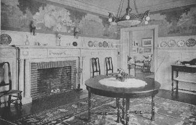
There are few treatments for walls in a Colonial dining-room that can compare with paneled walls, or wainscoting with a decorative paper above. The subject, however, must be in keeping. This paper is extremely inappropriate, and the center light is also badly chosen and could be eliminated.
Cool colors should be used in bright and sunny rooms—blues, greens, grays, grayish tans, and those delightful colors, old ivory, and soft deep cream color and linen color. Colors with a tone of yellow in them are easier to use than cold blues and greens and violets, for the yellow tinge, be it ever so little, brings them into relation with the majority of woods used in floors and furniture frames. Light colors make a room seem larger by apparently making the walls recede, and dark colors make it seem smaller, as they make us conscious of the walls and so seem to bring them nearer. Any very bright room may have dark walls to soften the glare, but if it has to be used by artificial light it will then be heavy and cheerless in effect; and so a better choice would be some soft neutral color of medium or lighter color values, such as gray green, and use awnings and dark shades. This matter of color in relation to light is important to remember when planning one's house. There is also another question which has great influence on one's choice of paper, and that is the amount and kind of furniture to be used in the room. Georgian furniture calls for plain or paneled walls, or if a figured paper is used it should be one of the old-fashioned designs or one of the striped papers. Old-fashioned chintz designs are also appropriate for bedrooms with mahogany or painted furniture. Plain or paneled walls, striped paper, and some of the fine floral designs, which can also be used as panels, and the charming Toile de Jouy designs, are all appropriate when used with French furniture. Heavily made furniture like Craftsman or Mission needs the support of strong walls which may be rough-finished natural-colored or painted plaster, or grass cloth, or one of the many good plain papers of heavy texture. There are also figured papers which are appropriate. Wicker furniture will go with almost any kind of attractive paper which is correct for the room, but when there is much figure the cushions should be covered with plain stuff. All-over stuffed furniture when covered with chintz looks best with plain walls. Painted furniture looks well with plain walls and chintz. A motif from the chintz can be used on the furniture for the decoration, but if the wall paper is figured the effect will be more restful if the furniture is only striped.
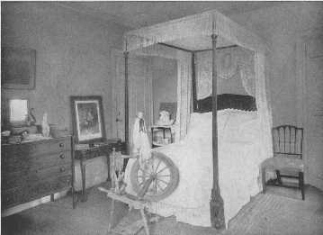
This room is unattractive because of the poor arrangement of the furniture and the inappropriate bed-hangings. The bed, Sheraton chair, and card-table, are all very good examples.
In summing up: the important points which govern the choice and color of wall covering are the connecting rooms, the amount and quality of light, the size and shape of the room, its use, the furnishings which are to be used, the condition of the walls, and personal preference as to paint or paper. Do not be afraid of the idea that plain walls, whether paint or paper, may become tiresome, for one can stand well planned monotony year in and year out with a cheerful heart. If some rooms are to be papered with figured paper be sure the selection is made with care and with the idea in mind that a figured wall is in itself a decoration and should not have pictures crowded upon it.
To light a room successfully appropriate lights must be placed where they are needed to keep the feeling of balance and proportion and bring out the charm of the room by their relation to its furnishing. They should also be so placed that the life of the household can go on as cheerfully and smoothly in the evening as in the day time.
The position and style of lighting fixtures is decided by the type of house, the size and height of the rooms, the amount of wall space, the use for which the rooms are intended, their style of furnishing, the chief centers of interest, such as mantels, doors, furniture, and pictures of importance, and also the manner in which the walls are treated, whether paneled or papered. If one is building a house one should give all possible data to the architect in regard to any special pieces of furniture or pictures which one may wish to use in certain places. By doing this the tragedy of a slightly too small wall space will be escaped, and the lights will be properly placed in the beginning.
One must always remember in planning the position of the lights for a room that the eye naturally seeks the brightest spot, and badly placed lamps and sidelights will upset the balance of a room. The room must not be glaringly bright, but there should be a feeling of a certain evenness in the distribution of light. A top light makes the light come from the wrong direction. Artificial light in a room should take its general idea from the lighting of the room in the day time. The daylight comes from the windows, the sides of the room, and the decoration of the room is built up with that in mind; so when we are planning the lighting scheme we should remember this and realize that the light should come from lamps placed advantageously on tables, and wall lights placed slightly above eye level.
Living-rooms should have a sufficient number of well placed sidelights to enhance the beauty of the room, and they should be placed near centers of importance such as each side of the fireplace, or wide door, or on each side of some important picture or mirror. If there is a group of two or three windows which need to be more convincingly drawn together to form a unit, lights may be placed on each side of the group. Sidelights can be placed in the center of panels, thus forming a decoration for the panel, and, flanking paintings or mirrors or tapestries, make beautiful and formal rooms, especially for the different periods of French, English, or Italian decoration. This treatment with simpler forms of fixtures may also be used in our charming, but more or less nondescript, chintz living-rooms and country house drawing-rooms or dining-rooms. With a sufficient number of lamps in the room the side-or wall-lights need not be lighted during the average stay-at-home evenings but are ready if there is some special occasion for brilliancy. There are some rooms which are much improved by having no side-lights at all, all the light coming from lamps. There should be plenty of floor sockets so placed that lamps may be used on tables near sofas and armchairs and on the writing table or large living-room table. It is this proper placing of lamps which has so much to do with the charm and comfort of a room when evening comes.
In the average home there is no greater mistake in the matter of lighting than having a room lighted by chandelier or ceiling lights. Lights at the top of the room, or a foot or two from the ceiling, break up completely the artistic balance of the room by drawing attention to them as the brightest spot. They make the room seem smaller both by day and night, they cast ugly shadows, they do not give sufficient or correct light for reading or writing, and the glare above one's head is nerve destroying. When the sun is directly overhead we hasten to put up sunshades, so why should we deliberately reproduce in our homes the most trying position of light? The fixtures also are usually extremely ugly. One sees sometimes in private houses what is called the indirect method of lighting, which is usually an alabaster bowl suspended by chains from the ceiling in which the lights are concealed. The reflected light on the ceiling is supposed to give a suffused and bright light. To my mind there is something extremely obnoxious about this method used in homes, for it smacks of department stores and banks and public buildings generally. And then, too, the light is unpleasant. If I were the unfortunate possessor of such a light I should have it taken down and use the bowl on a high wrought iron tripod for growing ivy and ferns, and thus try to get a little good from the ill wind that blew it there.
There are a few cases, however, where top lights may be used, such as large drawing-or music-rooms, rooms in which formal entertaining is to be done. Crystal ceiling lights are then best to use, or chandeliers with crystal drops or pendants. If these rooms are Italian Renaissance in style, the center lights must naturally harmonize in period. Large halls with marble stairs and wrought-iron balustrade can have this elaborate kind of light, but the average hall demands a simpler chandelier. If one is to be used there are some very good copies of old Colonial lights and lanterns, but personally I prefer wall brackets and a dignified lamp, or a floor lamp. Torchères or lacquered floor lamps may be used in pairs if the hall is large enough to have them placed properly. In a long, narrow hall they would look a bit like lamp posts. Rather close fitting round shades, nearly the same size at top and bottom, made of painted parchment give a decorative touch and sufficient light. As one does not need an especially bright light in a hall, a beautiful lamp can be made of one of the fine old alabaster vases which many people have by dropping an electric bulb in it. Placed on a consol table before a mirror it makes a delightful spot in the hall. These lamps may also be used in other rooms where a light is needed for effect and not for use. In placing lamps the charm and utility of a reflection in a mirror must not be overlooked.
A vestibule may have a lantern of some attractive design in harmony with the house, or side lights, if they can be so placed as not to be struck by the door.
Dining-rooms are far more beautiful and also better lighted if sidelights are used, with candles on the table, rather than a drop light. Dining-room drop-lights or "domes" have all the disadvantages of other center lights and are extremely trying to the eyes of the diners, as well as being unbecoming. Even when screened with thin silk drawn across the bottom there is something deadening to one's brain in having a light just over one's head. Side lights with the added charm of candles will give plenty of light. It is a cause for thanksgiving that drop-lights over dining-tables are rarely seen now-a-days.
Bedrooms should have a good light over the dressing table, and to my mind, two movable lights upon it, which may be in the form of wired candlesticks or small lamps. These are much more convenient than fixed lights. There should be a light over any long mirror, and one for the desk and sofa or chaise longue, and one for the bedside table. The dressing-room should be supplied with a light over the chiffonier and long mirror, and there should also be a table light. Clothes closets should have simple lights.
And do not forget the kitchen if one wishes properly cooked meals. A light so placed that it shines into the oven has saved many a burned dish, and a light over the sink has saved many a broken one. The servants' sitting-room should have a good reading lamp.
The question of the style of the fixtures is important, for if they are badly chosen they will quite spoil an otherwise perfect room. They must harmonize in period with the room, and also with its scale of furnishing. There is a wide choice in the shops, and some of the designs are very good indeed, having been carefully studied and adapted from beautiful museum specimens of old Italian, French, English, and Spanish, carvings and ornament. Some of our iron workers make very fine metal fixtures which are beautiful copies of old French and Italian work. There are graceful and sturdy designs, elaborate and simple, special period designs, and many which are appropriate for rooms of no particular period. There are charming lacquer sconces to go with lacquer furniture, and old-fashioned prism candelabra and sconces, and fixtures copied from choice old whale oil lamps in both brass and bronze. There are suitable designs for each and every room. The difficulty lies not in finding too few to choose from, but too many, and, growing weary, making a selection not quite so good as it should be. One should take blue prints to the shop if possible, but necessary measurements without fail. One must know not only the width of the wall spaces, but the width of the pictures and furniture to be put in the room, or the calamity may happen of having the fixtures a bit too wide. When fixtures are meant to be a special part of the decorative scheme, and support and enhance pictures and tapestries, they should have an appropriate decorative value also, but in the average home it is better and safer to choose the simpler, but still beautiful, designs. It is better to err on the side of simplicity than to have them too elaborate.
Lamps should be chosen to harmonize with the room, to add their usefulness and beauty to it as a part of the whole and be convincingly right both by day and night. There are many possibilities for having lamps made of different kinds of pottery and porcelain jars; some crackle-ware jars are very good in color. Chinese porcelain jars, both single color and figured, make lovely lamps. Old and valuable specimens should not be used in this way, for they are works of art. Many modern jars are copies of the old and these should be used. There are lacquer lamps, bronze, and brass, and carved wood lamps, and lovely Wedgwood and alabaster vases. There are charming little floor lamps, some of wrought iron with smart little parchment shades, some in Sheraton design, some in lacquer or painted wood, which can be easily carried about to stand by bridge tables or a special chair. There are dozens of different jars and lamps to use, but the one absolutely necessary question to ask oneself is: is it right for my purpose?
Lamp shades are a part of the scheme of the room's decoration and should be chosen or made to order to achieve the desired effect. Special shades are made by many clever people to harmonize with any room or period and are apt to be far better than the ready made variety. There are all manner of beautiful shades, lace, silk, plain and painted parchment and paper, mounted Japanese prints, embroidery, and any number of other attractive combinations. To be perfect, beside the fine workmanship, they must harmonize in line with the lamps on which they are to be used, and harmonize in color and style with the room, and have an absolute lack of frills and furbelows. The shade for a reading lamp should spread enough to allow the light to shine out. Lamp shades simply for illuminating purposes may be any desired shape if in harmony with the shape of the lamp. Lacquered painted tin shades are liked by some for lamps on writing tables. There should be a certain amount of uniformity in the style of the shades in a room, although they need not be exactly alike. Too much variety is ruinous to the effect of simple charm in the room. The chintz which is used for curtains will supply a motif for the painted shades if one wishes them, but if there is a great deal of chintz, plain shades will be more attractive. Side lights may have little screens or shades, as one prefers, or none may be used. In that case the bulbs may be toned down by using ground glass and painting them with a thin coat of raw umber water color paint. Bedroom shades follow the same rule of appropriateness that applies to the other shades in the house. There should be several sets of candle shades for the dining-room.
There is really no reason why so many houses should be so badly lighted. Often simply rearranging the lamps and changing the shape of the shades will do wonders in the way of improvement. Radical changes in the wiring should be carefully thought out so there will be no mistakes to rectify.
The love of color which is strong in human nature is shown in the welcome which has been given to painted furniture. If we turn back to review the past we find this same feeling cropping out in the different periods and in the different grades of furniture. The furniture of the Italian Renaissance was often richly gilded and painted; the carved swags of fruit, arabesques, and the entwined human figures, were painted in natural colors, or some of the important lines of the furniture were picked out with color or gold, or both. As the influence of the Renaissance spread to France and England, changed by the national temperament of the different countries, we find their furniture often blossoming into color—not covered by a solid coat of paint but picked out here and there by lines and accenting points. During the time of Louis XIV everything was ablaze with gold and glory, but later, during the reigns of Louis XV and Louis XVI, a gentler, more refined love of color came uppermost, and the lovely painted furniture was made which has given so much inspiration to our modern work. The simpler forms of the Louis XV period, and the beautiful furniture of the Louis XVI period, were often painted soft tones of ivory, blue, green, or yellow, and decorated with lovely branches of flowers, birds, and scenery where groups of people by Fragonard and other great painters disported with all their eighteenth century charm. These decorations were usually painted on reserves of old ivory with the ground color outside of some soft tone. Martin, the inventor of famous "vernis Martin," flourished at this time, and the glow of his beautiful amber-colored finish decorated many a piece of furniture from sewing boxes to sedan chairs. In England the vogue of painted furniture was given impetus by the genius of the Adam Brothers and the beautiful work of Angelica Kaufmann, Cipriani, and Pergolesi. In both France and England there was at this time the comprehension and appreciation of beauty and good taste combined with a carefree gaiety which made the ineffable charm of the eighteenth century a living thing. There are some of our modern workmen and painters of furniture who feel this so thoroughly that their work is very fine, but the majority have no knowledge or understanding of the period, and, although they may copy the lovely things of that time, the essence, the true spirit, is lacking. Cabinet making and painting in those days was a beloved and honored craft; to-day, alas, it is too often a matter of union rules.
Chinese lacquer, while not strictly coming under the head of painted furniture, was another branch of decorated furniture which was in great demand at this time. The design in gold was done on a black or red or green ground and was beautiful in effect.
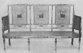
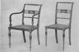
The delicacy of the painting and the graceful proportions of these reproductions are in the true spirit of Adam.
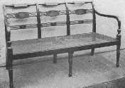
A three-chair settee of the Sheraton period, lacquered, and with cane seat. It would be appropriate for a living-room or hall.
While the upper classes were having this beautiful furniture made for their use, the peasant class was serenely going on its way decorating its furniture according to its own ideas and getting charming results. The designs were usually conventionalized field flowers done with great spirit and charm. From the peasants of Brittany and Flanders and Holland have come down to us many beautiful marriage chests and other pieces of furniture which are simple and straightforward and a bit crude in their design and color, but which have done much to serve as a help and guide in our modern work.
The supply of painted furniture to-day is inspired by these different kinds of the great periods of decoration. There are many grades and kinds in the market, some very fine, keeping up the old traditions of beauty, some charming and effective in style and color, but with a modern touch, and some very very bad indeed; "and when they are bad they are horrid." I have said a great deal in other chapters on this subject, but I cannot too often urge those of my readers who have the good fortune to live near one of our great art museums to study for themselves the precious specimens of the great days of genius. It will give a standard by which to judge modern work, and it is only by keeping our ideals and demands high that we can save a very beautiful art from deteriorating into a commercial affair.
When selecting painted furniture, one can often have some special color scheme or decoration carried out at a little extra expense; and this is well worth while, for it takes away the "ready made" feeling and gives the touch of personality which adds so much to a home. One must see that the furniture is well made, that the painting and finishing are properly done, and that the decoration is appropriate. If the furniture is of one of the French periods, it should be one of the simpler styles and should be painted one of the soft ground colors used at the time, and the decoration should have the correct feeling—flowers and birds like those on old French brocade or toile de Jouy or old prints. The striping should be done in some contrasting color or in the wonderful brownish black which they used. The design may be taken from the chintz or brocade chosen for the room, but the painting must be done in the manner of the period. This holds true of any English period chosen, such as Adam furniture or the painted furniture of Sheraton. There are several firms who make a specialty of this fine grade of furniture, but it is not made by the car load; in fact it is usually special order work. The kind one finds most often in the shops is furniture copied from the simpler Georgian styles or simple modern pieces slightly reminiscent of Craftsmen furniture, but not heavy or awkward in build. This furniture is painted in different stock colors and designs, or can be painted according to the purchaser's wishes as a special order. These "stock" designs are often stenciled, but some of them have an effective charm and are suitable to country houses, and also many city ones. When there is much chintz used, the furniture will often be more attractive if it is only striped with the chief color used in the room. The designs which are to be avoided are of the Art Nouveau and Cubist variety, roses that look like cabbages gone crazy, badly conventionalized flowers, and crude and revolting color schemes. It sounds as if it should not be necessary to warn people against these monstrosities, and I have never heard of any one who buys them, but some one must do so or they would not be in the shops.
Attractive and inexpensive painted furniture can be made to be used in simple surroundings by buying slat-backed chairs with splint seats and a drop-leaf pine table and having them painted the desired ground color and then striped and decorated with a motif from the chintz to be used in the room. A country house dining-room or bedroom could be most charmingly fitted up in this way, chintz cushions could be used on the chairs, and candle shades could be made to match. One can sometimes find a bed or chest of drawers or other piece of furniture which is a bit shopworn and can be had for a bargain. Old bureaus can be made to serve as chests of drawers by taking the mirror off and using it as a wall mirror. In many houses there are old sets of ugly furniture which can be made useful and often attractive by having the jigsaw carving removed and painting them. In a set of this kind, which I was doing over for a client, there happened to be two beds with towering headboards, quite impossible to use, but I combined the two footboards, thus making one attractive bed. The furniture was painted a soft pumpkin yellow, striped with blue and with little, old-fashioned nosegays, and a lovely linen with yellow and cream stripes and baskets of flowers was used and turned a dark and dreary room into a cheerful and pretty one.
One can find some kind of suitable painted furniture for nearly every room in the average modern house. People everywhere are turning away more and more from the heavy, depressing effects of a few years ago; but unless they know the ground they are walking on they must tread with care. The style chosen must be appropriate and in scale with the style of house. The fine examples would look quite out of place in a bungalow or very simple house, and the simple kind founded on peasant designs would not be suitable in rooms with paneled walls and lovely taffeta curtains. In Georgian and simple French designs there are fascinating examples of chairs, settees and tables, corner cupboards and sideboards, beds and dressing-tables and chests of drawers, mirrors and footstools and candlesticks, everything both big and little which can be used in almost any of our charming rooms in the average house, with their fresh chintz and taffeta and well planned color schemes.
Lacquered furniture is more formal than the average painted furniture, and often one or two pieces are sufficient for a room. A beautiful lacquered cabinet with its fascinating mounts and its soft, wonderful red or black and gold tones is a thing to conjure with. Lacquered furniture is lovely for some dining-rooms and morning-rooms. The tables should always be protected with glass tops, which also applies to other painted furniture.
One or two pieces of painted furniture may be used in a room with other furniture if they happen to be just the thing needed to complete the scheme. A console table, for instance, with a mirror over it and sidelights, might be just the touch needed between two windows hung with plain taffeta curtains. Like all good things there must be restraint in using it, but there are few things that have greater possibilities than painted furniture when properly used.
When trying to select furniture for the home, people often become bewildered by the amount and variety to be found in the shops, and, not knowing exactly what to look for in the different styles, make an inappropriate or bad selection. One does not have to be so very learned to have things right, but there are certain anachronisms which cry to heaven and a little knowledge in advance goes a long way. A purchaser should also know something about the construction and grade of the furniture he wishes to buy. There are good designs in all the grades, which, for the sake of convenience, may be divided into the expensive, the medium in price, and the cheap. The amount one wishes to spend will decide the grade, and one naturally must not expect to find all the beauties and virtues of the first in the last. The differences in these grades lie chiefly in the matters of the fit and balance of doors and drawers; the joining of corners where, in the better grade, the interior blocks used to keep the sides from spreading are screwed as well as glued; the selection of well seasoned wood of fine grain; careful matching of figures made by the grain of the wood in veneer; panels properly made and fitted so they will not shrink or split; careful finish both inside and out, and the correct color of the stain used; appropriate hardware; hand or machine or "applied" carving. In the cheap grades it is best to leave carving out of the question entirely, for it is sure to be bad. Then there are the matters of the correctness of design and detail, in which all the knowledge one has collected of period furniture will be called upon; and in painted furniture the color of the background and the charm and execution of the design must be taken into account, whether it is done by hand or stenciled. Nearly all kinds of woods are used, the difference in cost being caused by the grade and amount of labor needed, the kind of wood chosen and its abundance and the fineness of grain and the seasoning. Mahogany costs more than stained birch, and walnut than gum wood, but there are certain people who for some strange reason feel that they are getting something a little smarter and better if it is tagged "birch mahogany" than if it were simply called birch. Some of the furniture is well stained and some shockingly done, the would-be mahogany being either a dead and dreary brown or a most hideous shade of red, a very Bolshevik among woods. One must remember that the mahogany of the 18th century, the best that there has ever been, was a beautiful glowing golden brown, and when a red stain was used it was only a little to enhance the richness of the natural color of the wood, more of a suggestion than a blazing fact. The wood was carefully rubbed with oil and pumice, and the shellac finish was rubbed to a soft glow. Modern furniture, especially in the medium and cheap grades, is apt to look as if it were encased in a hard and shining armor of varnish.
Beside this practical knowledge one should have a general idea of the artistic side or the appearance of the different period styles and the manner in which they were used. To achieve this, one must study the best examples it is possible to find in originals, pictures, and properly made reproductions. Many of the plates in this book are from extremely valuable originals and should be studied carefully as they give a fine idea of some of the chief points in the different styles. One should also go to libraries and Art Museums whenever possible and study their collections. The more knowledge gained the more ease one will have in furnishing one's home whether there is everything to buy, or one is planning to add a few articles to complete a charming interior, or, with an eye to a future plan, is buying good things piece by piece and slowly eliminating the bad. It is this knowledge which will help you to study your own possessions and decide what is needed and what will be correct to buy. That, is one of the most important points, to have a well thought out plan, and never to be haphazard in your purchases. Very few of us have houses completely furnished in one period, but we do try to have a certain unity of spirit kept throughout the whole, whether it be French, Italian, English, or our own charming Colonial. There can be a great variety in any one of these divisions, and suitable furniture can be found for all rooms, from the simplest kind to the most elaborate. It is easier to find good reproductions in the English periods of Jacobean, Charles II, William and Mary, Queen Anne, and the Georgian time, and the French periods of Louis XV and Louis XVI.
If one wishes a house furnished in the Gothic period it will be necessary to have nearly all the different pieces made to order, as there are few reproductions made. As our modern necessities of furniture were not known in those days, the designs would have to be carried out more in the spirit of the style than the letter, and one must be certain to have advice and designs from some person who thoroughly understands the period and who will see that the whole is properly carried out. Gothic days were rough and strenuous, and the furniture was strong and heavy and was made chiefly of oak with no varnish of any kind. The characteristic lines of the furniture and the designs for carving were architectural, and a careful study of the Gothic cathedrals of France, Belgium, and England will give a very satisfactory idea of this wonderful time. The idea of the pointed arch, rose window, trefoil, quatrefoil, animal grotesques, and geometric designs, as well as the beautiful linen-fold design, were all adapted for use as carving in the panels of the furniture of the day, which consisted of chests that served as seats, buffets, armoires, screens, trestle tables, as well as the choir stalls of churches.
This style is appropriate to large and dignified country houses. The architect must see that the background is correct.
The Renaissance period should not be attempted as a style to furnish one's house unless it can be carried out properly. The house should be large and architecturally correct, and there should be at least a near relation of a Fortunatus purse to draw upon. It is one of the magnificent and dignified periods, and makeshifts and poor copies have a pitiful appearance and are really time and money wasted.
Much of the furniture of the Renaissance was architectural in design, many chests and cupboards and cabinets having the appearance of temple façades. The carving was in both low and high relief and was extremely beautiful, but in the later part of the period became too ornate. Walnut and chestnut were the chief woods used, and there was much inlay of tortoise shell, ivory, brass, mother-of-pearl, lapis-lazuli, and fine woods. There was much gilding, and paint was also used, and the metal mounts were of the finest workmanship. The bronze andirons, knockers, candlesticks, of this time have never been equalled. There was a strong feeling of balance in the decorations, and the chief motifs were the acanthus beautifully carved, conventionalized flowers and fruit, horns of plenty, swags and wreaths of fruit and flowers, the scroll, dolphin, human figure, and half figure ending in fanciful designs of foliage. Beautiful and fascinating arabesques were carved and painted on the walls and pilasters. The chief pieces of furniture were magnificently carved chests and coffers which were also sometimes gilded and painted, oblong tables with elaborately carved supports at each end, usually with a connecting shelf on which were smaller carved supports. The chairs were high backed with much carving and gilding, and there were others of simpler form with leather or tapestry or damask seats and backs. The Savanarola chair was in the form of a curved X with seat and back of velvet or leather or sometimes wood on which a cushion was used. Mirror frames were magnificently carved and gilded and picked out with color. The rooms were a fitting background for all this splendor, for the woodwork and walls were paneled and carved and painted, the work often being done by the greatest painters of the day.
The French Renaissance followed the general line of the Italian but was lighter and less architectural in its furniture designs and ornament. Chairs were slowly becoming more common, and rooms began to be more livable.
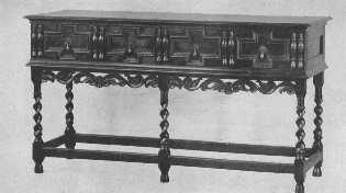
This Jacobean buffet is finely reproduced with the exception of the spiral carving of the legs, which is too sharp and thin, and gives the appearance of inadequate support. The split spindle ornament was much used on furniture of the period.
The English Renaissance was of slow growth and was always marked by a certain English sturdiness, which is one of the reasons why it is more easily used in our modern houses. It began in the time of Henry VIII and lasted through the Tudor and Jacobean periods.
The best modern copies of Renaissance furniture are not to be found in every shop and are usually in the special order class. There are some makers in America, however, who make extraordinarily fine copies, and there is the supply from Europe of fine copies and "faked" originals—a guaranteed original is a very rare and expensive thing.
The period of Louis XIV in France was another "magnificent" period and should not be used in small or simple houses. Louis XIV furniture was large and massive, lavish in gilding and carving and ornament, but had dignity as well as splendor. The Gobelin and Beauvais Tapestry Works produced their wonderful series of tapestries, and Boulle inlay of brass and tortoise shell was lavished on furniture, and the ormolu mounts were beautiful and elaborate. All workmanship was of the highest. During the early part of the period the legs of chairs and tables were straight and square in shape, sometimes tapering, and much carved, and had underframing. Later they were curved and carved, a kind of elaborate cabriole leg, and had carved underframing. Toward the end of the period the curved leg and underframing became much simpler, some of the furniture having no underframing, and slowly the style merged into that of the Regency and Louis XV. The illustrations for the long chapter on Louis XIV show some very fine examples of both the grand and simple form of chair, and also show that comfort was becoming more of a fact. The materials used for upholstery were brocades of large pattern, tapestries, and splendid velvets. Tables, chests, armoires, desks, console tables, mirrors, screens, all were carved or painted or inlaid, gilded and mounted with wonderful metal mounts.
There is great danger, in buying furniture for both this period and the Renaissance, that the reproductions chosen may be too florid, the gilding too bright, the carving too ornate, with an indescribable vulgarity of line in place of the beauty of line which the best originals have. Some of the best makers are, however, making some very fine reproductions of the simpler forms of this time which are beautiful to use in houses of fair size and importance.
If one wishes to use Louis XV furniture it is better to choose the simpler and more beautiful designs rather than the over-elaborate rococo. The period was a long one, sixty-nine years, and began with a reminiscence of the grandeur and dignity of the time of Louis XIV, which was soon lost in the orgy of curves and excessive ornament of the rococo portion; and toward the end came the reaction to simpler and finer taste which reached its perfection in the next reign of Louis XVI. The legs of the furniture of Louis XV time were curved and carved, light and slender, and had no underframes or stretchers. The frames which showed around the upholstery or cane were carved elaborately and later more simply (see illustration at end of chapter on Louis XV). Walnut, chestnut, ebony, and some mahogany were used. Some of the furniture was veneered, and there was a great deal of gilding used and also much painted furniture. The ormolu mounts were most elaborate, curved and ornate like the carving, and were used wherever possible. The brocades used for furniture coverings were lovely in color and design. Garlands, flowers, lace and ribbon effects, baskets of flowers, shells, curled endive, feathers, scrolls, all were used, as well as pastoral scenes by Boucher and Watteau for tapestry and paintings. Comfort had made a long step forward.
The period of Louis XVI was much more beautiful in style than the preceding one, as it was more restrained and exquisite because of the use of the straight line or a gracious, simple curve. This comparative simplicity does not come from lack of true feeling for beauty but rather because of it. The sense of proper proportion was shown in both the furniture and the room decoration. The backs of chairs and settees were round or rectangular, and the legs were square, round, or fluted, and were tapering in all cases. The fluting was sometimes filled with metal husks at top and bottom, leaving a plain stretch between. Walnut and mahogany were much used and were beautifully polished, but had no vulgar and hard varnished glare. There was wonderful inlay and veneer, and much of the furniture was enamelled in soft colors and picked out with gold or some harmonizing color. Gilding was also used for the entire frame. The metal mounts were very fine. Brocades of lovely color and designs of flowers, bowknots, wreaths, festoons, lace, feathers, etc.; chintz, the lovely "toil de Jouy," which is so well copied nowadays; soft toned taffeta, Gobelin and Beauvais and Aubusson tapestries, were all used for hanging and furniture coverings. Cane also became much more popular. Walls were paneled with moldings, and fluted pilasters divided too large spaces into good proportions. Tapestry and paintings were paneled on the walls, and the colors chosen for the backgrounds were light and soft.
The charm and beauty of this style as well as its dignity make it one which may be used in almost any modern house, as it ranges from simplicity to a beautiful restrained elaborateness suitable to the formal rooms.
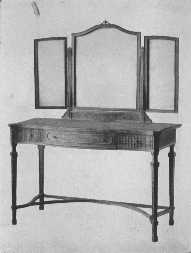
The modern style of mirror is brought into harmony with the eighteenth century dressing-table by means of carving.
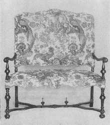
This William and Mary settee would be delightful in a country house. There are chairs to match it.
The change from Louis XVI to the Empire was a violent one both politically and artistically. The influence of the great days of the Roman empire and the mystery of ancient Egypt stirred Napoleon's imagination and formed his taste. Empire furniture was solid and heavy, with little or no carving, and much ornamentation of metal mounts. Mahogany was chiefly used, and some furniture was gilded or bronzed. Round columns finished with metal capitals and bases appeared on large desks and other pieces of furniture. Chairs were solid, many of them throne-like in design, and many with elaborately carved arms in the form of swans and sphinxes, and metal ornaments. The simpler form of chair, which was copied and used extensively in America, as a dining-chair, often had a curved back and graceful lines. Furniture coverings were very bright satins and velvets brocaded with the Emperor's favorite emblems, the bee, torch, wreath, anthemion. It is a heavy and gaudy style and must be used with great discretion. American Empire furniture was far simpler and is better suited to many American homes. In buying it, however, one must be careful to select copies from the earlier part of the time, for it fast deteriorated into heavy and vulgar curves. This American Empire furniture is often shown in the shops under the name of Colonial, which is a misnomer, as we had ceased to be colonies years before it came into existence. It was used during the first half of the nineteenth century.
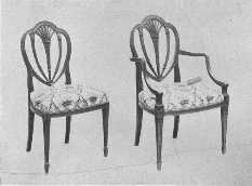
These chairs are reproductions of designs by the Adam Brothers. They are of satinwood, covered with damask. This design was also used by Hepplewhite.
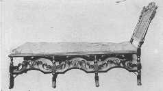
The first day beds, or chaise longue, were made during the Jacobean period. As will be seen, this "stretcher," as they were also called, has Charles II influence in its carving and Spanish feet.
When we come to English furniture, I think we all take heart of grace a little, for there is something about its sturdiness that seems to appeal to our American sense of appropriateness. By inheritance we have more of the English point of view about the standards of life and living and we seem to settle down with more comfort in a house furnished in any one of the English periods than we do with any of the other great styles.
The English Renaissance is often called the age of oak, and all through the long years of its slow development this oaken bond, so to speak, gave it a certain unity which makes it possible to use much of the furniture of its different divisions together. There are many fine reproductions made of the Tudor and Elizabethan times, but from the early Stuart days, the time of James I onward, good reproductions become more plentiful. This does not mean, however, that one is safe in buying anything called Jacobean or Queen Anne or Georgian. One must still be careful and go armed with as much knowledge as possible. For instance, do not buy any Tudor, Elizabethan, Jacobean, or Charles II furniture made of mahogany or with a high polish. Do not buy any with finicky or delicate brass handles. This may seem an unnecessary warning, but I have seen dainty oval Hepplewhite handles used on a heavy Jacobean chest. This does not happen often, but a word to the wise—. The handles which were used were some times of iron and sometimes of brass, often with a little design etched on them, and the drop handles were either oblong or round rings, or pear- or tear-shaped drops with either a round or oblong plate. H-hinges of iron were used. Chairs of the time of James I, which are much like those of Louis XIII in France, were square and strong with plain or spiral turned legs, and stretchers, and had seats and half backs covered with needlework, leather, velvet, or damask. They would make very comfortable dining chairs and would harmonize with sturdy gate-legged tables, or the long narrow tables which show the influence of Elizabeth's time in the carved drum or acorn-like bulbs of the legs. A court-cupboard would make a beautiful sideboard, and one of the long tables spoken of above would make an appropriate serving-table. Carved chests, and screens covered with leather or needlework, may be used in rooms of this kind, and for modern comfort one may add stuffed chairs and sofas if the proper materials for coverings are chosen. There are some very fine copies made of old needlework of different kinds and also of damasks and other stuffs. One must have the right background for all this, oak paneled walls and tapestry and plain or figured velvet or damask hangings. There are also some finely designed heavy linens which are correct to use.
The furniture of Cromwell's time was much like that of the time of James I and Charles I, but was simplified wherever possible. There were no pomps and vanities in those stern days.
When Charles II came to the throne, there was a reaction against Puritan gloom which showed in the furniture being of a more elaborate design. Chair backs were high and narrow with carved and pierced panels of wood, or carved backs with cane panels, and the carved front rail carried out the feeling and balanced the carved top rail. The crown and rose and shell were used, supported by cherubs and opposed S curves. The illustration opposite page 65 will give a very good idea of the general style. Upholstery was also used, and day-beds and high-boys made their appearance. The chests of earlier days became chests of drawers. Rooms were paneled in oak, and much beautiful tapestry was used. Walnut began to take the place of oak in the later days of Charles II and those of James II, and introduced the age of walnut which lasted through the reigns of William and Mary and Queen Anne.
The furniture of the early days of William and Mary was much like that of the time of Charles II. The chair backs remained high and narrow, but the carving slowly grew simpler and the caning at last went entirely across the back. Many of the early chairs had three carved splats or balusters in the back, and a feature which added greatly to comfort was the slight curve the backs were given instead of the perfectly straight backs of Jacobean days. Dutch influence at least conquered the old style, and the more characteristic furniture of William and Mary was made. A rather elaborate form of the cabriole leg was used, ending in a species of hoof with a scroll-like stretcher between the front legs and curved stretchers connecting all four legs. The cabriole leg became simpler as time passed until in the days of Queen Mary it became the one we all know so well in the Dutch chairs and the early work of Chippendale.
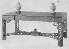
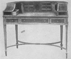
These copies of rare old pieces of furniture are of the best. The choice of wood, the carving, the inlay, all show the highest ideals. The Chinese Chippendale table shows the pagoda effect, and the Hepplewhite desk has the charm of a secret drawer.
There was much beautiful marquetry used; in fact it is a marked characteristic of much of the furniture of William and Mary. After she died in 1694, the white jasmine flower and green leaves were not used so much, and the sea-weed pattern and acanthus became more popular.
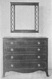
An exceptionally fine reproduction of a Sheraton chest of drawers.
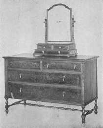
The walnut used in this adaptation of the William and Mary period is very fine. Shaving-glasses were used throughout the eighteenth century.
The cup-and-ball design of turned legs with curved stretchers was used for chairs, settees, tables, cabinets. China cupboards with their double-hooded tops and soft colored brocade linings were used to display the wonderful china collections so much in vogue. There was much upholstered furniture covered with beautiful petit-point, which is perfectly reproduced nowadays, but is naturally expensive. Silks, velvets, and damasks were also used, and Queen Mary had a "beautiful chintz bed."
The handles used were of various kinds, the favorite being the drop from a round or star-shaped boss. The furniture was beautifully polished but did not have a bright gloss.
When Anne came to the throne in 1702, the English cabinet maker had became an expert craftsman, and we have the beginning of the finest period of English cabinet-making, which later, in the Georgian period, blossomed into its full glory. The furniture of this time was of walnut. The chairs had a narrow, fairly high back, with a central splat spoon-shaped and later fiddle-shaped. The corners of the back were always rounded. The cabriole legs were often carved with a shell on the knees, the acanthus being used in the more elaborate pieces of furniture, and ended chiefly in a club foot. Stretchers became less common, but if they were used were pushed back and did not form such an important part of the chair design. Seats were broader at the front than at the back, and all furniture showed a real desire for comfort and convenience. Marquetry and lacquer were both in great favor, and there are wonderful examples of both reproduced, but especially lacquer. Petit-point, damask, velvet, and chintz were all used for upholstery and hangings. Chintz was becoming more plentiful, but it was not until the Georgian period that it reached its perfection.
The Georgian period covers the work of Chippendale, the Adam Brothers, Hepplewhite, and Sheraton, who gave to the eighteenth century its undying decorative fame.
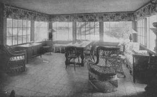
A glassed-in sun-porch furnished with comfortable wicker furniture adds much to the joy of life.
When Chippendale began his fine work, the Dutch influence of Queen Anne's reign was still strong, and this shows in his furniture; but his genius lightened and improved it. The characteristics of his style which remained fairly stable through his different phases were the use of mahogany, a certain squareness and solidity of design which has no appearance of heaviness because of the fine proportions, chair backs with a center splat reaching to the seat. The curving top rail always had curving up corners (see drawings page 84). The center splat was solid at first, but soon was pierced and carved, and went through the many developments of his style such as ribbon-back, Chinese, and Gothic. In some chairs he also used horizontal rails, and what are called "all-over backs." The legs of his earlier furniture were cabriole, and later they were straight. He used much and beautiful carving, gave great attention to the beauty of the wood and the perfection of workmanship and finish. Chippendale's settees were at first designed like two chair backs side by side, and if a larger settee was made either a third chair back of the same design or a different but harmonizing one was used. His dining-tables were made up of two center pieces with wide flaps on each side, and two semicircular tables, and all four pieces could be fastened together into one long table by brass fasteners. The end pieces were used as side tables or sideboards, for the sideboard as we know it did not come until later. He also made oblong sidetables, some with marble tops, which were used as sideboards with wine-coolers placed underneath, and usually a large tea-caddy or tea box on top. The beds which Chippendale made were large and elaborate four-posters, with beautiful carved cornices and posts. The curtains hung from the inside of the cornice, and silks or chintz were used for the curtains. His mirror frames were very elaborately carved, and in his rococo period were fairly fantastic with dripping water, Chinese pagodas, rocks, birds with long beaks, and figures. They were gilded, and some were left in the natural mahogany. He made folding card-tables with saucer-like places at the corners for candles, and later when the candle-stand came into fashion, the tables were made without them.
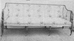
An admirable example of the Sheraton style mahogany settee with original silk covering.
There are many fine reproductions of Chippendale's furniture made which carry out the spirit of his work. In the medium and inexpensive grades, however, there is danger of bad carving, a clumsy thickening of proportions, a jumble of his different periods, and too red a stain and too high a varnish glitter. Good examples can be found in these grades, but one must spend time looking for them, and perhaps it may be necessary to have them rubbed down with powdered pumice and linseed oil. If one uses Chippendale furniture, or that of any of the other Georgian makers, the walls should not be covered with a modern design of wall paper. Plain walls or molding may be used, or one of the fine old designs of figured paper, and this must be used with great discretion and is better if there is a wainscot. Chippendale was very fond of using morocco, but damask and velvet and chintz may also be used. The chintzes were charming in design, and many good copies are made.
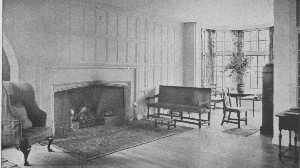
This is in reality a moderate-sized room, yet the open arrangement and the clear center give the impression of great space. The curve of the fireplace and the oak panelling are simple Tudor. The furniture is a mixture of many kinds.
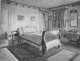
The wallpaper border, the bedspread, the table cover, and the curtains are all wrong in this room. The Empire bed is good but should not have castors.
The Adam Brothers, of whom Robert was the more important, showed strong classical influence in their work, and much of it resembles that of Louis XVI, which was influenced from the same source. Chairs had square or round or oval backs, and they also used a lyre-shaped splat which was copied later by Sheraton. Often the top rail was decorated by small and charming painted panels. These little panels were also used in the center of cobweb caning in chair backs and settees. Legs of chairs and tables were tapering and round or square and often reeded or fluted. Adam used much mahogany and kept its beautiful golden brown tone (not the dead brown called "Adam" too often in the shops), and also satin-wood and painted wood. The best artists of the day did the painting. Wedgwood medallions were introduced into the more important pieces of furniture. Painted placques, lovely festoons, and charming groups of figures, vases of flowers, and Wedgwood designs, and designs radiating from a center, as on semicircular console table tops, are all characteristic of his work. He also used much inlay. As Adam usually planned all the furniture and the interior of the house, even to the door-knobs, he kept the feeling of unity in both background and furnishings.
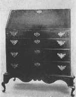
The Hancock desk was a design greatly favored in America in the eighteenth century. This fine example dates from about 1750.
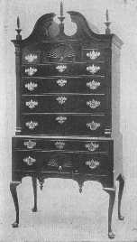
The general proportions, the broken pediment and torch or flame ornaments and drops, large brasses, and cabriole legs all show that this splendid example of a highboy belongs to the same time as the desk, about 1750.
Hepplewhite's furniture has much of the delicacy of Adam's work, by whom, without doubt, he was influenced, as he was also by the French styles of the time. Luckily his own personality and sense of beauty and ingenuity were strong enough to develop a marked and beautiful style of his own. His favorite chair back was shield-shaped (see page 83), and he also used heart-shaped and wheel backs, either round or oval, and charmingly painted little panels. The three feathers of the Prince of Wales was a favorite design. He also made ladder-back chairs, usually with four rails. On much of his furniture the legs tapered on the inside edge only and were put in at a slight angle which gave security both in fact and appearance. He also used reeded legs. His console and other tables are beautiful in design and workmanship, being painted usually in different forms of the radiating fan design, or inlaid with beautiful colored woods. The inlay used was often oval in shape, sometimes only a line and sometimes panels of different woods or matched veneer. The handles used were round or oval. He made sofas and settees with either chair-back backs or all upholstered with the frame showing and the covering tacked on with brass tacks close together. His cabinets are fascinating, with their beautiful inlay and delicate strap work over the glass. He made four-post beds with fluted posts, and chests of drawers and little work tables and candle-stands and screens; and one thing we must be deeply grateful to him for is that he developed the sideboard into a really useful and beautiful piece of furniture. He made nearly everything in the way of necessities, and all show the marks of his taste. His dining-tables were on the plan of those of Chippendale but lighter in effect with tapering legs instead of the long cabriole leg ending in claw feet. His mirrors were usually oval with charming festoons. His favorite woods were mahogany and satin-wood, and he used many fine woods for inlay. Chintz and taffeta and fine velvet are all appropriate to use.
In his best designs Sheraton was much influenced by Adam and Hepplewhite and the style of Louis XVI, but like them he also developed his own special and beautiful style. He used mahogany and a great deal of satin-wood of beautiful grain and of a delightful straw color, which was often veneered on oak frames. He was exceedingly fond of inlay, and his designs called for inlaid panels, borders, and festoons. He used the shell, bell-flower, fan, etc., all carried out in fine colored woods. He also used much painted furniture, and often designed white and gold furniture for drawing-rooms. His characteristic chair back was rectangular in shape with a central splat resting on a rail a few inches above the seat (see page 83). This splat was in many different forms, both inlaid and painted. The legs of his furniture were tapering and either square or reeded, the square usually being inlaid. He made beautiful sideboards which were inlaid and finished with a brass rail around the sides and back of the top, and round or oval or lion's-head handles with rings. He also designed most graceful inlaid knife boxes. Like Hepplewhite, he designed all kinds of furniture both large and small, and, until his deterioration came when he designed his astonishing Empire furniture, his style is full of beauty and charm and delicacy, and is copied very successfully by our modern makers.